Reader Design: Emily's Curated Creation

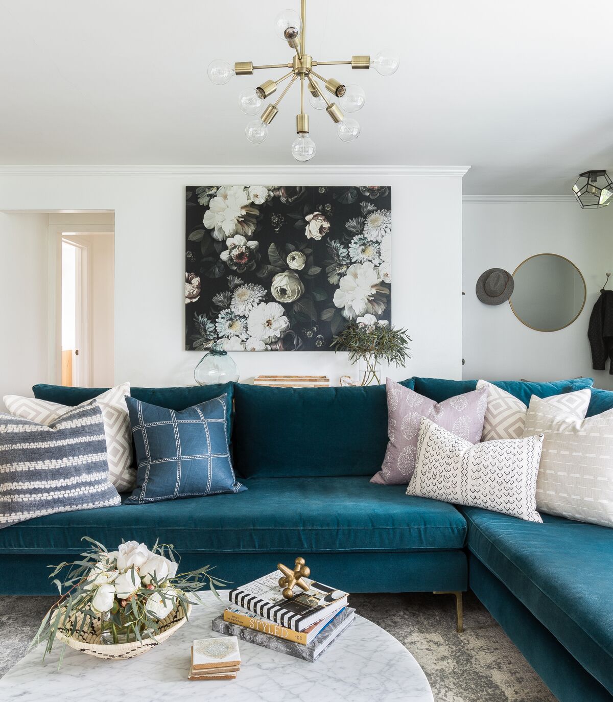
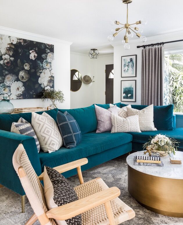
There's something about Emily, the focus of today's reader design spotlight, that makes me think we should be friends. Sure, there's the practical "we both live in Seattle" part. But, we also chose bright turquoise couches as the focal point of our living rooms. I mean, that has to mean something, right?!

west-elm-home-tour-EMILY-RUFF-004.jpg
west-elm-home-tour-EMILY-RUFF-007.jpg
west-elm-home-tour-EMILY-RUFF-001.jpg

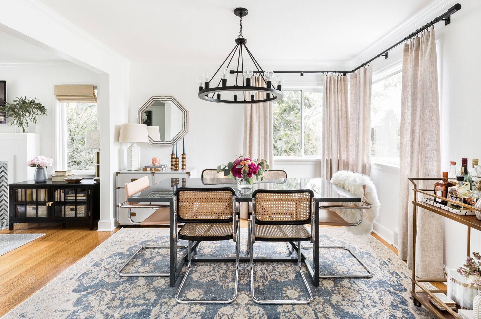
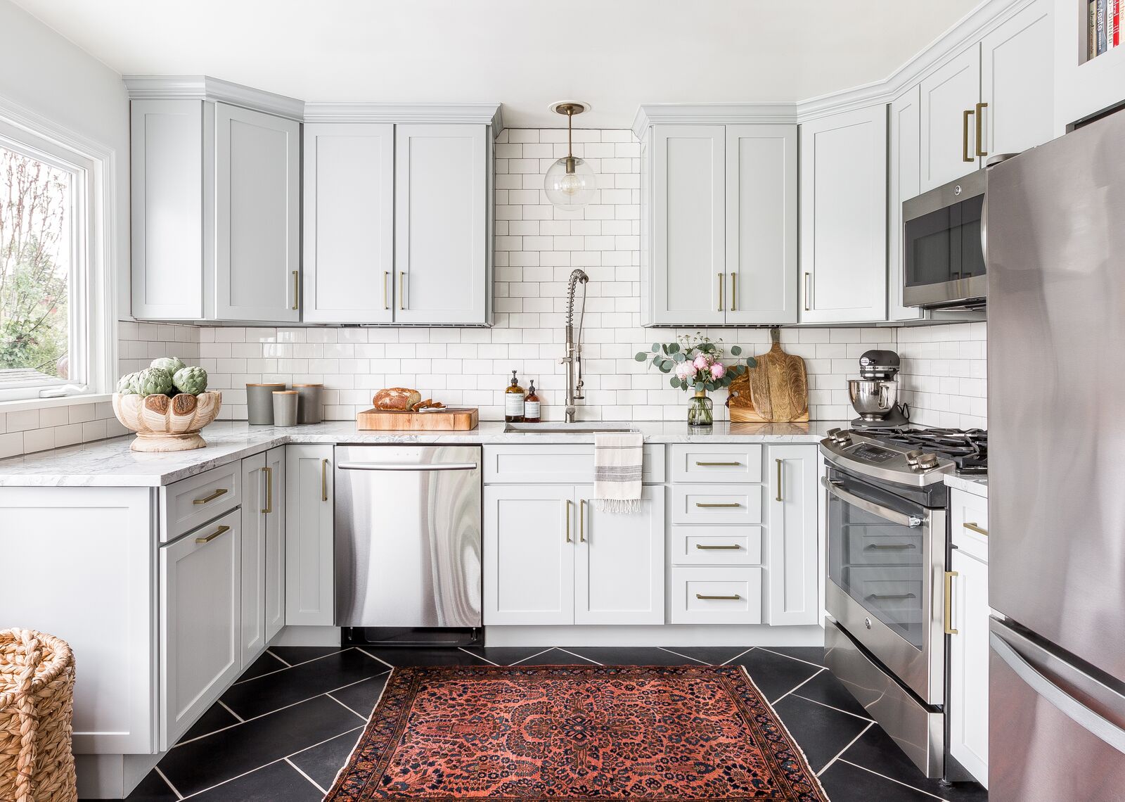
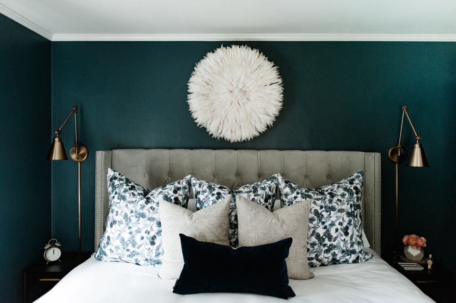
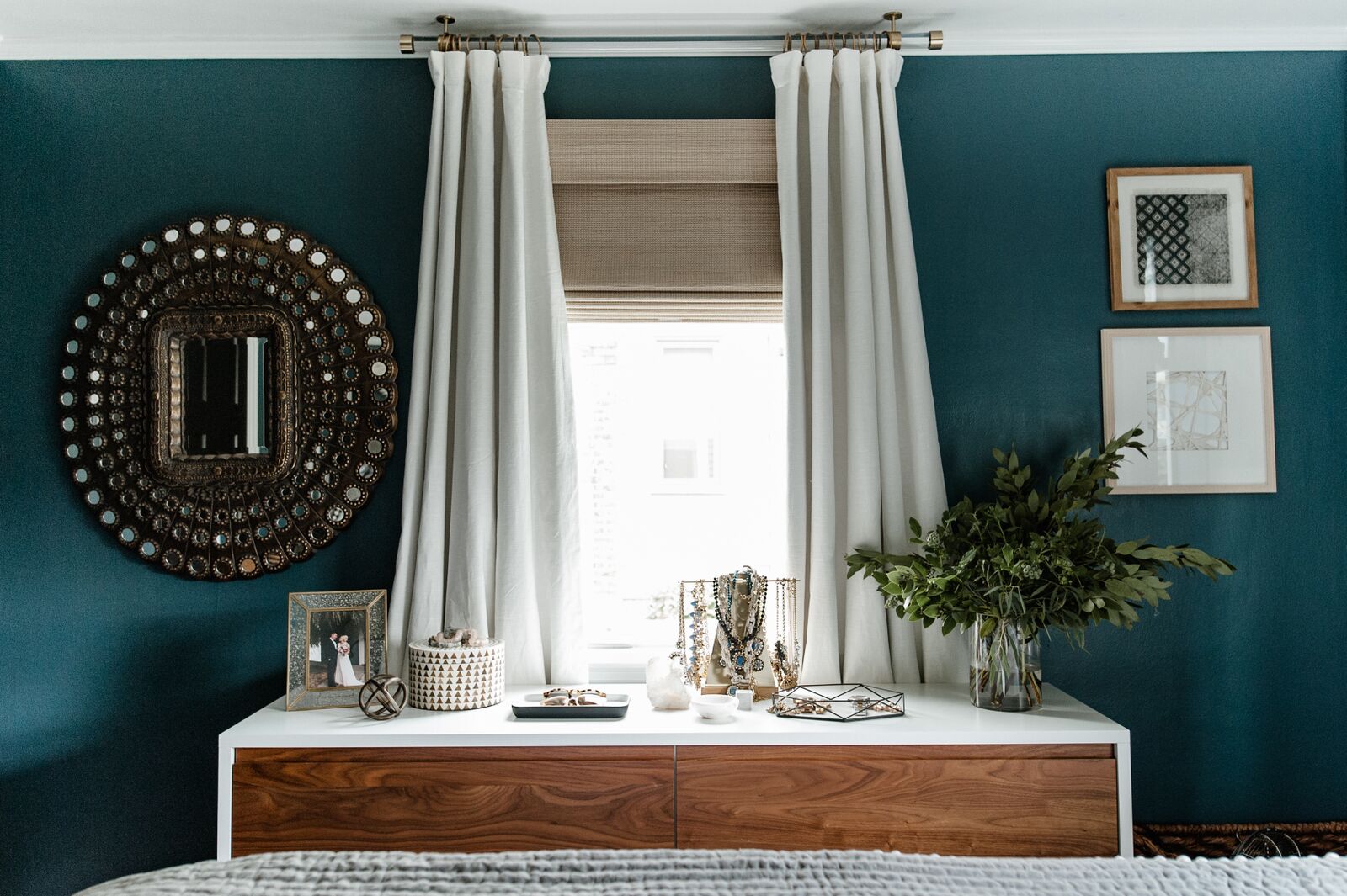
I saw Emily's home pop up on Instagram a few months ago and was immediately in awe. It is quite modern but still cozy, neutral while being bright and deep. 

My design style incorporates a bit of everything, I typically describe it as eclectic modern. I love modern elements, but I also incorporated traditional, art deco, bohemian, and plenty of vintage pieces to give it a curated feel. It takes a lot more time, but gives a space so much more personality. This “design philosophy” is the reason I named my business Cohesively Curated.
west-elm-home-tour-EMILY-RUFF-005.jpg
west-elm-home-tour-EMILY-RUFF-036.jpg
west-elm-home-tour-EMILY-RUFF-038.jpg

It's got a cool but classic London vibe. As Emily describes - 

The city of London above all else is very classic, but it also has so many modern gems and up and coming trends to discover.
west-elm-home-tour-EMILY-RUFF-013.jpg

It's a perfect fit for a similarly rainy, gray, but oh-so-cozy and interesting place like Seattle; I like to think Seattle & London are sister cities. Does anyone else buy that? 

west-elm-home-tour-EMILY-RUFF-002.jpg
west-elm-home-tour-EMILY-RUFF-008.jpg
west-elm-home-tour-EMILY-RUFF-009.jpg

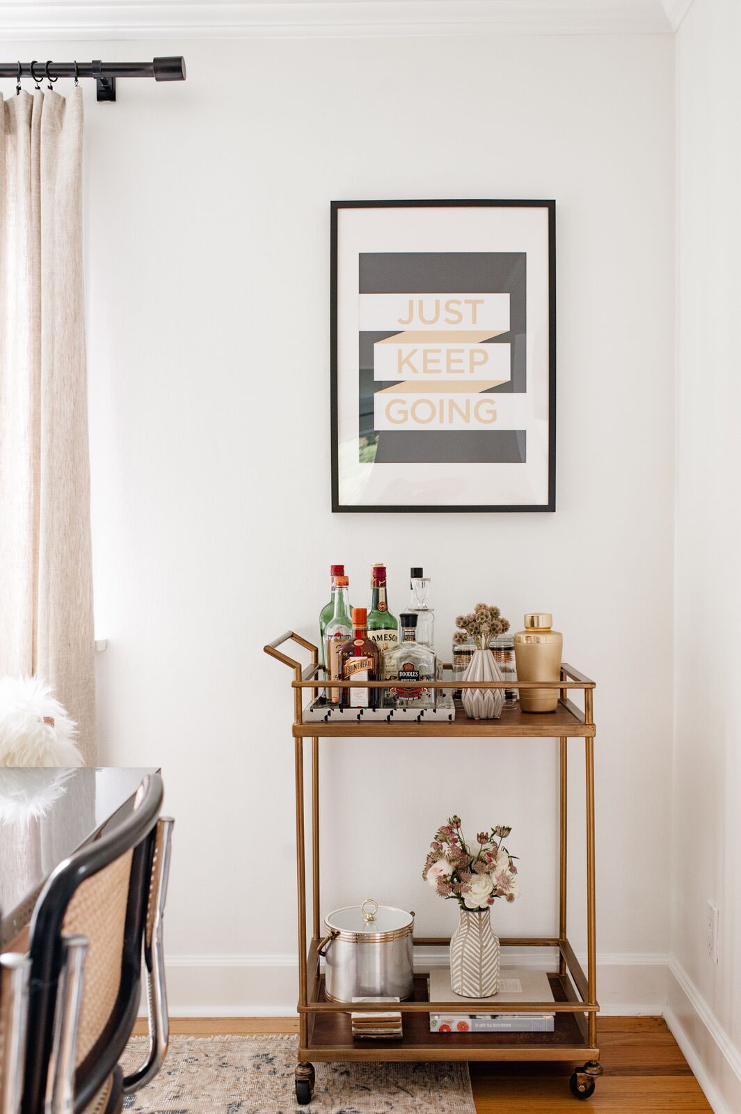
With a focus on classic and modern looks, Emily has carefully selected every piece inside this home, filling it up to the brim with pottery, textiles, and art. She grounds herself in things that hearken back to her design philosophy and uses that as her foundation for making decisions. 

I think it is challenging with social media, Pinterest, blogs, etc. to not let yourself be swayed by other designers styles. Taking something as inspiration and figuring out how to integrate it with your own aesthetic can be a bit tricky. The trend I struggled with most is the boho trend and not going overboard, because that really isn’t my primary style. I included some vintage textiles and rugs that fall into that category but made sure to integrate them with my core aesthetic.
west-elm-home-tour-EMILY-RUFF-052.jpg
west-elm-home-tour-EMILY-RUFF-011.jpg
west-elm-home-tour-EMILY-RUFF-010.jpg
west-elm-home-tour-EMILY-RUFF-054.jpg

This home has to be one of my favorites yet, and I encourage you all to follow Emily along on Instagram @cohesivelycurated for more! We really just scratched the surface. 

Happy Fall, y'all! 
McKenna Sig.jpg

Reader Design: Vinaya's Serene Space

It must be rental season around here, because today, we have another amazing rental - this one, in Boston, Massachusetts.

Vinaya and her husband originally chose their Boston rental for its amazing location, but it has become 'home' over time! 

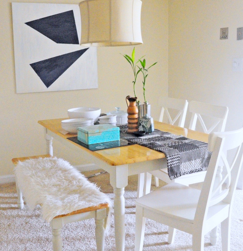
Over time, we’ve styled the space and now it truly feels like home. When I started decorating, I had no idea what my style was. I have gone through several design styles by now — which explains our farmhouse-style dining table and a cottage-style bed! If you ask me ‘today’, I prefer clean, modern lines that are also comfortable.


Vinaya's history of moving has forced her to curate her own collection of only the most loved and eclectic pieces - like her beautiful slatted second-hand coffee table. Of course, there are some things she can't change, like the carpet or white walls. Luckily, as we all know, white walls are the 'it' trend right now! 

From Vinaya:

I think one thing I can’t get my mind off is the all white interior. All white interiors are super trendy now, and I love that! But I also love color. And I also love black and white and graphic. I am really torn between a unified color scheme.
(un)Luckily for me, I can’t paint my rental – so I have no way of experimenting with this. But if I could, I think I will turn into someone who paints their walls a different color every month. So instead, I try to add color in other ways like art and accessories. One of my favorite things is my black and white gallery wall – I love the graphic quality of it and over a year later of putting it up I still enjoy looking at it!

For us renters, gallery walls (if your landlord is cool with holes) or a photo ledge like Cate & Chelsea pulled off here are great options to add your own personal touch! Vinaya's got this one down


Now to close with Vinaya's own words, that I believe represent the mantra by which all of us style mutts live:

I love trends, but don’t follow every trend out there. If it is something I truly like, I will still incorporate it even if it’s been over and done. And if I don’t really fall in love with something , I try not to do it just because everyone is doing it. I think if you decorate purely based on what you love, it will always be trendy to you, and that’s all that matters!

Follow Vinaya along on Instagram @hiphiphome or on her blog

Reader Design: Heather's Preppy & Coastal Abode

Heather, of Pineapples and Pearls, has graciously welcomed us into her new Washington, D.C. apartment. You'll soon find that her home is a perfect mirror to her style: preppy, coastal, and totally welcoming. 

Heather's aesthetic is as sweet as her dimples. This place just invites you to take a seat, have a sip of prosecco, and stay a while.
From Heather: 

I moved into this apartment by myself last month from a much larger apartment that I shared with a roommate. It’s been a fun challenge to make everything work in a 530 sq ft space!
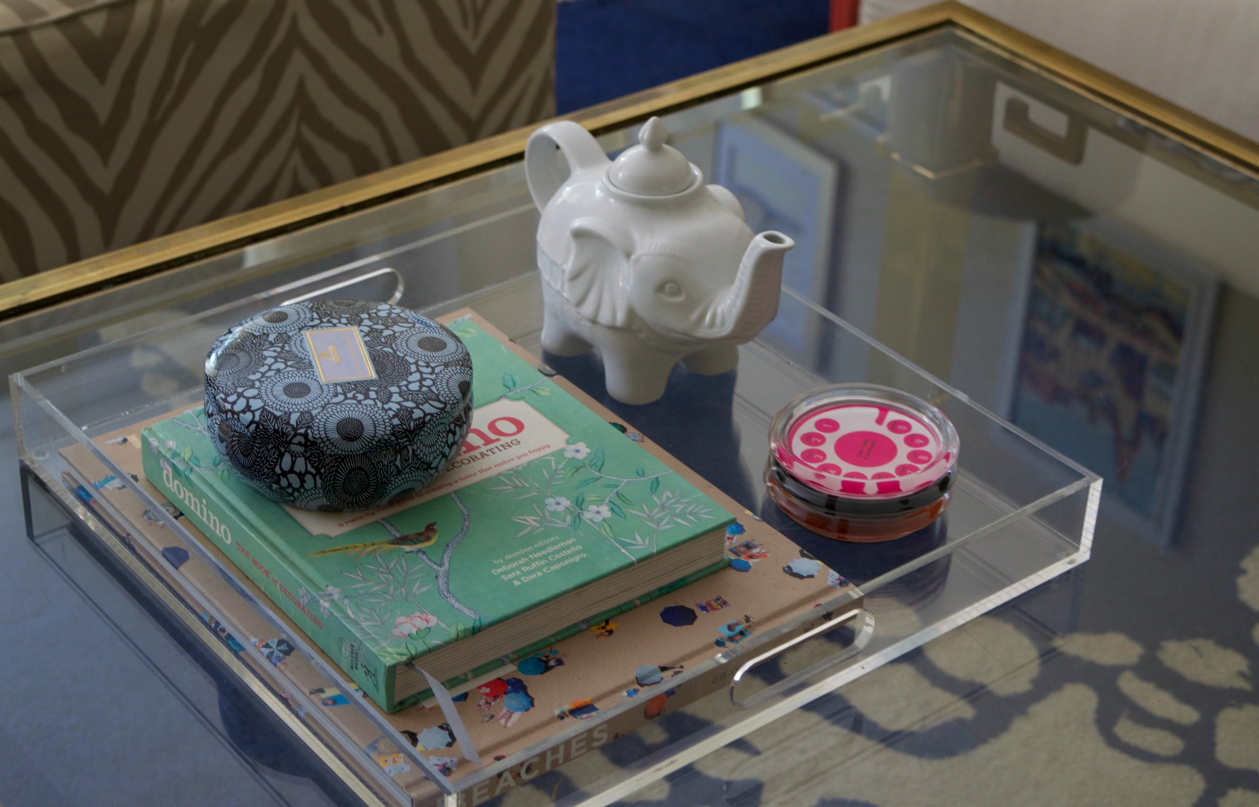
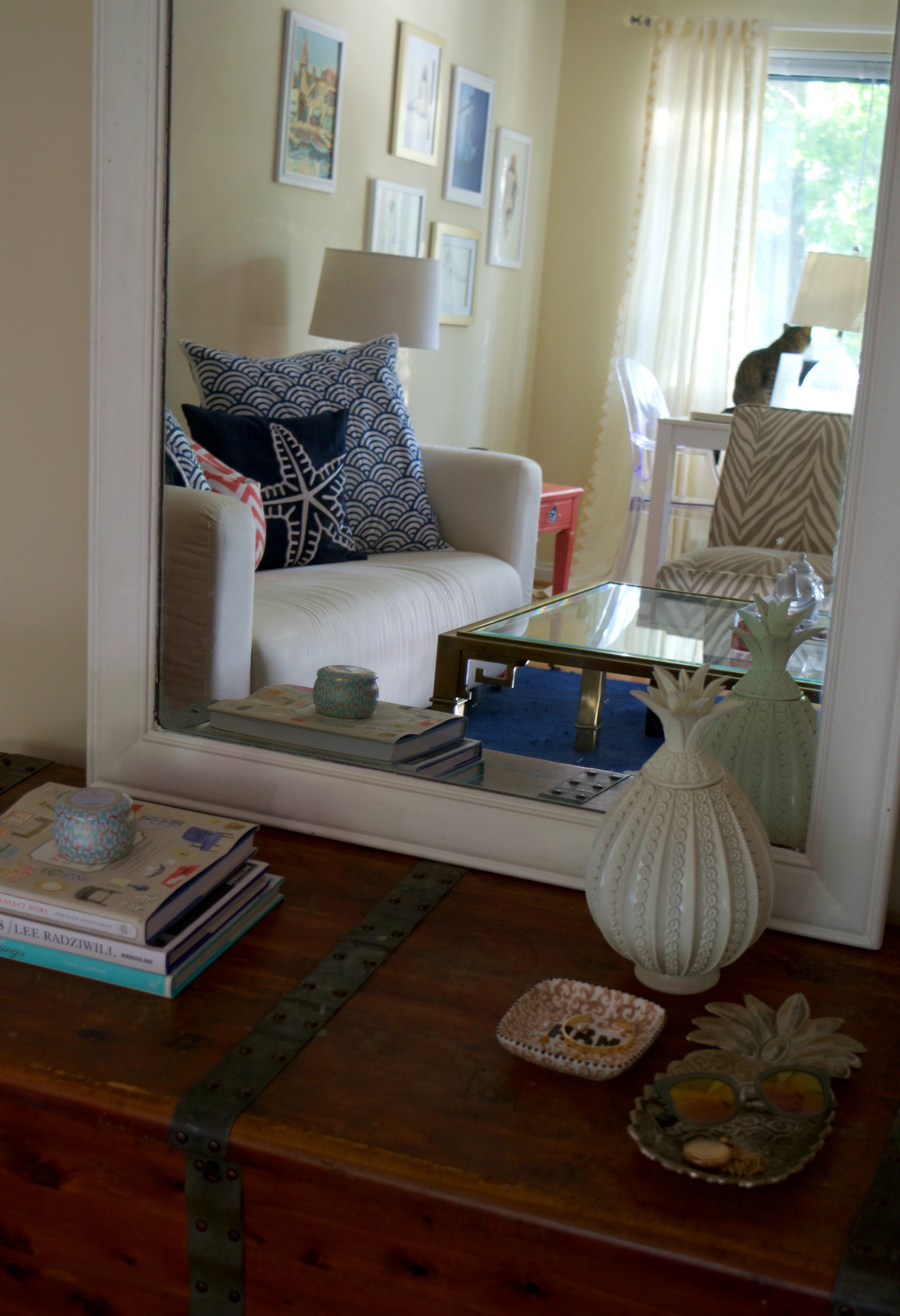
Mixing colors and patterns has never been a fear of mine, so nothing is off limits, though I’ve kept a navy, coral, and turquoise theme running throughout the entire apartment. When the main color palette remains cohesive, it’s no big deal to throw in an animal print chair here or a glitter tray there. I like to think I’ve created a space that’s colorful, bright, just a bit girly, and also comfortable.

... And boy did she nail that animal print! Right now, I think we can all agree that the world of design is obsessed with neutral minimalism. But I completely admire Heather for her ability to just go with it - and make a space that is totally hers. They say that the best compliment is when someone walks into your space and says "this is SO you!" And even though I haven't met Heather in person, I know that she is represented perfectly.

While my style is definitely colorful and modern, I love mixing in older pieces. The trunk in my living room came from my grandmother and is well over 100 years old. The nudes above my desk (with the exception of the blue one, which is from a local DC artist!) were done by my grandfather, who dabbled in every art form you can think of.

And for those StyleMutt loyalists who saw Lejla's post - AGAIN we have the pineapple trend. It's everywhere. I perused my favorite local boutique this past weekend, and was completely tempted by a gold pineapple shaker. I passed on it, but that decision and practice in abstinence haunts me. 

I didn’t want to spend a lot on redecorating and wanted to work with what I already had, while still ending up with something that felt totally different than my previous apartment. I hadn’t set out for a coral and navy room, but I love the way it came together!

Thank you, Heather, for sharing for beautiful space with us! We've loved getting to share your specific 'breed' of style with our mutts! 

Until next time,