Reader Design: Karen's Chippy Charm in Chile

Ok guys here's a fun fact about me: I grew up as a diplobrat.  Meaning my State Department family would up and haul our homebase to a new country in a constant three-to-four-year rotation.  We moved all over the world and I have had the pleasure NAY the honor of meeting so many wonderful internationals - many of whom, like me, had been uprooted and replanted in a foreign country as well.  It was often difficult for our grents and aunties and uncles and cousins, etc... to trek all the way across the globe to visit so our local friends became our surrogate extended family by distance default.  I spent many a Christmas celebrating with blood brothers instead of blood relatives :)

So it has been especially tickling to have StyleMutt Spaces submissions coming in from all over the globe!  You all are such a sweet reminder of my childhood and the amazing people I now count as family.  And whether you know it or not, you are such a vibrant and important installation to StyleMutt Home.  Thank you for sharing your slice of globe with us and we are so honored to all of you (natives and internationals alike) who have found our site.

Today's reader designer is a Chilean who has filled her living room with vintage European touches.  Karen's home is full of chippy charm and re-found, re-purposed, and re-loved pieces. 

From Karen:

I've always loved when a space has pieces that nobody else has that makes it unique. I know it can be difficult, but you can accomplish this by giving a new life to maybe an old piece of furniture, like I did here: the bookshelf it was made by my father twenty years ago... I took off the back side and the two glass doors from the front.  Then I sanded, painted, and distressed it.  Later I did the same with the chair. 
The brown side table is a second hand piece that I got to restore... for the moment, I love how it looks with the white details.
And finally, my gallery wall which I am absolutely in love with!!  It took me some time to gather all the right pieces, but I am so so happy with the result.

That accent wall is my favorite!  The french-inspired graphics, the black and white, and don't get me started on those gold and mirrored frames!!!  

Karen, this is exactly what we want to hear from our readers: that you love and are proud of your space!  You were one of the first readers to tag your #stylemuttspaces and we are so delighted that you did!  

Don't forget that StyleMutt Home is open to all you fellow mutts out there.  You don't have to be an international, a local, a professional decorator, or even a fellow blogger to share your favorite room with us!  The purpose of Reader Designs is simply to share beautiful rooms with fresh ideas and document these features in our SPACES page as a source of inspiration.  So tag #stylemuttspaces on your IG or FB pics people - we wanna see what your rooms have to say for themselves!

Reader Design: Jen's Fabulously Functional Home

We are so pumped to have so many inspiring entries to #stylemuttspaces.  Chelsea and I want so dearly for StyleMutt Home to be a resource for our readers and we certainly don't believe the buck stops with us.  We pine for input from you all!  And we hope you never shy away from reaching out to us with your own ideas.  You don't have to be a professional designer or blogger to have your voice heard here.  Love your space?  Then...

Work It.png

(or boy ;)  and share it with us!

Ok, I need to reign in my sassy snapping fingers and get back to serving your double helping of juicy inspiration from our next reader design.  Are you hungry?  Because dishing it out hot is our first international feature from Alberta, Canada: Jen from Fresh Crush.

From Jen:

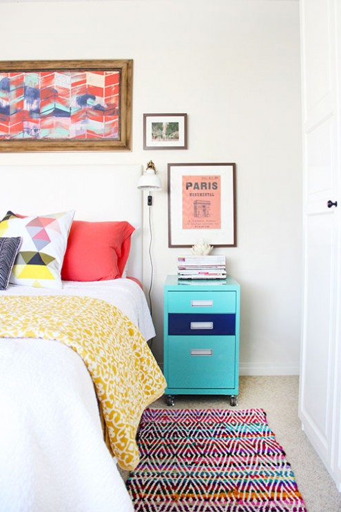
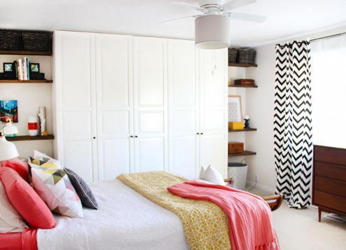
"The goal was comfort and colour!  I was crazy for coral while doing this project, and pairing it with neutral walls, a little black, aqua, and yellow was the perfect match."

Fun fact!  I have a filing cabinet that I painted this color aqua.  Jen - great minds eh?! 

Jen's wall-mounted clip lamps make the best use of surface space without sacrificing style.

"A few simple DIYs brought everything together, the easiest (and cheapest) of which had to by my addition of a drum shade to our ugly old (but needed) ceiling fan.  And custom shelving added a lot of pretty for very little cost, but huge comfort impact.  Definitely a great space to unwind at night." 

Did you even notice there was a ceiling fan?!  I didn't!

Don't those shelves masterfully maximize the dead space in the corner?

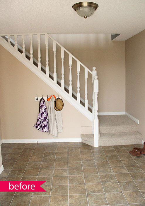
Jen's marriage of form and function does not stop here.  Wipe the drool from your mouths and let's go gawk at the before-and-afters of her foyer:

"Our foyer needed a serious update, but on a budget..."  

You're speaking my love language here Jen ;)

"The goals were to make it welcoming and warm, get it organized with easy to use storage, and make it easy to clean.  The open concept of the foyer [makes] it easy for our little one to help out.  The previous heavy doors [on the hallway closet] were too hard to operate and kept everything hidden and hard to find.  The new flooring and neutral paint warmed everything up..."
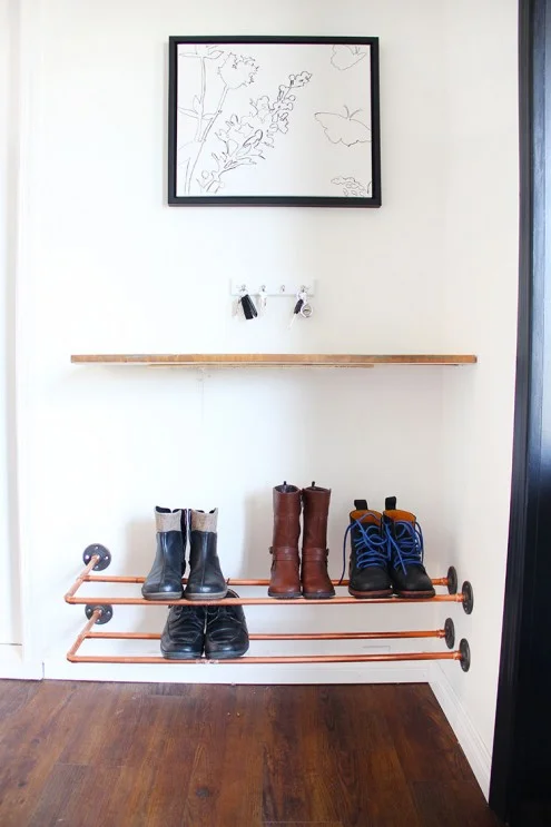
"...and new lighting, along with a few DIY projects and accessories kept everything on budget.  My favourite project from the space was my DIY copper shoe rack."  

Me too Jen.... meeeeee too.

Read about more of Jen's bedroom makeover and foyer transformation on Fresh Crush,  Thank you Jen for sharing with us all the way from Canada!

So what do y'all think?  You crushing on Fresh Crush yet?  

Don't forget, we want to celebrate your individuality with you!   So don't hesitate to tag #stylemuttspaces on Instagram or post your photos onto our Facebook wall!  The whole point of Reader Designs is simply to share incredible rooms with fresh ideas and document these features in our SPACES section to use as a reference of inspiration.  These submissions are seriously the jewels in the StyleMutt Home crown.  

You never know who else will be inspired by your space so don't deprive us of your unique YOU people!