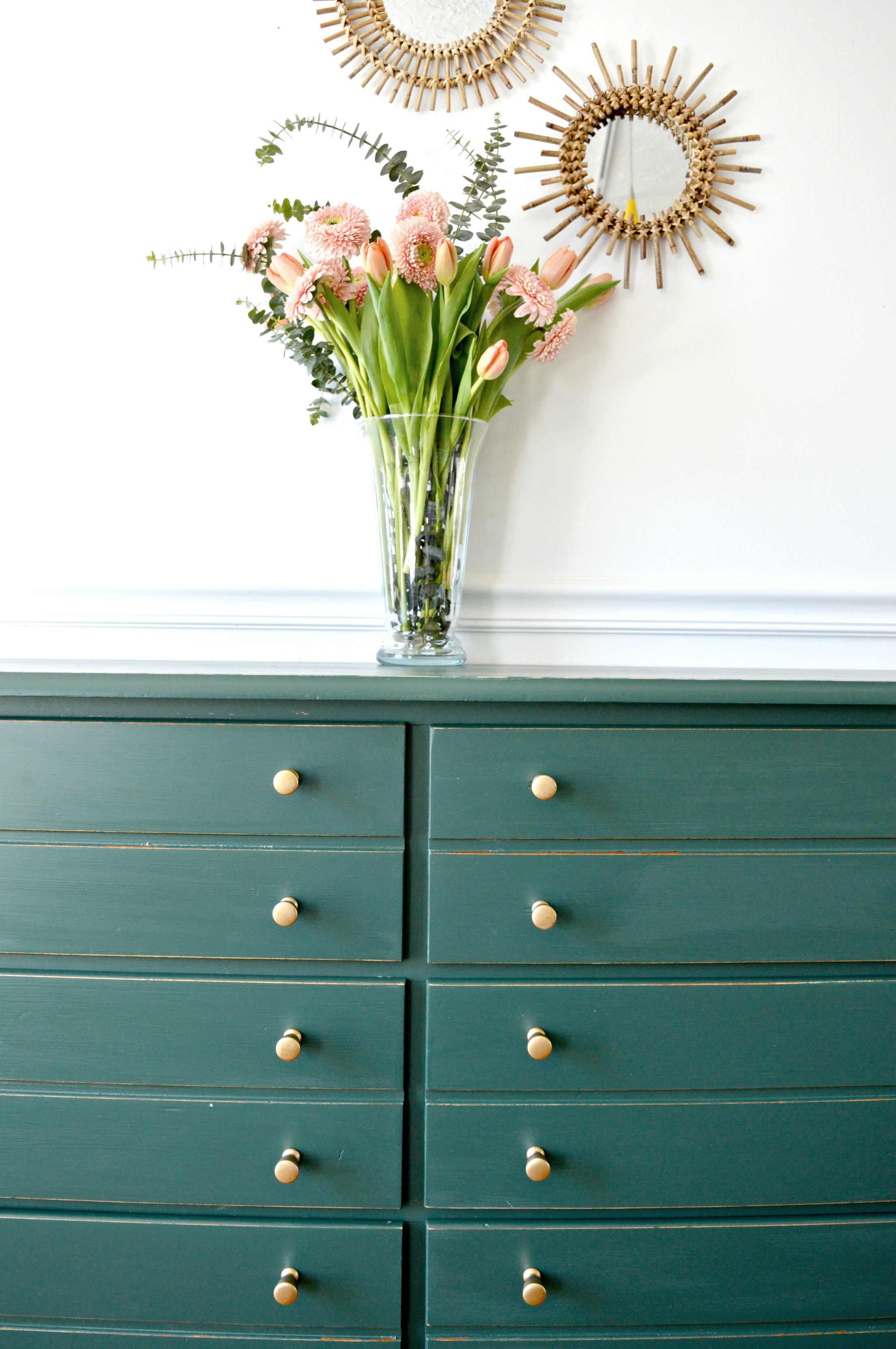
Welcome back, StyleMutts, and happy Friday! Today, I want to introduce you to Katie Banks, of CMB World Designs. She is another talented DC area native. I promise I'm not just selectively featuring DC area people - but I guess the best food city of the year is also a hot spot for designers!
Before I jump in, I need to tell you all something about Katie's home: it used to be a fraternity house. And an unofficial one at that, which means no regulation! Bless the soul (looking at you, Katie!) who saw the potential through the Animal House leftovers.
From Katie:
“An unofficial fraternity house. Need I say more?! It was TRASHED! We couldn’t move in for weeks. The first thing we needed to do was get a clean new bathroom (gross). We did most of the work ourselves, from refinishing the wood floors, tiling, framing, new windows - you name it!”
“Our style is a mix of mid century, Hollywood Regency, and industrial. Obviously very eclectic, and color makes me happy. I have always been obsessed with bold color and patterns. I’ve also never been a trendy person, so the fact that bamboo and rattan has made a comeback is working out pretty good for me right now. ”
Based on what I know of Katie, this living room is a perfect representation of her: the macrame, made by Katie's sister who owns Sealily Designs. The chairs are Craigslist. The couch is made for cuddling. What else do you need?!
I feel like 99% of the photos I see of Instagram are of these beautiful, bright white spaces. And, real talk, when do you guys think that trend is going to end? Those spaces are the perfect source of art, but that make you ask "could I actually live in that space?" Katie's home is not one of those places. And I assure you, in no way is that a negative thing.
“We are a super casual family, so comfort is a must; no fancy rooms in our house. I honestly have found that the best things in my house have come from Craigslist, yard sales, or are made by my super duper husband [like the dining room table]! ”
“This hallway makes me happy. My theory is ‘if you have kids why would you ever pay for art?’ Framing all these pics was my Mother’s Day project a couple of years ago. Across the hall is the wood wall my husband made, which doubles as a photoshoot place for some the pieces that I refinish for CMB World Designs.”
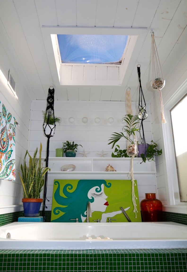
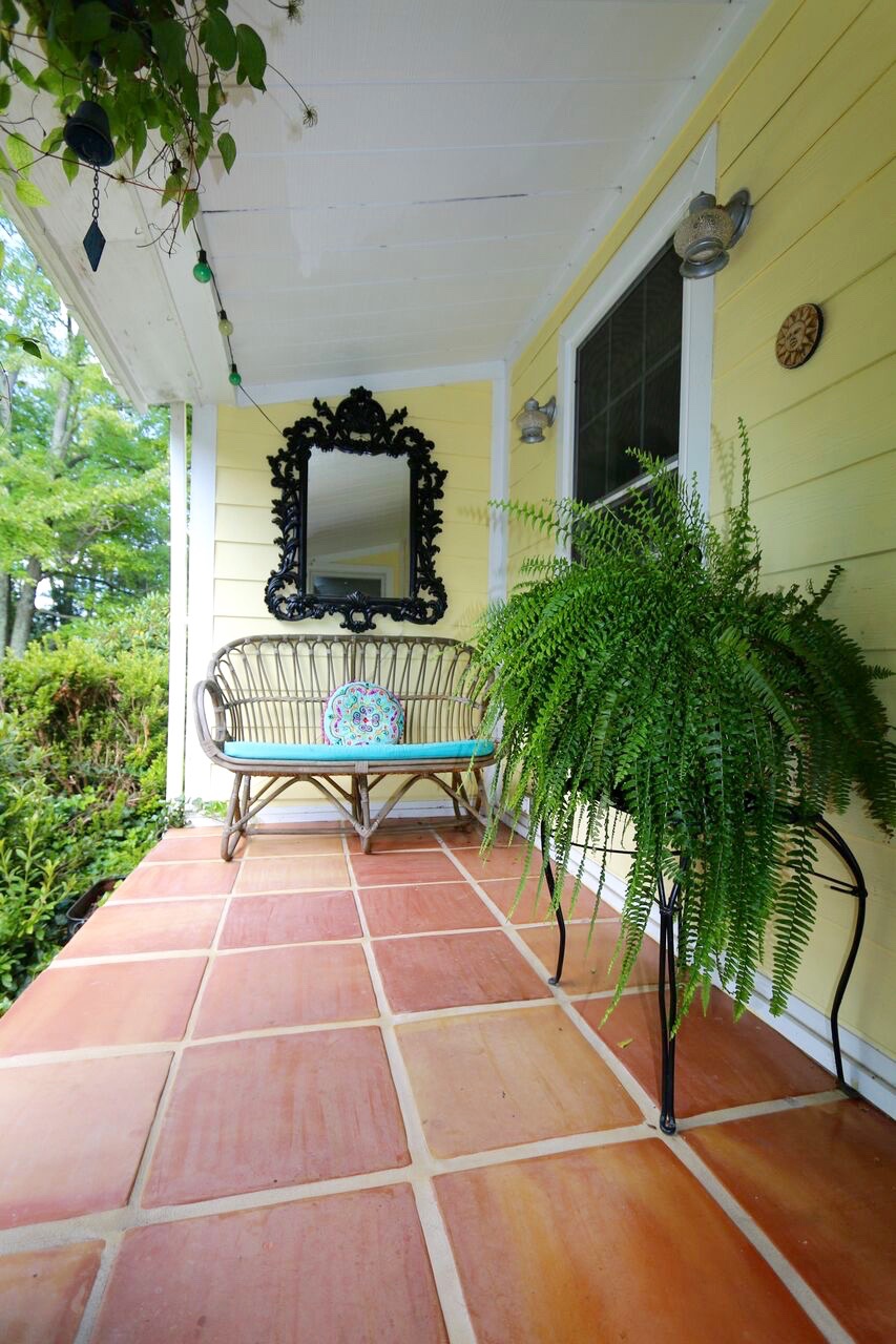
Something else I love about Katie's house? SO. MUCH. GREEN. They say decorating with green has seriously restorative properties - perfect for a busy and lively family home! Both the bathroom and the front porch would make my top two locations in this house for some serious 'me time.'
“And, finally, my favorite spot: my bathroom. Well, my tub area in my master bath. The green mosaic tile, with the skylight and plants, makes a great place to relax. At night I can see the stars. ”
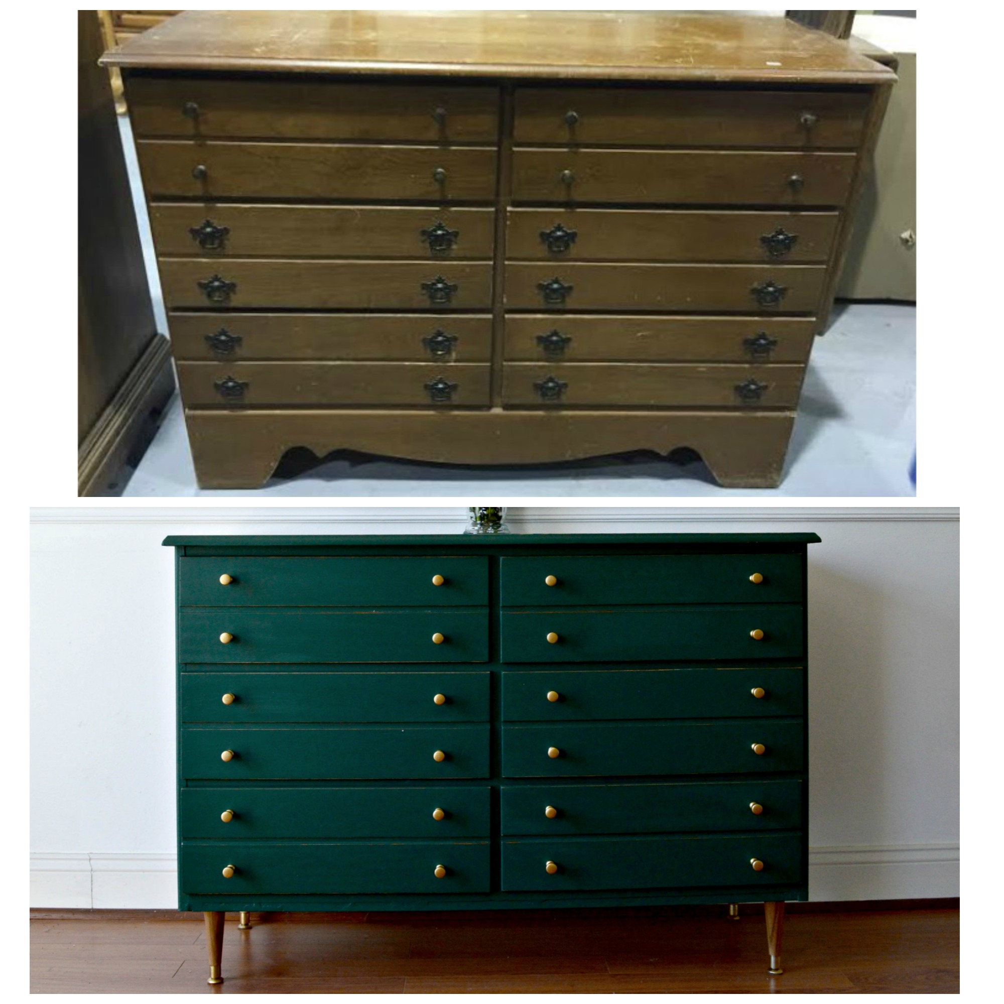
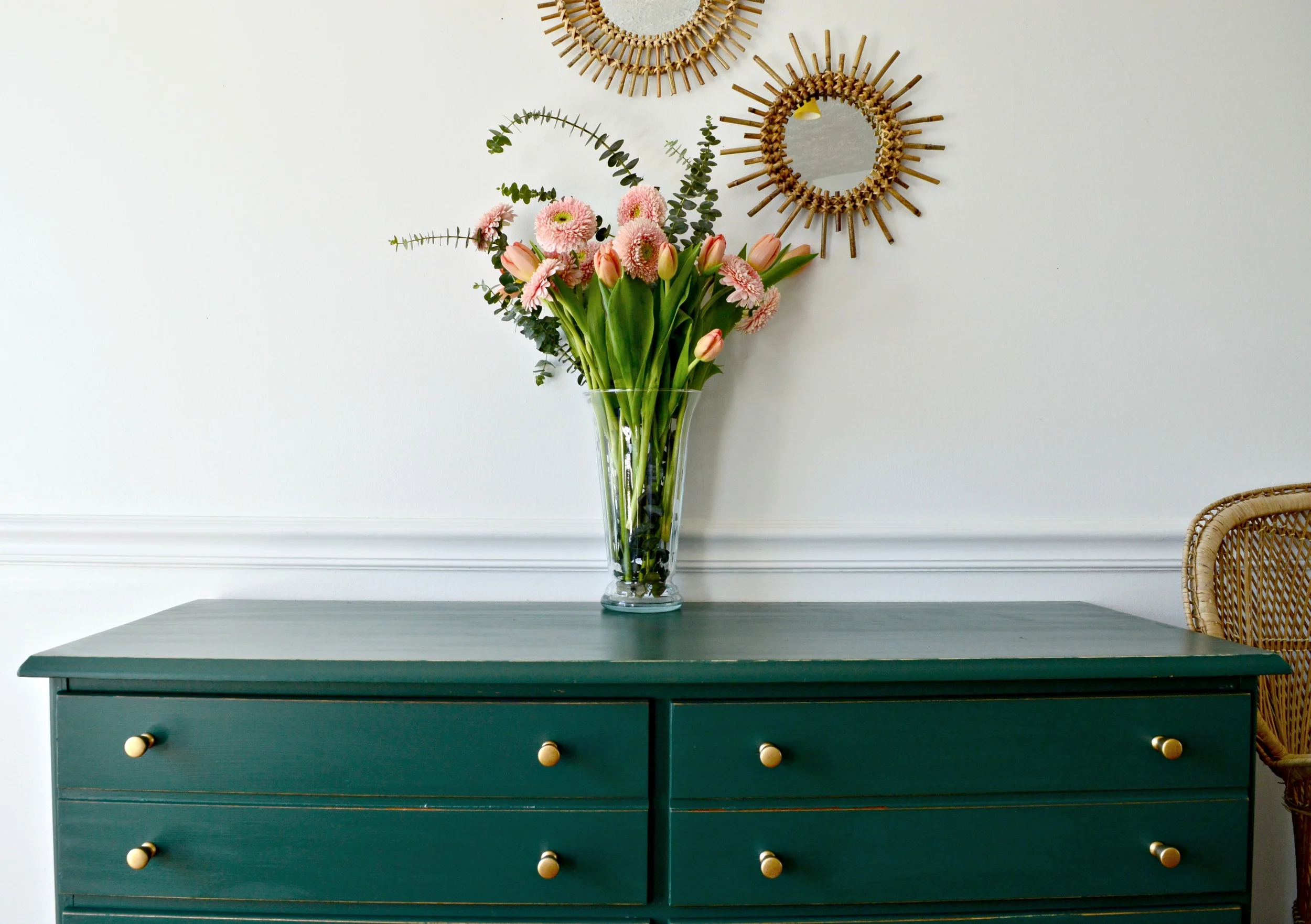
Follow Katie along on Instagram at @cmbworlddesigns and check out her incredible furniture designs! We love to support our StyleMutt community! Check back next Friday for the next #stylemuttspace.


