Reader Design: Oscar's Luxe Dining Room

First of all, a very happy Valentines Day from our hearts to yours! Please consider yourselves loved and appreciated by us here at StyleMutt Home. If we could, we'd take each and every one of ya out on the town tonight to show you how much we care. But we think we've got something better, (which is a good thing because the night on the town was never going to happen).

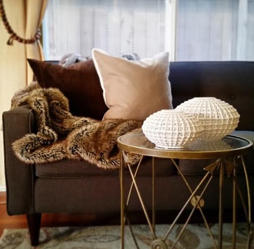
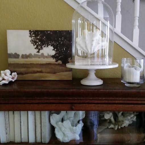
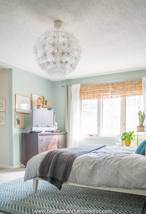
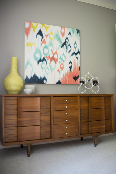
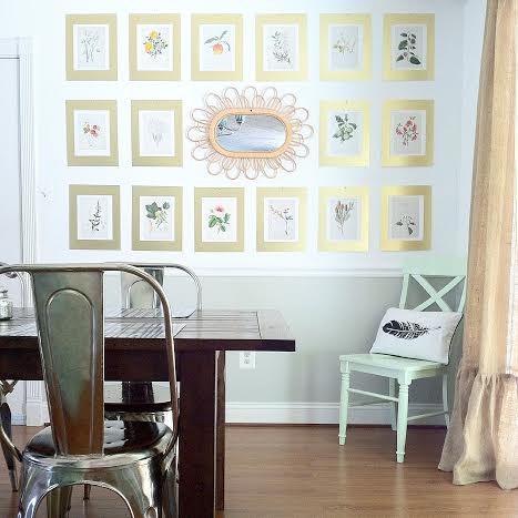
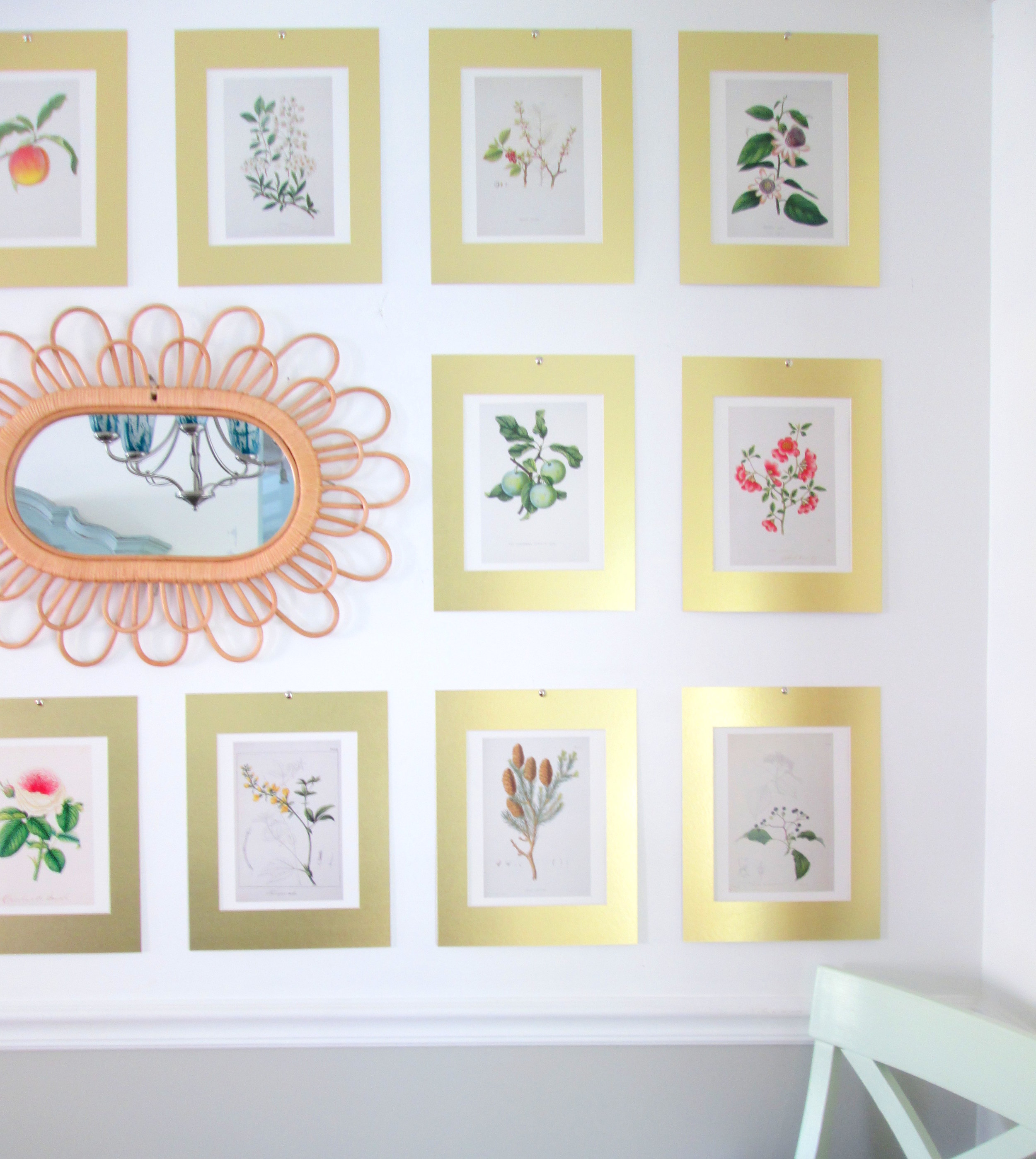
Our V-Day gift to you is an absolutely stunning Reader Design by my pal Oscar! I met Oscar through Instagram, (at left are just a few of his amazing images), and was instantly inspired by the way he mixes luxury with comfort. This guy has the formula down pat. When he agreed to share his home with us here I just couldn't wait for you guys to see!

As you may recall, Reader Designs are an open invitation to  share your unique design and creativity! There are no requirements to be a professional decorator or even a fellow blogger. The purpose of Reader Designs is simply to share incredible rooms with fresh ideas and document these features in our SPACES section to use as a reference for inspiration. And can I just say to all the dudes here, we know you've got mad skills, we are all about sharing mad skills, so get on it! Guys and gals alike, tag your work with #stylemuttspaces on Instagram or share your pictures right to our Facebook page!

I mean, after Cate's sassy Work. It. Girl. cheer on our last Reader Design, I just had to:

In honor of our first male Reader Design...

Enough yacking, here's the good stuff!

From Oscar:

"These are pictures of my living area turned dining area. I've always wanted a huge dining area with a fireplace or opening up to a patio. I have a fireplace, I have a patio, but in the living room. I decided to swap the living room and dining room and love it!!"

What a genius use of space!

"Our family hosts a lot of dinner parties so ample space to get around the dining table is important."

Look at all that space! Mission definitely accomplished!

"Fortunately our floor plan is open concept so the change was fairly easy without compromising too much space in the living area." 

This is such an incredible example of not letting floor plan stand in the way of your hopes and desires for your home. Oscar saw the potential that his living room had to be an even better dining room, and knocked it out of the park! You can follow Oscar's stunning work on Instagram @oscarbravohome!

Thank you so much for sharing your gorgeous dining room with us, Oscar! Can we talk you into sharing more?! Who's with us!

Have yourselves a lovely Valentines Day and thank you for making StyleMutt Home a part of it! Carry on lovebirds!

XOXO

Reader Design: Ashley's Evolving Dining Room

Cheers to the weekend! Back with another Reader Design today from the talented Ashley of Bigger Than The Three Of Us! We shared her stunning 'Airy Bedroom', (at left), last week which had us spinning with fresh ideas, and her dining room sure doesn't disappoint either!

Just as a reminder, Reader Designs are an open invitation to share your unique design and creativity! There are no requirements to be a professional decorator or even a fellow blogger. The purpose of Reader Designs is simply to share incredible rooms with fresh ideas and document these features in our SPACES section to use as a reference of inspiration. Besides, who doesn't like getting to peek inside beautiful, creative homes?!

So, are you ready to see more from Ashley?!

From Ashley:

"When we moved in to our house three years ago, I hated the formal dining room space. The built-in was definitely not my style nor was the wall coloring. I painted the walls gray first thing. Next, I tackled all the trim and the built-in. They both got a coat of bright white."

"I found a vintage credenza on Craigslist as well as some mid-century chairs. I paired those with an old table that we had and some garden chairs. Instantly the room had life. I kept adding more layers to make it my own. My husband painted the ikat painting for me and that helped finish the space."

"Things have to evolve for me and continue to evolve and that's the only way I know how to decorate."

Well, Ashley, your home is evolving absolutely beautifully! Thank you so much for sharing your hard work and creativity! Now, how can we commission your husband to paint a few more ikat paintings for us???

There are two ways you can share your SPACES with us: Tag #stylemuttspaces on Instagram or just post photos right onto our Facebook wall! We LOVE seeing your handiwork and are thrilled about the line-up of Reader Designs coming up - one of which is by a beautiful French woman living in Australia!

Thank you all for stopping by and have a splendid weekend!

Large Botanical Gallery Wall {+ tips & tricks!}

Hi guys! I recently made a big, life-changing step when I overcame a personal fear; the fear of gallery walls.

I've always been struck by large, organized, symmetrical gallery walls. I think they're stunning! However, it's always intimidated me to try to hang everything absolutely perfect. In the past this intimidation has lead to random, haphazard gallery walls which weren't supposed to be even or organized. Those were my safe zone where I felt comfortable. (Kind of like when I get home from church on Sundays and change into despicably ill-fitting sweatpants.)

After finding an entire book of botanical prints on Ebay for $4, I took a leap out of my comfort zone to create a big, structured gallery wall in our dining room! Since these prints were already large, (11 x 13), and I wanted to use a lot of them, (16), I decided to just mount them using mattes to keep the expense of this project low. I used painters tape to attach the prints to the mattes, which will peel off easily without ripping the prints should I ever decide to use them another way.

Drawn From Nature + Antiqued Gold Mattes from Matboardplus.com

To begin, I measured the space I wanted to use on the wall and then taped those measurements onto the floor using painters tape. Then I added the mirror, ($12.95 on sale at Anthropologie), in the middle, measuring all four sides to be sure it was centered. Once the mirror was in place I filled in the rest of the space with the prints! Taking a picture of the finished product on the floor really helped when I went to hang everything on the wall. I liked the arrangement I had on the floor and didn't want to forget where they all went!

To get the gallery up on the wall, I basically followed the same steps as I used for the floor triall! I pulled the tape up off the floor and used those same strips to create my rectangle on the wall, (definitely grab a level to make sure your tape is...level). Second, I hung the mirror, measuring all four sides to be sure it was in the center. Then I filled in with the prints! I hung these with simple metallic tacks, which is way easier than measuring where to hang a nail for a frame. Baby steps.

All finished!

Another tip I've seen for hanging a precise gallery wall is to trace all the frames onto brown packaging paper and cut them out. Then tape each 'paper frame' onto the wall, moving them around until you're satisfied, (idea seen below from Young House Love).

Have you hung a gallery wall in your home, (symmetrical OR random)? We'd love to see it and/or hear your tips! Just share right to our Facebook page or tag #stylemuttprojects on Instagram!

Thank you for stopping by!