A Vvvvery Interesting Piece, Indeed

Hi friends! I posted this stack of pieces the other day that we collected after a particularly lucky weekend on Craigslist a few weeks ago. I've already shared how the mid-century cabinet in the middle turned out, and how Shire flipped those accent tables on top. If you're an Instagram pal you may have seen a teaser of that bottom piece already. Well here it is, done and ready for a new home!

I really wanted this piece to be something unique when it was finished. It didn't need hardware as there is a deep lip underneath each drawer for easy opening and closing, but even before I began painting it just seemed to fall a little flat. As soon as I saw it I wanted to add some visual interest here. I sketched a few things out on paper, and while my drawings are at the artistic skill level of a 1st grader, seeing them side by side made the decision easy!

There was just something about these 'V' pulls that was so unique, but not in a 'what in the world are those' kind of way, (unless I'm missing something). So I measured out some 3/8" wood trim and cut all the pieces I'd need. Each individual pull is made up of two pieces, which you can see below. My '1' marked pieces were 4", and my '2' marked pieces were 3.6". I made 9 pairs in total, one for each drawer.

I used a very small nail to tap the pieces together as shown. It didn't really matter that they be attached well at this point, since I would ultimately attach both pieces to the drawers. At first I thought I would attach the pieces to the drawers facing down, as shown below. I didn't hate it but wanted to see both ways. I really loved the pieces opening upward; I can't explain why, but it just looked better!

V piece 2.jpg

Gentle distressing, (with my go-to tool, a medium grit sanding sponge), along all the edges and corners of the piece brings out the shape and lines without being too distracting.

Now available for sale!
66"L x 29.5"H x 18"D
$625
Contact chelsea@stylemutthome.com if interested in this piece of a custom order like it!

Thank you so much for stopping by and have a wonderful day!

¡Olé! for Serape

So besides settling into our new apartment, I've also been settling into my new job.  My schedule has been rather unruly as of late but the new gig does have perks... like it's own private thrift store!  Yup, you heard me right - the company I work for has a monthly thrift store where the proceeds go toward a charitable fund.  And the beside the remarkable prices, the best part is that employees get first dibs!  Twas there that I scored this er... beauty...

What I liked most about it was its lines: tapered mid-century legs with brass feet and the beautifully bowed wood back.  What I did NOT like however, was the icky gray-brown stain [the picture really doesn't do it justice] and well that... interesting floral print.   

Now let me shed some insight on the inner-workings of my head when I'm hunting for a piece to flip.  First, I scan the thrift store for a piece with "potential."  Once I identify my target, I then assess my options.   Sometimes I know exactly what I would do to cute-ify it, sometimes all I have to go on is a je ne sais quoi.  Next step is to check the price - is it a steal?  If it is, I pull the trigger and buy - plan or no.  I'm sure inspiration will strike sooner or later...

And sometimes inspiration strikes sooner rather than later.  In this case, it struck while I'm walking back to my office with my haul.  Have you also noticed this recent design trend of reupholstering mid-century furniture in unexpected textiles...?

Source: Modernhaus

Source: Modernhaus

I think I love this budding trend because of [you guessed it] all of the colorsssssssssss.  

Now I begin to take stock of potential supplies and remember that I brought home a stray Mexican serape blanket a few months ago.  It's PERFECT and now I officially have a plan of action.  The end result? 

¡Olé! 

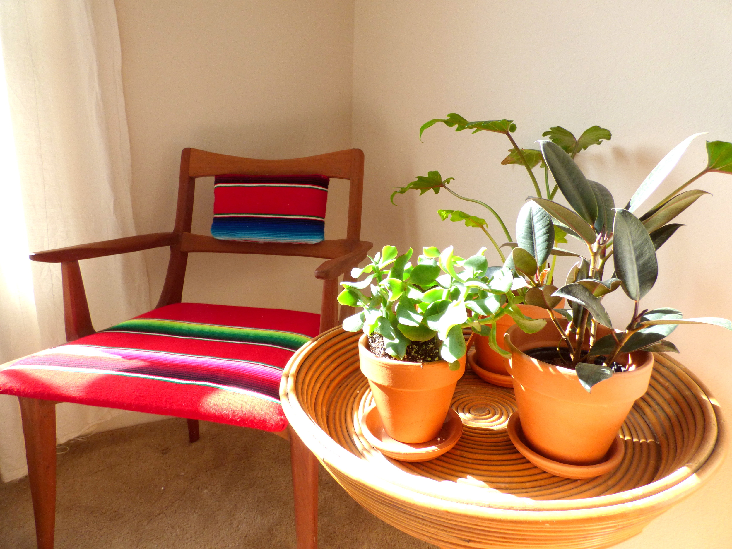
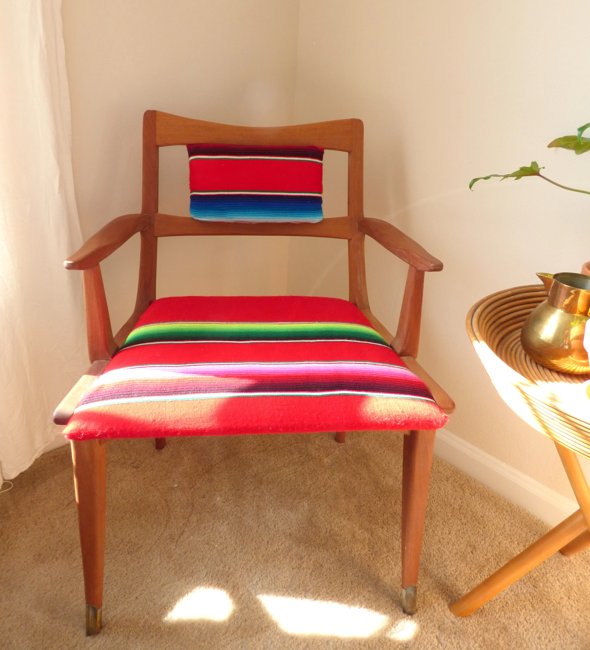
The bright pinks, greens, blues, and reds of the serape are a happy pop of color to what was once a ho-hum floral.

I spent 6-ish hours stripping stain to reveal the original warm wood underneath but it's so worth it because now the wood is a buttery soft texture instead of a shellac.   

The backrest cushion was a happy accident.  I didn't really care for the original metal bars as a decorative element.  I realized I had some spare batting from my cowhide bench so I wrapped it in extra serape fabric and hand stitched the cushion into place.

I also got that epic rattan plant stand at work for $5!

It's such a simple idea with a BOLD impact.  ¿No?  If you like statement pieces then be sure to check back in with us on Friday for our next #stylemuttspaces reader design!  Hasta la vista mis amigos ;)

Mid-Century Serape Chair
Now available for sale
$180

If you are interested in this piece or a custom order like it, please email me at cate@stylemutthome.com.

A Sweet Buffet with Boho Edge

Well how about that snow, Northeast peeps?! God is just a magnificent Creator, isn't He. The kids will probably be out of school until March so if you've got any favorite indoor activities to share, send them forward! :)

Right before the holidays this past Fall I came home with a piece that wasn't really my particular cup of tea. And it definitely wasn't what I was looking for. What I really had a hankering for was to refinish a credenza or a china cabinet, like this, or this. But everyone's got an Achilles heel of some sort and mine happens to be long and low pieces that are less than $100. These days that's a hard find to come by. But my budget is important and something I do my best not to bend too much because my intention is to produce beautiful, affordable furniture for those looking to fill their homes on a slim budget. With prices on used pieces rising significantly, I've realized I need to bend my expectations of what I'll find in my price range, rather than my price range. And if I'm going to take on pieces that aren't my style wheel house, well then I just need to work extra hard to bring them up to speed!

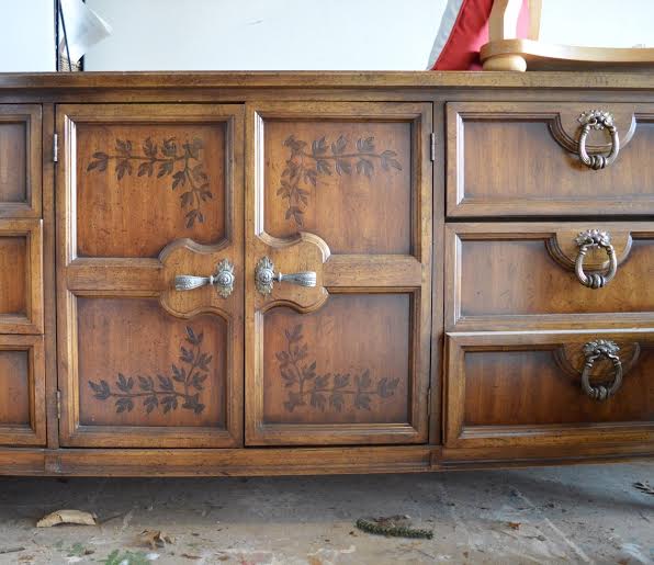
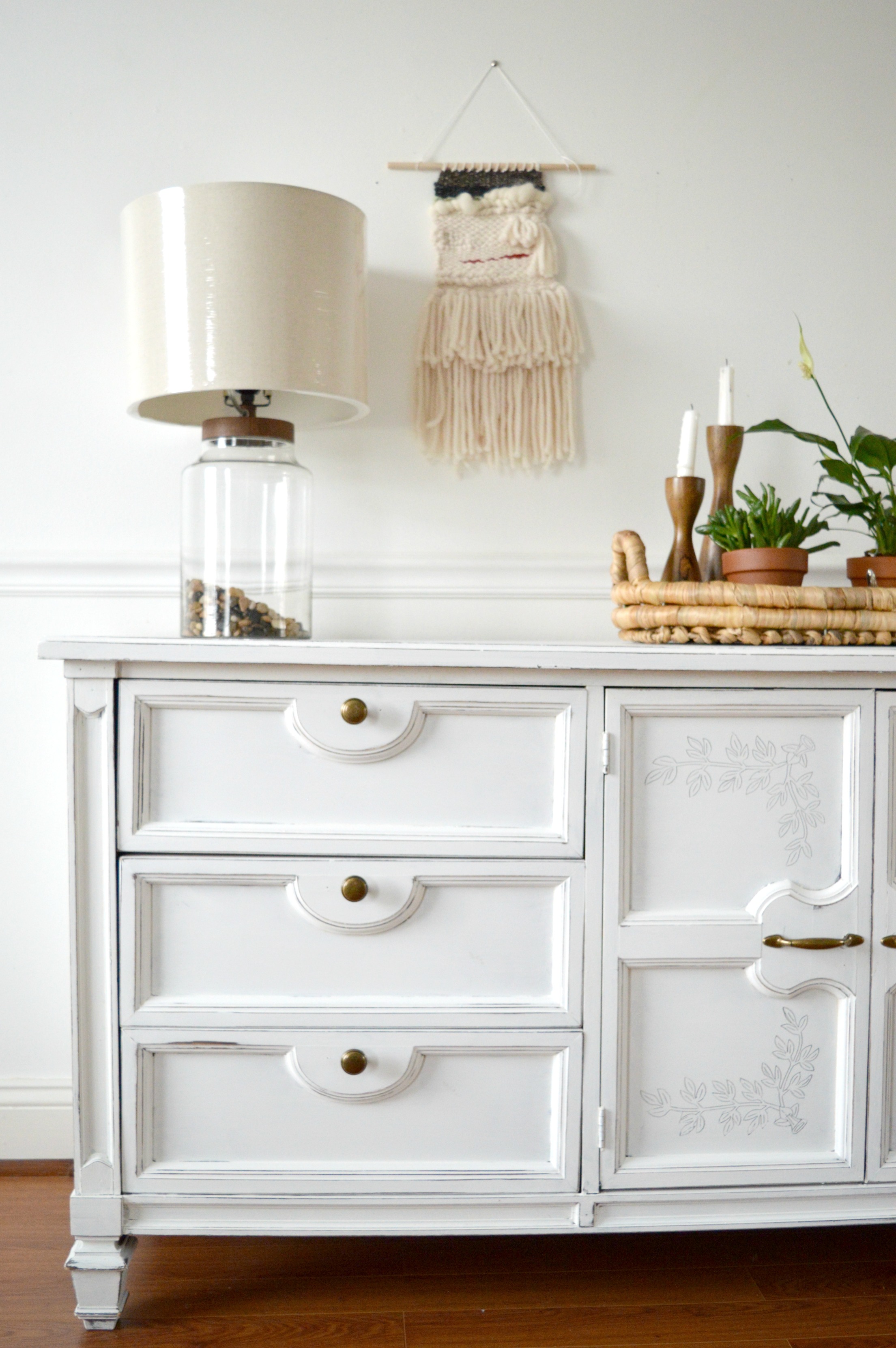
What really bothered me about this piece originally was this decorative ivy. I mean, why?? I just didn't understand why it was there or how it added anything to this piece that already seemed to have a lot going on, (fancy legs, chunky hardware, freckled wood). My first step was going to be sanding it down and getting the surface smooth and ready for paint. But then something strange happened.

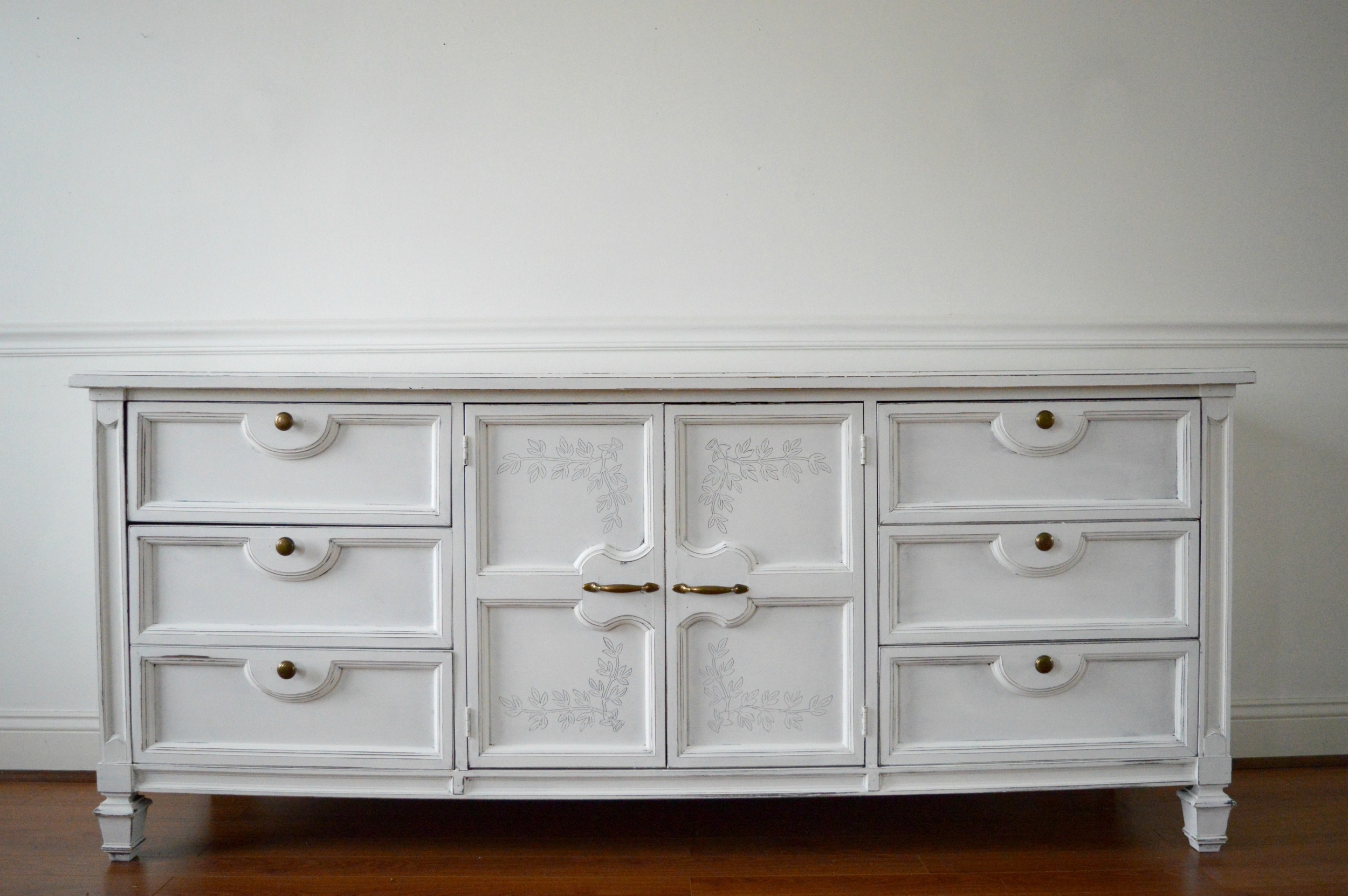
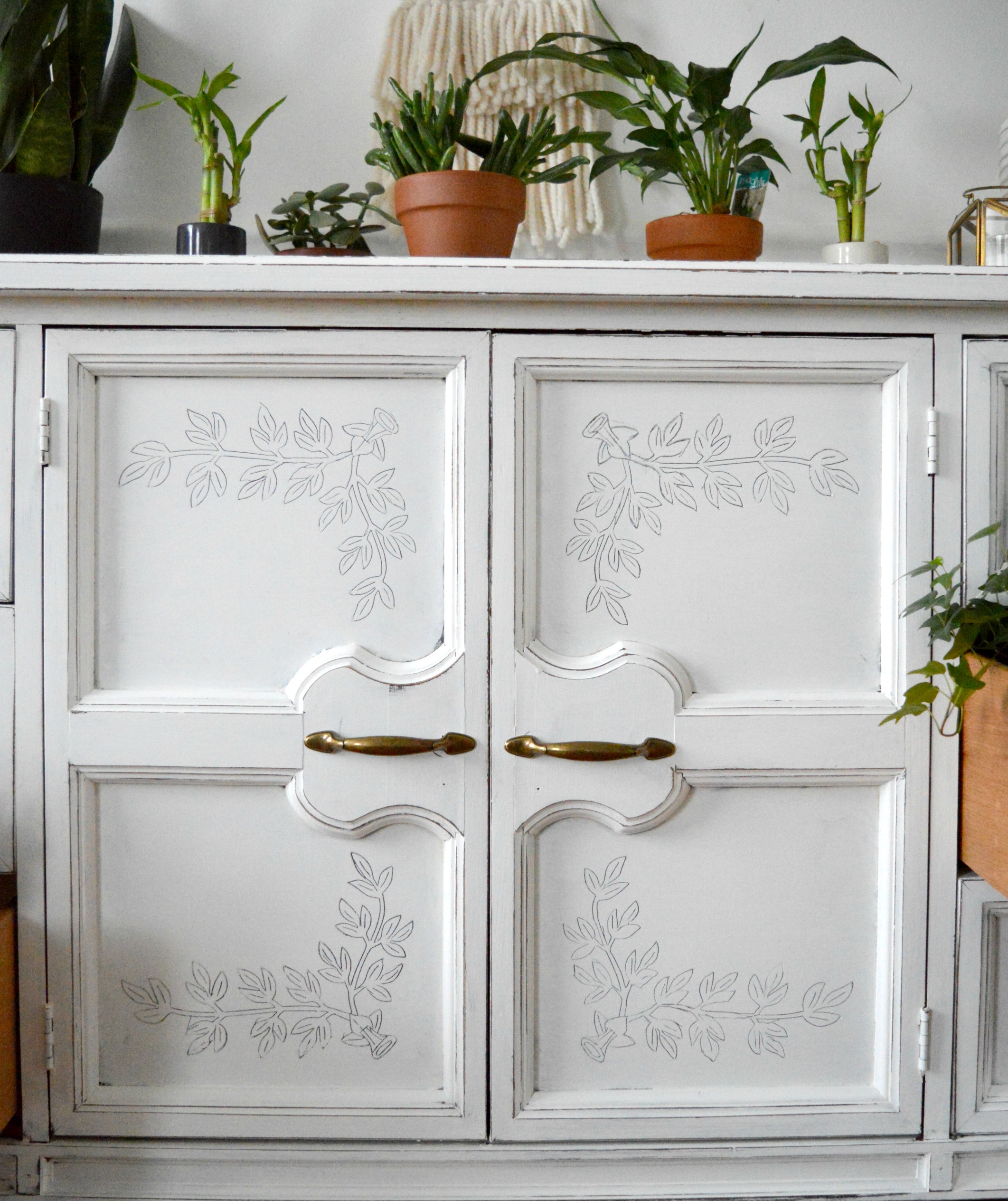
Not only did I not even try to hide the ivy, I went to painstaking measures to carve it out during 3 sittings in freezing cold temperatures in my garage shop! Maybe it was brain freeze, but I suddenly wanted to see the ivy carved through white paint, accented with aged brass hardware.

I think it was the desire for a challenge that lead me to maintain the original look of this piece but in a really cool bohemian chic way. And I knew that to pull this plan off it would come down to the styling. Because a white piece of furniture with carved ivy and brass pulls is still just a white piece of furniture with carved ivy and brass pulls. Are you with me?

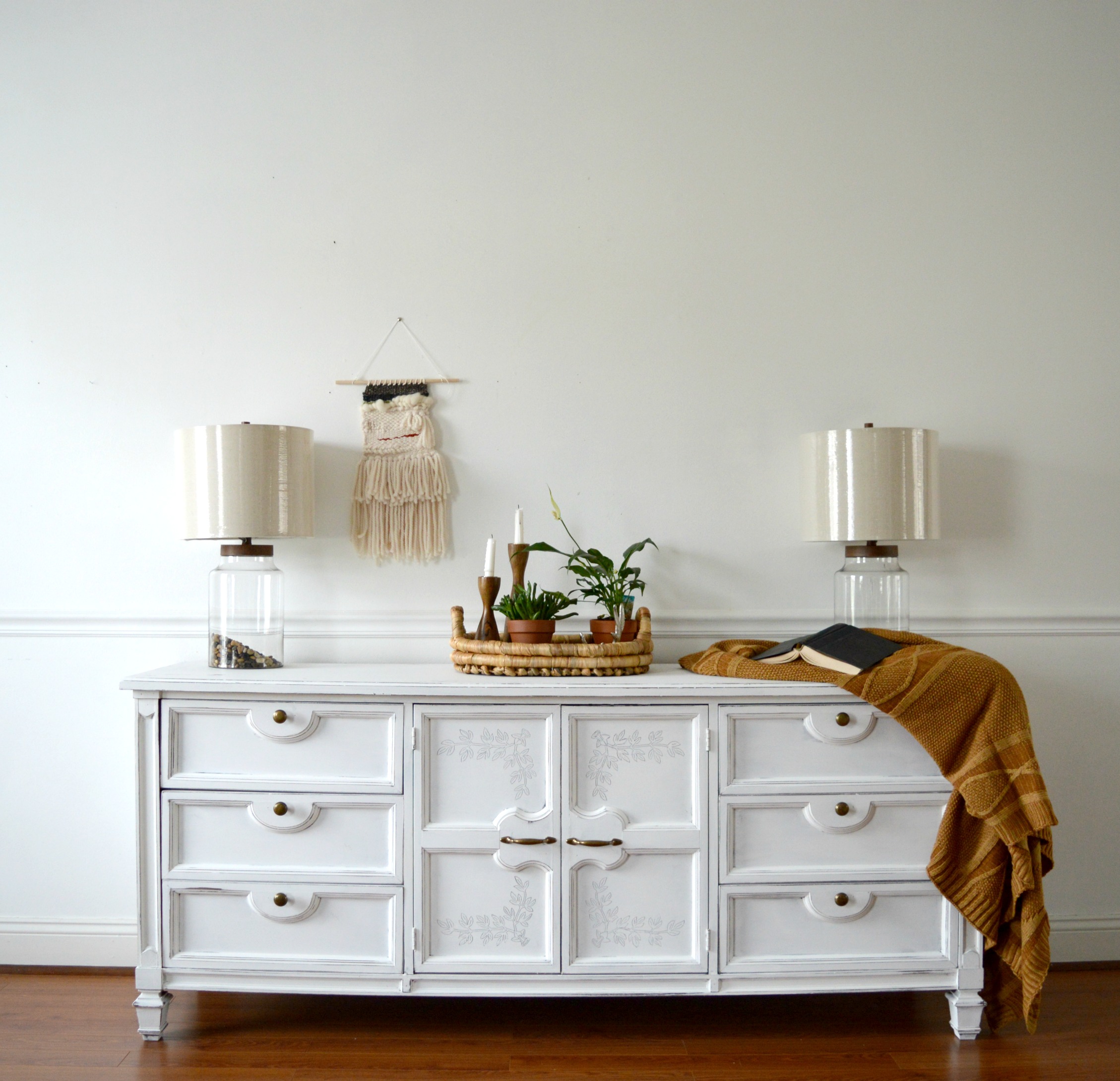
I styled the sweet thing two different ways; one more clean and edited, and one care free and over the top. Here's a looksie!

8.jpg

I used my favorite earthy palette of rich browns and rust tones to bring out the sophistication of the piece. The hardware was a critical choice and I went through three different options before deciding on this set. I wanted the aged brass to stand out and the rich colors styled with the piece here do that well, I think.

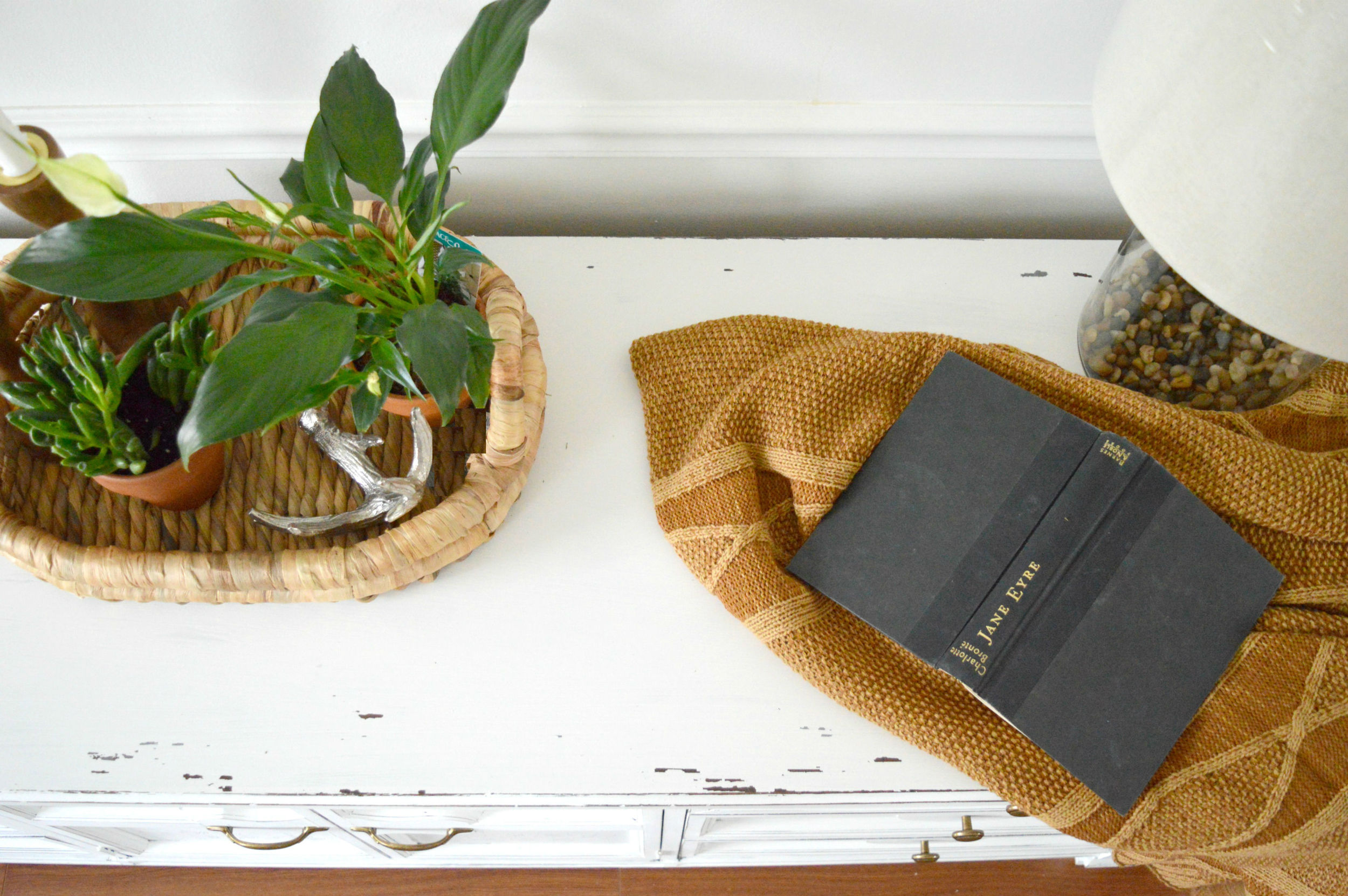
A chunky woven tray from Target containing clay potted plants and wooden candle sticks still speaks that laid back boho language, but with subtle formality. Like with a British accent.

I didn't over-distress this piece as I've been doing more recently, but rather focused on the edges and corners to highlight the unique details and shape of the piece. Still, I love a well worn surface so I took a little extra off the top just for fun. I really should read Jane Eyre. I use it for styling enough.

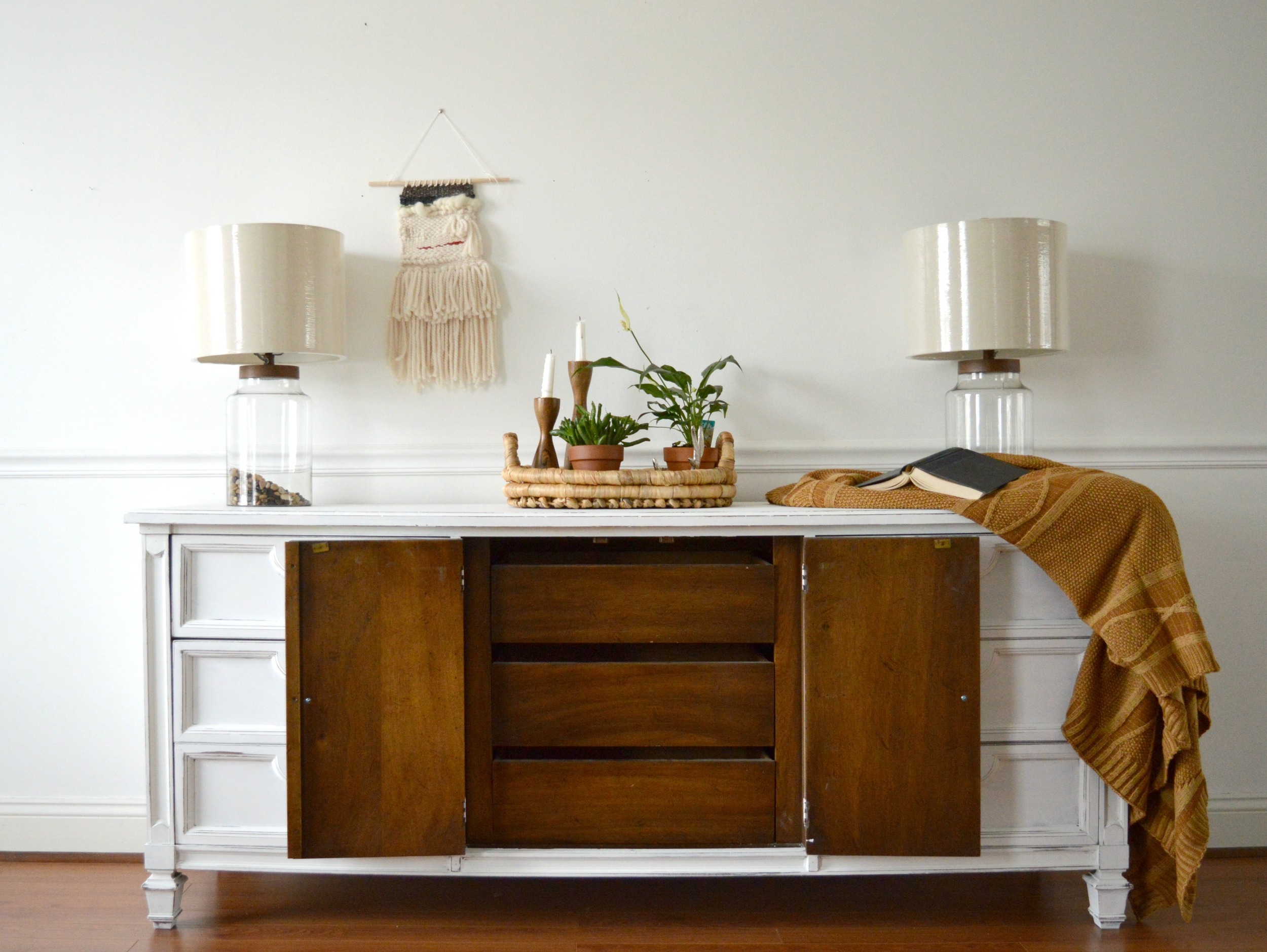
Since pieces like this are sought out for their versatility I didn't do anything to alter the interior! The storage makes this a fantastic piece to be used as a dresser or dining room buffet, while the center compartments also add the option to place shelves where the drawers are and use the piece as a media center!

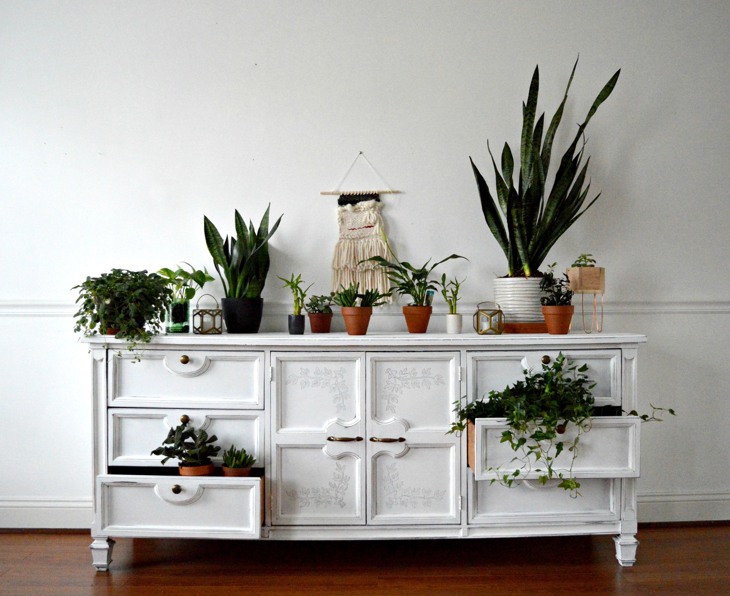
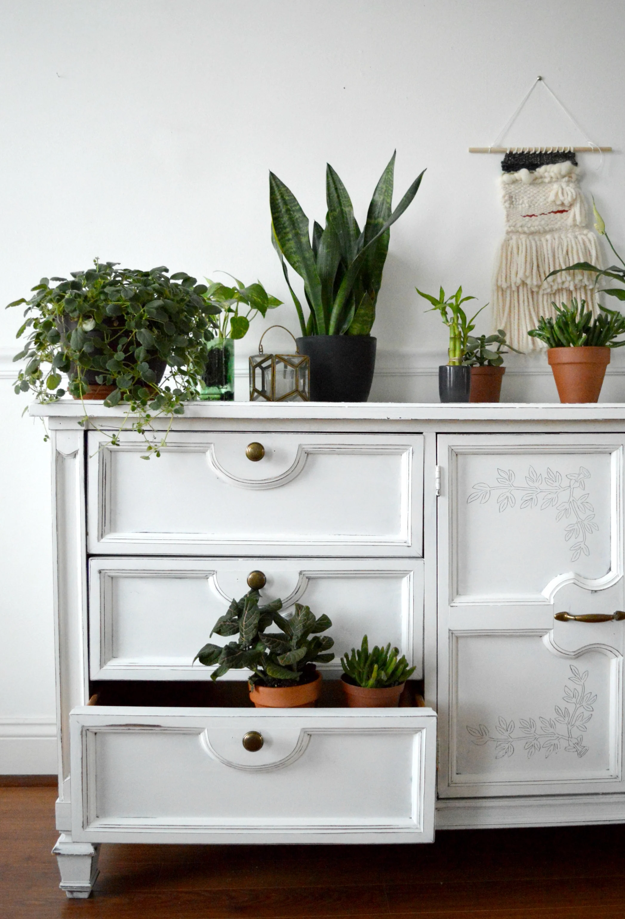
The second way I styled this piece was really for me. Hah! If I ever have a dining room buffet, whether in our current house or a future one, I'd use it just like this: An in-home greenhouse.

Man, watering would be SO much easier if I kept all these guys together regularly!

The carved ivy just fits right in with the real ivy cascading out of the drawer. :)

This piece was a really wonderful learning experience for me in taking something I wouldn't normally refinish and putting my style into it. It's a more feminine and sweet piece than I'm normally into, but feminine with a dash of daring is just smashing.

I absolutely adore this ivy. Who would ever consider covering it up?? ;)

Piece now available
$425
73.5"L x 30.5"H x 18"D
chelsea@stylemutthome.com

Thank you all so much for coming by!