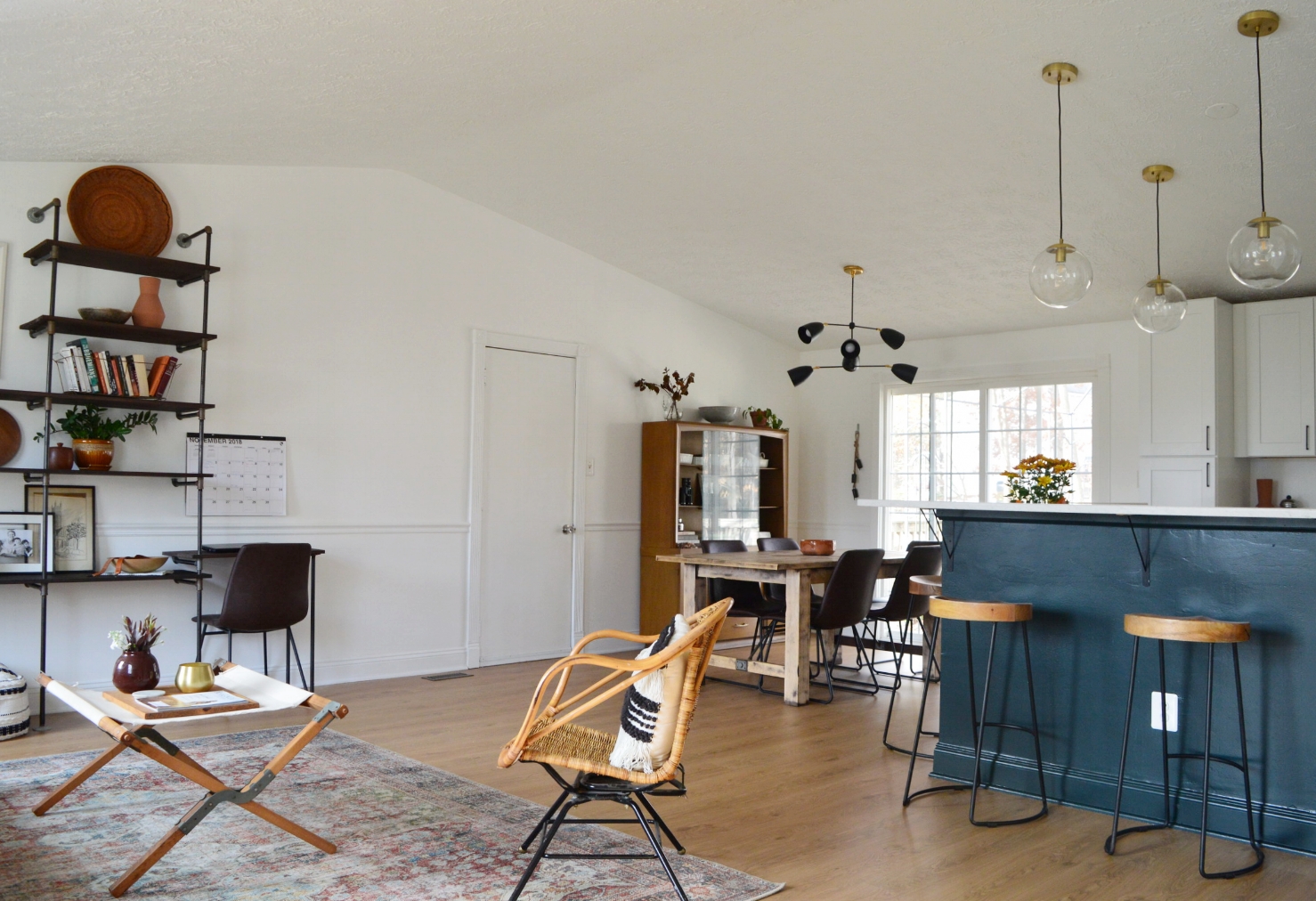
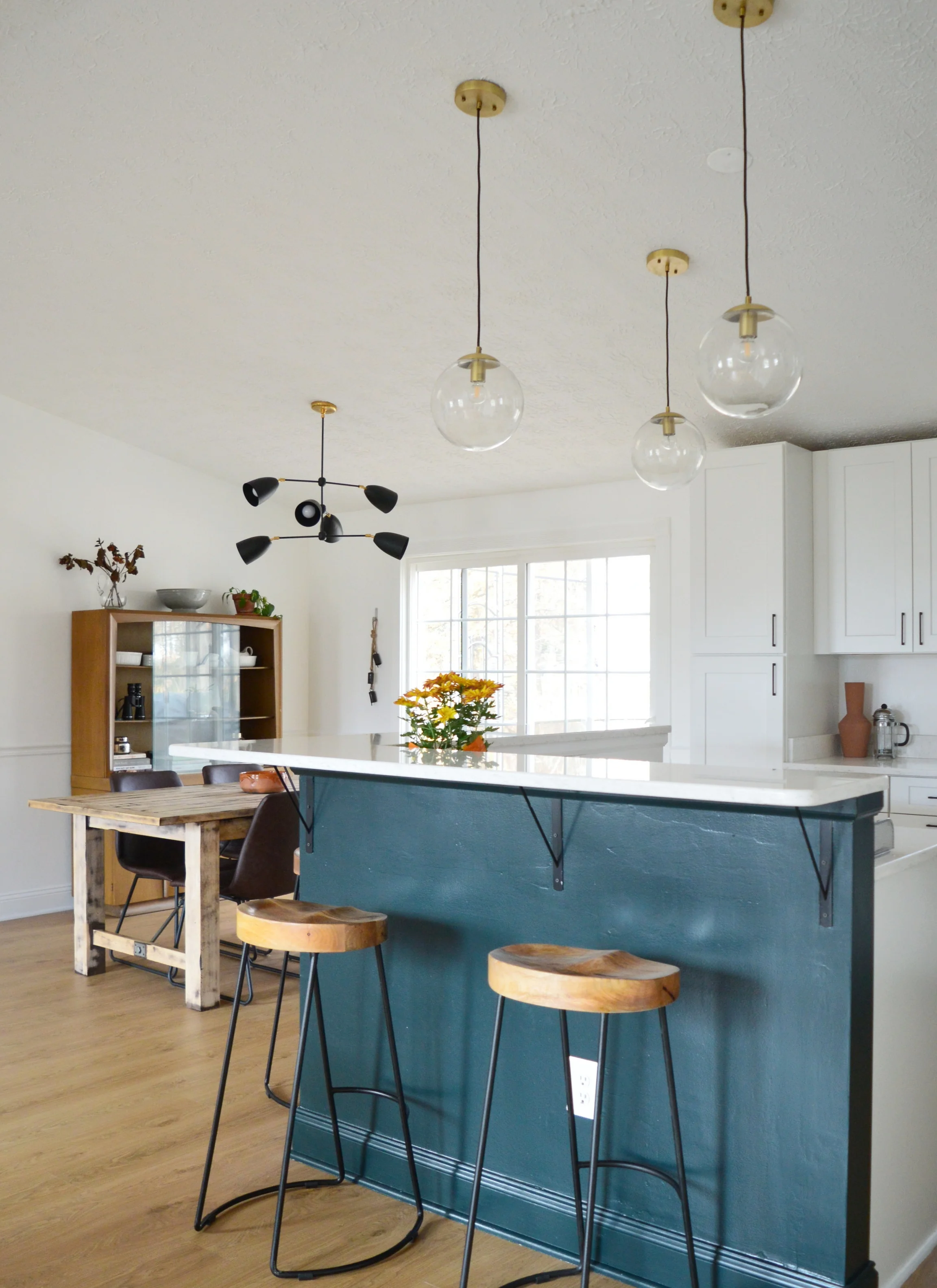
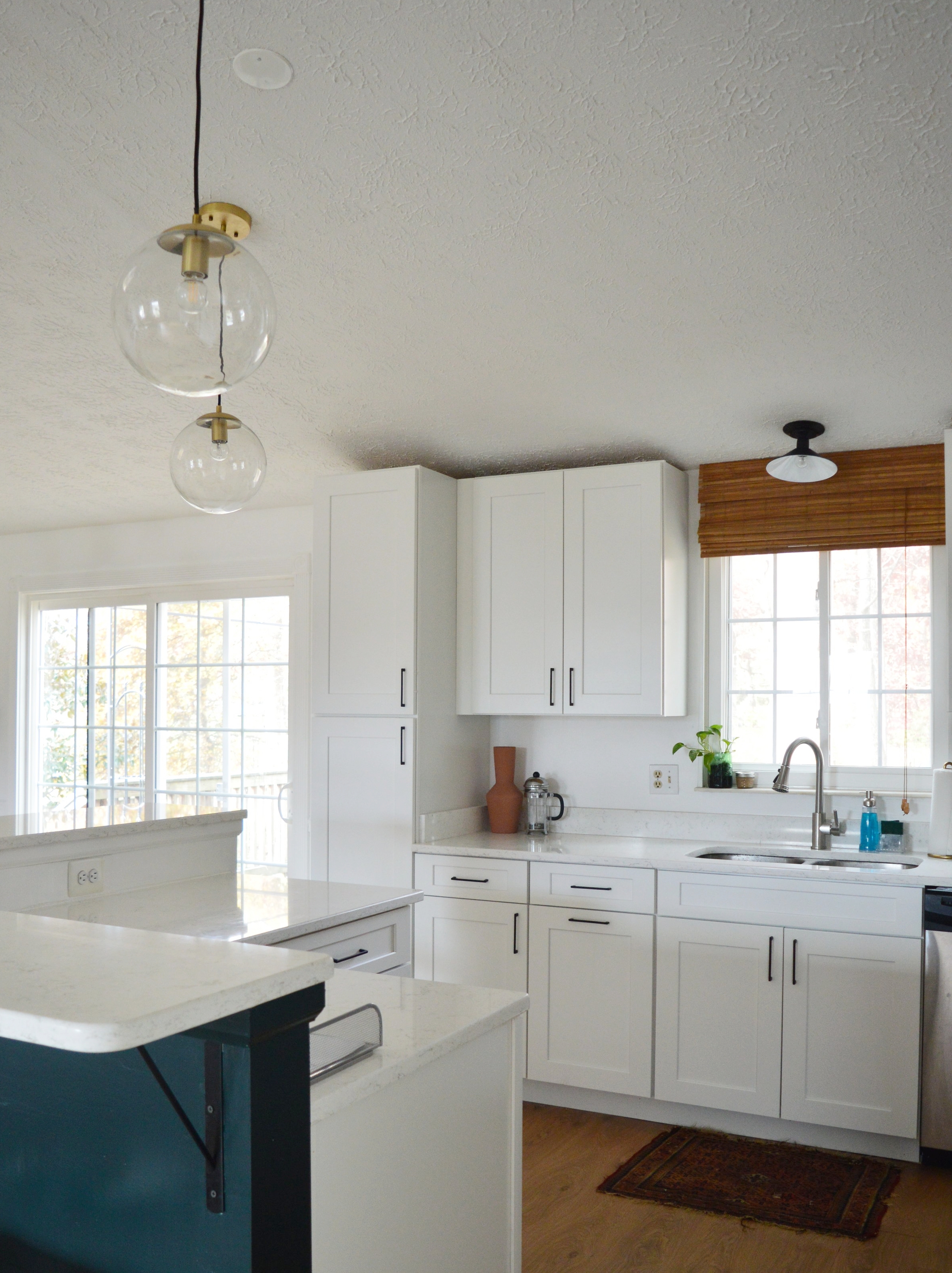
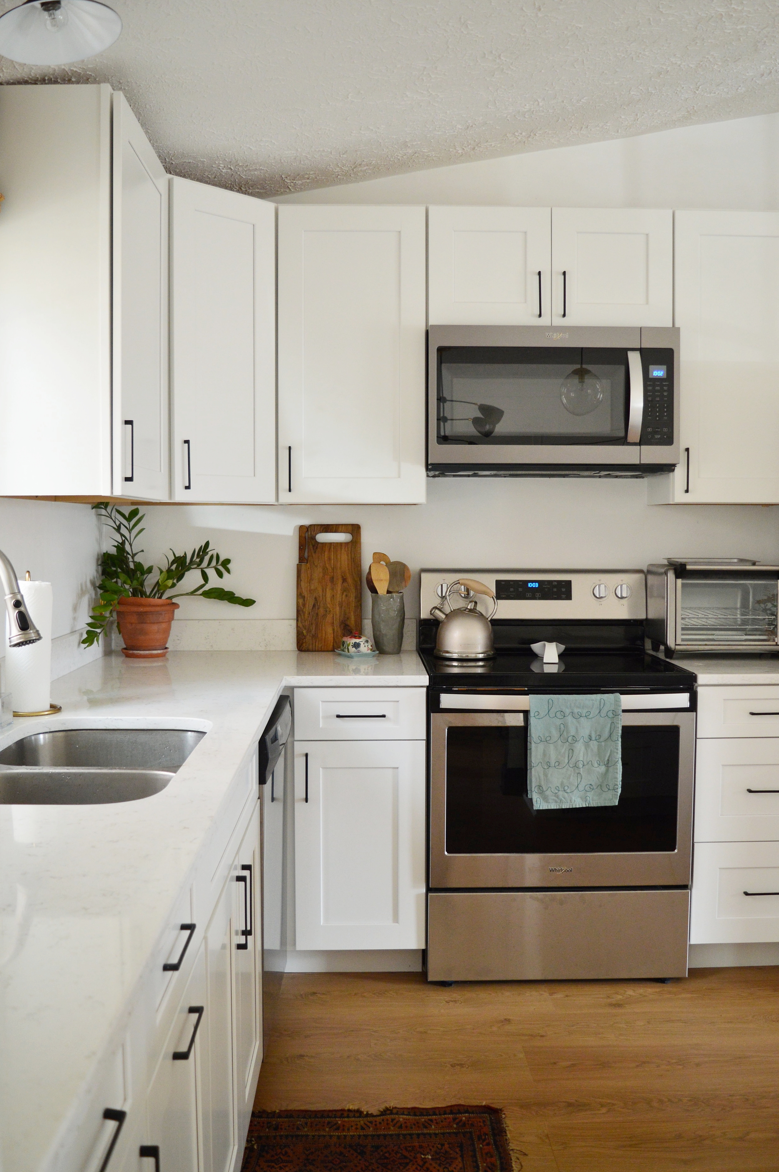
Hi, Friends! As it turns out, I’m a terrible updater - generally speaking, AND especially during a renovation. So to catch you up in one sentence - We renovated our kitchen this past fall and it’s done. Welcome to the reveal of the project! LOL
To be honest, as detail oriented as I am during a design project, I find the thought process of managing so many details to be tiring! I love it but I don’t feel like I have much energy left to talk about it. I know. I really really have no business being on a blog. Good bloggers share step-by-steps and pictures along the way. Mediocre bloggers share Before and Afters. Bad bloggers just share the After. It’s taking everything I’ve got to be mediocre today and scrounge up some Before and Progress shots I got during the reno. Worlds Okayest Blogger, right here, folks! Hah!
So let’s get down to it! The biggest change we made was taking down the ‘L’ shaped wall on the right:
Then
Process
Now
We have lived in this house for 8 years so we didn’t come to the decision to knock that wall down flippantly. Over time as our babes got older we realized how much happens around the kitchen. And the more life that was happening outside of that ‘L’ shaped wall, (think homework, test studying, recapping the day, dancing, playing), the most closed off the kitchen was starting to feel. I think living here for so long before diving into this project really helped us make big decisions about what would make the most sense for us and our family and most especially, this house.
And by this house, I mean a 1982 generic build. I adore this house but since it’s a basic spec home, (one of 5 different models to choose from in our neighborhood), it just doesn’t have a strong personality. There are no architectural details driving the style of the house - arched openings, thick window casings, stuff like that. As a designer I tend to pick up on these details in my clients homes and play them up in regards to the client’s personal taste. But having a house with no particular personality is a double-edge sword. In one sense, you’re not beholden to any particular style of design. But on the other, adding any strong style elements stands out like a sore thumb. In looking at kitchen ideas I was really drawn to some modern wood kitchens ive seen - no hardware, just a simple lip. This style I was drawn to would have required renovating the entire rest of the home in order to maintain some sort of consistency. As it stands now, we still have work to do around the rest of our home so the kitchen doesn’t look like the ONLY updated area. But we’ll knock things out over time and as we have funds.
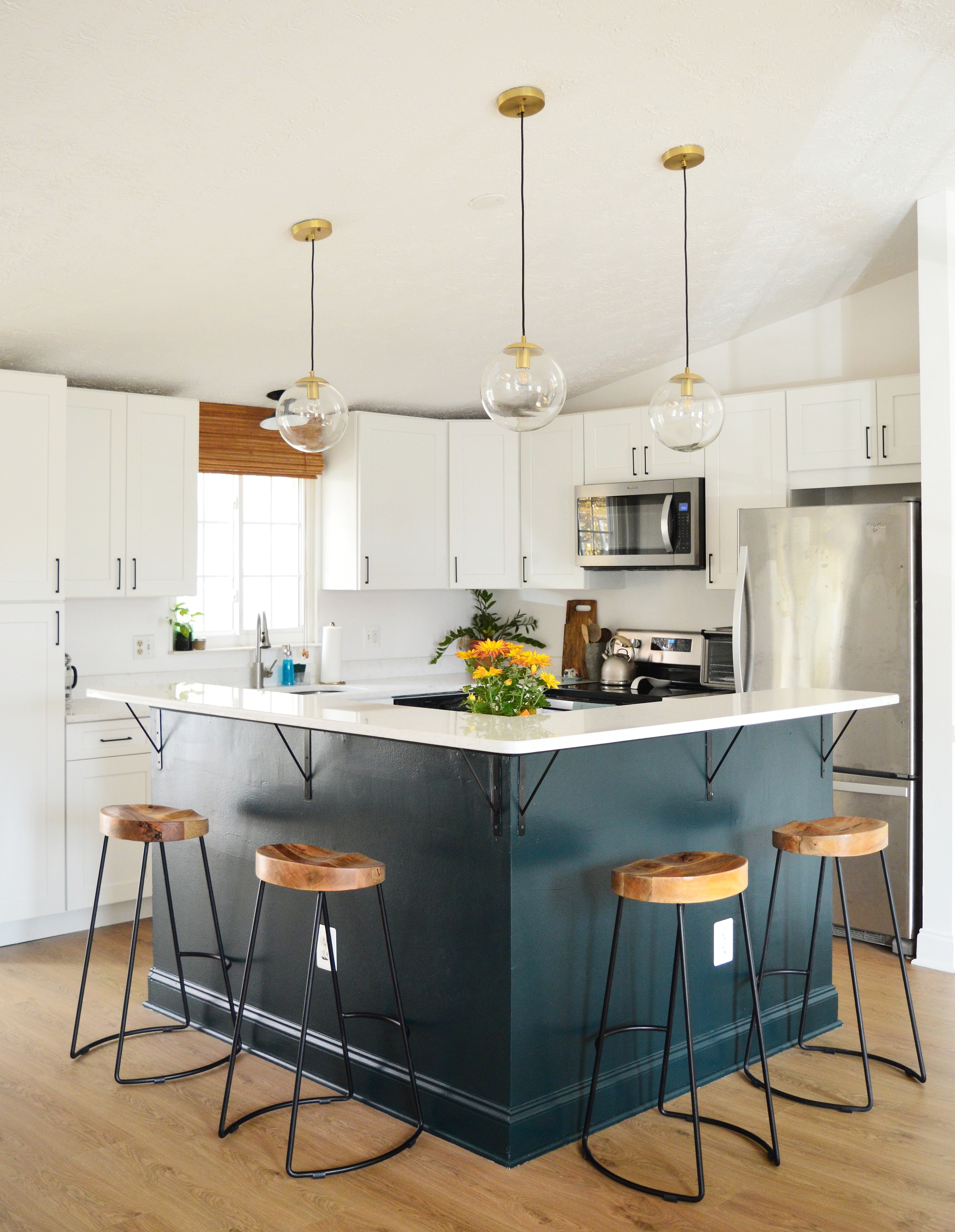
We went with Allen + Roth shaker style cabinets from Lowes, and Q Quartz counters from Granite Center, a local counter warehouse in Sterling, VA that we would highly recommend to any locals in the market!
With so much white going on I was particualrly excited for some dramatic contrast! After scouring the great world wide web for the sleekest black pulls I could find within budget, I landed on these pretties I found on Etsy, (they came all the way from Bulgaria)! There are various sizes to choose from and we went with the 5 5/8. For this particular kitchen I wanted to use one consistent pull for every cabinet and drawer, and this size was the most versatile across the board.
The island color is Salamander by Benjamin Moore, and is amaaaaaaazing in person! I wanted a dark teal color and this was the perfect green-blue that I was imagining! Although our kitchen remodel is ‘safe’ and basic white, I always think an island is a great opportunity to add a big ol’ ‘POW’ for just the cost of paint. And I love the color with these rust and marigold mums that some dear friends gifted us.
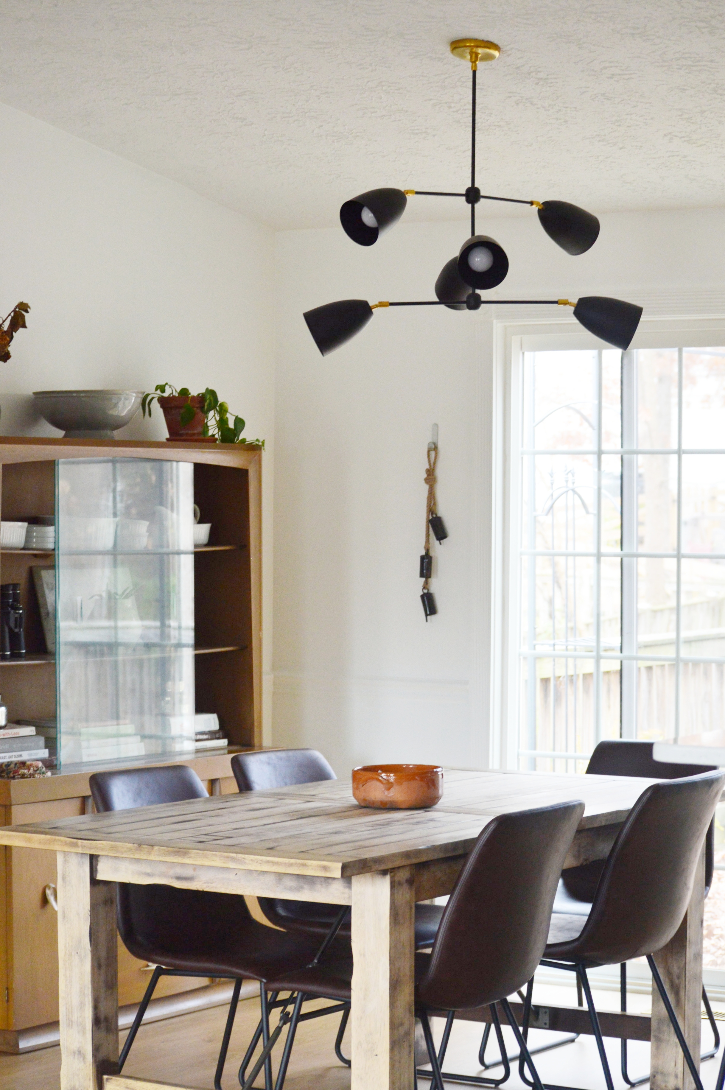
Lighting was hard for me when designing this space! We were pulling a lot of track lighting out, but trying to fit new lighting in, and all in a shared open space! I wanted the kitchen sink light, island pendants, and dining table fixture to all be different but flow well together. For me that was a challenge! I was constantly comparing sizes and scale and photoshopping lights together so I could see them side by side.
After sending out an SOS on Instagram for some lighting source suggestions, I was introduced to Sazerac Stitches! I absolutely loved their style - it was EXACTLY what I was looking for! This is the Drew 6-Light fixture and it’s the perfect blend between industrial and modern that I was looking for.
The island pendants are from Poly + Bark, and the stools are AllModern.
Designing a kitchen was an absolutely amazing experience, but I am SO grateful my first time could be on our own home! Throughout the process I just kept saying, “You don’t know what you don’t know.” I asked a ton of questions and really stuck around during the process so I could understand it all. One thing I am beyond grateful for is that our contractor is a trusted neighbor and friend. He talked through every little decision with me and when I asked for his honest opinion he gave it. I honestly learned so much from him as he was willing to teach me as he worked.
The image below is my first attempt at a 3D kitchen rendering. DON’T zoom in, I beg of you. LOL! It’s laughable, but it really helped me visualize the main pieces in the space.
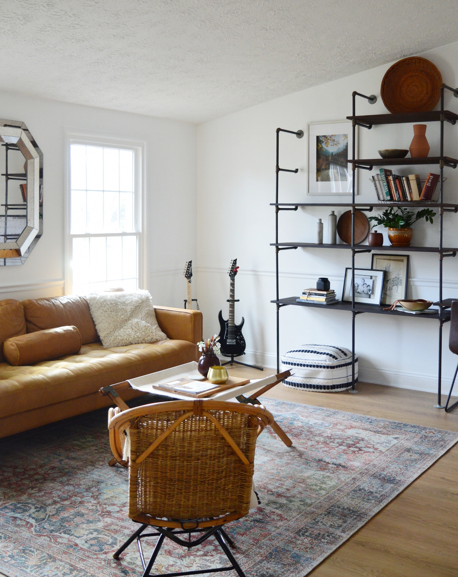
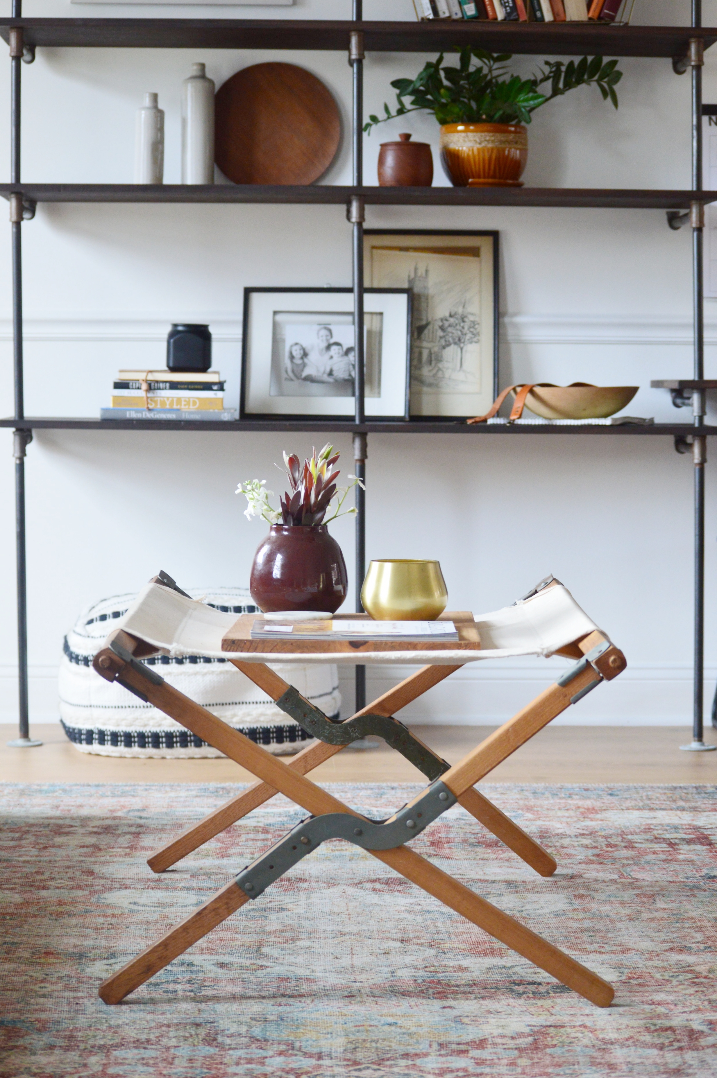
While you’re here why don’t we take a gander at the living room! That is, afterall, one of the main reasons we took down that ‘L’ shaped wall to open things up in the first place! So much life happens in this space and now we can share in it from the kitchen, too. Don’t get too cozy with this set-up. Christmas is just up ahead so things will be shifting here and there to make room for a tree soon!
Nothing much changed in here from our pre-reno layout, but we did incorporated a new rug that pulls from the color of the island! It’s so fun and vibrant and happy - a perfect backdrop for this space. A huge thank you to Loloi rugs for working with us! This piece is from their Loren Collection.
It still feels surreal that this is our home - that we get to live here! We just absolutely love it. There are still small things to wrap up and touch up but for now we are excited to lay down the brushes and nails and just hang out and rest together. Our hearts are spilling over with gratitude for all that we have - each other, our family, friends that are like family, this home…it’s all so much more than we deserve or could have ever hoped for.
We wish you the very happiest Thanksgiving tomorrow! You friends are on my list of things I am incredibly grateful for. Thank you for making StyleMutt Home such a fun place to share this work.


