Guys, I have a new happy place. It’s the StyleMutt SPACES page. I mean, would you LOOK at all that eye candy?!? But you wanna know why it’s my favorite place – or collection of places rather? Because of you.
Seriously, this page is all you. This gallery represents décor from all over the world, all walks of life, and all kinds of Style Mutts. And you don’t have to be a designer, a blogger, or a betty-homemaker to join this league of extraordinary rooms! Just use the tag #stylemuttspaces on Instagram or post to our Facebook page to enter your pics.
Today’s reader design is from San Diego, California. Kelly from House of Aqua started with a desk and a magazine rack and built an entire bedroom around it!
From Kelly:
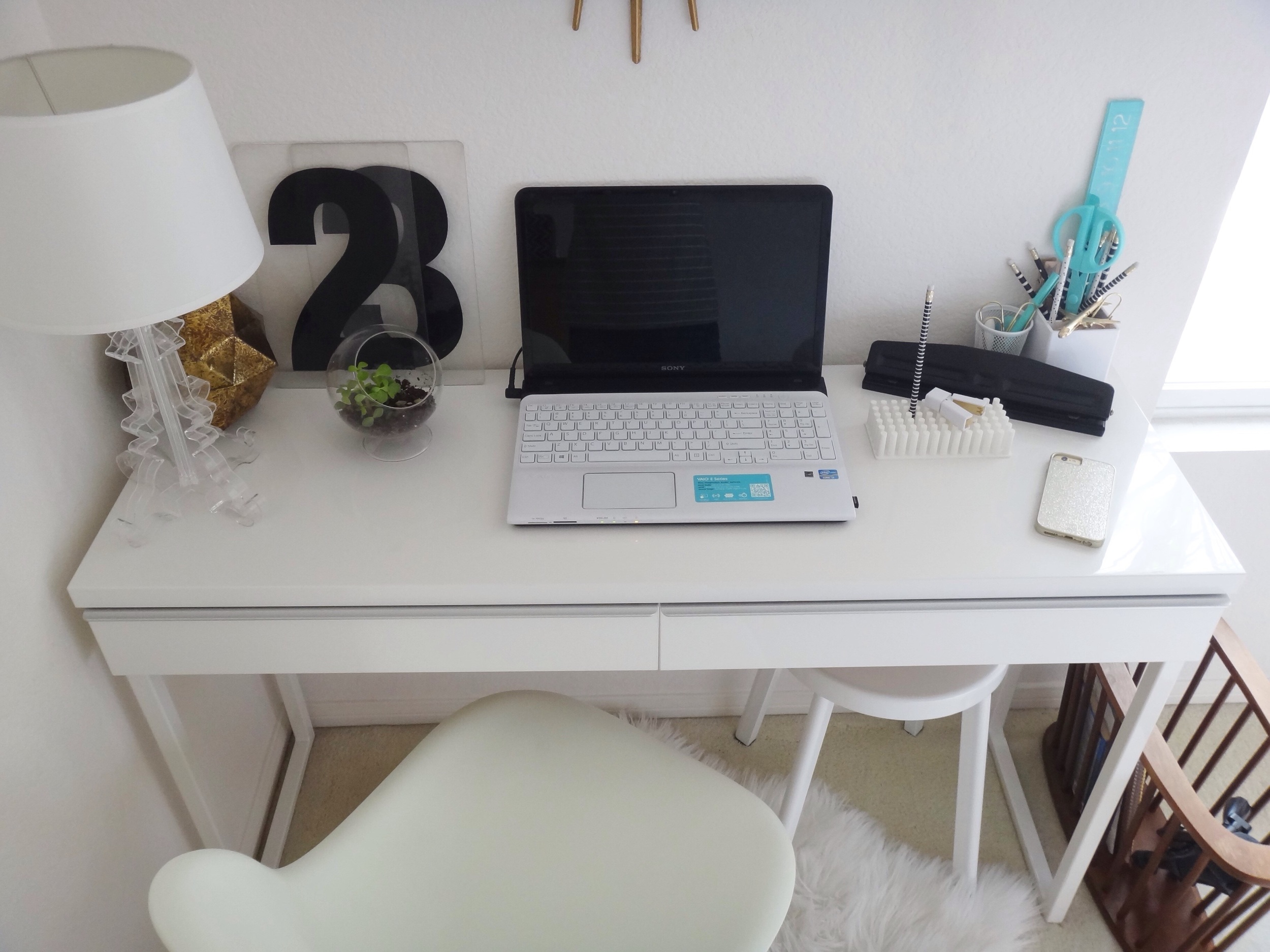
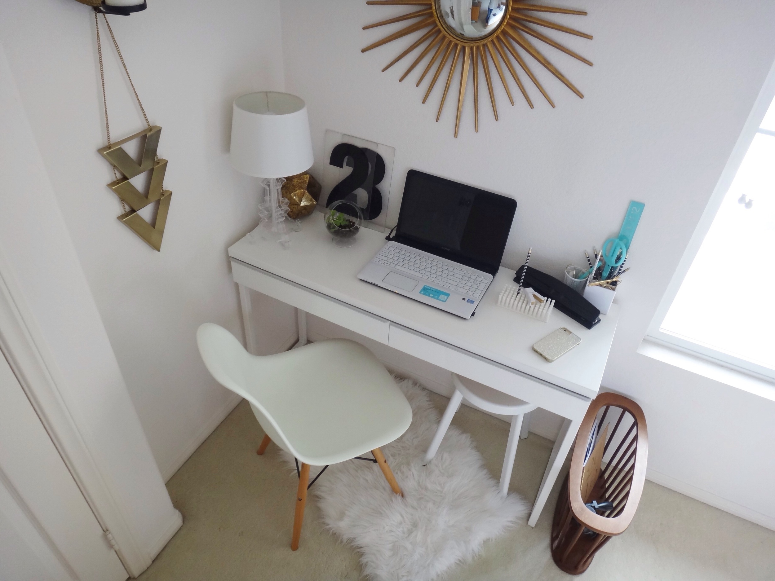
Our master bedroom design was inspired by my desk nestled into the corner of our bedroom. The desk was originally in our living space but I no longer had room for it so I moved it into my daughter's room. My daughter wasn't using the desk and wanted more floor space for playing so it ended up in my room, awkwardly placed behind the bedroom door as it was the only available place in our small house to put it. I realized that if I had a stool or chair without arms it could function as a desk without interfering with the bedroom door. I've logged many hours in my cozy desk area while conducting research and writing my thesis for my graduate degree!
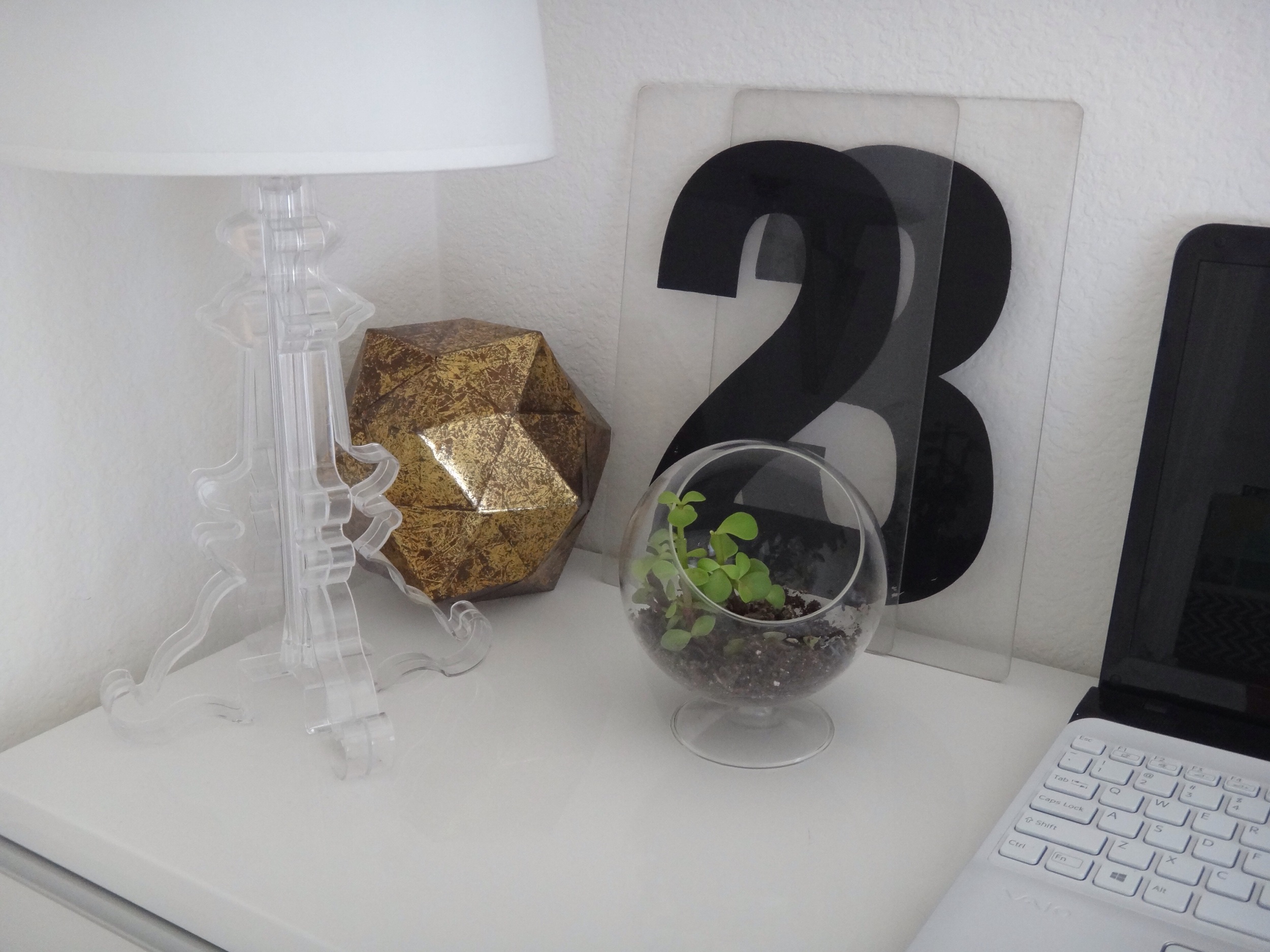
Those oversized acrylic numbers once belonged to a Gas Station marquee! Clever clever salvage.
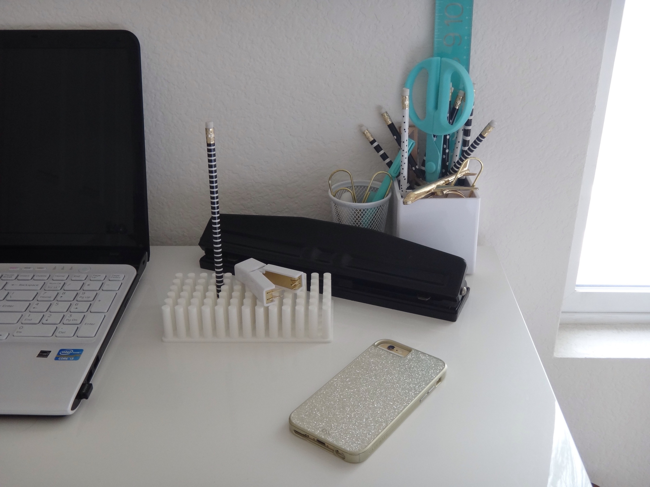
I keep my desk supplies to a minimum by only keeping what I need so that everything fits into the shallow drawers of the desk. For example, I only keep one set of pencils and a couple of pens which are in the cup on my desk.
Our bedroom furniture it just over ten years old and I was ready to replace the set with an upholstered bed and white furniture until I thrifted a midcentury modern magazine holder that sits next to my desk.
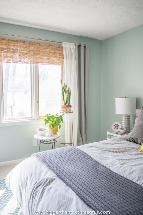
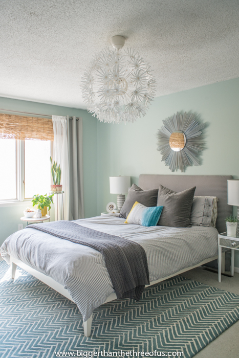
For whatever reason that magazine rack helped me link together a design that I didn't know I wanted and helped me fall back in love with the bedroom furniture I already had. Most of the decor is hunted down in HomeGoods and thrift stores. I find that I gravitate towards a mix of elements such as acrylic, wood, stone, and nature. I like crisp white bedding but I bring in different textures with functional pillows.
That’s funny, Thor sleeps almost exactly the same way as Emmy there…
Gah! Where'd she find those Swiss cross sheets?!
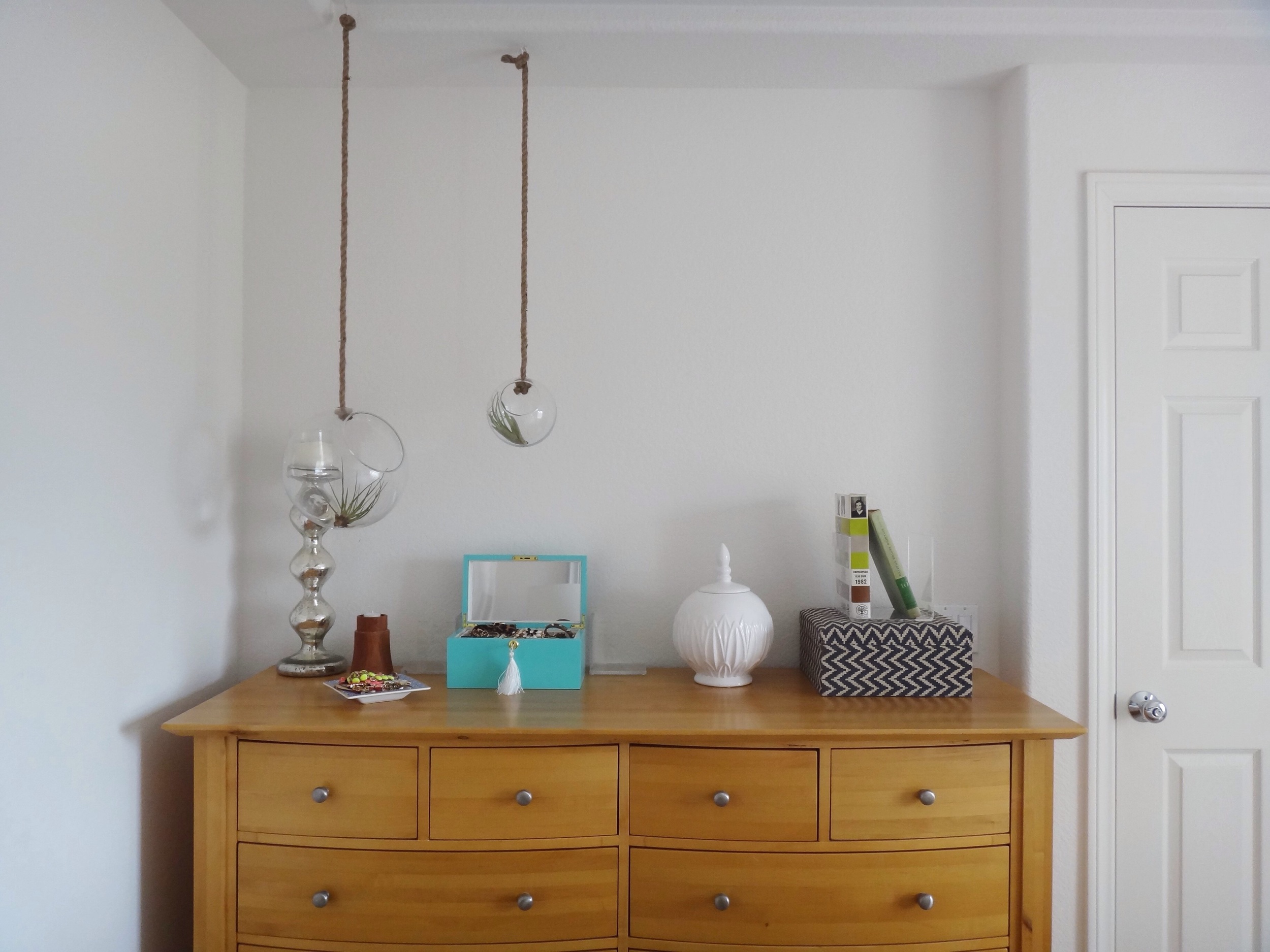
The mirrors propped on our nightstands help to make the room feel larger by reflecting light... We maximize storage by using the decorative vase and box to store belts on our dresser.
UGH! More adorable terrariums! I want them all.
Aren’t you just amazed that this whole room effortlessly started with such a relaxed workspace?! I just wanna set up camp at this desk and blog for dayssssssss…
Thank you Kelly for opening up your home to us this Friday! Follow Kelly (@houseofaqua) for more easy-breezy style! And if you are on the fence about submitting your own room for your chance to be a Friday feature, then ask yourself one question: do you like what your style has to say? If the answer is yes, then we want to hear it! You never know who else out there will be empowered to develop their own voice...xoxo


