Constellation Table ||A Star-Crossed Love Story||

This is a love story.  A furniture love story.  The story of one table top and one table base who were destined to be together.  But first they had to figure up how to break up with their original table top and table base... And that's where I come in...


Ok guys, I'm no homewrecker.  In fact, I would more likely call myself a homemaker.  But in this case, I did have to break up two perfectly good tables to help them find their soul mates.  You may remember that a while back I scored a deal on this world market table:

My first impression of the table was that this combo was a little too dark and sad for my taste so I offered to give the base a makeover.  He got a full-bodied coat of gold spray paint and rub down with dark wax.  But I think his new look got him thinking he was too good for the ole plain wooden top.  And so he left her for this glamorous round mirrored tray and they made a beautiful bar cart together

But the rejected top took the break-up kinda hard.  She spent the next four months single... and aimless... and hiding underneath my couch.  

I tried to convince her that she didn't need a base.  She was a strong and beautiful wooden top who didn't need a base to feel useful.  I tried to fix her up with a pair of handles and make her into a tray, but she just wasn't into it.  She wanted a new look, a new life - something that would make that campaign bar cart jealous.  I suggested all sorts of makeovers.  But they were either too understated, too out-there, or too over-the-top for her liking. 

 But then one day... we found it...  Her perfect look.  

Source: Fab.com

Source: Fab.com

It was classy and elegant and simple.  Just like her.  

Meanwhile... I just so happened to meet this quirky base while out on a Home Goods run.  He was simple, sleek, three-pronged, and perfect for my wooden top.  Although he was with that crazy guitar-pick top at the time, I knew that wouldn't last.  I mean, she was laminate and a weird shape and (on closer inspection) severely damaged.  There was no way they would ever make it out of the store together.  I just had to intervene.

After getting a quick discount at the register for the damaged pair (always ask at Home Goods for a deal if you find a serious imperfection - you never know if you'll get a little money off!), I convinced them they would be better off seeing other people and the crazy top went on her way (into the trash can).  

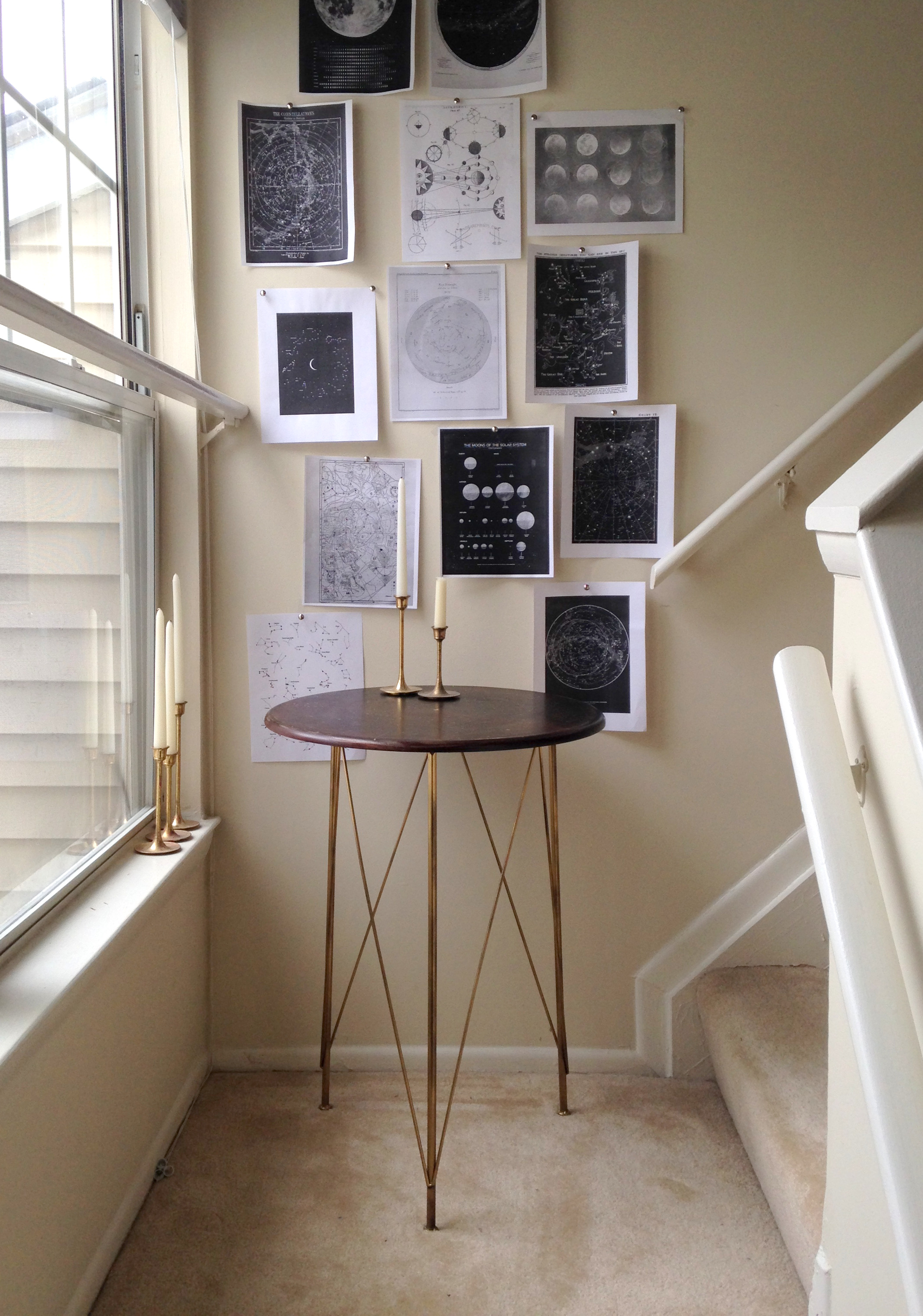
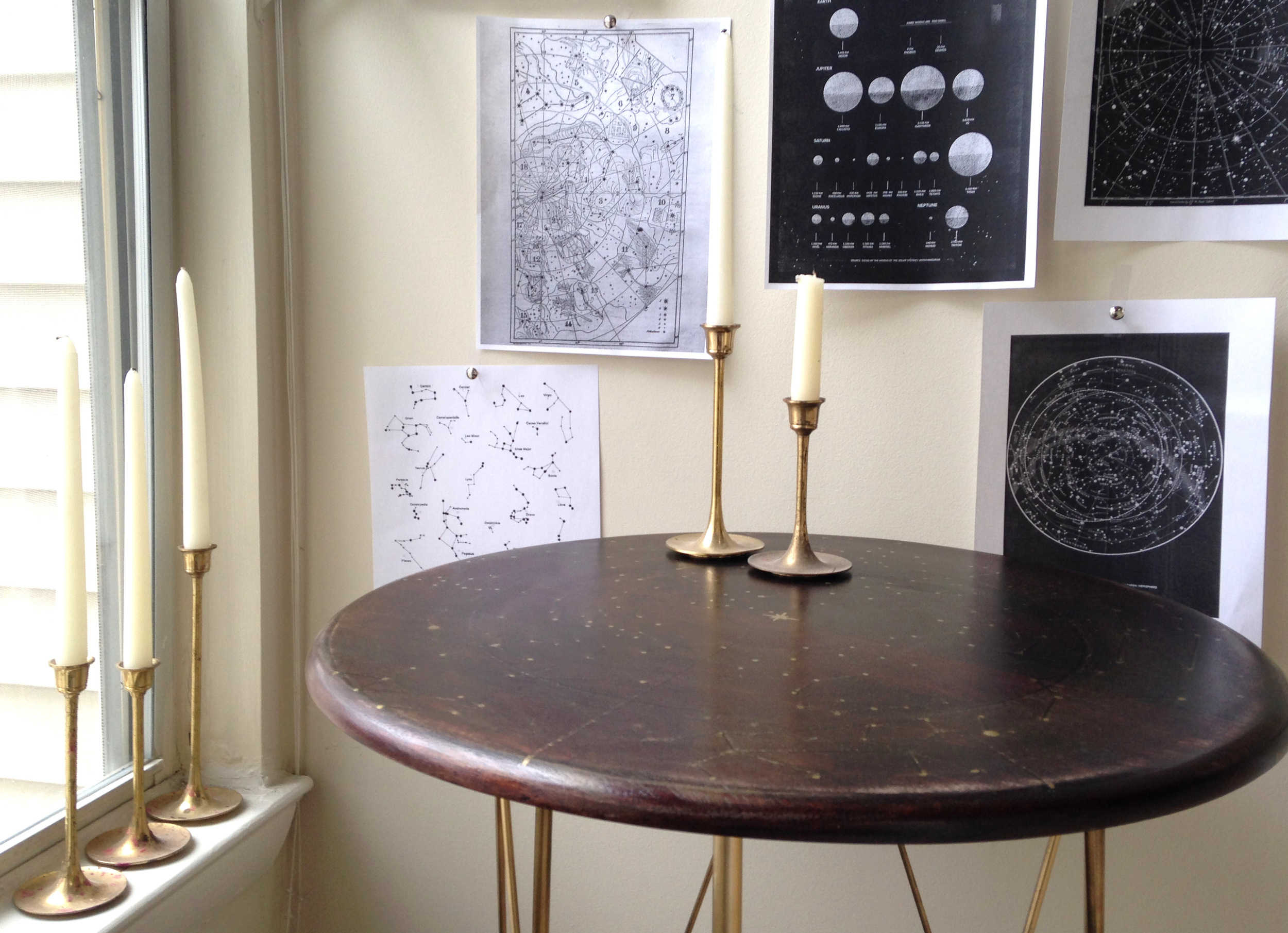
I, being the perfect furniture wingman, told the base all about the wooden top.  He agreed to be set up on a blind date but needed a little sprucing of his own first.  So when the two finally met, it was like the stars had aligned:

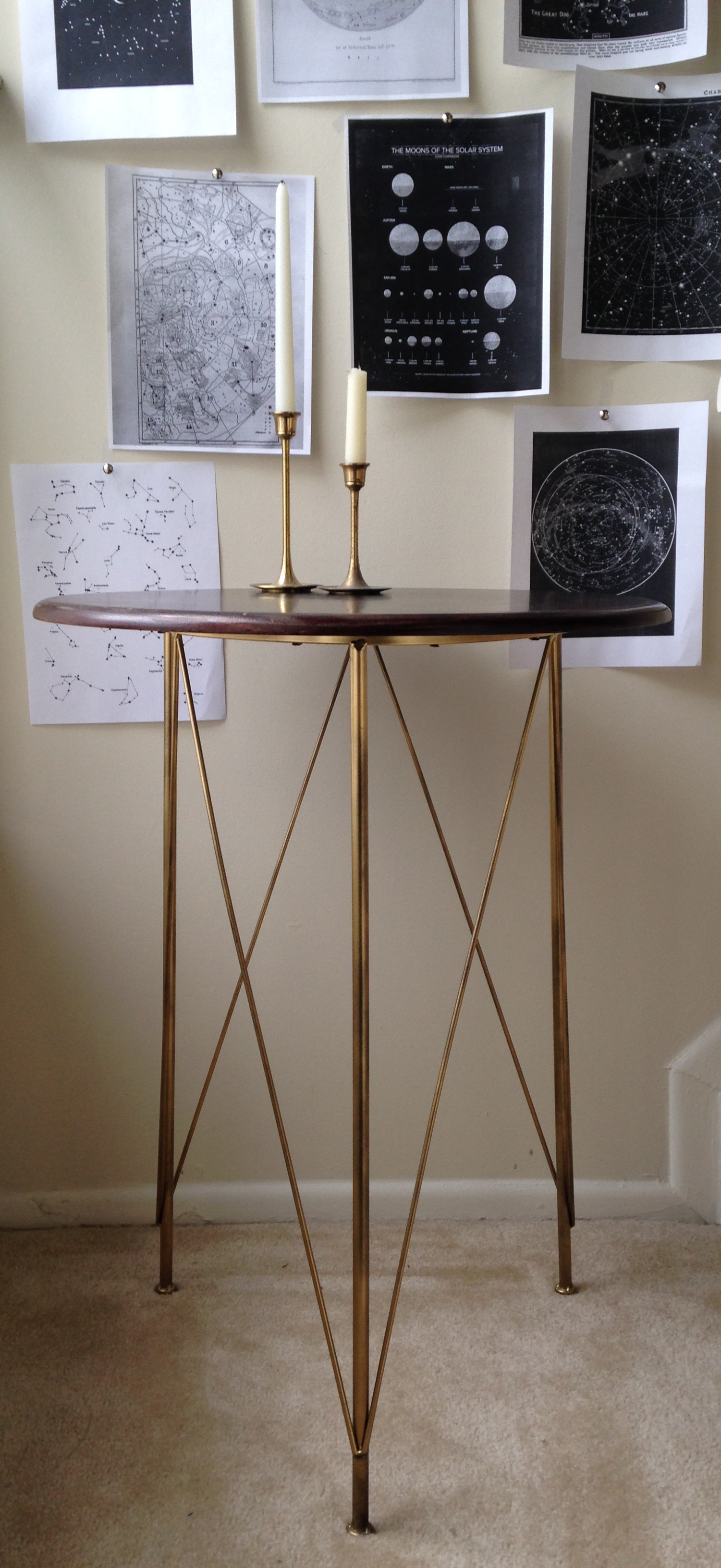
The base was now a handsome gold.

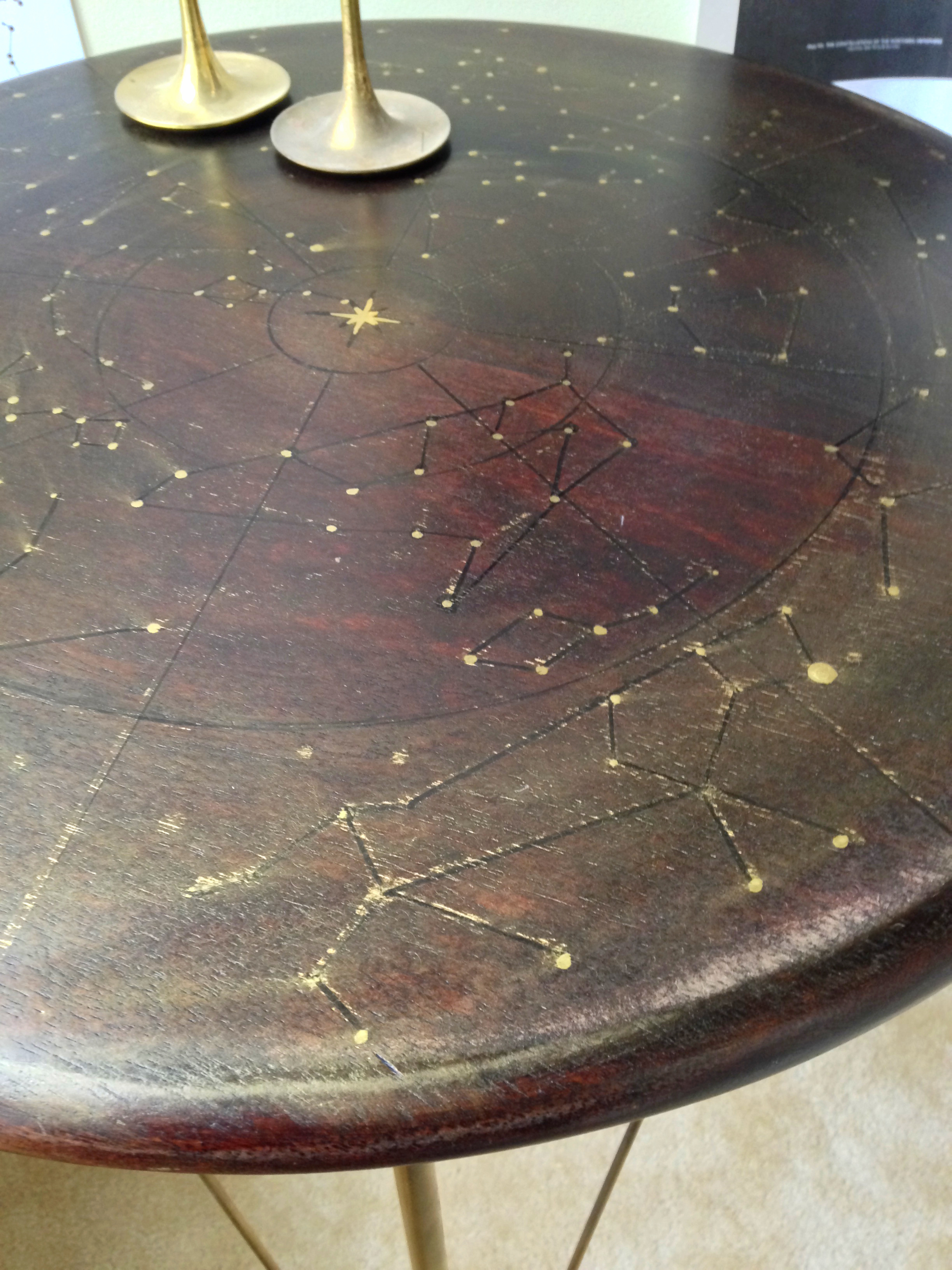
His simple, clean lines perfectly complimented the top's celestial swirl of elegant constellations.

Her makeover took a combination of black sharpie, gold leaf pen, an orbital sander, and sealing wax.  When applying the wax, I accidentally discovered that it smeared the gold.  In the end, she liked that better because it gave her more of a "cosmic swirl" - don't you think?  

It is definitely NOT accurate so sorry all you sextants out there who were thinking of using this table to navigate the heavens while at sea. 

[My low-budget staging is brought to you by my $0.50 brass candle sticks and some photocopies of stellar maps and moon charts.  Winning!]

I picked out my favorite constellation - not sure what it really is, but I'm calling it Mufasa.  Can you spot it?

A winning combination don't you think?  

And they lived happily ever after...

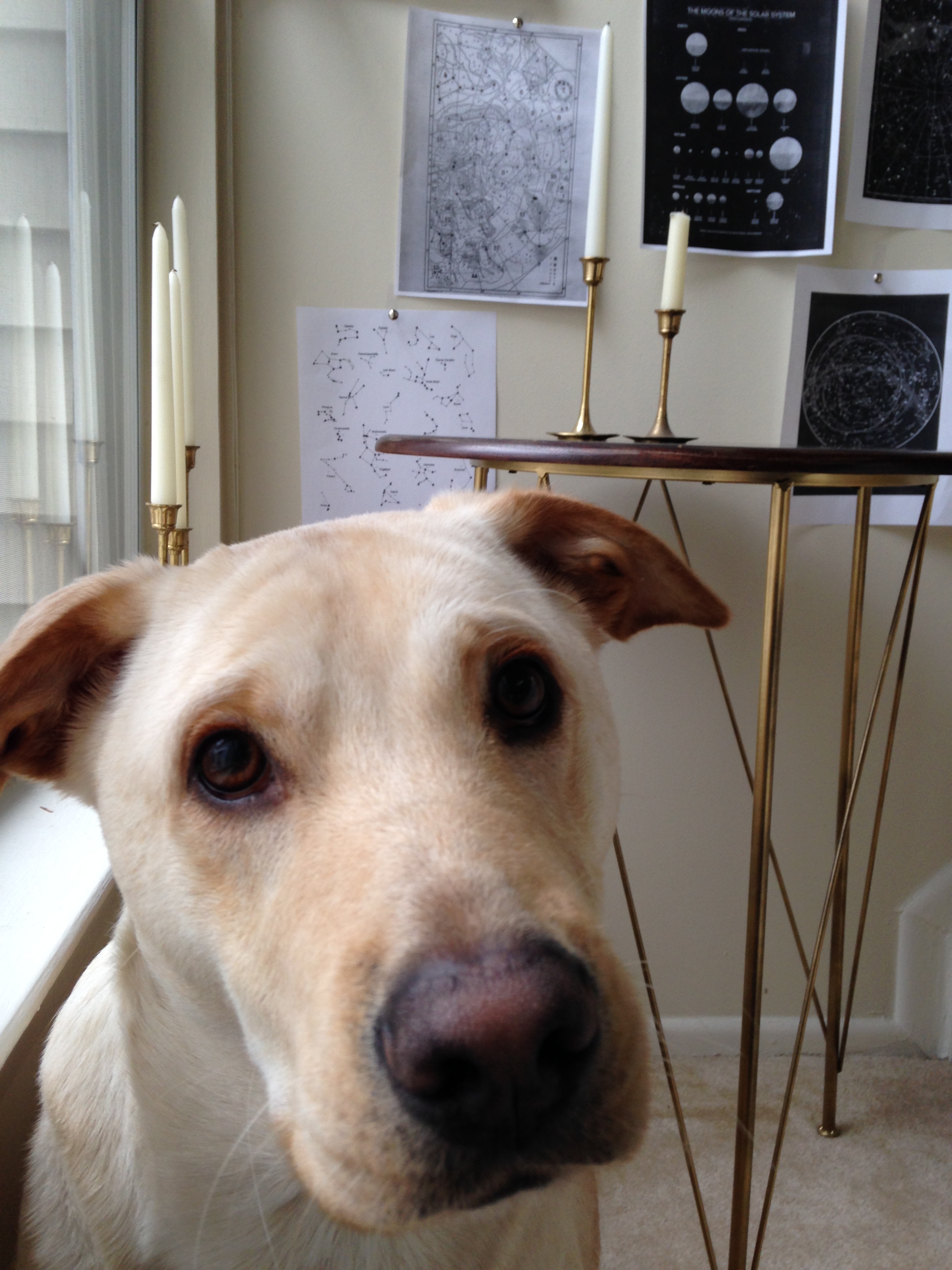
Photo Mar 27, 10 55 02 AM.jpg

The piece has already sold, but there's no need to make sad puppy-dog eyes - we do custom orders!  Just email me at cate@stylemutthome.com and we can talk about how to get you your own heavenly table.


And friends, if you like what we are doing over here at StyleMutt Home, please help us reach more readers by voting for Chelsea's space in the #SOdomino contest!  We offer our eternal friendship and gratitude in return ;)

Staging Smart: Tips For Staging in Small Places

GORGEOUS Photo Cred: Jillian Michelle Photography

GORGEOUS Photo Cred: Jillian Michelle Photography

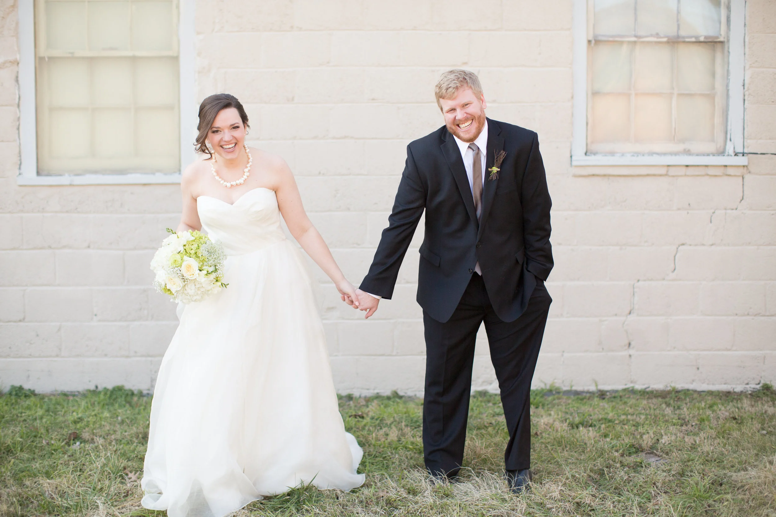
Caleb and I hit our first wedding anniversary this weekend!  Can I get a woot woot?!   I'd heard that the first year of marriage is supposed to be the hardest, but I think because I made Caleb patiently date me for so long {4 years to be exact} we covered a lot of the hard topics pre-rings.  This last year, I mainly just had to overcome adjusting to my first boy roommate and how to feed a man who's taste buds are more like an 8 year old boy's {love youeeee}.  Here's to year two!

Now that we're officially not newlyweds, Caleb and I are also approaching the anniversary of moving into our apartment.  This means that for a whole year Caleb and I have been carrying furniture up 3 flights of apartment stairs and rearranging our apartment like a sliding tile puzzle just to flip, stage, sell, and repeat again.

Last week Chelsea kicked off our series on staging.  I'm gonna go ahead and nick-name the series Staging Smart so if you are just checking in {why hello there and welcome!} be sure to check it out.  So in the hopes that I am not the only one in a tiny-apartment-furniture-flipping situation, I'm following Chelsea up with some tips about how I stage-to-sell in a small space.

Besides being only 863 sq.ft., our apartment comes with some additional challenges:

1} Our apartment doesn't get the best natural light for photos
2} Our open-concept with a loft means I do not have a lot of blank walls to stage/ play with
3} I am NOT a minimalist... I am a collectionist {ergo I have a lot of stuff to move and stage around}

Figuring out how to stage around these hurdles came through a lot of trial and error.  My staging journey began with my first piece for sale: the tufted mid-century modern bench.  I was so excited to show off my first piece, that I kicked Caleb out and hurried to clean the entire apartment before the tiny window of decent light hit our skylights like the fleeting sunbeam on treasure map in Raiders of the Lost Ark.  

©1981 Paramount Pictures. 

©1981 Paramount Pictures. 

But when I staged it as the coffee table in our living room, the piece was definitely getting lost in the busy background of our apartment:

After moving it around multiple times, I began to get discouraged that none of pics were showcasing the piece.  I eventually gave up and I brought it over to Chelsea's to borrow her great staging wall:

After seeing how the bench popped against a plain background, I was determined to find an alternative way to photograph pieces without schlepping them to Chelsea's every time.  So next I tried staging outside:

But I was dealing with carrying pieces up-and-down 3 flights of stairs {more than I already am}, harsh direct sunlight, un-groomed grass {not to mention some rogue piles of dog poop...}, and quizzical looks from neighbors.  So I turned to our balcony in hopes of finding a relatively easy solution to a simple staging backdrop: curtains.

Utilizing our porch curtains was a HUGE step in the right direction.  The trick with staging on the porch was that sometimes the sunlight would back-light my pieces:

The good news is with a little a photo editing, you can actually use that to your advantage.  All I had to do was increase the brightness, mid-tone, and add a pinch of contrast:

If you have the momentum to wiggle a big piece into your staging-spot, then you better take advantage of the trouble you went through to set up.  Chelsea touched on staging multiple ways to show a piece's versatility, but I find it is also helpful to stage them to show a piece's personality:

Cool & Classy?

Or Colorful & Contemporary?

Both incorporate many of the same elements: geometric lamp, starburst mirror, moss ball, and books. But I chose to use the photo sesh I though brought more life to the piece to market to buyers.

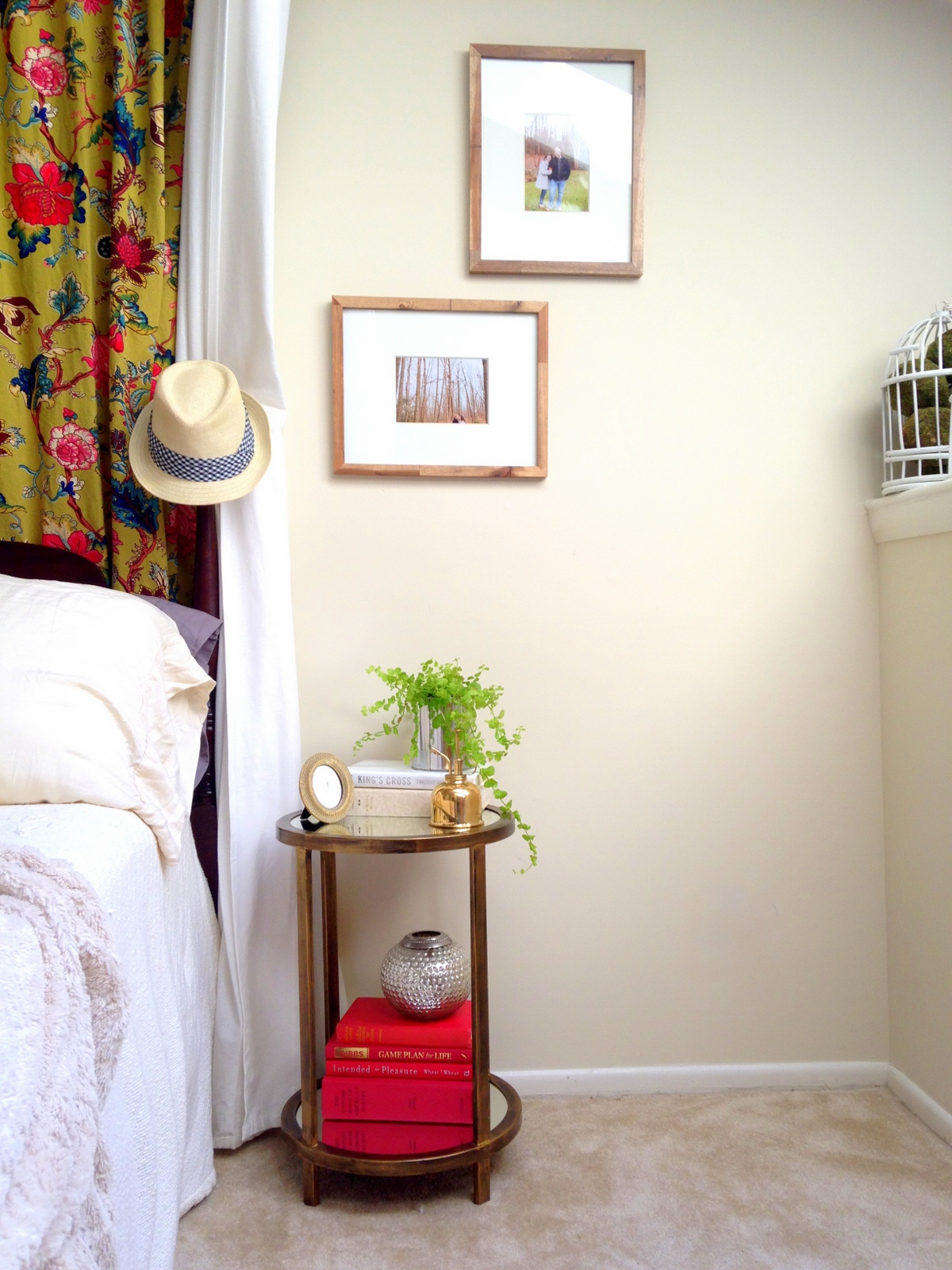
With the smaller pieces, it is a little easier to find places for them inside.  But if you are going to stage a piece in a complete room and not with a blank backdrop, try to find a way to easily transform your space to best highlight it.  The trick is using what you have in new ways.  These tables were staged in the same spot but with subtle differences.  Can you spot them?  

Answer: curtain behind headboard, bedding, overall color schemes, rug, hat, and table top decor.

When staging these pieces, I tried to think like their potential buyers: the gold and mirrored accent table felt like it would attract a glamour-loving easy-breezy girl.  The x-base campaign table felt more masculine and classic.  Interestingly enough, the mirrored accent table sold to a cute twenty-something co-ed and the campaign table to a guy who's girlfriend was helping him style his first place.

Ok let's re-cap the takeaways for staging in small spaces:

1} If you don't have a simple backdrop that allows your piece to "pop," try making one
2} Take advantage of your piece once it's in place and style it for multiple photo shoots
3} Decorate around your piece to enhance it's unique personality 
4} Think about what kind of buyer(s) your piece might attract when styling your piece

Hope this helps all you small-space-stagers out there!  If you have any tips of your own, we'd love to hear them!

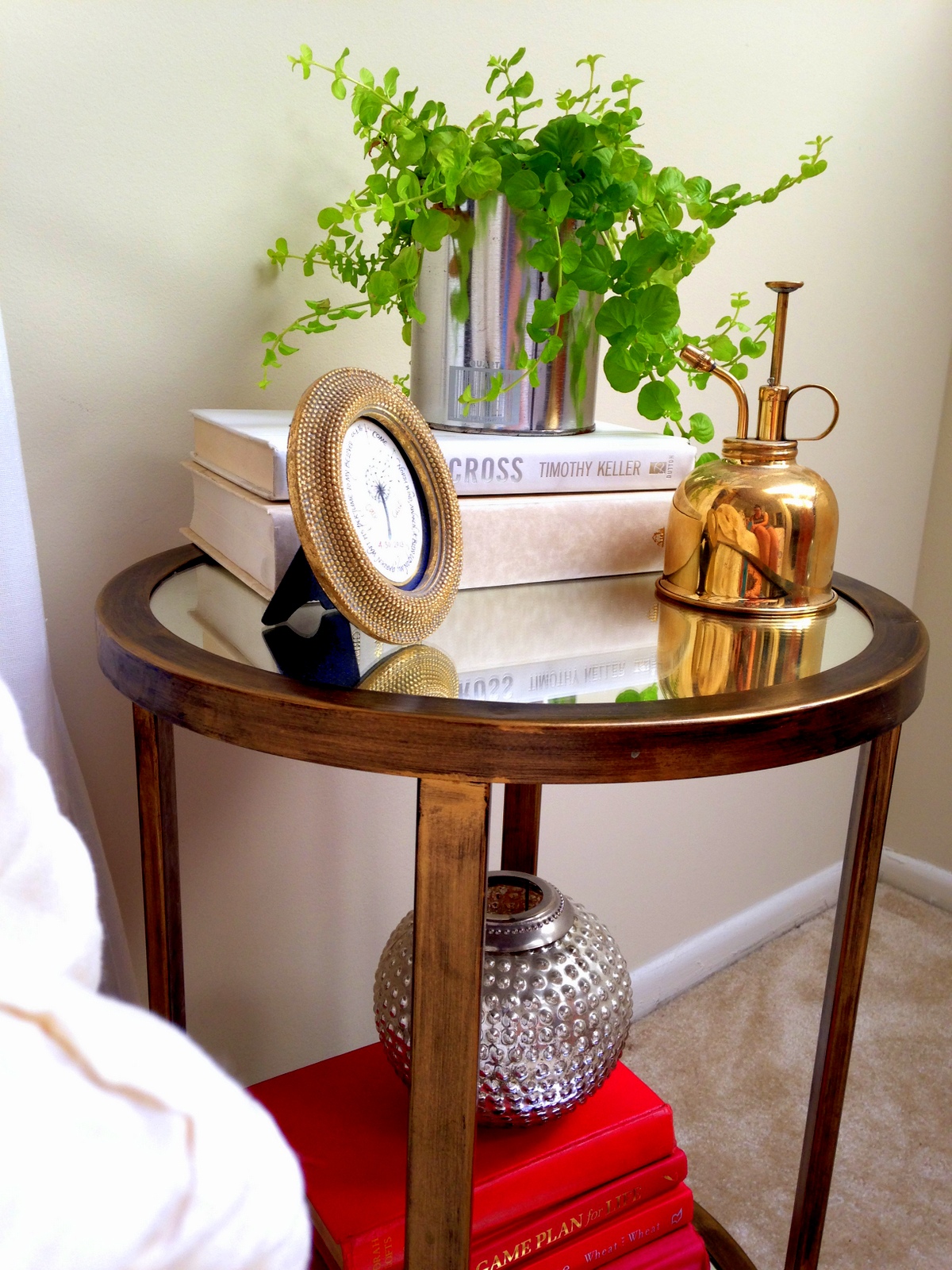
Mirrored Accent Table

Woot!  Can you believe we have the new site ready for use so quickly?  I can't!  At our strategic meeting last month, we put together a temporary timeline for this beast of a website and predicted we wouldn't really have things operational until closer to the holidays.  God has been so good to us in the process: working out kinks, giving us fresh ideas, keeping us excited even after HOURS of staring at the comp screen making ridiculously teedious edits.  But hey, God created the world in 6 days right?  Guess He decided to help us make a new website in 20.  Thanks Big G ;)

So let's get the StyleMutt party started!!!!!!!!!!!!!!!!!!!!!!!!!!!!!!!!!!!!!!!!!

I am so happy to have such a cute little furniture rehab project to debut to you today.  But I am even MORE tickled to tell you the story of how I ended up with this little table in the first place:

 I was trolling Craigslist on my day off {as per usual} and typed in the search bar: mirror.  I was looking for something that could work in a client's space at the time and while I was thumbing through picture after picture of wall hanging mirrors, I was surprise to stumble across one lone picture of an accent table.  It popped into my search feed because the seller also has a mirror and another table for sale, but the first picture of this table was so cute I just had to jump on the chance to snag this little gem.   When I reached out to seller, I was pleasantly to get an email back saying "Are you the Cate from Chelsea's Garage who did the geometric lamp copycat post?" Needless-to-say I was shocked!  I have never been "recognized" for something I wrote before.  Turns out the seller was a friend from Chelsea's church and an absolutely sweetie pie!  Christine: if I didn't make it clear when I was picking up the table, you totally made my day ;)

I must have still had mirrors on the brain on the drive home because I was struck with inspiration!  Replace the wooden shelf inserts with round mirrors?  Challenge accepted.  This whole thing was divinely orchestrated right?!

I measured the diameter and felt so lucky - all I needed was to track down a 14" round mirror and whatdoyaknow - my local Michael's had some beveled ones.  Even better!  

Now sometimes, when working on a project, you have to chose to do it the easy way or the hard way.  When I brought the table home, I thought I wouldn't have to choose slash that it would be breeze to unscrew the wood and replace it with round mirrors.  HA.  Nothing is ever that easy. 

Alrighty folks - I hit my first snag.  The one thing that I did NOT account for when measuring is that the wood shelves had 4 notches cut into them to allow them to sit snug around the metal legs.  In order for the mirrors to fit, they too would need notches.  So I found myself asking, how in the world do you cut a mirror?!?!  This was out of my area of expertise.  Either I abandon the pursuit of glamour and just refinish the wood, or I quickly educate myself in what was bound to be some sort of complicated laser cutting process with elusively expensive special tools that I would have to obtain somehow...

Then I found this fabulous mirror/glass cutting tutorial from View Along the Way {a great little blog Chelsea has often mentioned to me} and learned that about $13 would buy me all I needed to complete the project!  The answer is actually that toothbrush-looking thing {more technically known as a "cutter"} - turns out you just roll the cutting wheel on the tip of the cutter along the edges you want to cut. 

Since I was cutting notches into the mirror, I did have to adapt the tutorial a little.  I was able to break the notch off but not with very clean lines.  Either this is due to the notching itself or perhaps the beveled edge made it harder to cut clean.  Good news is, the brass frame on the table hides any imperfections and protects any fingers from jagged edges.  I believe the cutting tool simply allowed me to break off a piece {albeit uncleanly} without damaging the whole mirror.

Now for you folks trying this at home, full disclosure - I broke TWO mirrors trying to make this table happen.  I hope my lessons learned with spare you some money:

1.  Score the line WELL before breaking it off.  This will help you to only break what you want and not send spider cracks beyond your measured line.
2.  Measure TWICE ("duh" she says as she bonks her hand on her forehead).  On one of my discarded mirrors I cut the notch too deep and the edge was still visible when inlaid into the metal frame.  Whoops.
3.  FILE the edges.  This will relieve stress on the jagged edge and prep the surface for any future encounters with fingers.  I used a fine grit sandpaper and went slowly - it seemed to do the trick for me.

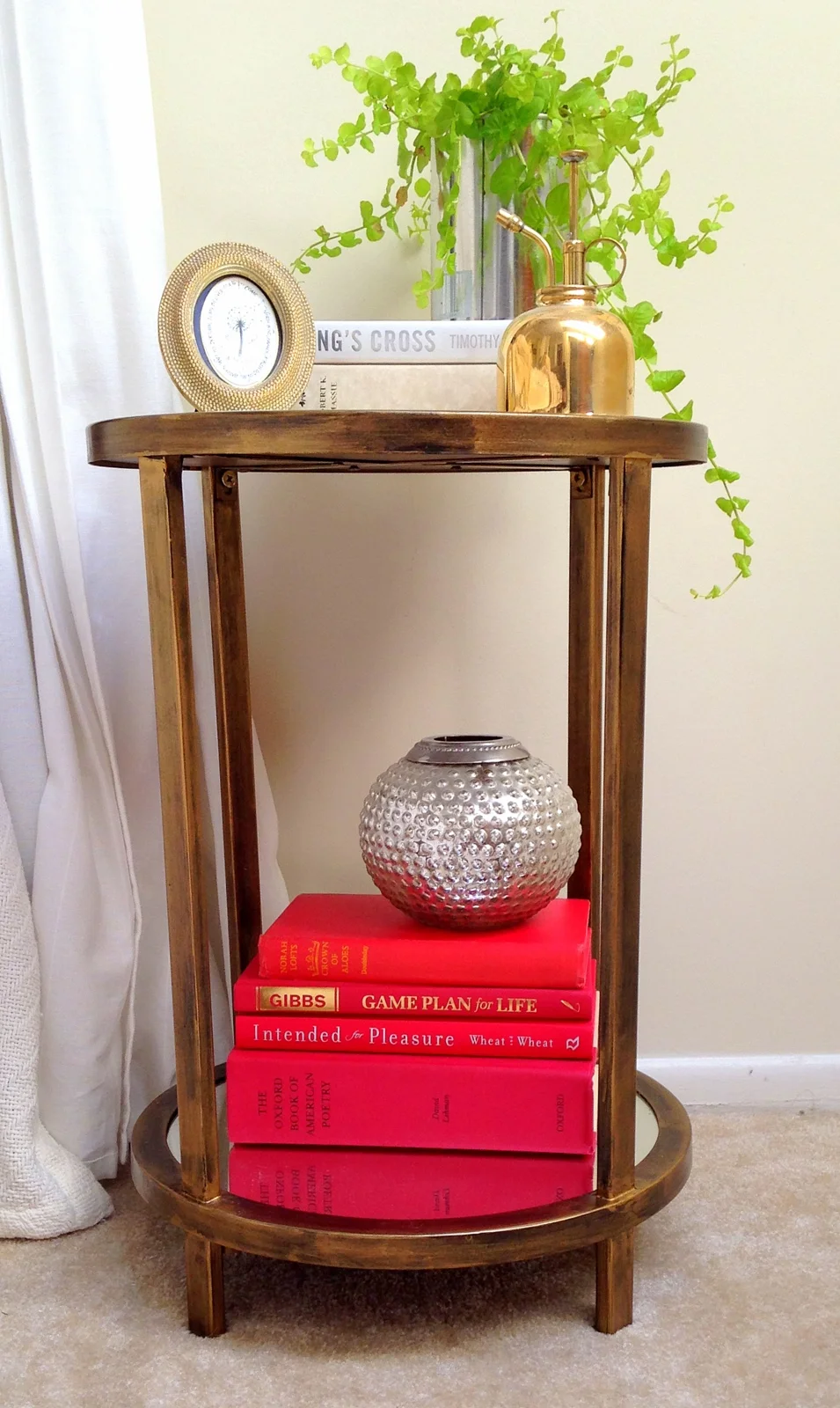
And the results speak for themselves: 

IMG_0190.jpg

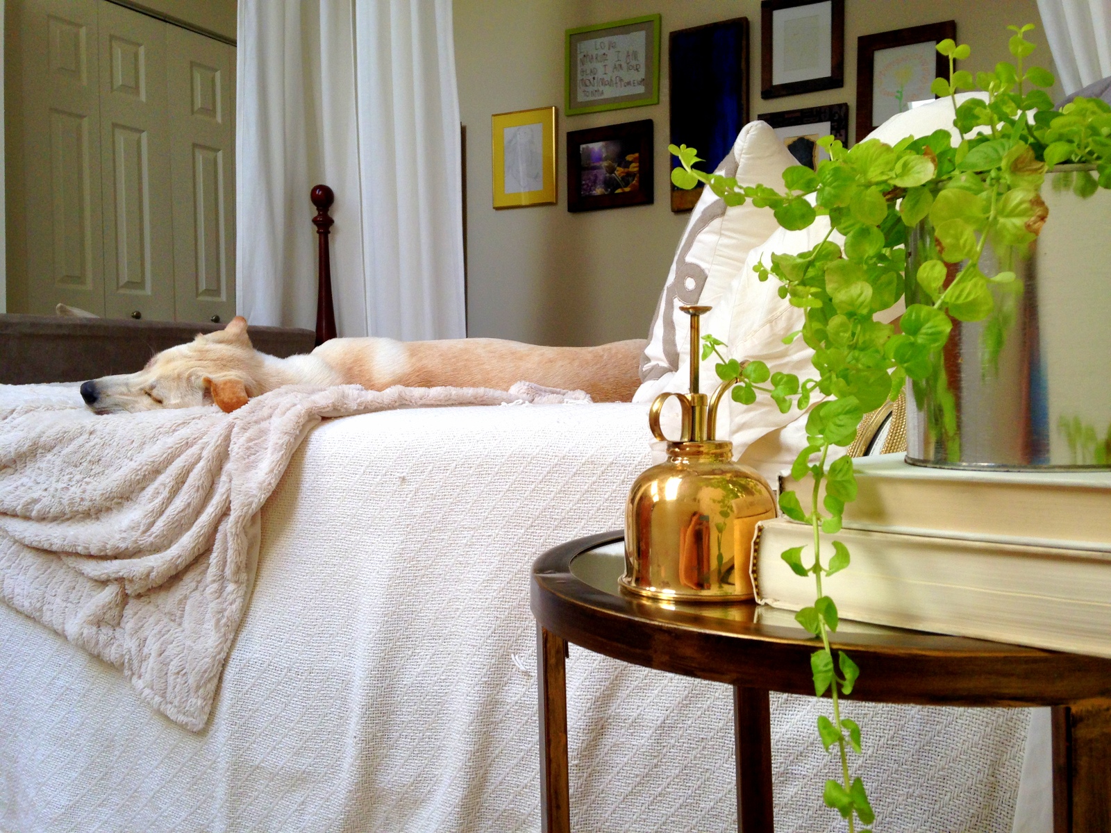
Even in the background, he's still the star of the show. 

And no post is complete without a Thor montage ;)

  Out like a light

Piece now available for sale
15"W x 15"D x 22"H
$175
Please contact cate@stylemutthome.com if interested


This post is dedicated to the two mirrors that laid down its life for the making of this table.