Hi guys! I'm trying something new today and stopping by to share....wait for it....PROGRESS! I've never been great at jumping on to let you how things are going with a particular project, but if project progress is your love language, I'm going to do my best to speak it!
At the beginning of the year multi-talented jewelry designer Dani Barbe reached out to us for help with her and her fiance's rental home. Although they are renting, they feel a deep desire to establish roots and create a home that truly feels 'them'. During our first discussion I just knew Dani was going to be a joy to work with, and I can honestly say several months later that the process has been a delight every step of the way. Maybe it's working with a fellow creative, maybe it's personality, but we're having all kinds of fun with this one, (so much so that we're keeping a good thing going and just added her formal dining room and studio work-space to the list of rooms to complete)!
If you haven't checked out our eDesign process you're going to get a glimpse of it today! After our initial consultation with Dani we took to Pinterest to pin inspirational rooms. Dani had a single leather sofa from Article, as well as a round breakfast table for her kitchen nook. Otherwise, we had some serious space to fill! It can be daunting to start with so much empty space and the impulse to fill it can feel overwhelming. But my strategy for this one was to make this space special with a few choice pieces and minimal filler.
Living Room
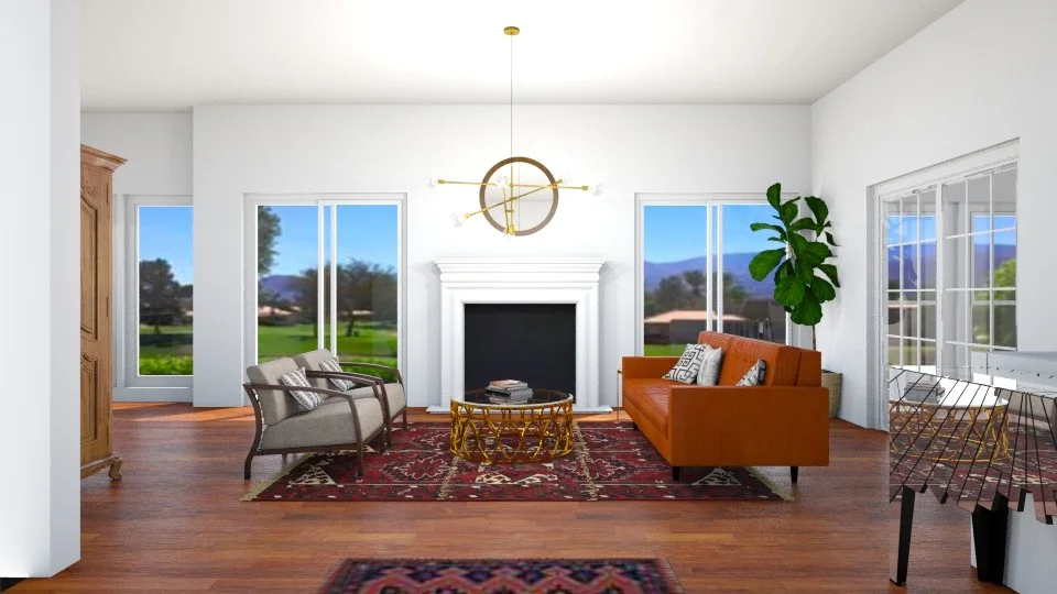
This was the 3D rendering I designed of her living room shortly after gauging her style through the rooms that spoke to her on Pinterest. Although we knew we wouldn't be using a lot of things for the space, we also didn't shy away from mixing antiques with modern elements.
After getting a thumbs up from Dani and her fiance on the 3D rendering, the StyleMutt Home team researched precise pieces to use for the space and we tried them on in design boards, (below). The toughest piece to find - a vintage turkish rug! The problem was not that we couldn't find the right rug; the problem was that every rug we mocked up looked SO good in the space! Ultimately, we all agreed that a warm, glowing pastel piece would suit the glowy space best. Can we use glowy to describe a space? It's my favorite adjective for this home!
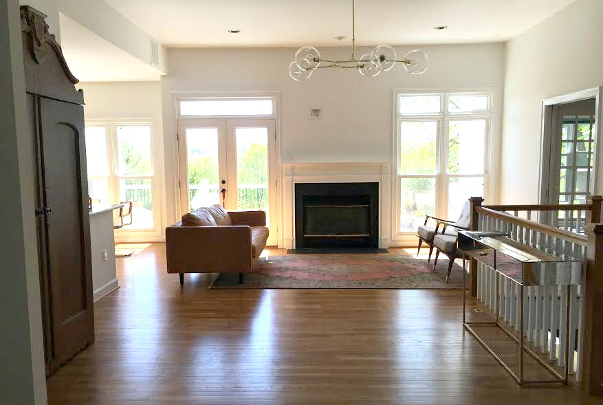
See?! Glowy!!! This is a recent progress shot Dani sent and it makes my heart skip a beat every time I see it. You may notice a few key pieces still missing, (coffee table, mantle piece, plant), but those items are en route now and we're nearly there, you guys! See that big guy to the far left? 1900s Craigslist find. Isn't he a charmer! (Psst! I actually found it before doing ANY designing for this space; I saved it to my phone and it inspired a lot of other pieces that we selected).
Breakfast Nook
The process for the adjoining breakfast nook was the same, starting with a 3D rendering! We nailed down the basic concept for this space but the specific elements changed pretty dramatically when we really started researching products.
This space started with the wooden table and that was it! We wanted to incorporate some color into this space and at first I liked the idea of using patterned upholstered chairs and a neutral wall hanging in a natural un-dyed fiber. But as soon as I spotted these gorgeous vintage inspired blond cane chairs I was smitten enough to bag my original inclination and do the reverse! We paired the blond wood chairs with the warm wood table, (definitely a 'do'), and are having the incredible Filia over at Fibers by Filia create a custom piece similar to this one below! I refinished the thrifted cabinet in a simple glossy white to match Dani's kitchen cabinets that she just painted, and spared the original aged brass hardware. A timeless brass and glass multi-faceted pendant completes this cozy nook.
And here is a recent progress shot that Dani sent over! I can't wait to see it finished with the cabinet and Filia's fiber art piece on that empty wall, but as far as progress goes...I have no words. I just love this space so much. This work is the best!
We are all so thrilled to see this eDesign coming to life and can't wait to share the final reveal of these two spaces! We are currently working on Dani's formal dining room and studio space now but we thought we'd break things up to spare you from a novel of a post!
So what do you think, is a progress post your kind of thing? Because I've got more to share if you're feeling loved by it! ;) Either way, I so appreciate you coming by. Thank you!


