StyleMutt Home hasn't been offering design services for very long - just the past few years, with last year being a break through year that accounted for 23 individual jobs as I switched gears to follow my passion for design full time. I won't get into dull shop talk except to say, we are a small but mighty team! Each of us, Cate, Mckenna and myself, all share a passion for home, and I've discovered that we each bring unique skills to the table. The reveal that I've got for you today is such a fun example of what happens when heads and hands come together.
You may recall our reveal of our dear client, Dani's, living room and breakfast nook from last Summer. Prior to that reveal we had already begun work on her dining room which is just around the corner from those other areas of her main floor. As you can see below, it was very important to me that her home tell the same story throughout. No surprise colors or accent walls! Dani's style is soft but edgy and she's up for taking risks as long as they're practical.
Want to see a before picture for the books?
It's amazing, isn't it. Hah! Dani and her beau, Nate, did the hard part - they painstakingly peeled the wallpaper and painted the room before we even started working together! That's a gigantic first step for any space! So it was a fabulous white box when we arrived, except for the gorgeous Anthropologie table that Dani had already purchased, and the fancy-schmancy chandelier that they'd been instructed not to remove by the landlords, (this is a rental).
The chandelier was a stumper. It's not Dani's style but at the same time this is a formal dining room, afterall. There aren't many of those around anymore these days! So with my first formal dining room to design I was thrilled by the challenge of figuring out how to make it Dani's style and 'speak the same language' as the rest of the home, as Cate says. The three design boards below were the original ideas for the space, with the final design being a blend of 2 and 3.
Final design! I happened by my favorite local stop-in, Valerianne of D.C. to see what they had as far as storage pieces and art - it was a hoot snapping all the viable options that day and texting them to Dani for her thoughts! The piece in the board below won her heart and she snatched it up right over the phone while they wrapped it!
So the room was coming along as decisions were made regarding the larger items, but we needed a lot of things to layer in. As much as I adore those shelves for the way they're constructed, they weren't cutting it totally empty. I had an idea of what I wanted them to look like but it was fuzzy, like I couldn't make out the precise details. So I reached out to Cate and McKenna explaining how I thought a really monochromatic look with a lot of white elements and some fresh greens would complete the space really well. They proceeded to scour the internet for all the pretty, neutral things, and then Cate took those items and created a digital rendering of how to stye the shelves.
I mean, who gets to work with someone who can produce THAT?! It's pretty special. So with the big stuff and little stuff decided, our first formal dining room was born.
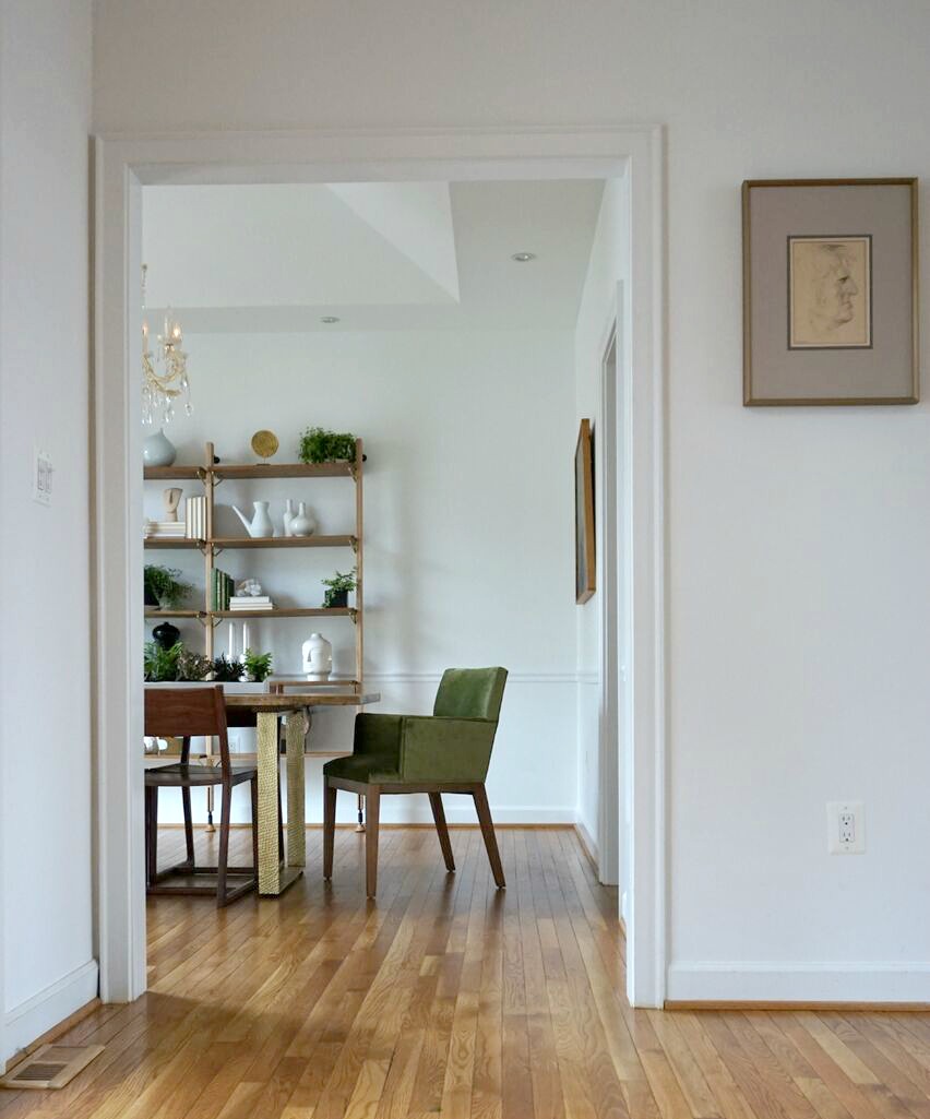
Oh yes, the old man sketch was also a Valerianne of D.C. purchase, framed at Michaels. We all like him and we don't know why. That's the best art though, isn't it?
Oh yes, before we go any further someone would like for everyone to know who's house this is:
Lonny has our hearts forever. We have a stack of pics of this sweet boy, but we'll stick with the room for today. ;)
One week before heading up to photograph the space with Cate I wasn't quite feeling a table centerpiece. I was toying with the idea of completely setting the table for the pictures, or creating a floral arrangement that would be placed off center...but nothing was sticking out as a winning idea. I texted my Momma, (who has a very good eye for this stuff), an unstyled progress picture of the room and asked for her thoughts. She suggested a long and narrow container full of tiny plants. Bingo! With little time to shop around I went to our local Lucketts Antique Store and found a galvanized metal feeding trough. Though the finish was too rustic for the space, there are times when you just can't beat finding the perfect dimensions. So I brought it home and gave it a couple coats of Rustoleum White Enamel. It's definitely a statement centerpiece without overwhelming the space. Exactly what the room needed! Way to go, Mom!
I think Cate had just a little bit of fun playing with these shelves before we took pictures. She styled them out of the park! That fuzzy idea I'd had months ago of how the shelves would look finished - this was totally it. How'd she do that?!
I love the peek-a-boo touch of brass on the chairs - such a subtle element but when I was looking into durable, wooden chairs that would measure up to the live edge and brass dining table, these spoke the language very well, indeed. I don't typically think of wooden chairs in a formal dining room, but these are pretty special.
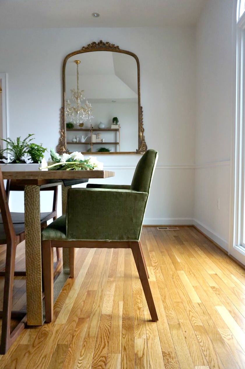
Oh yes, and there's a gigantic mirror anchoring the entire other side of the room! It's not antique but it sure looks like it. That piece really ties the chandelier and other elements of the room together well.
Details for days...
Dani begged us to be in a shot where she was pretending to cut flowers. NOT! We asked her .237 seconds before snapping this if she'd mind jumping in so we could grab a living shot of the room. And guess who was right at her heels. :)
Well, that's a wrap! Sorry for the length today but I wanted to share a bit of the progress that went into transforming this space - it was such a fun experience! Dani just handed over her bedroom and we are thrilled to dive in and get started in there. We'll keep you posted!
Thank you so much for stopping by today!


