Back to Black || 2019 Flip List Item No.4

Black. And wood. These have been banner forces in some of our projects for a while now and the reason I wanted to turn up the contrast on my two-toned flips.  That dark mysterious black against a warm and welcoming wood. Yes please and I’ll have another.

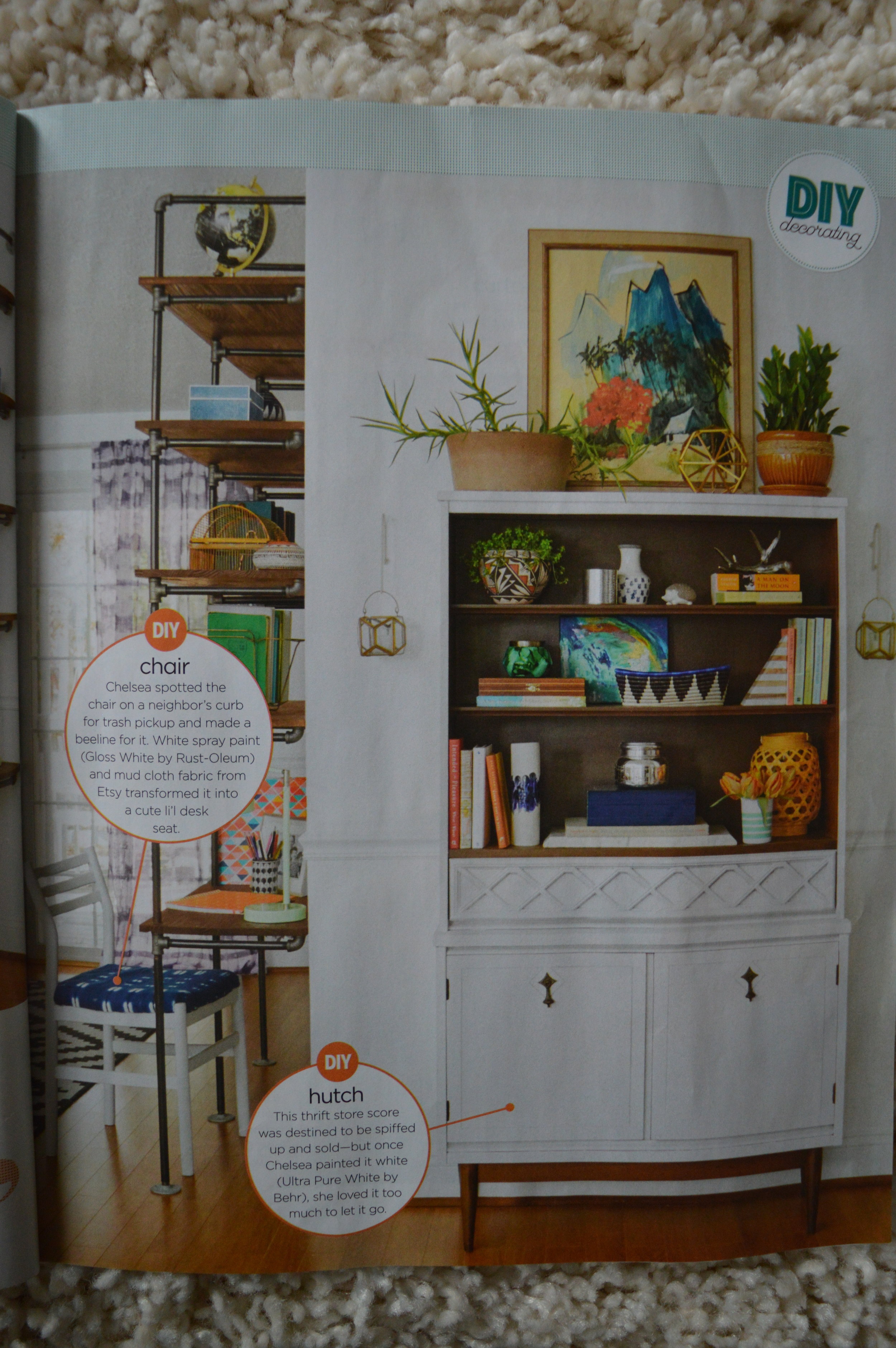
Then last week, I came across this listing on Craigslist for two original mid century bookcases made by the West Michigan Furniture Co. They were a great price which made for the perfect opportunity to scratch this jet black itch I’ve been having…

IMG_0189.JPG

If you’ve been following the 2019 Furniture Flip Bucket List then you’ll know where I’m going with this.. item No.4 is in my sights:


IMG_0215.JPG

​Now just let me dangle the carrot here for a minute - look at that contrast!

IMG_0221.JPG

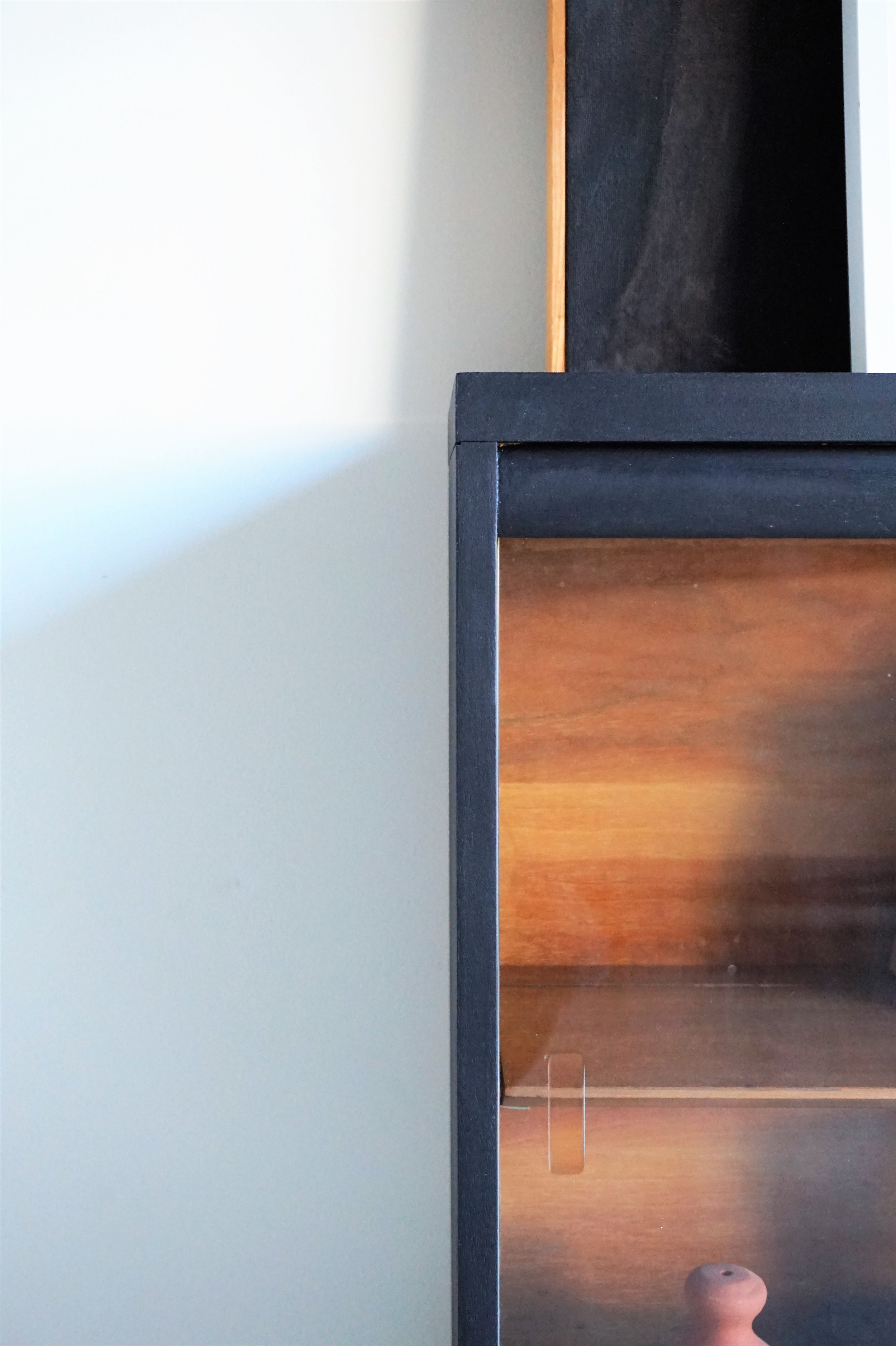
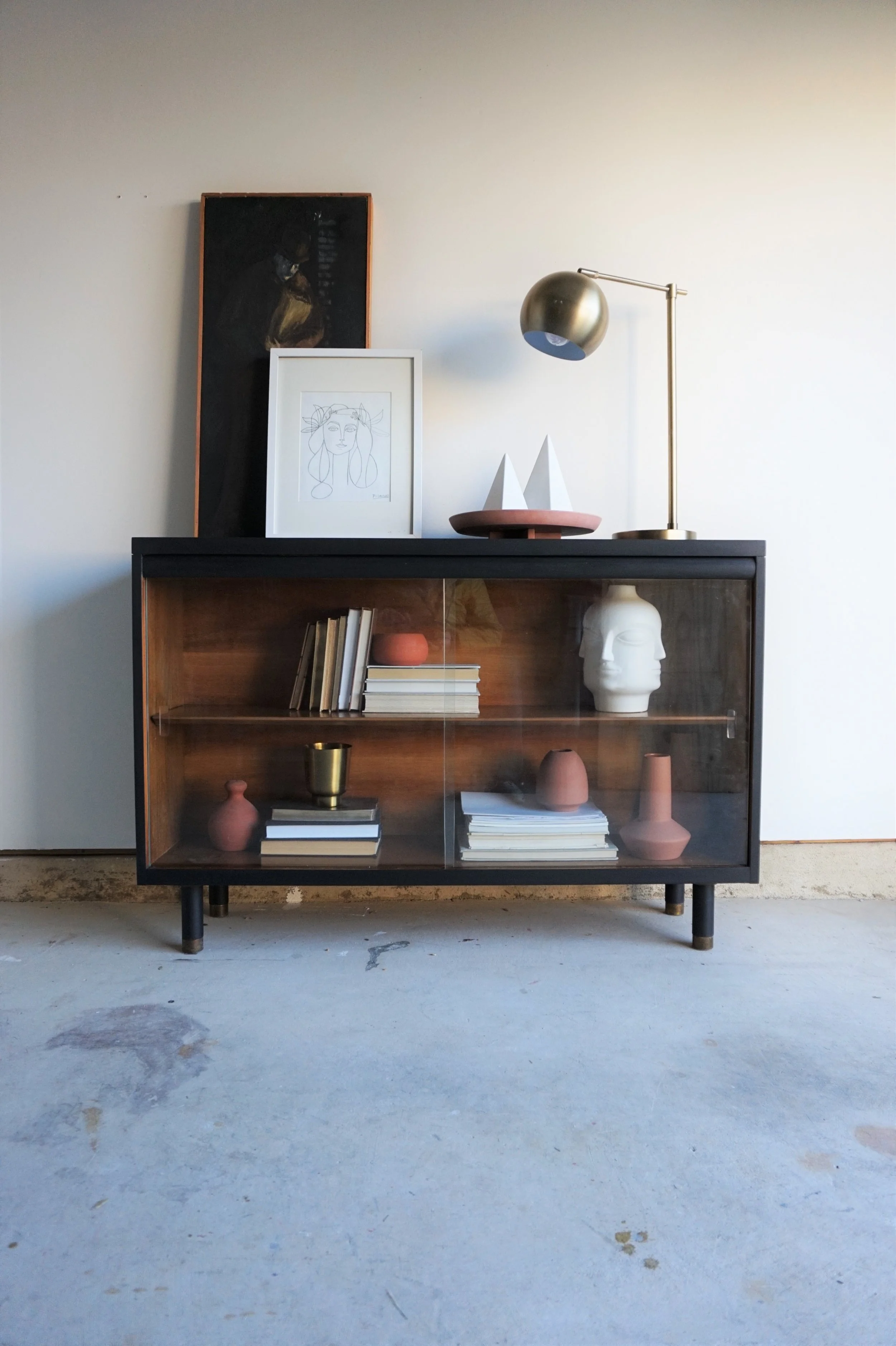
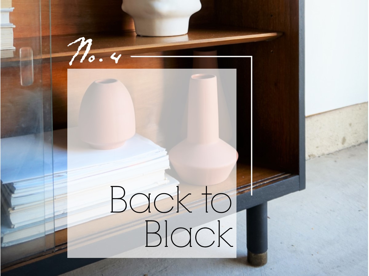
Instead of keeping the cases stacked as a single unit, I decided to make them two separate units. The top surface on the lower, larger cabinet was damaged so it was already asking for a fresh coat of paint.  Painting the casing in a new-found favorite Limousine Leather by Behr allowed the interior to electrify. 

IMG_0220.JPG
IMG_0222.JPG

Unlike my prior flirts with dark tones, this black is much more severe.  It’s still my trademark dark and moody and it’s so very stately - especially contrasted against that wooden interior.

IMG_0223.JPG

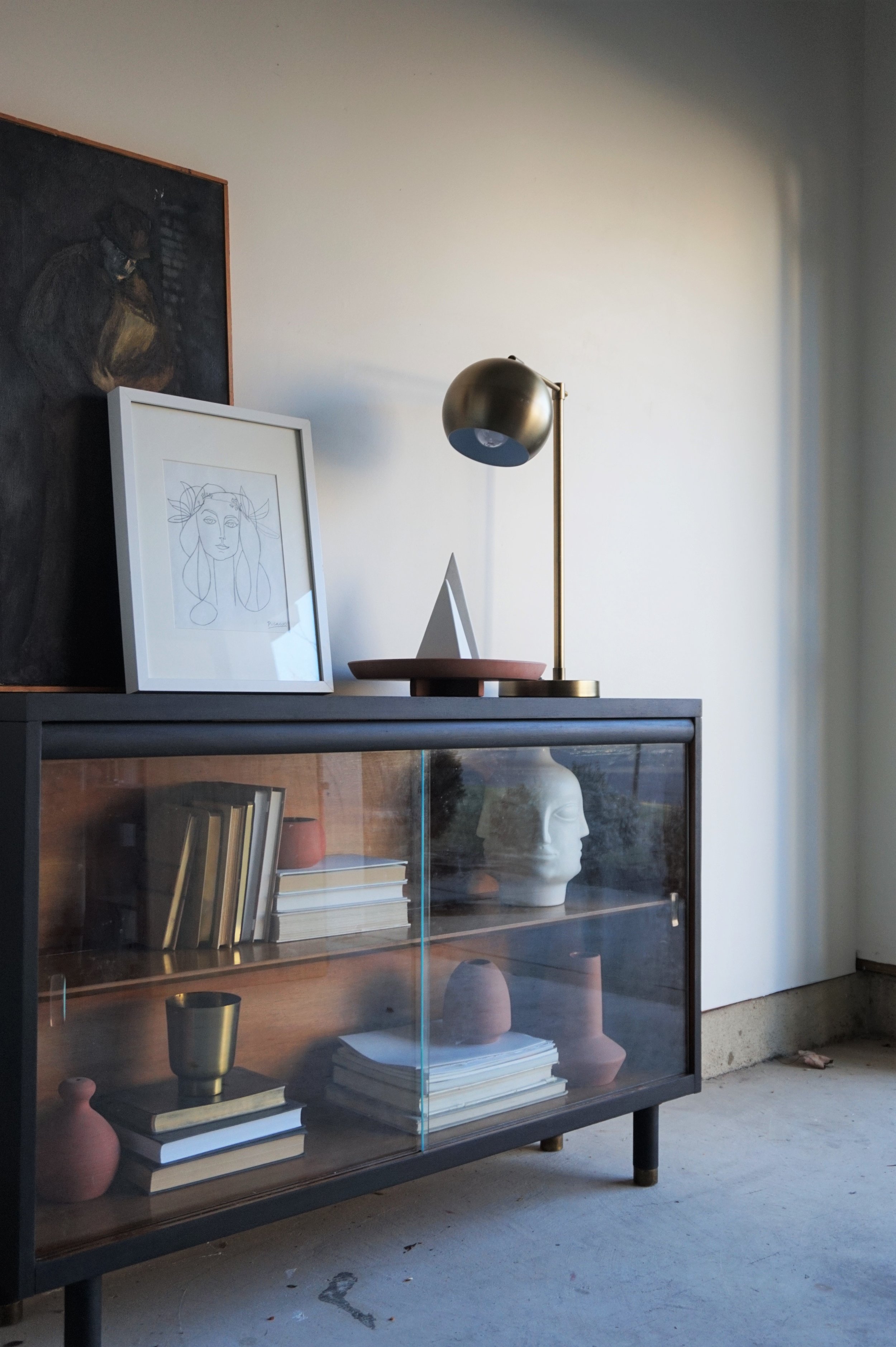
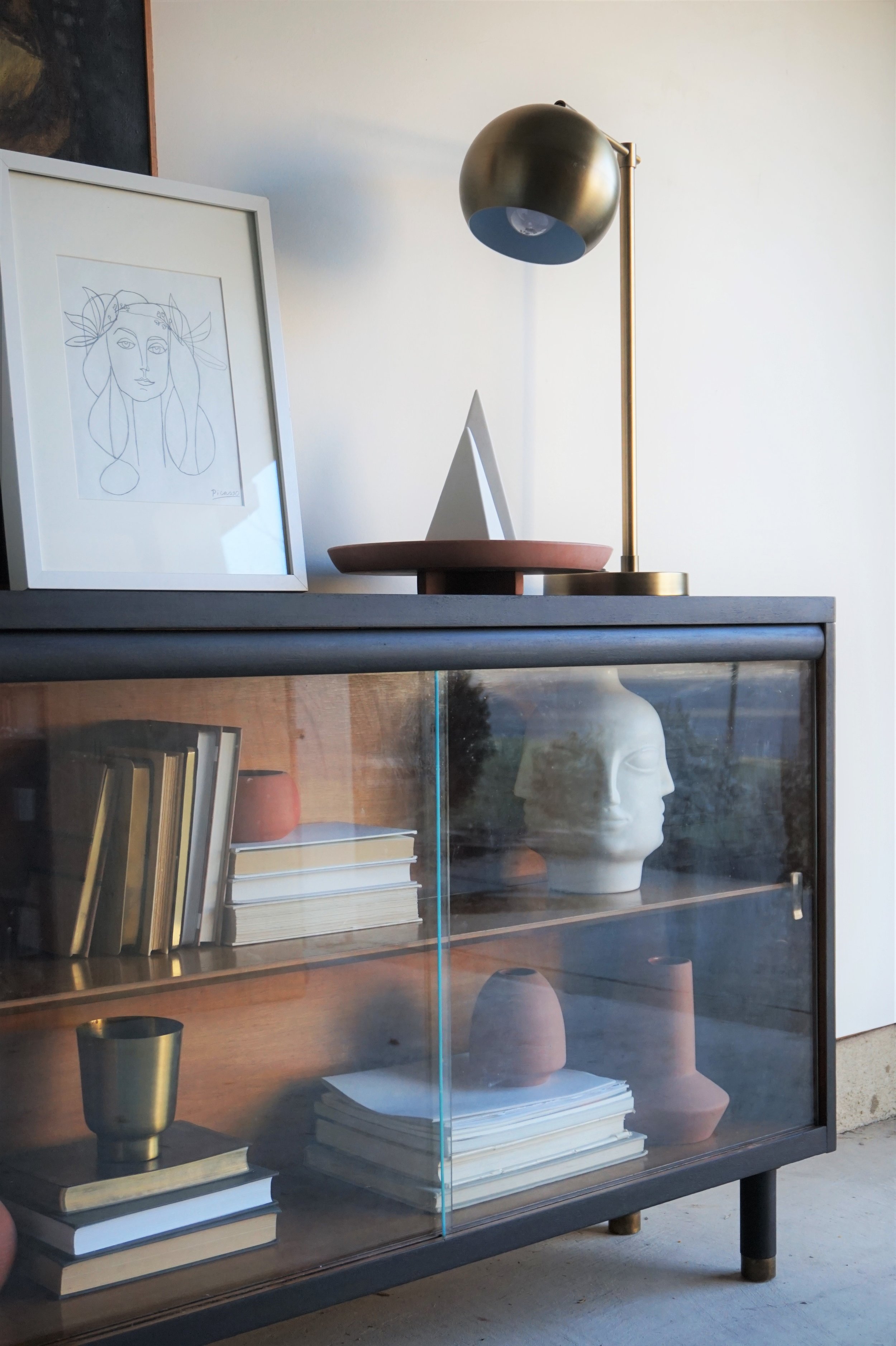
This West Michigan Furniture Co. piece still has its original glass sliding doors to protect your treasures from collecting dust.

IMG_0219.JPG

Truth time - I hate photographing pieces with glass surfaces.  I end up obsessing about the reflections or how I apparently don’t know how to keep glass clean. Does anyone out there have any tips??? Asking for a friend…

IMG_0216.JPG

It also has the original brass capped peg legs which I cleaned up a little but left a lot of the natural patina. I’m so used to working with tapered or metal legs but these little gams are just so cute, I might have to replicate this look again.

IMG_0217.JPG

For styling, I leaned into the monochromatic look with terra-cotta, books, touches of brass, and white decorative accents. I felt like the piece called for a more “masculine” look with an emphasis on interesting shapes and varied heights.

IMG_0218.JPG

You’ll have to tune back in to see what will come of his little leggless brother!


Back to Black Bookcase
Now available for sale
48”W x 12”D x 31”H
$425

 If you are interested in this piece or a custom order like it, email me at cate@stylemutthome.com

IMG_0224.JPG

One down, four to go. Catch up on the 2019 Furniture Flip Bucket List.

Colin + Mason's Room Reveal

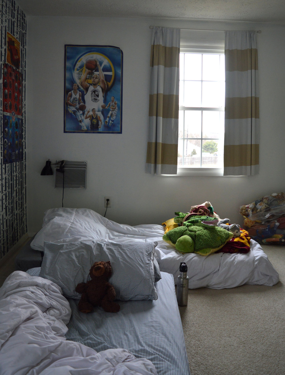
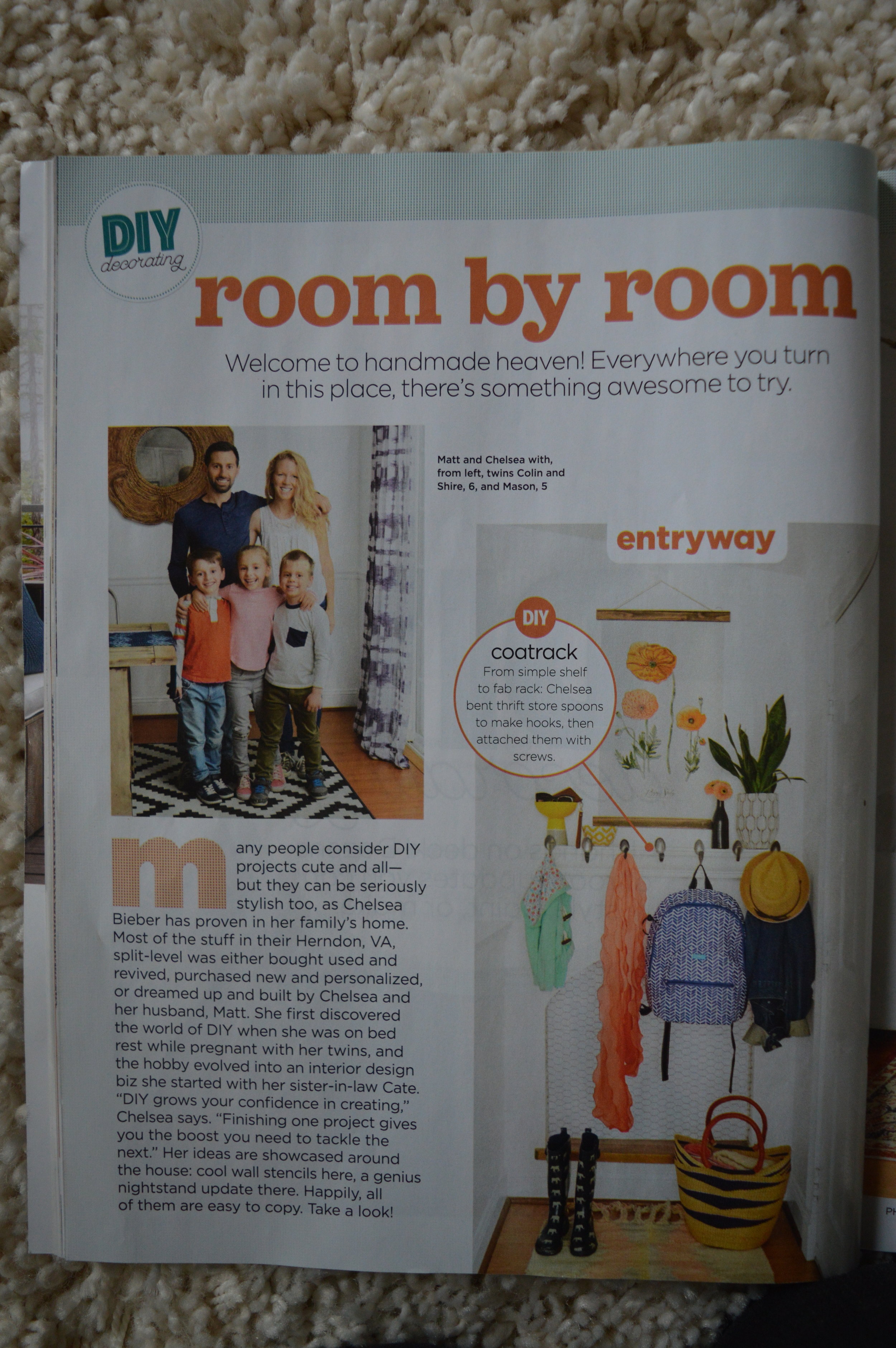
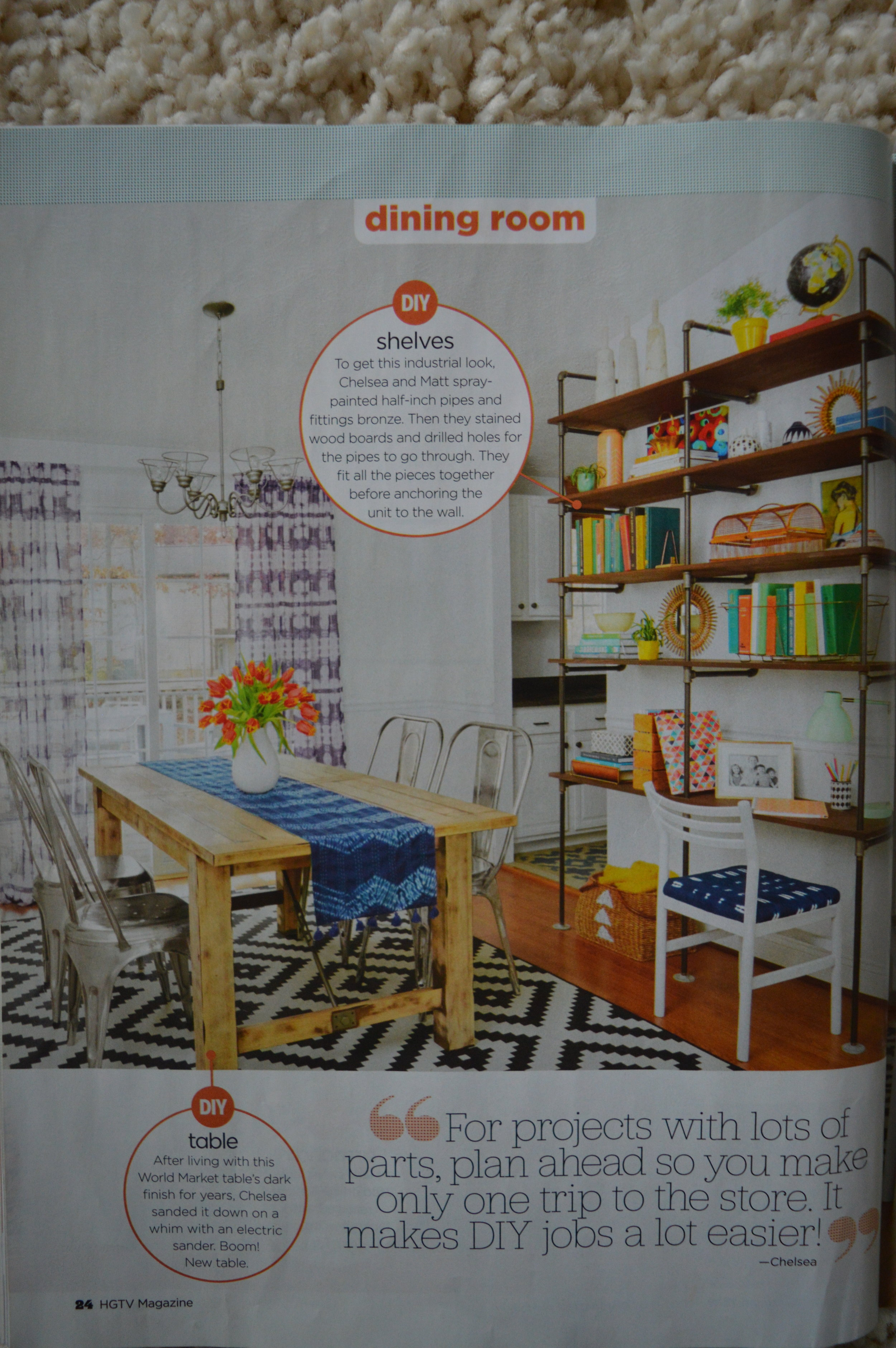
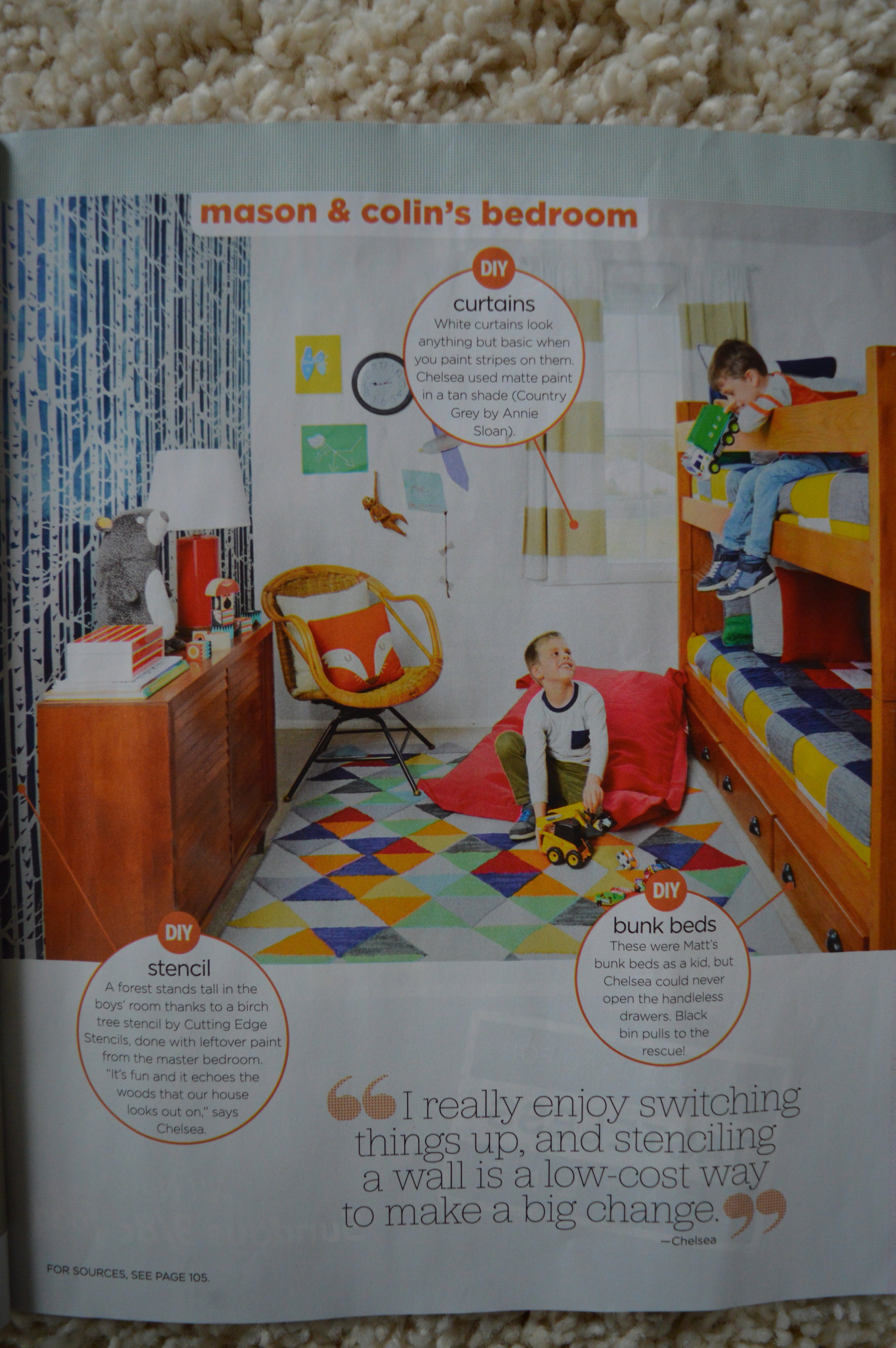
Hey there! A couple weeks ago I was sharing a ‘then & now’ tour of our home now versus when HGTV mag came to shoot it two years ago! We ended on a sad note with the boys’ mattresses on the floor:

0.jpg

I promised I’d be back to share it when we were finished! To recap, I sold the old bunkbeds since they were rather bulky for this small room. Over the past few years I have learned a lot about scale and making the most out of the square footage we have. In the bedrooms, especially our itty-bitty kids’ rooms, that means pieces that take up a smaller footprint. With smaller, more streamlined pieces, and A LOT of playing around with arrangement, I think I nailed down a room that feels open and flows well for the way our sons use it. Let’s look around!
DSC_0861.jpg
DSC_0879.jpg

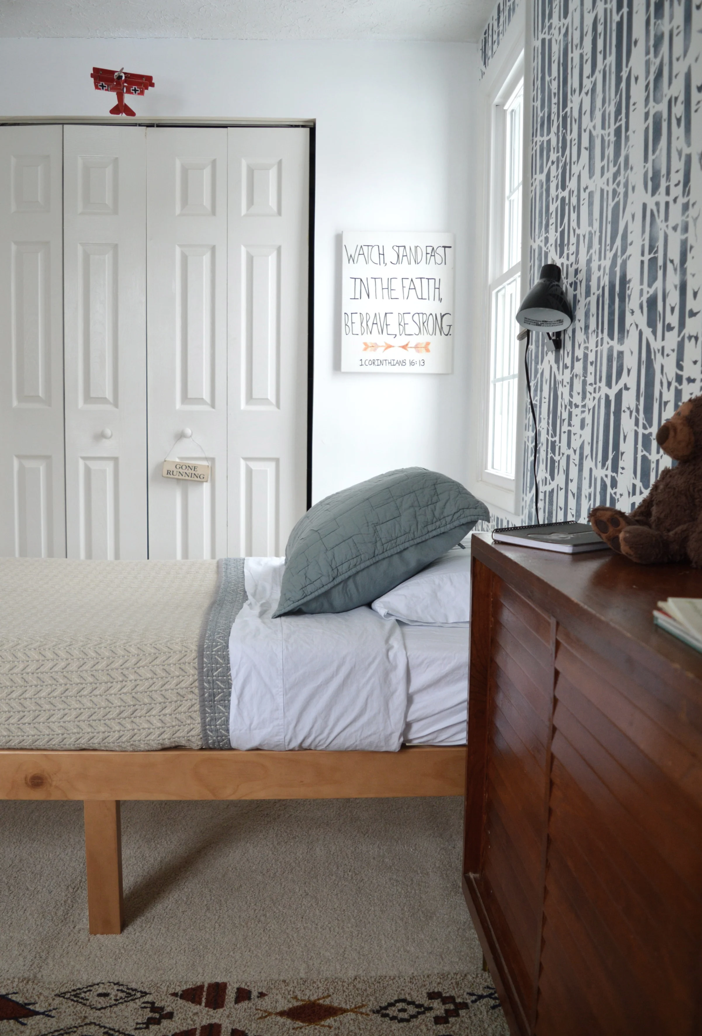
Colin REALLY wanted to keep the birch tree wall, which was A-OKAY with me. I love that wall and am glad they haven’t outgrown it yet! To tie this room into our home, I wanted to include similar color tones that we have elsewhere. The ochre curtains are a nearly identical shade to Shire’s quilt, and warm up the space similar to the camel leather we have peppered around our living room and master bedroom.

DSC_0868.jpg

I was completely lost as to what to do about bedding. I didn’t want white OR a color. Hah! I turned to CStudio Home to see what they had and knew as soon as I saw these quilts that we had a home run!

DSC_0877.jpg
DSC_0871.jpg

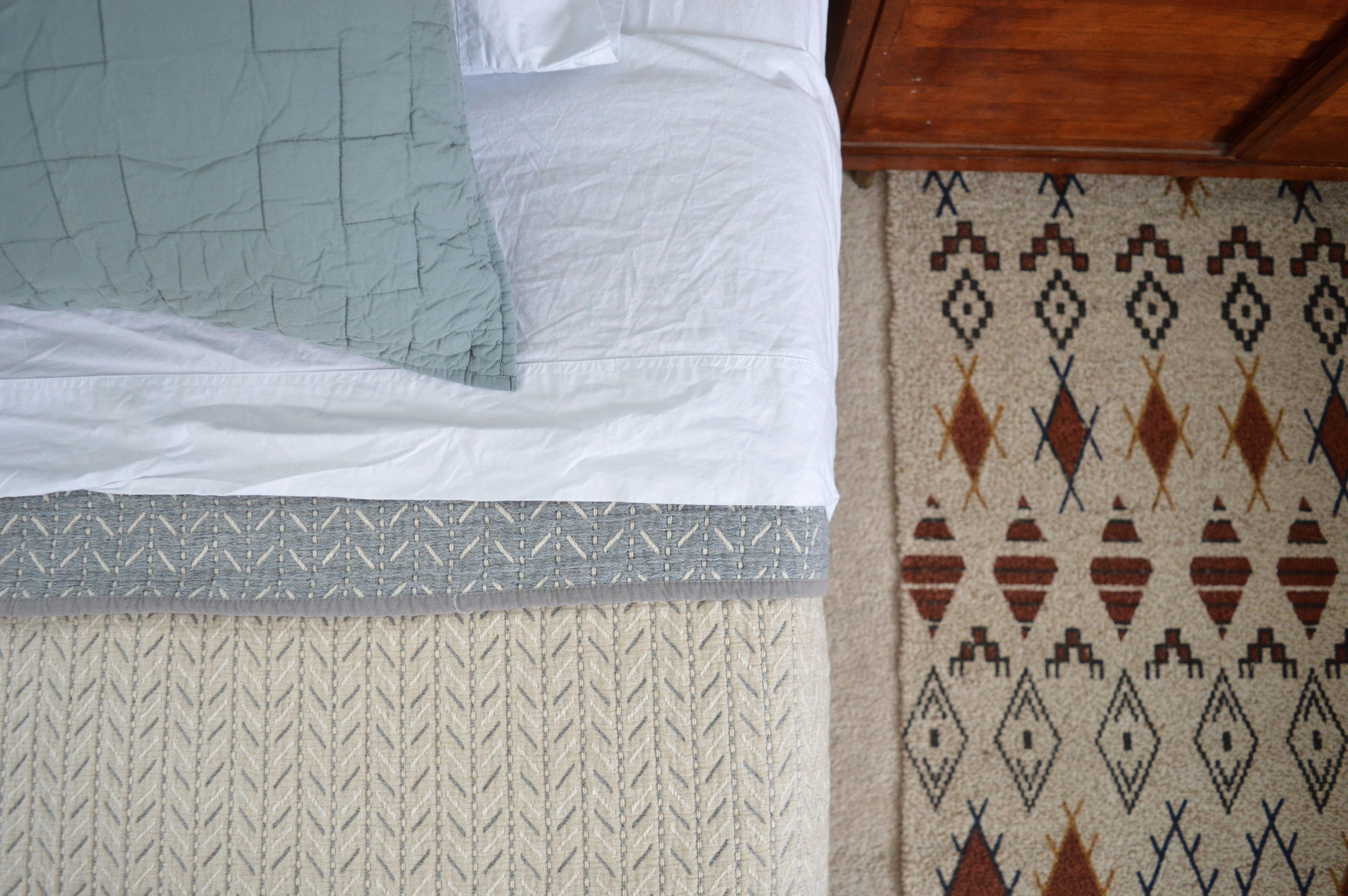
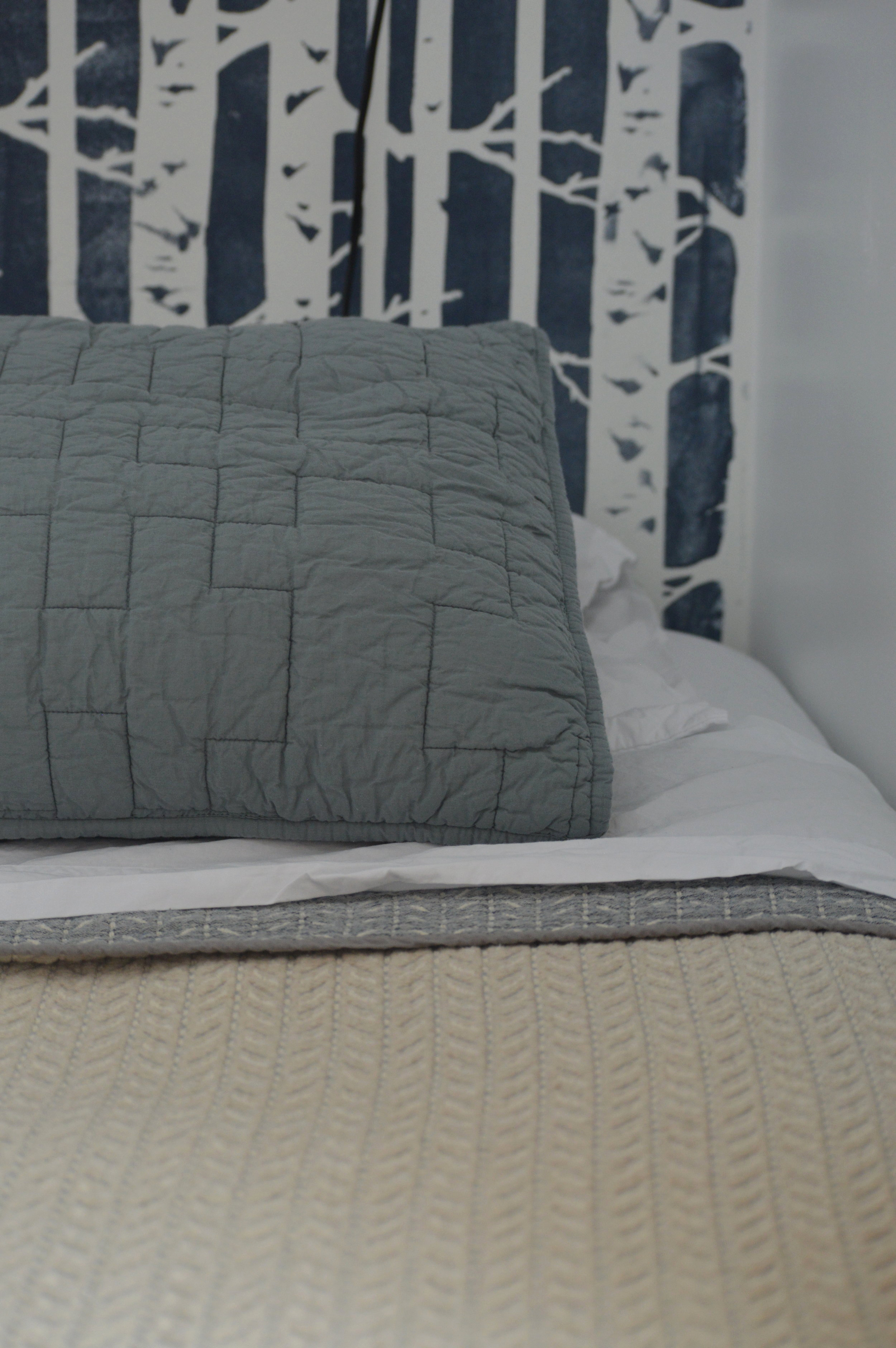
The Dash Reversible Quilt is beige on one side, and a denim-y gray on the other. I paired it with the Studio Sham in ‘Lake’, a dusty aqua blue. And one can never have too many fresh white sheets! I used the Percale Sheet Set in White shown here!

DSC_0909.jpg
DSC_0887.jpg
DSC_0905.jpg
DSC_0874.jpg

I’ve always wanted to use this petite wooden cabinet between the beds but with our old separated bunks we just couldn’t make it fit! I found this cutie at a yard sale with Cate a few years ago for pocket change. It’s definitely nice to have some hidden storage in a kids’ room! All our kids are huge collectors - they see potential in absolutely everything! Rocks, leftover party confetti, deflated balloons, ribbon from Christmas gifts….and they actually use these things in their daily play! Even still, it’s nice to not have to see it.

DSC_0880.jpg

Across from the beds we’ve got three sets of 3-shelf bookshelves I found at Walmart for $17 each. I almost jumped on the IKEA Billy 3-set bookshelves that are identical, but am so glad to have found a cheaper option! By themselves, these bookshelves are nothing to write home about. But three in a row makes a stronger statement in a space, (see how I used the Billy set in this home office)

DSC_0894.jpg

While the colors used in this space are deep and saturated, I didn’t use many - when I use strong colors in a room I try to keep the palette limited to just a few. In here I used navy, rust and mustard/ochre. So while the room is colorful, the consistency keeps it relaxed and peaceful. Cate does SUCH a good job of using color in her home, and if you look closely, you’ll see that she emphasizes just a few colors and the rest is neutral. I’ve definitely been inspired by her to make some bolder statements, while maintaining a laid back, minimal vibe.

DSC_0865.jpg
DSC_0891.jpg
DSC_0889.jpg

To keep toys and books separate I use various storage pieces, like these green metal ammo containers I found at an antique store a few years ago. Basically anything with high edges can be toy storage - it’s a great way to think beyond the basic storage cubes that slide into cubbies!

DSC_0892.jpg

That’s a wrap! This space has seen a lot over the 8+ years we’ve lived here and these walls have loads of stories to tell already. (It started off as our twins’ nursery with two cribs on either side)! Every time I switch it up to meet the next chapter of life, I wonder about what that chapter will hold for us.

Thank you so much for coming by today!

Chelesa.jpg