One of the perks of being the furniture flipper in my friend group is sometimes they give me er... presents... In the form of discarded furniture.
This asymmetrical wonder came to me when a friend got a fish tank off craigslist that came with a quirky base. They kept the tank and were about to kick it to the curb when they probably thought, "Waste not: Cate not" and passed it off to me for some hail Mary refurbishing.
But the good news is, being quirky has its perks. In fact, mid-century modern furniture is iconic-ly quirky. Besides making the piece stand out in a space, there's something... endearing about their asymmetrical lines:
Source: 1st Dibs
Source: Unknown
Source: Blood & Champagne
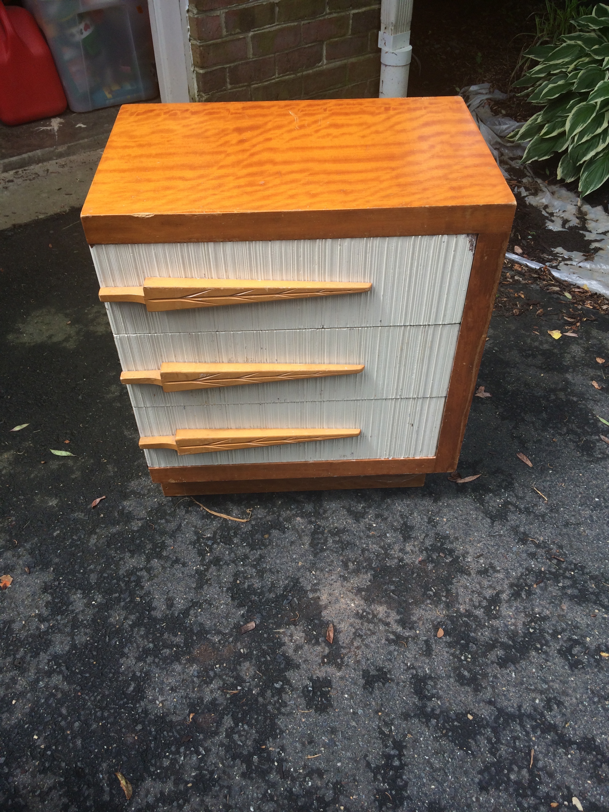
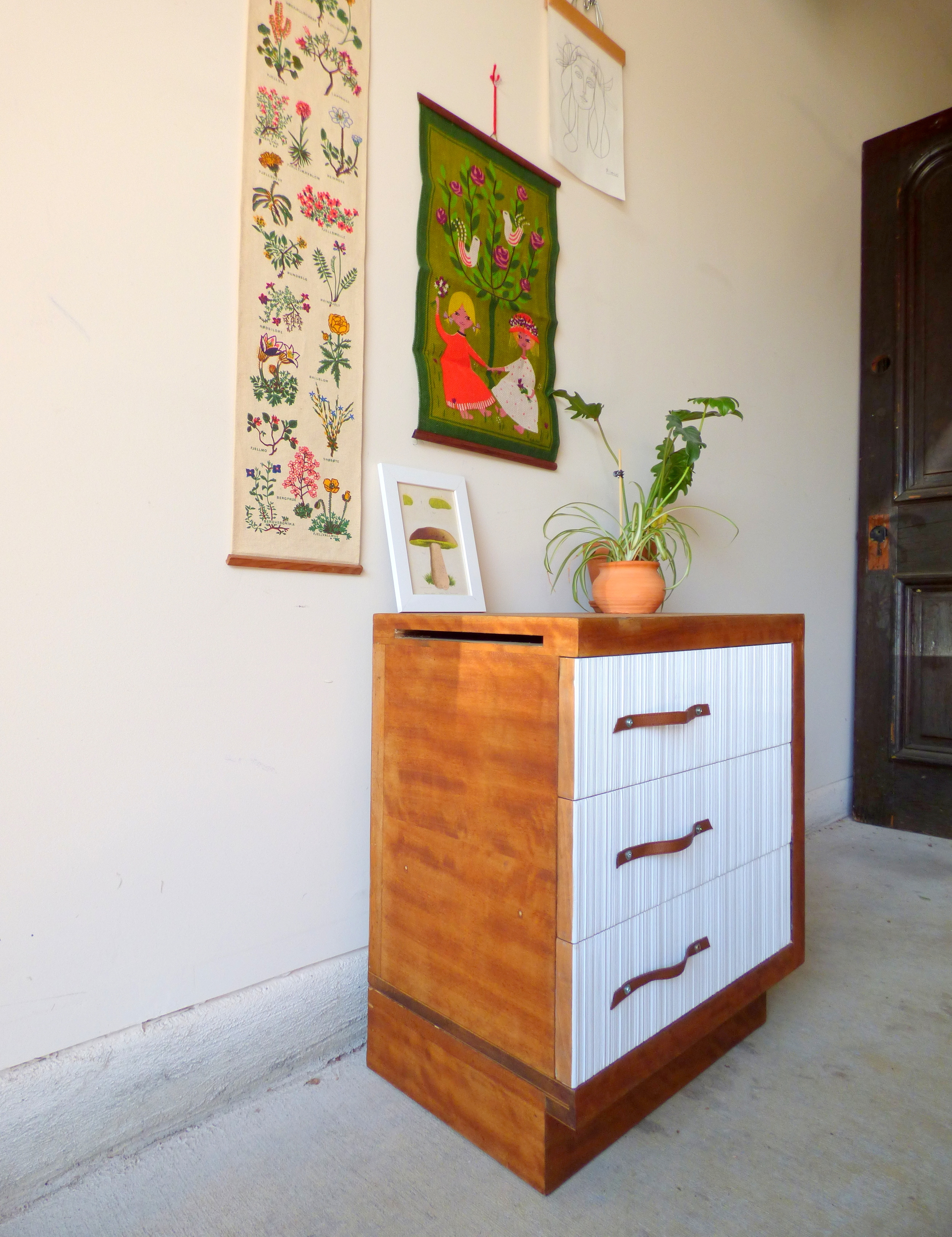
Upon closer inspection, this little odd-ball was certainly a little worse for wear: deep scratches in the finish, funky Christmas tree pulls, yellowing paint... It would be undoubtedly be easier to paint the whole thing but that burled wood grain! So in the end I put in the extra elbow grease and restored him with some repurposed leather pulls.
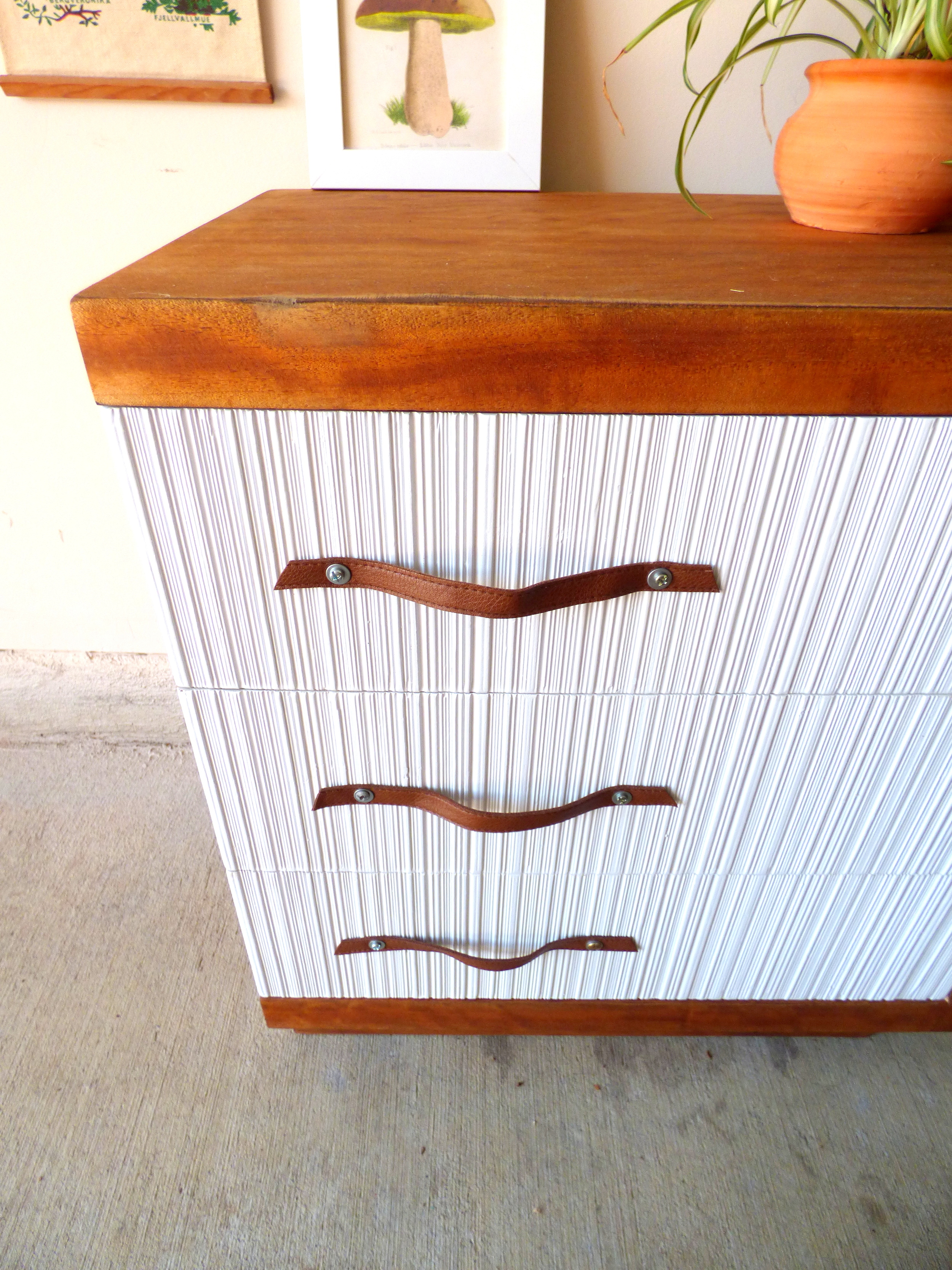
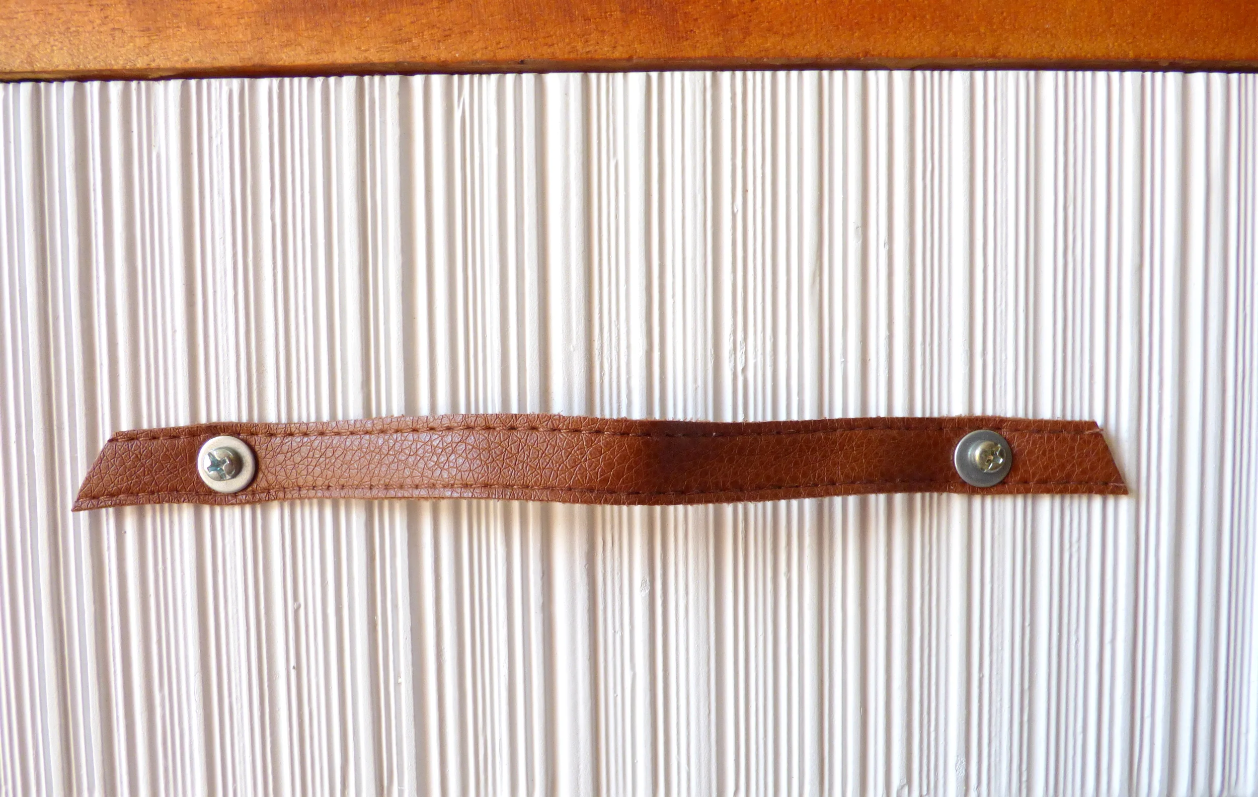
Yes those stylized tree pulls had to go. They were easy to unscrew but the awkwardly-placed holes made finding new pulls to fit difficult. And the textured drawer fronts made filling them in to drill holes for new pulls just as challenging. So here's where I had to get creative with a touch resourceful: I had an old camel leather string belt lying around and cut three lengths that were long enough to fit the off-center holes with a some extra slack for easy grabbing.
I punched holes in the belt for the cabinet screws, threaded them through with a washer for extra reinforcement, and secured them on the inside with a nut.
To add to the quirk of this piece, there is a slot cut into the left side of the nightstand. At first I couldn't make sense of it. I mean, was the nightstand designer so lazy that he didn't want to have to open the top drawer to put some papers away? But then I realized, this designer wasn't lazy - (s)he's tech savvy! This slot turns the top drawer into a charging hub for your personal electronics so instead of having a rats nest of cords cluttering up your bedside surface real estate (like I do), you can stow them away discretely!
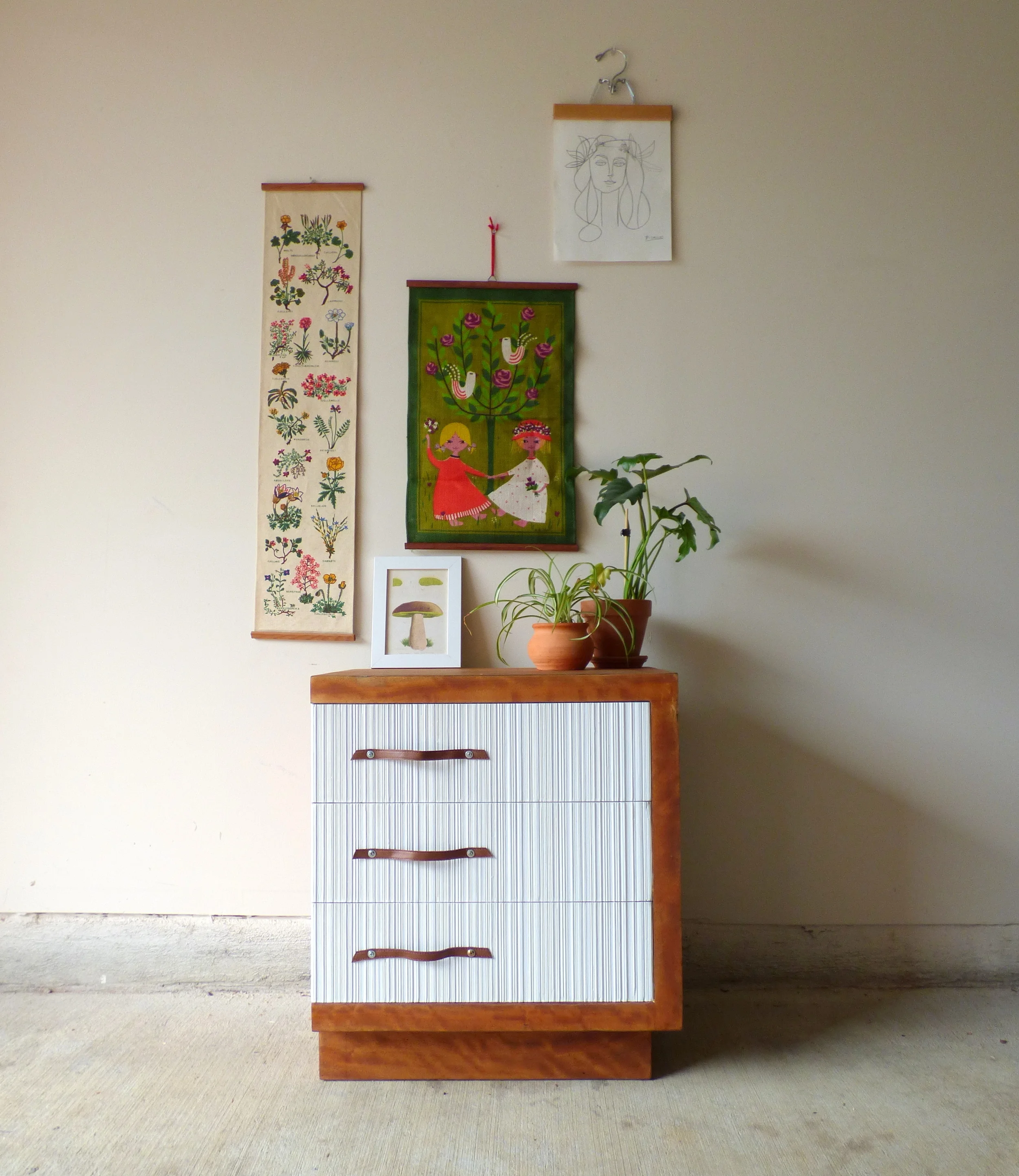
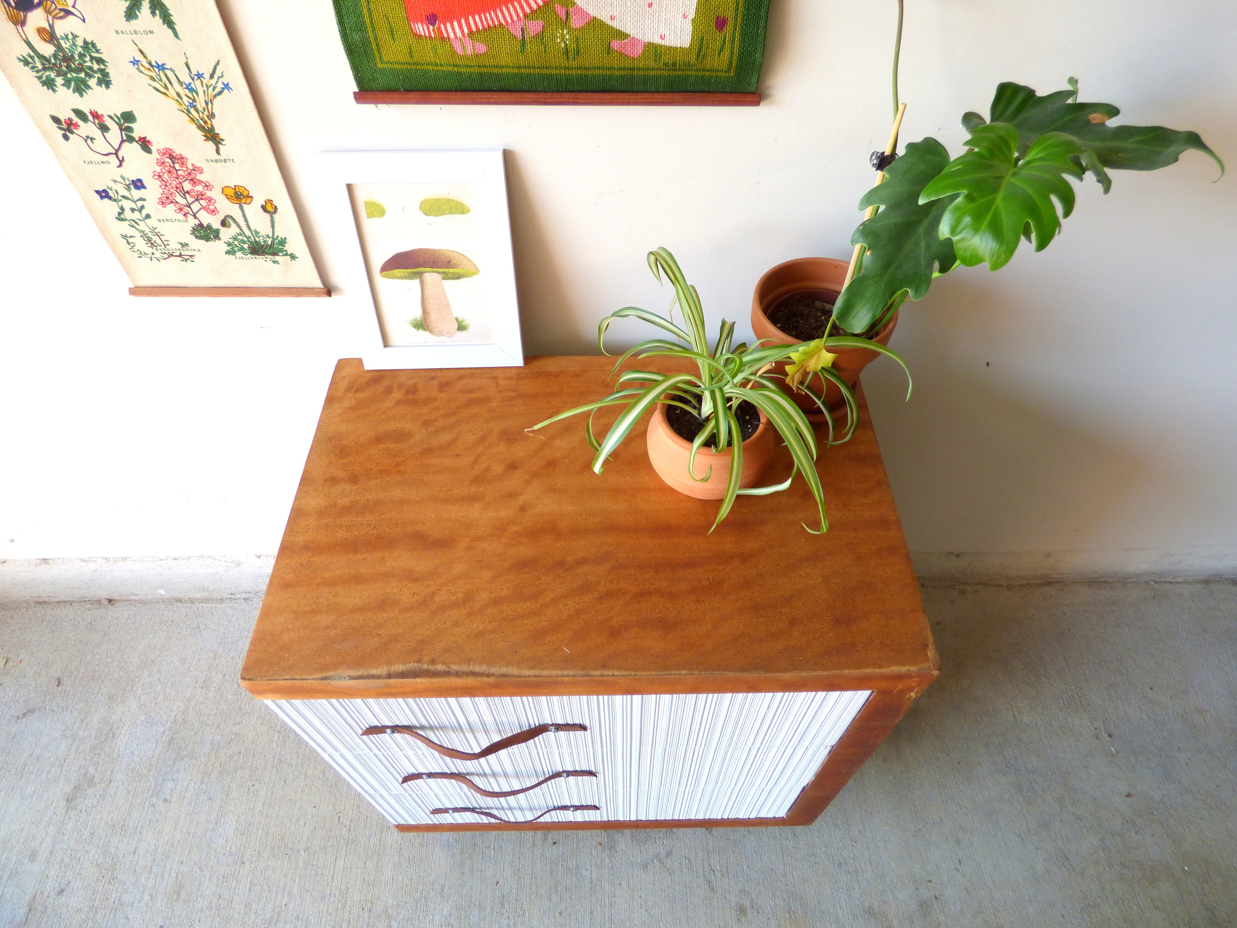
Keeping the piece two-toned lets the texture of the drawer fronts play off of the banding in the warm wood grain.
Keeping the burled wood grain did mean I couldn't mask some of the discoloration along the edges.
I'm not sure what caused the "worn" edges but they are completely flush so the surface is still baby-butt smooth. Plus, I think the markings lend themselves well to the vintage character of the piece.
As a beloved teacher once told me, you have to earn your wrinkles. I think the same goes for vintage pieces: they don't get to be this old without collecting some storied markings along the way ;)
Two-Toned Mid-Century Modern Nightstand
21.5"W x 14"D x 24.5"H
SOLD
$85
If you are interested in this piece or a custom order like it, please contact me at cate@stylemutthome.com.
