Wood Pulls Dresser

 
IMG_0611.JPG
 

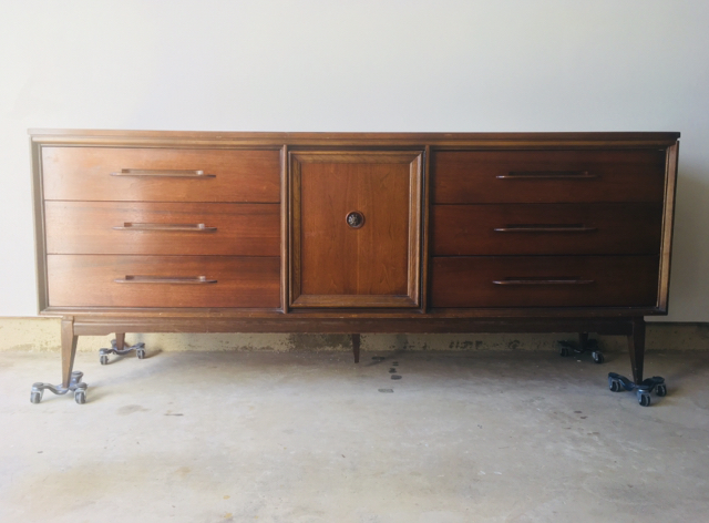
Meet the new workshop.  It’s pretty much the same as the whole workshop - but it's the main reason for my blog radio silence for the last 2 months.  Since April, Caleb and I have been in the throes of moving into a new rental townhouse (pics of that to come I promise!).  Besides the usual packing/ unpacking, we've been putting a lot of sweat equity into the new place (huge shout-out to my paint crew AKA Chelsea and fam!) which has also entailed aking a crash course in drywall to transform the unfinished garage into a suitable new workspace.  

 
IMG_0613.JPG
 

Finally, we’ve got most of the major projects done and I can start accumulating inventory again - starting with this one!

FullSizeRender.jpg

I asked you on Instagram if I should paint or restore and got mixed results so the people pleaser that I am, I decided to do both ;)

IMG_0794.JPG

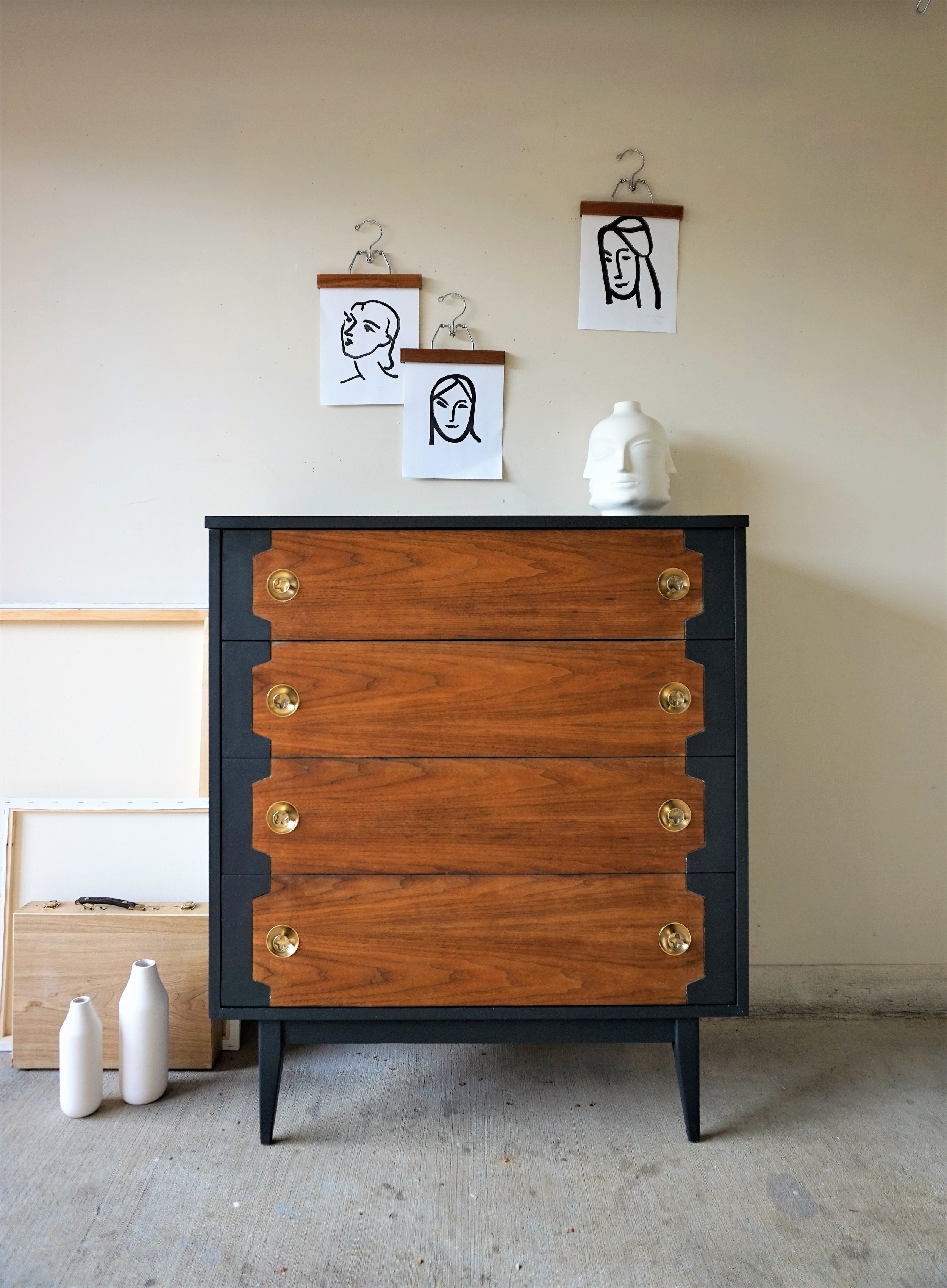
Sometimes I can’t bring myself to paint beautiful wood that’s still in good condition.

IMG_0790.JPG

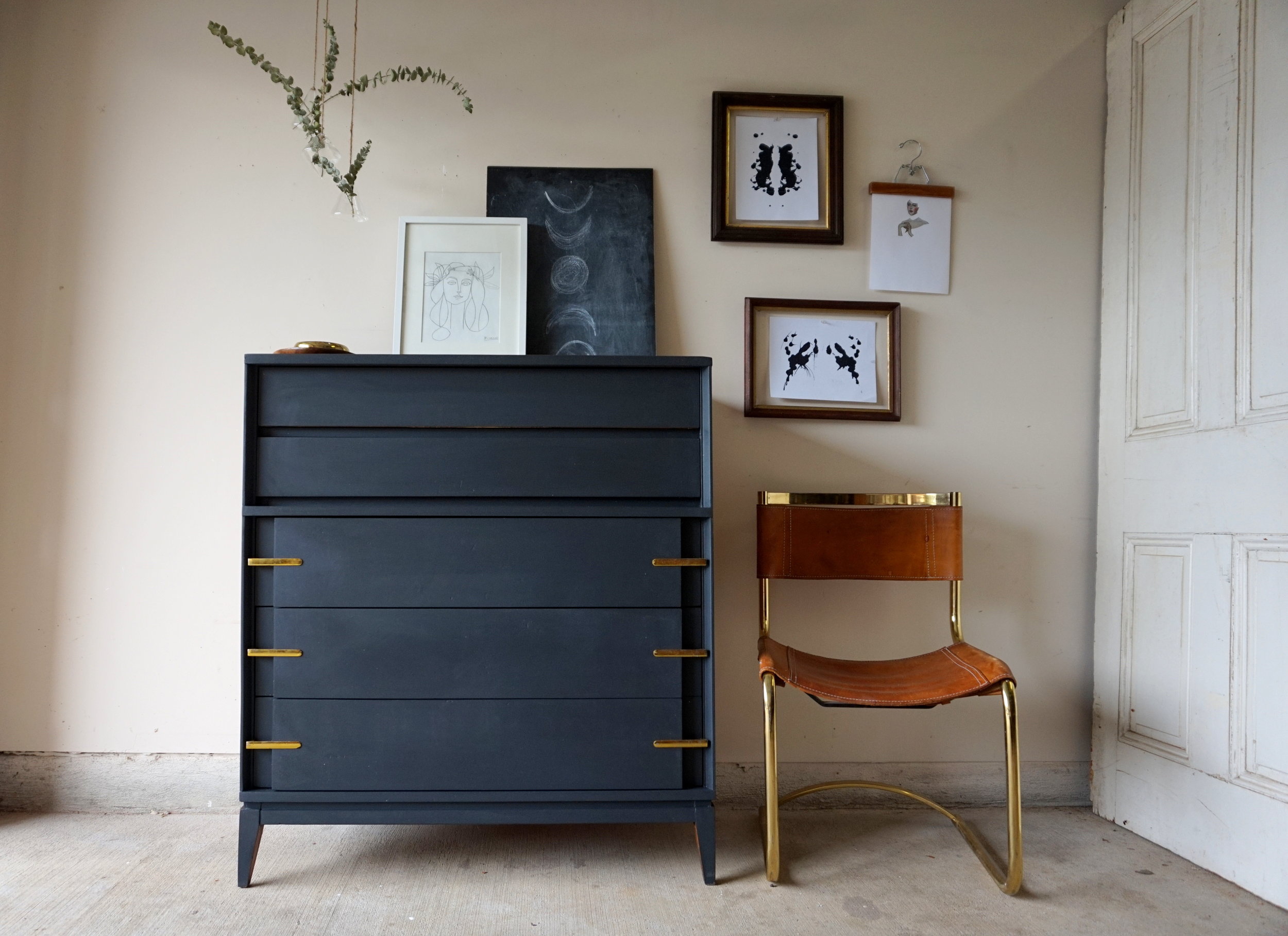
So instead I re-oiled the drawer fronts and did my new favorite take on two-tone and painted the outer surfaces.

IMG_0797.JPG
IMG_0801.JPG

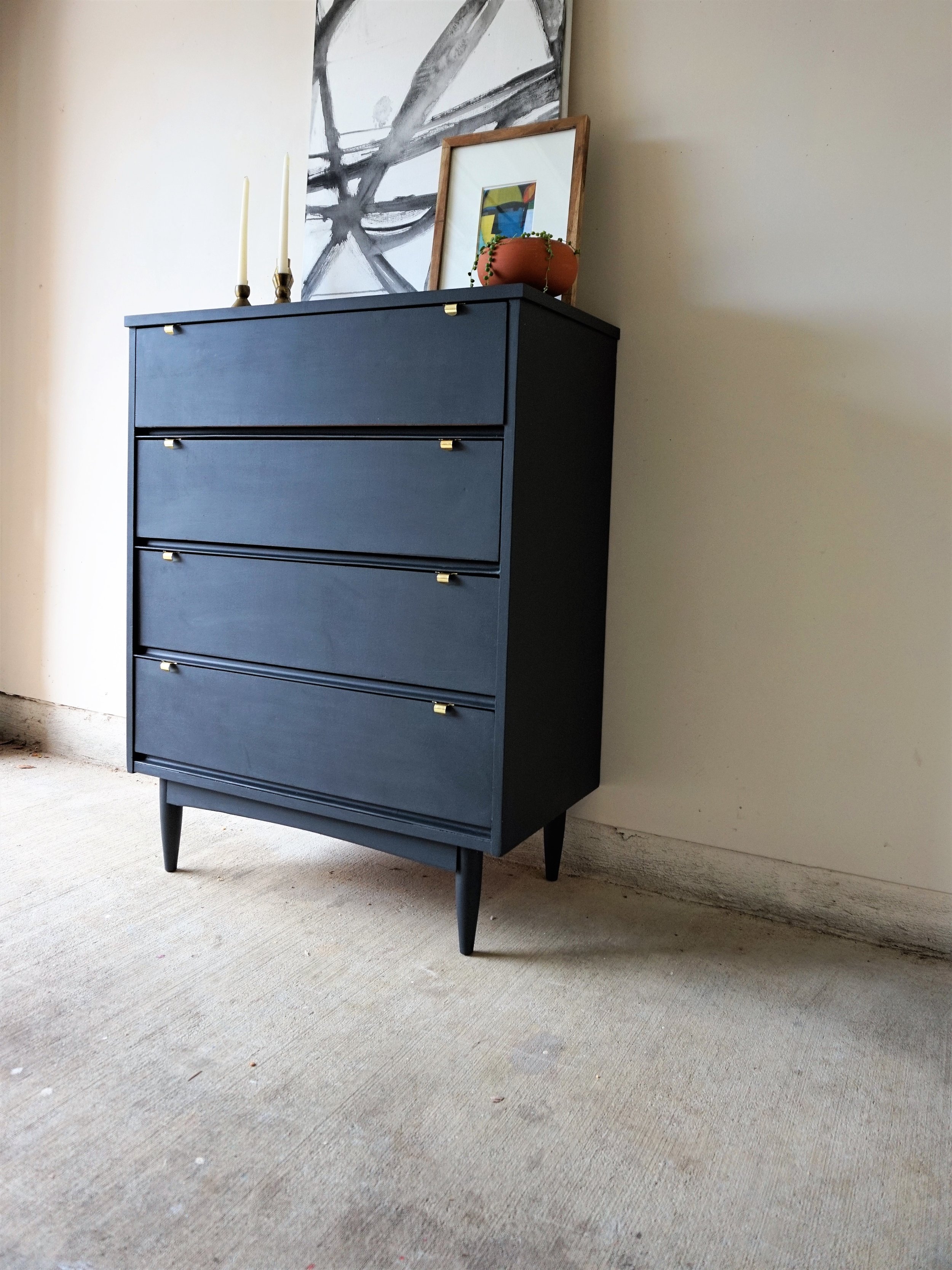
Yes you called it - I used my favorite “Black Boudoir” by Behr yet again.  I mean just look at how moody and inky these other pieces turned out?!? It’s hard not to like.

Pieces featuring "Black Boudoir" by Behr Marquee


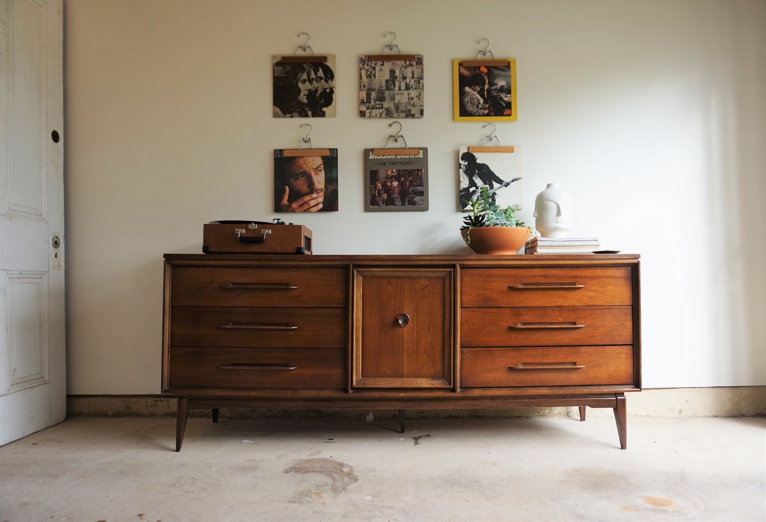
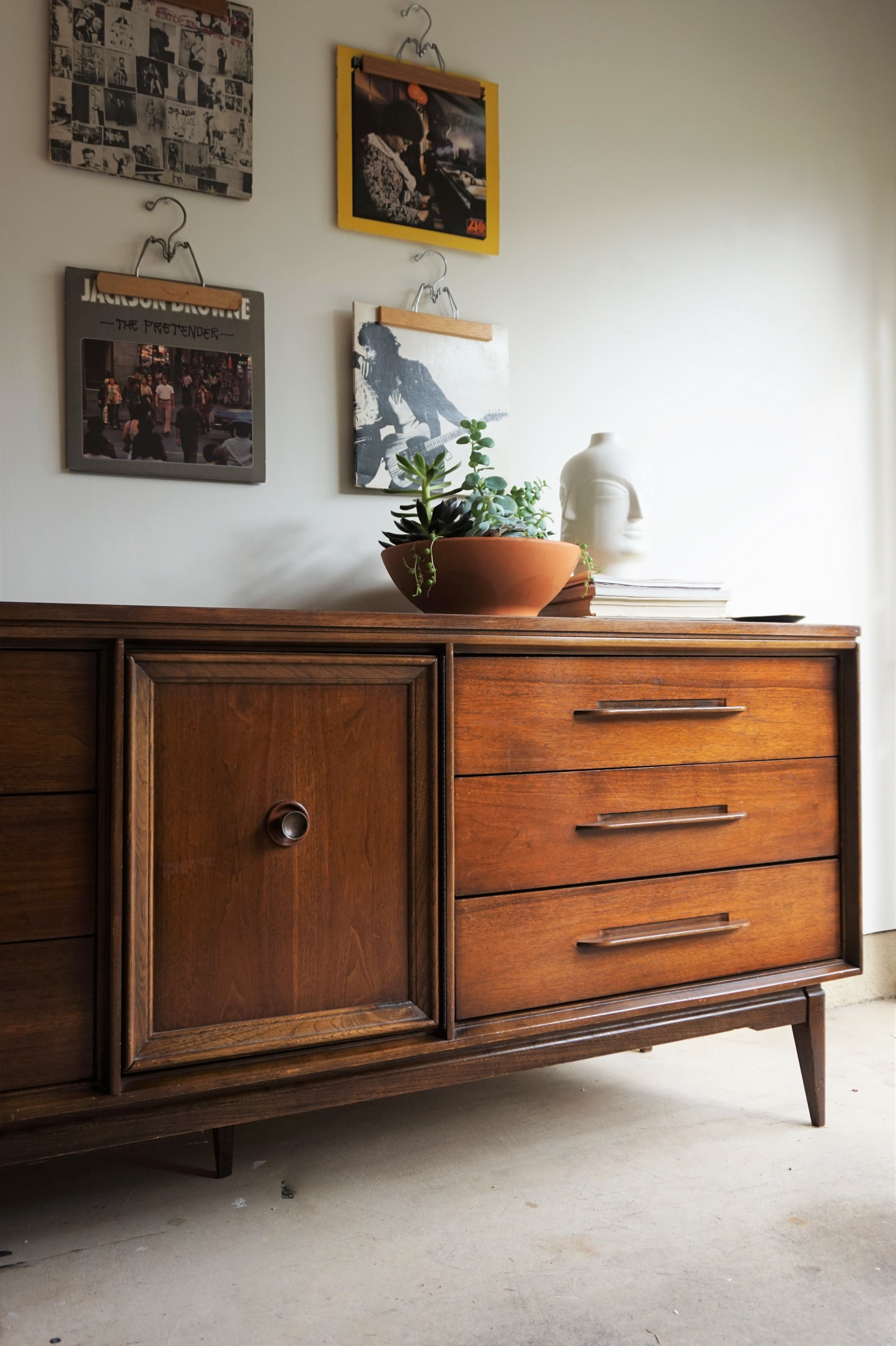
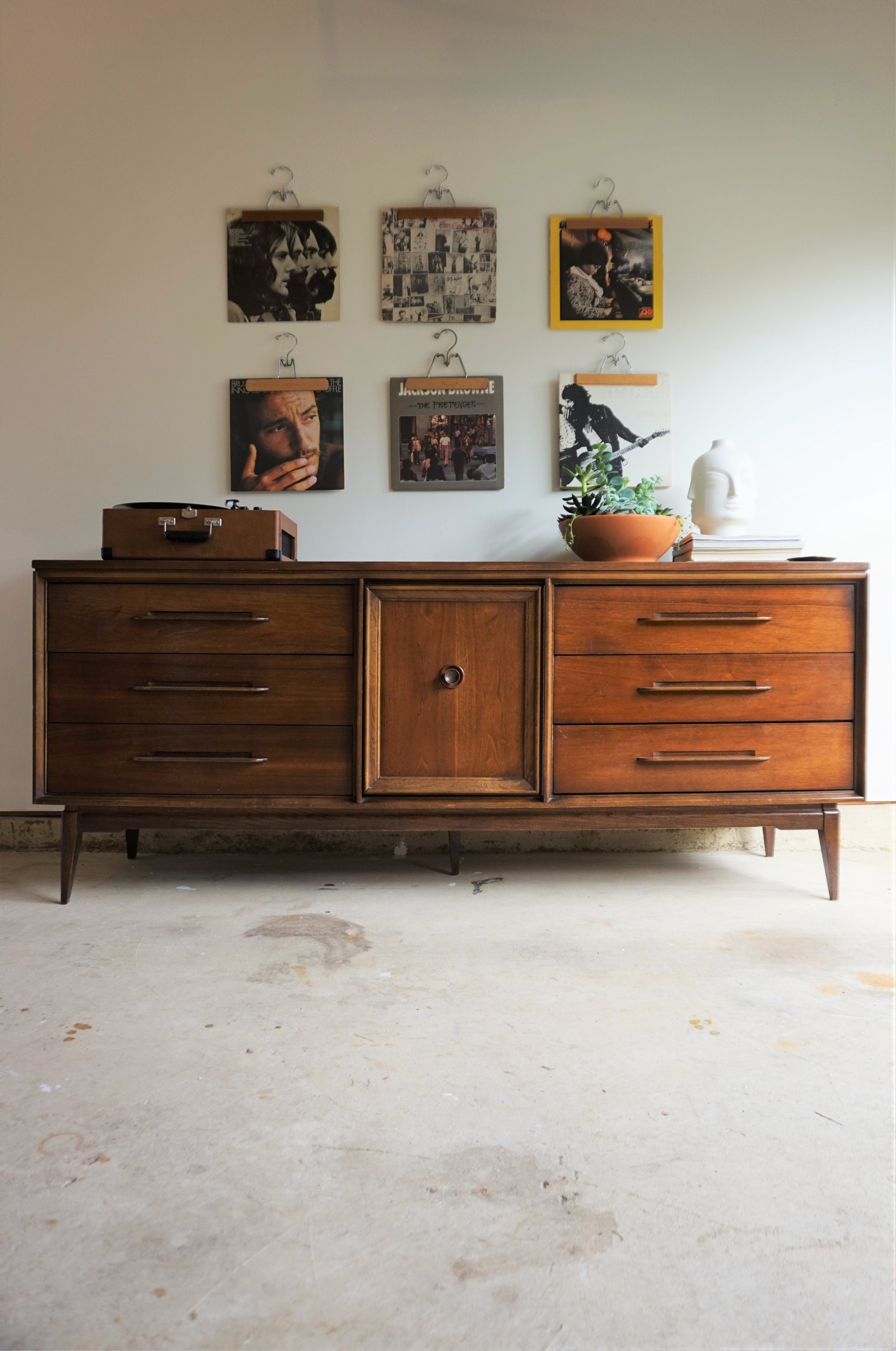
This extra-long beast has sx drawers and a cabinet in the center with three shelves.

IMG_0793.JPG
IMG_0788.JPG

The interior shelving make it an ideal media center or TV stand because you can simply close the cabinet door when you want to hide your electronics.

IMG_0803.JPG

I had a hard time deciding what to do with the knob on the center cabinet door.  The original pull was a fancy floret and read a little too traditional.  After a quick poll on social media, I decided to go with the clear winner - an antique brass knob that has similar contemporary lines to the unique wood pulls on the drawers.  

IMG_0792.JPG

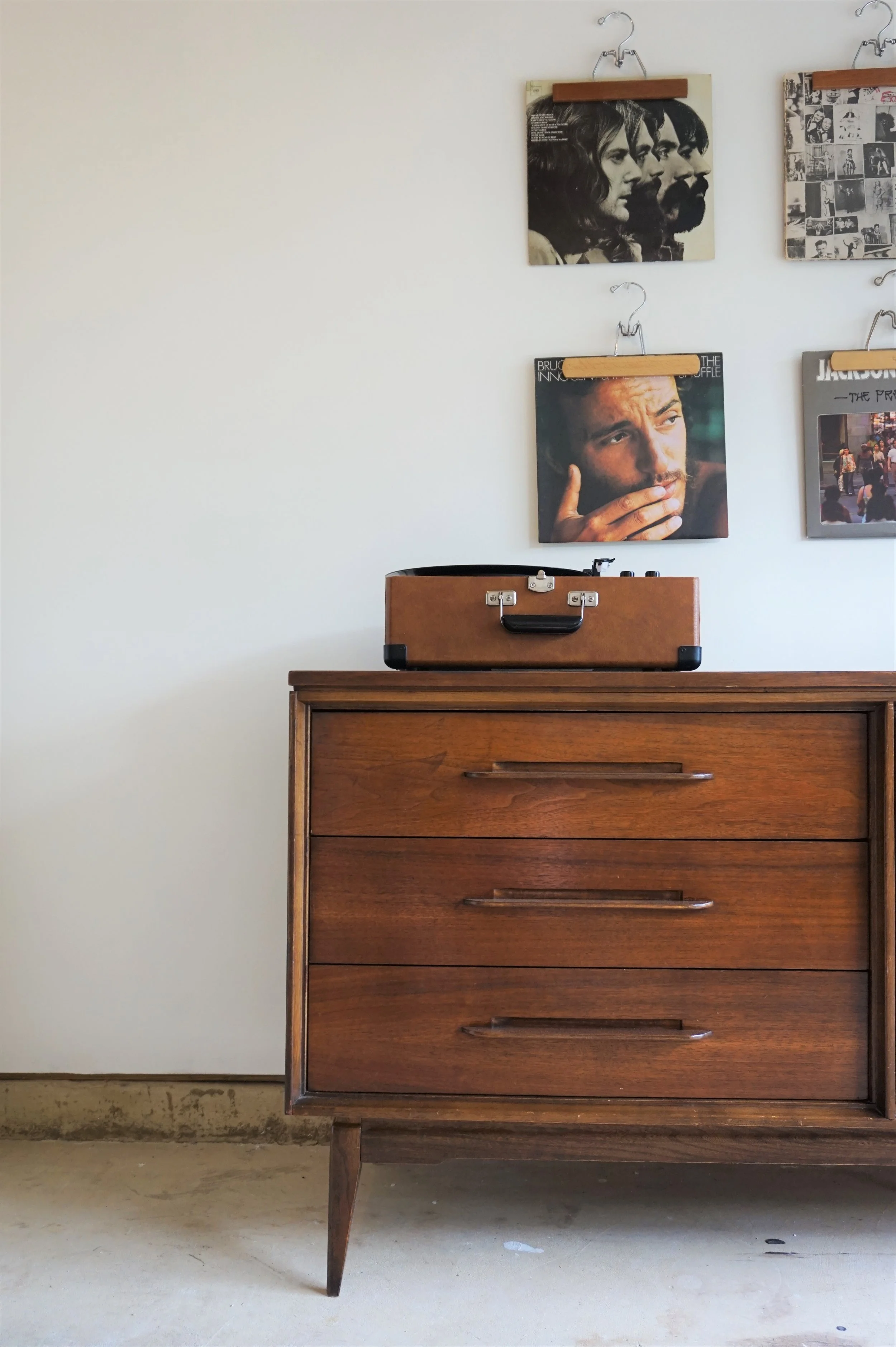
I'm in love with the organic lines of the pulls and the Mid Century Modern tapered legs!

IMG_0791.JPG
IMG_0799.JPG

This piece’s styling is brought to you by my dad’s vintage record collection (which heavily favors Bruce Springsteen I might add).

IMG_0802.JPG

And for a touch of brass - my favorite little “pocket change” tray.

IMG_0798.JPG
IMG_0800.JPG
IMG_0796.JPG

More pics to follow of the rest of our new place (but please let me get back into a cleaning routine first!) - ha!  #letsbereal

IMG_0789.JPG
 
Dark Wood-Pulls Dresser
Now Available for Sale
74” W x 19” D x 30.5” H
$745


If you are interested in this piece or a custom order like it, email me at cate@stylemutthome.com
IMG_4088.JPG
 

Reader Design: Linzi's Mod Apartment

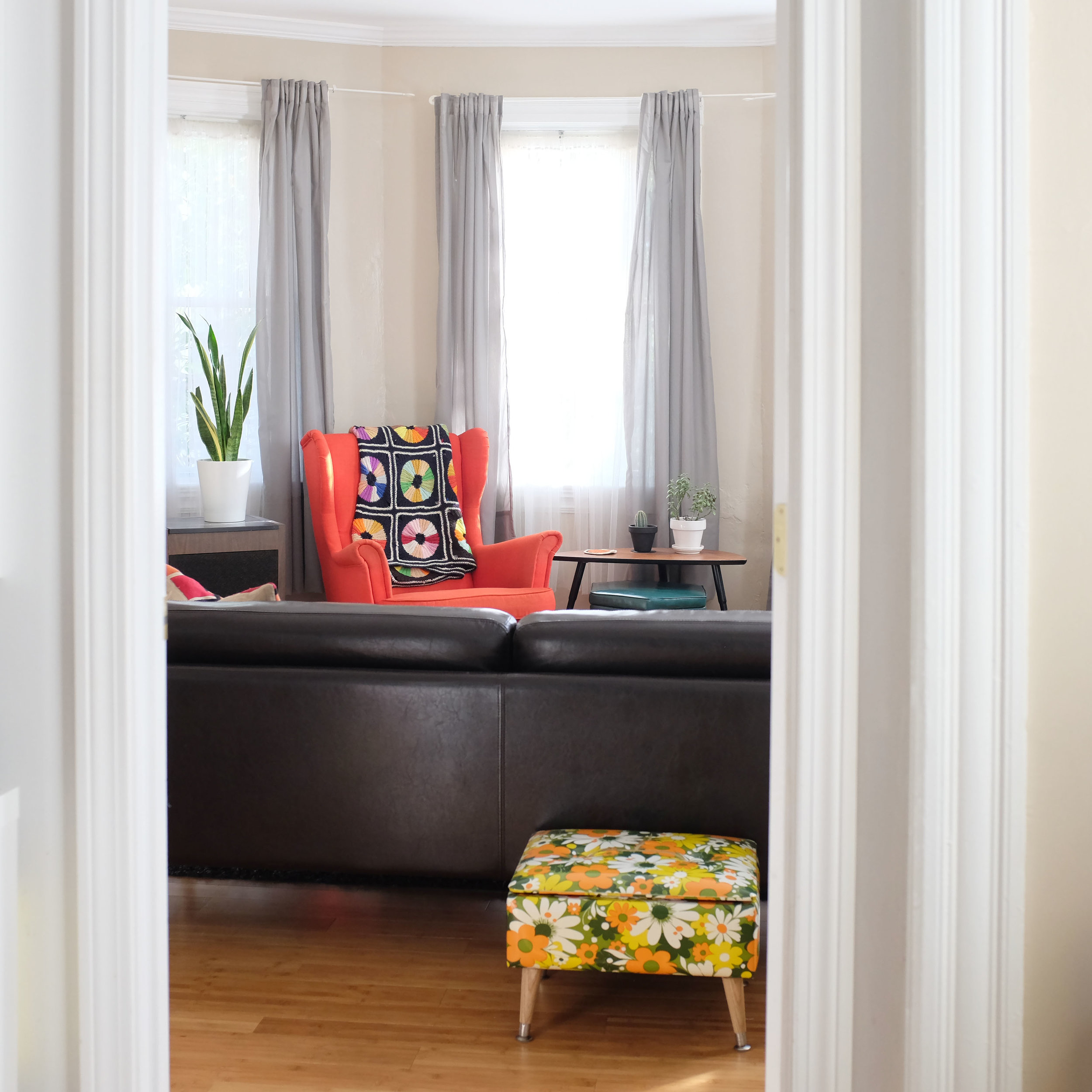
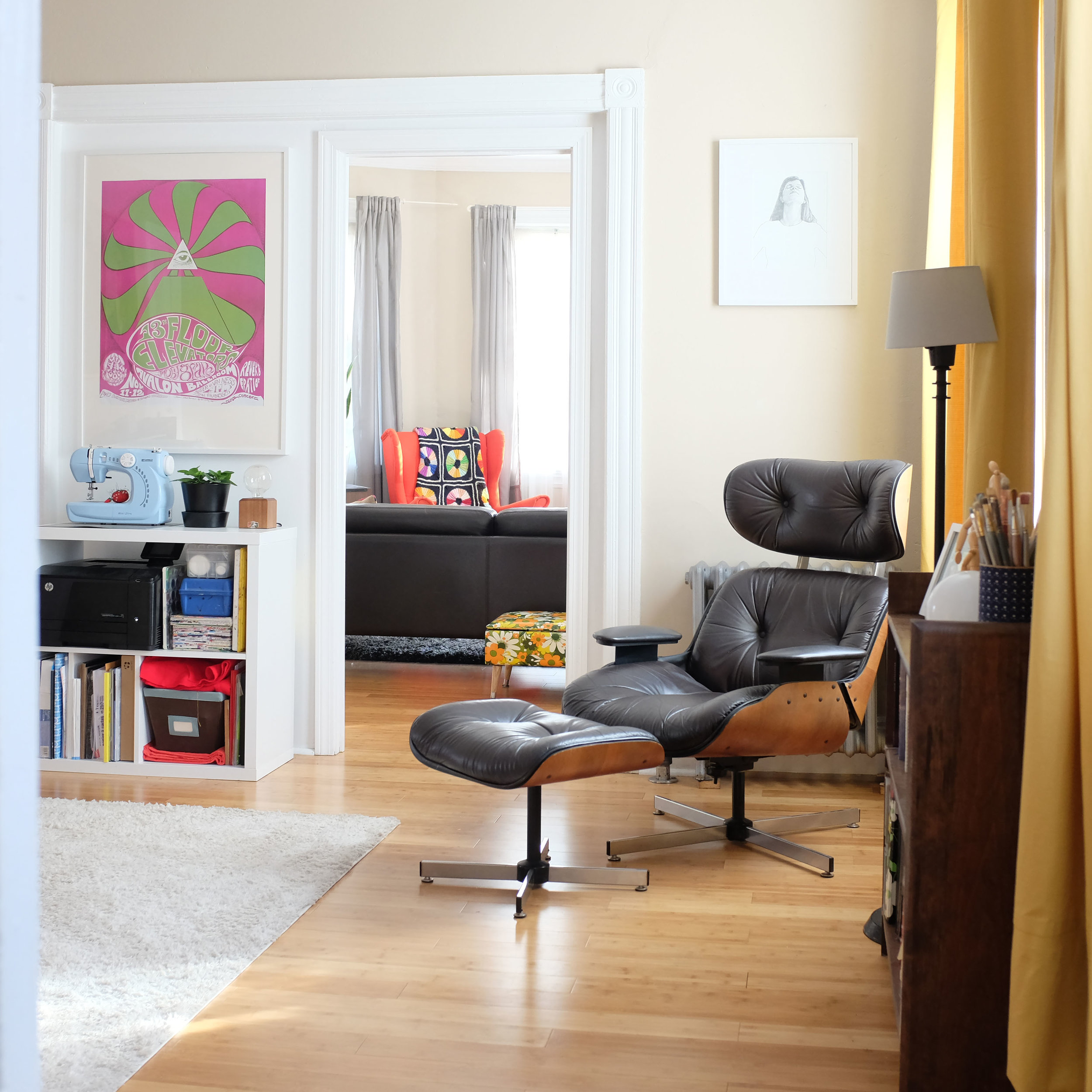
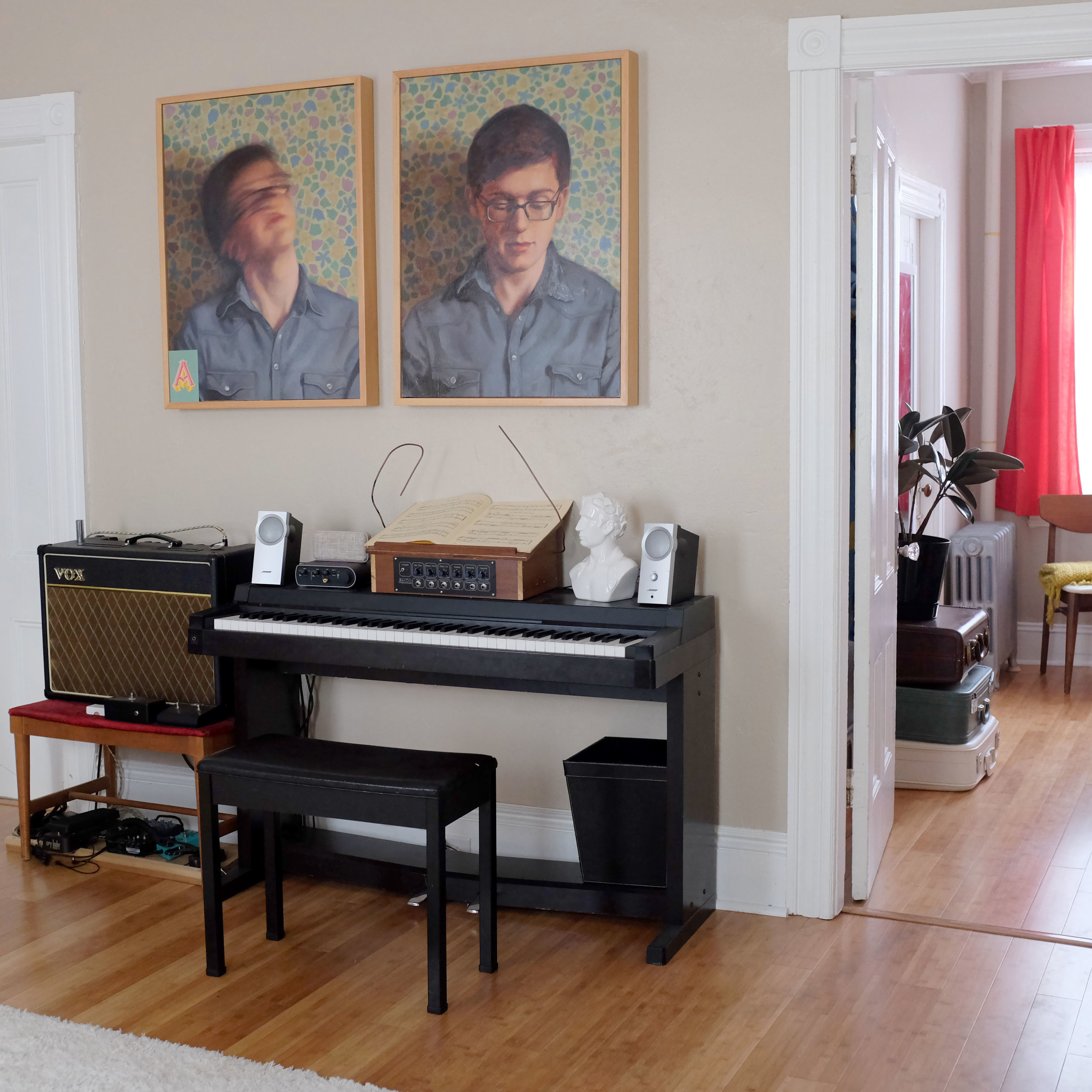
Happy November, Mutts! I hope you all are slowly coming off your sugar highs - but we're here to keep the excitement going with a tour of Linzi's mod apartment in Providence, Rhode Island.

She and her longtime love and fiance Spencer love all things retro and have a true penchant for Ikea, with a heavy dose of thrift to keep things interesting.

We both grew up in upstate New York in a very small town where there wasn’t much to do. In high school, we loved to go thrifting and decorate our bedrooms in our respective houses with our small vintage finds. When we moved in together here in Providence, it was great to combine all our stuff and pick out our own larger pieces of furniture like bed frames and couches together.
LinziClary_Apartment_02.JPG
LinziClary_Apartment_01.JPG
LinziClary_Apartment_03.JPG

Now, most people think of "basic" and "starter furniture" when they think of Ikea. But that really doesn't have to be the case. In our world of e-design, we know that Ikea can offer so many options for pretty and affordable furniture (this isn't an ad for Ikea, I promise). Linzi didn't shy away from the brand when designing her own home, though; in fact, she had to consciously reel herself in!

I think one of the biggest things I’ve wrestled with is loving Ikea almost too much. I love everything that place makes, but I had to step back and make sure I wasn’t living in a place that looked like it could be in their showroom.
LinziClary_Apartment_04.JPG
LinziClary_Apartment_08.JPG
LinziClary_Apartment_06.JPG

I don't know about you guys, but I can hardly pick out the Ikea pieces in this space. Linzi and Spencer did such a great job adding character through both thrifted finds and family passdowns. In fact, Spencer was lucky enough to get one of the most incredible inherited record collections I've ever seen, gifted by his dad. Those records on display really help this couple achieve the overall feel they're going for:

I try to evoke a feeling that is fun and comfortable, in a vintage way. I want people to feel like they can come hang out with us and listen to a record.
 
LinziClary_Apartment_13.JPG
 

Linzi also wasn't afraid to get hands-on to make this home special.

In the kitchen, my favorite pieces are the vintage wooden table chairs. I got all 4 for $10 each and put in a lot of elbow grease refinishing them (they were painted bright green before).
LinziClary_Apartment_11.JPG
 
LinziClary_Apartment_12.JPG

The retro and bauhaus vibe is carried through in every room, all the way to the bedroom. It's bright, happy, and effervescent, just like the 1960's era on which it draws.

Linzi, thank you so much for showing us around! We love what you've done with the place. Follow Linzi along on Instagram at @linziclary for more.

See you next week,

McKenna Sig.jpg