Hi friends! Over the better part of the last decade I have found a tremendous amount of enjoyment from home decorating and styling. I desire to further my knowledge and soak in as much as I can both from a creative standpoint as well as the business. A large part of this business is understanding the ebb and flow of trends. Trends have always fascinated me even well before I stepped into the interior decorating world. How does an idea take off and become trendy? Who gets the ball rolling? Is it every day people or the rich and famous?
Then you have trend predictions which further add to my curiosity. One of the first trend predictions I started following a number of years ago was the Pantone color of the year. Didn't know there was such a thing? Here, take a look at some of their recent selections:
How do they pick the color year after year? I understand it from a marketing standpoint. With every declaration of which color will be leading the way that year you see the ripple effect right down to the most accessible and popular shopping destinations, such as Target, HomeGoods, Pottery Barn, etc. And then the celebrity designers partnering with those stores, (think Emily Henderson and Target), start styling their projects with the newest goodies available, showing everyone just how to incorporate the declared color of the year in a tasteful, manageable way.
This year the color turned out to be a twofer! They picked not just one, but two colors for 2016: Rose Quartz and Serenity. Here, they created this image of a faceless woman wearing a flowing cape to make the announcement:
Since this is an honest place I'll admit, I wasn't terribly excited by this combo. It brought me back to the days of when we had new boy-girl twins under our roof and everything was baby pink and baby blue. And really, other than a blush crocheted throw pillow at target I've barely noticed these colors make any strong statement this year.
Then something strange happened. I started noticing a different color breaking through the color-of-the-year combo - dark green!
If you're a big Fixer Upper fan you may recognize the photo above and the one below. They're just two examples from Joanna Gaines' strong use of dark green in their latest season which finished earlier this year. I noticed this color in just about every episode and I absolutely adored it.
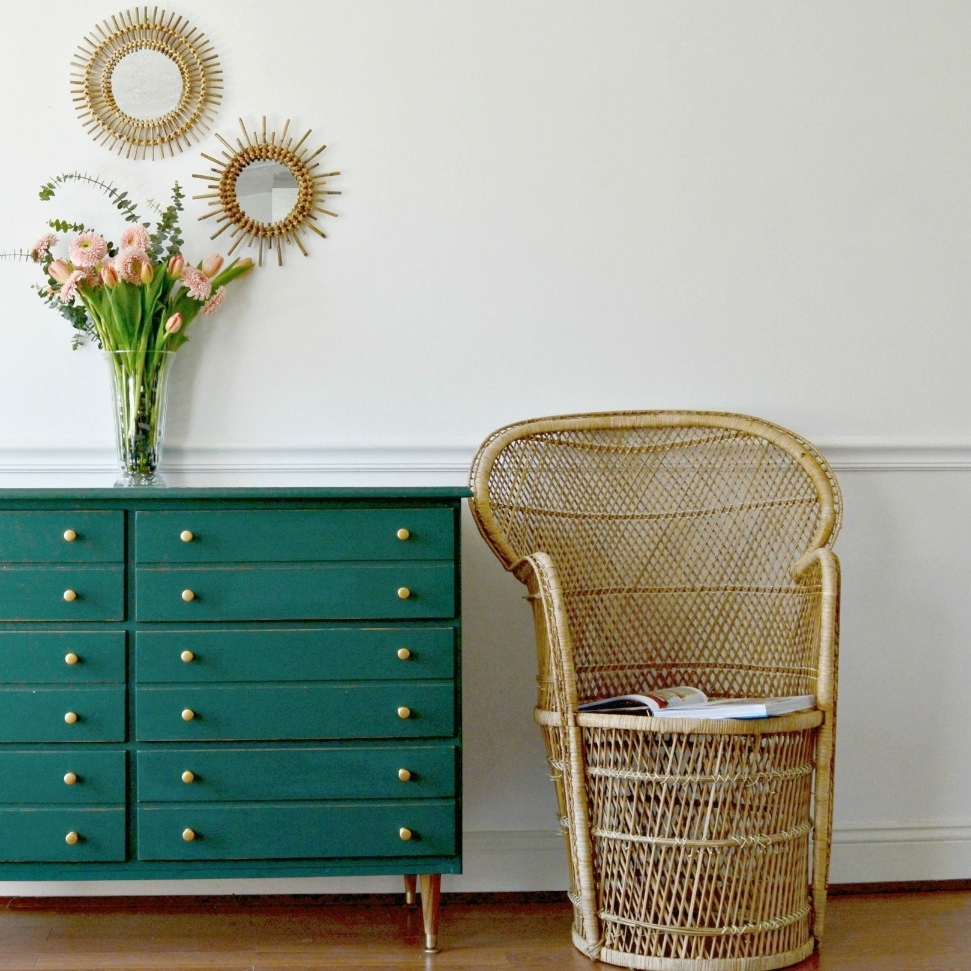
And with the Fixer Upper cult following, I wondered if anyone else noticed as well. So I picked up a can of dark green, (Behr's 'Secluded Woods'), to refinish a mid-century dresser last Spring and it got scooped up within days. I had so many inquiries on that piece that once it sold, I had an immediate request for a nearly identical custom piece, (below on left).
I took the Summer mostly off from refinishing to focus on my family and some design jobs, but as soon as the kids went back to school last week I painted this beauty below in Ralph Lauren's 'Scholar Green', and it was taken within two days.
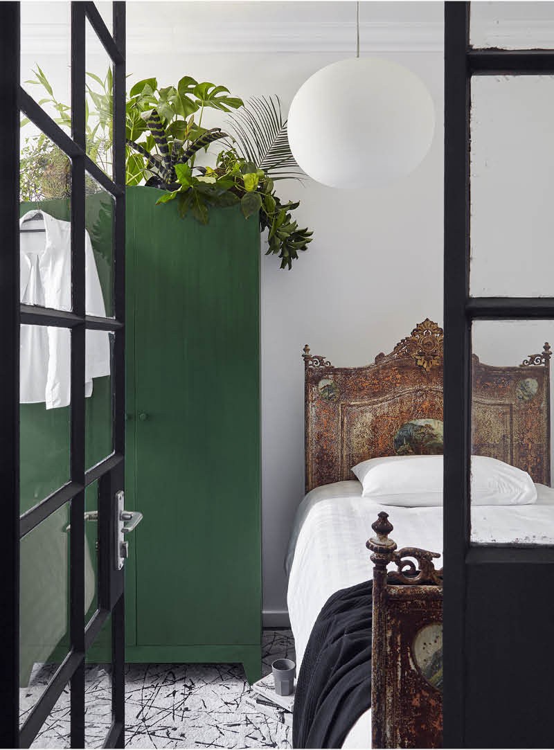
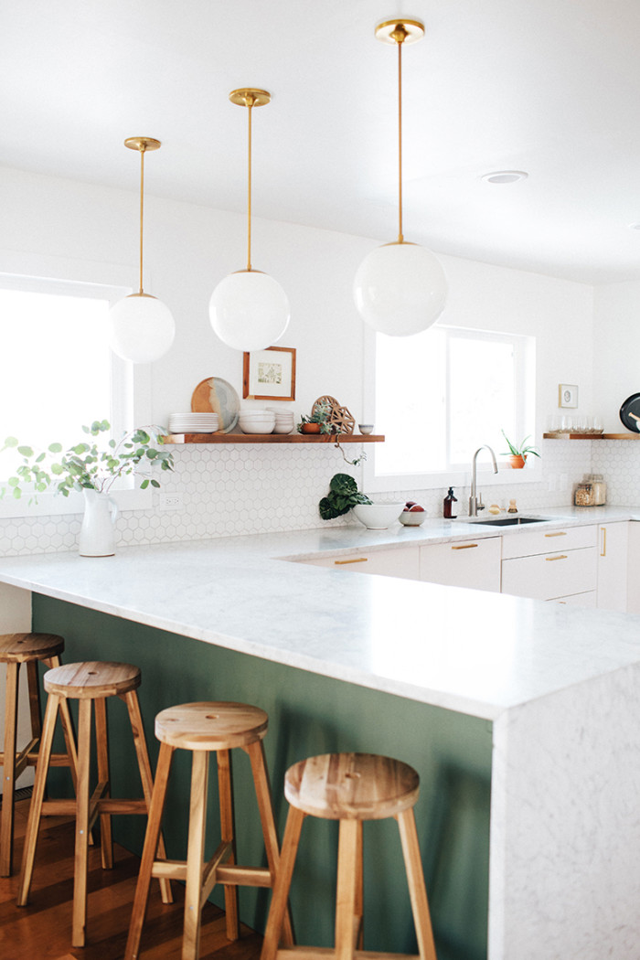
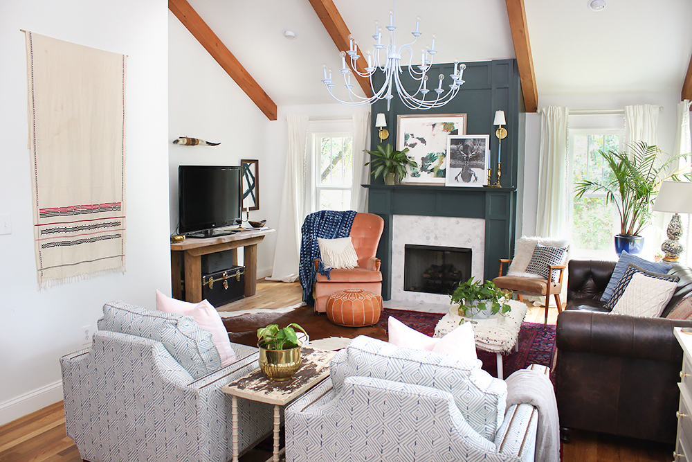
Is there a new color trending? Will it carry over to 2017? I sure hope so as we've got a little surprise to show you in a design job we're working on right now! But until we're ready to reveal, here are some more stunning examples of this moody color casually staking its claim:
Thank you all for stopping by!


