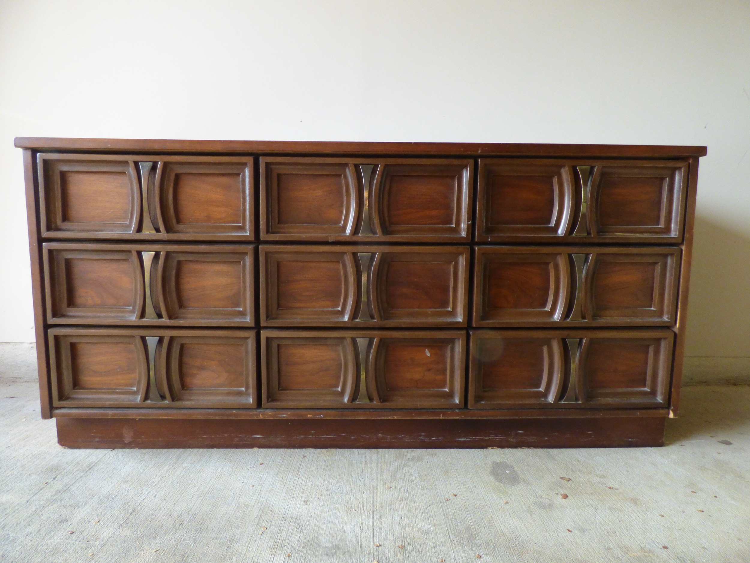
Guys! I have a new apartment! More importantly though, said new apartment has a GARAGE!!! You know what that means my friends... I finally have my own StyleMutt workshop! No more slugging pieces up flights of apartment stairs [and by me I mean Caleb]. No more heavy chemicals in the kitchen. No more painting piece on the balcony - much to the amusement of our befuddled neighbors. And since we moved in November, I've acquired not one, not two, not three, but FOUR new pieces to work on at once... Praise the Lord for concrete floors, unloading in the driveway, and storage space. I promise to give you a decor tour of our actually living space this week, but in the mean time one of my projects needs your input ;) I have a STATEMENT of a dresser in the queue for furniture flip bucket list item number 5 [why do I always go out of order?!?]
Let's take a look at our pre-jeweled candidate. Ain't she a beaut? My super strong and oh-so-talented younger sister-in-law Casey [Chelsea's lil sis] helped me pick up this lovely lady.
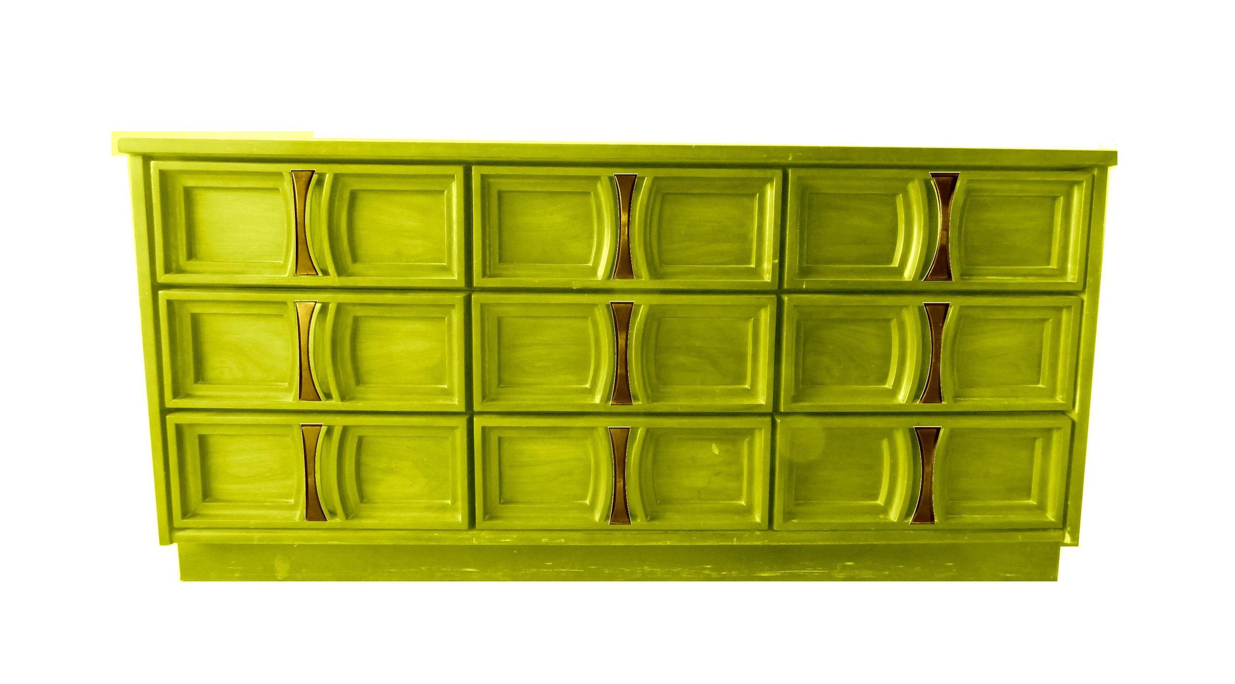
With the help of some handy-dandy rendering, I have mocked up this dresser in some bright colors and would love your input! Some of these colors I've used before in refinishes but I'm not ruling any repeats out just yet. I want the dresser to tell me what color it wants [and you all too]. So first up, let's try on teal:
Yes yes I know what you're thinking - Cate, haven't we seen this color from you before...? And you're right. I have done a teal & gold one-two knock-out punch combo before with this lil bamboo number:
I just can't help myself. I look at that teal rendering and I get giddy. But I have more colors to try on so I'm open to being swayed... Next up: Poppy.
There's just something about a pop of red am I right? I could see her all done up in scarlet, making a statement in any room like this little she-devil:
Source: Little Green Notebook
But what about an enchanting emerald? Chelsea won me over with her emerald highboy last fall and I've been aching to give green a go of my own.
Green pieces are becoming more and more a symbol of luxe in the home - a saturated viridescent could be a winning hit for some shopper.
Or maybe I go really bold with a vivid magenta...
Source: For Chic Sake
It's girly and glam and would be a show-stopping moment. But would it be too risky for a prospective buyer?
I've always been drawn to a rich Chartreuse! Anthro has the right idea here with a green-gold campaign piece.
Source: Anthropologie
But again, is citron too decor forward or should I say decorward?
And then there's navy. Another color I have played with before. Last year I put a navy & gold dresser on my 2015 flip list and I LOVED how it turned out on this campaign piece.
Even though the blue came out more saturated in these photos, a deep deep blue was such a winning look.
Perhaps it's indulgent to include navy in my jewel-tone prospects but I couldn't help but mock up this long-and-low in a deep navy. Where magenta and chartreuse may be too risky, navy is rapidly becoming the new neutral and so easy in integrate with any home's style.
so what say you? Which of these gems would you like to see come to life? I'd love your feedback in the comments below or on vote on instagram!


