She’s real! That’s the first thing I said to my husband when they held up our daughter to us in the OR. We didn’t plan on a C-Section but when your baby’s safety is at risk, you quietly cry your way through your first major surgery and wait for the wet sounds of a newborn using her lungs for the first time. And you thank God that there’s a healthy baby on the other end of those 38 hours in labor.
And you name her Huntleigh Wild:
Huntleigh is a blend of two family names - Hunt for Caleb’s grandma and Leigh for my sister. It seemed like the perfect way to honor both sides while still feeling unique and special. Yes, she’ll probably have to join the ranks of never-finding-your-novelty-keychain and spelling-your-name-for-just-about-everyone but I managed ok. And I grew to love being “Cate with a C.”
Wild became her middle name in utero mostly because it was all we knew about her at the time. We wanted a name that fit her personality but how do you choose one without ever having met? What we did know was she would kick up a storm until daddy wanted to feel and then mischievously stop right when he’d put his hand on my belly. She would demand bagels from me on the reg and then reward me with dragon-fire heartburn. She’d wait until I stood up and immediately slide into my bladder - pressing it like a gas pedal so I’d literally run to the bathroom. The little wildling. Don’t be fooled by that sleeping façade - she’s 8lbs of the best kind of trouble.
Now, I promised you a tour of her nursery and am holding myself accountable to that since it’s item No.5 on this year’s furniture flip bucket list. Now that she’s here and we’ve had a chance to settle her little space, I’m finally ready to make good on the promise with today’s tour!
It’s a shoebox of a room but we figure she won’t notice. When we found out we were pregnant, we gave our first born (the dog) the larger guest room as his consolation prize. That meant the wild child would have to make the little 3rd bedroom work so I set about painting over the “boy-blue” and gray racing stripe with a gender-neutral white (ironically over labor day weekend).
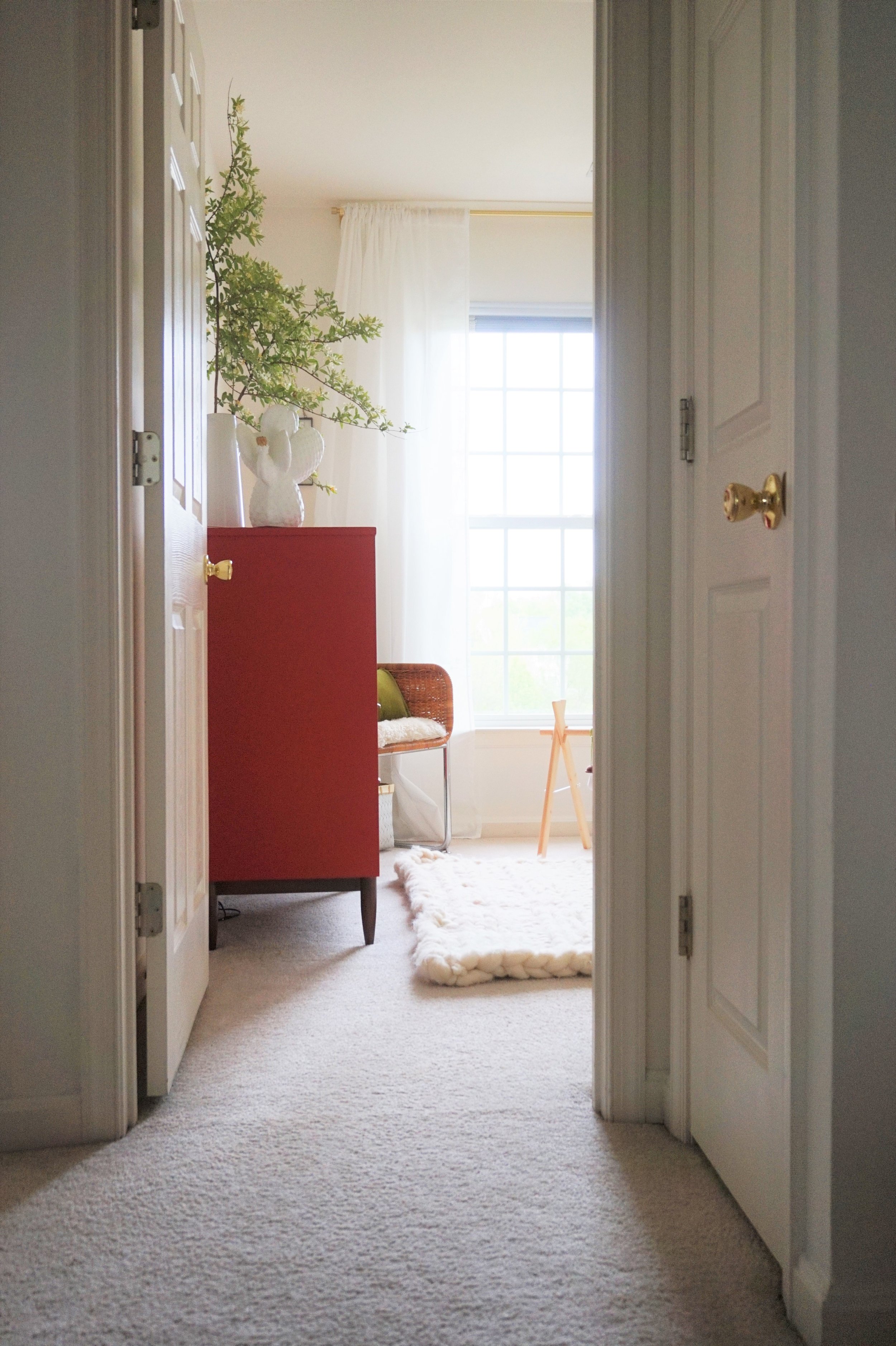
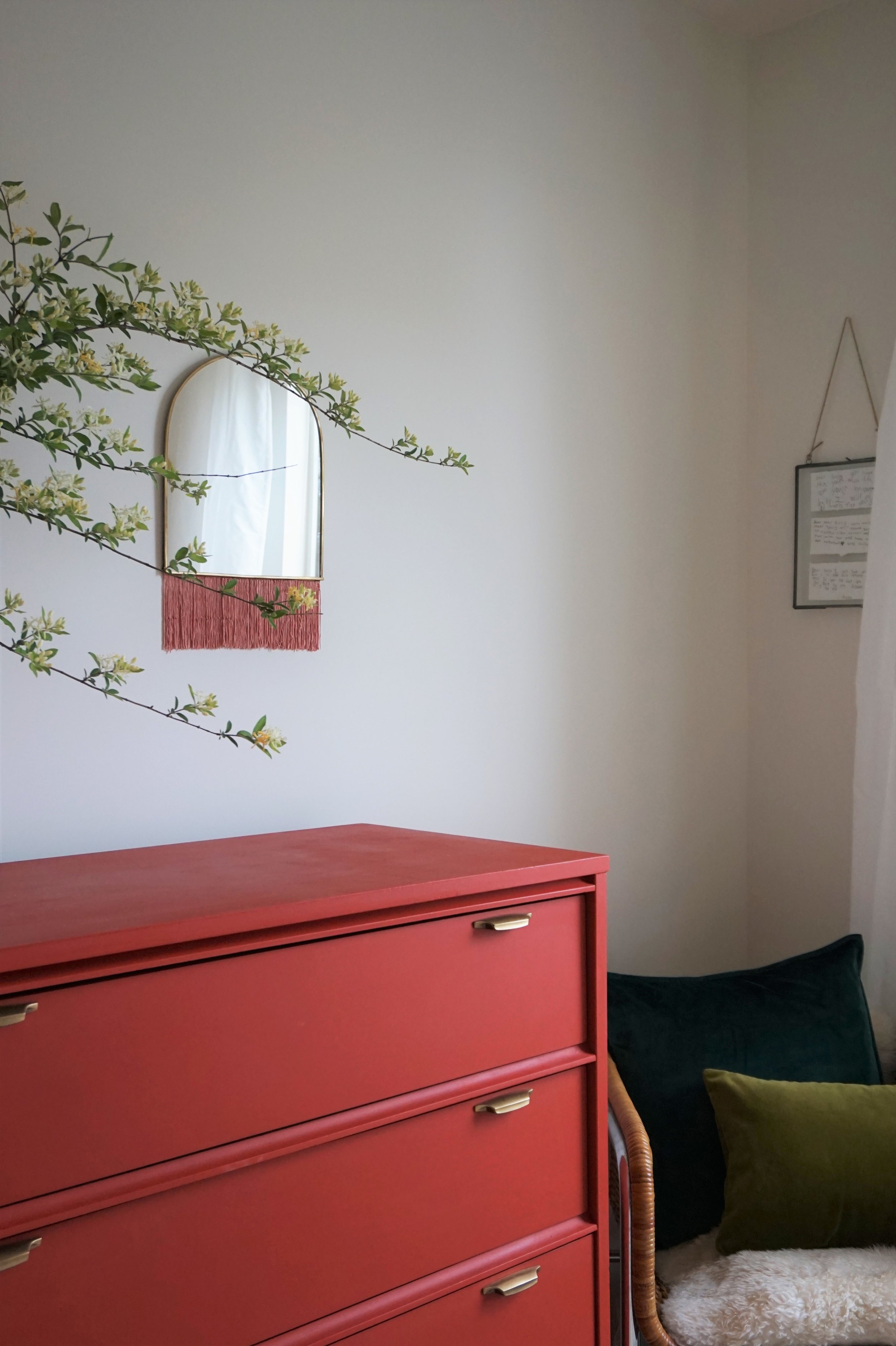
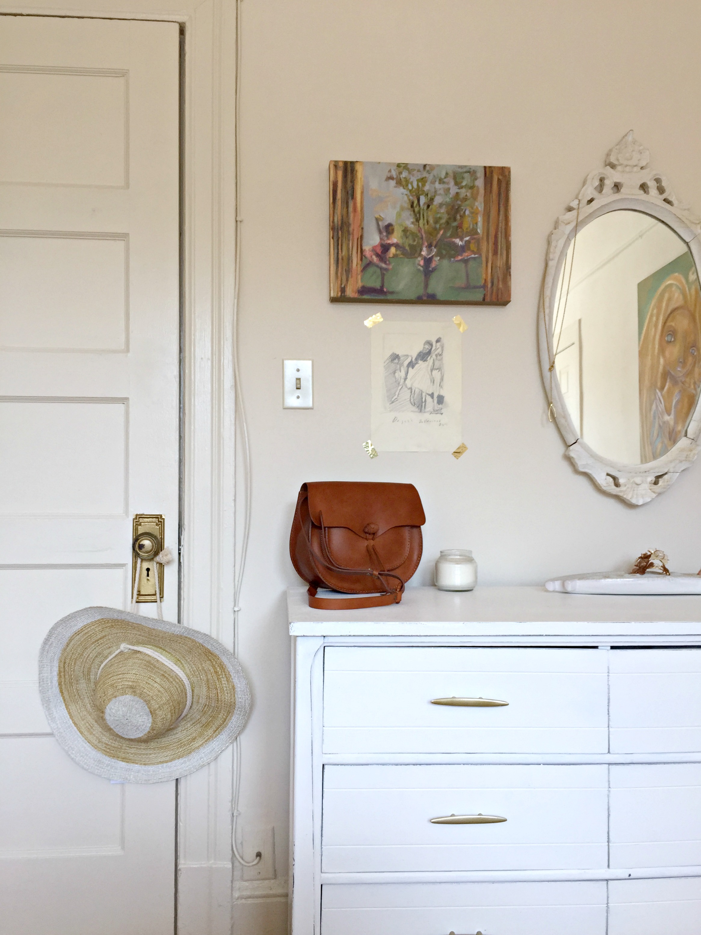
The white walls are not only rental-friendly (you’re welcome landlord) but they are my favorite forum to allow for playful pops of color. The main one being this persimmon dresser which you may recognize from this post. I knew even then that I was going to keep this bad boy for baby’s room (but I wasn’t quite ready to share the news with you all yet ;)
And what else but a wild honeysuckle branch to welcome our wild girl to the world.
The dresser is a little tall for a changing table so we hid one of those in the closet for easy access. The orangey-red flirts with the olive and chartreuse velvets in the room. It’s edgy but still softened by the touches of blush like this fabulous fringe mirror.
This mirror almost didn’t happen. It was a sweet steal on H&M Home which meant it went out of stock in a snap. I was actually crushed and kicked myself for slapping it on the registry instead of purchasing it. In my tunnel-vision desperation (I am my own worst client), I checked H&M Canada and UK just in case they could ship internationally. No luck. So I settled for keeping the browser open on my phone and would check it periodically just in case it magically went back in stock. And the day before I went into labor - I kid you not - I longingly opened the browser window to find that not only was the mirror back in stock, but it was half price! I was a mirror miracle!
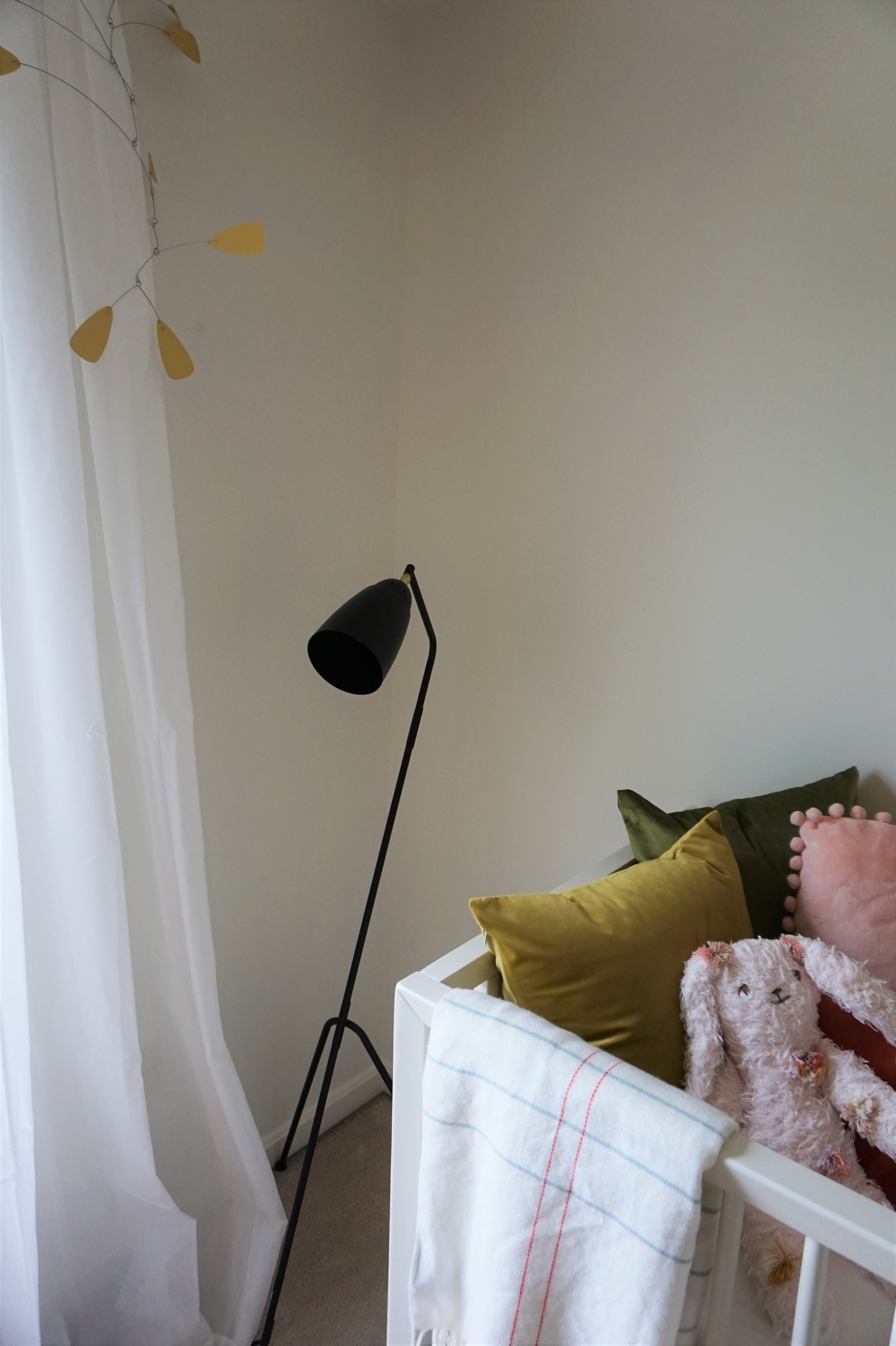
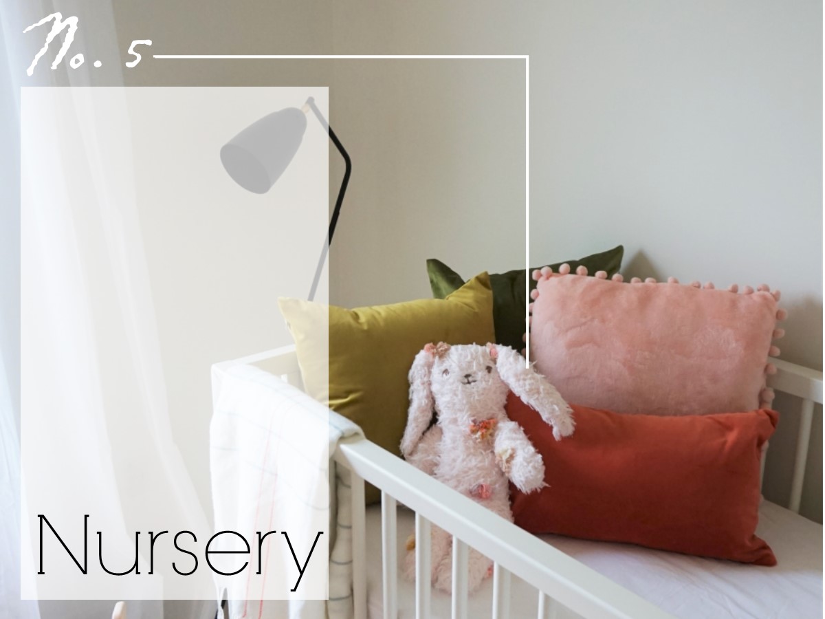
Across the room is her crib. I’ve admired the DwellStudio Mid-Century inspired nursery line for a while (I even modeled this dresser after their gray three-drawer dresser). My parents were kind enough to gift us their adorable 3-in-1 crib for baby H as the crib of my dreams (and hopefully hers - sleep training am I right??).
The pillows are purely decorative and won’t actually be here during nap time but they capture the nursery color scheme and add some plush texture.
The pink rabbit was a special gift from my sister - Huntleigh’s namesake. We each grew up with a stuffed bunny bff. Mine was technically her back-up if she ever lost Baby but me being the typical little sister… I just had to have one too. So I helped myself thankyouverymuch. I at least had the good sense to give mine a cool name (my sis is the self-proclaimed non-creative of the fam). I still have Gizmo to this day - and if you pay attention on this tour, you can spot him watching over Huntleigh’s room from his place of honor.
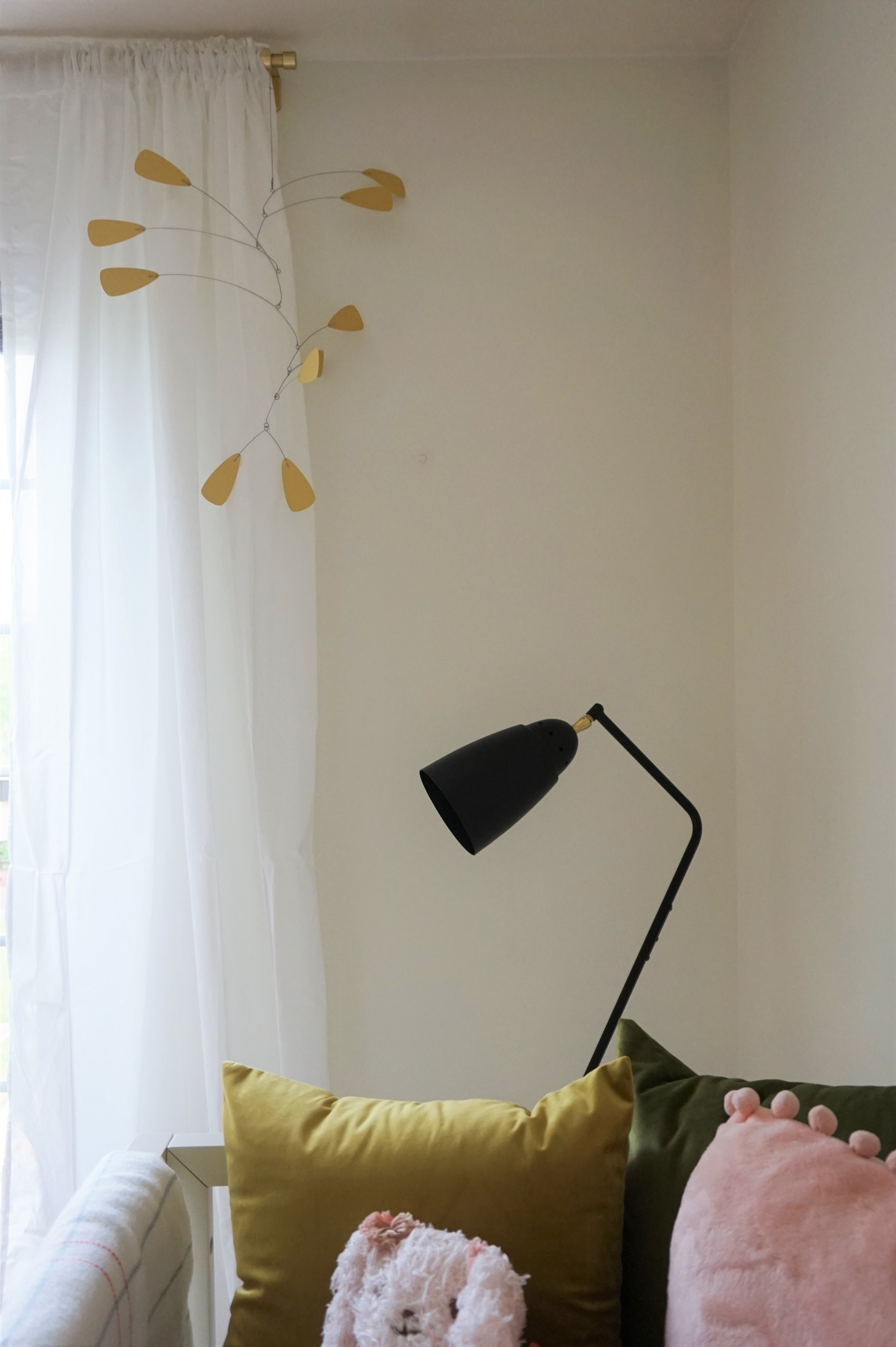
The tricky thing about Huntleigh’s little room is there is no overhead lighting. A good floor lamp was crucial for any nighttime feedings or diaper changes. I registered for this one on Amazon and have been greatly pleased with it’s ambiance as well as it’s modern design. It even came with a soft-white LED bulb that won’t make the lamp hot to curious little fingers.
The mobile is another modern touch in the room. Made in Croatia, this Calder-inspired hanging art is just one of the ways I’m hoping to introduce a love of art to baby H.
I’ve also stocked up on some fun art-themed baby books that sit on drawers-turned-shelves along with some of her other fun toys. Oh and points for Gryffindor if you spotted Gizmo!
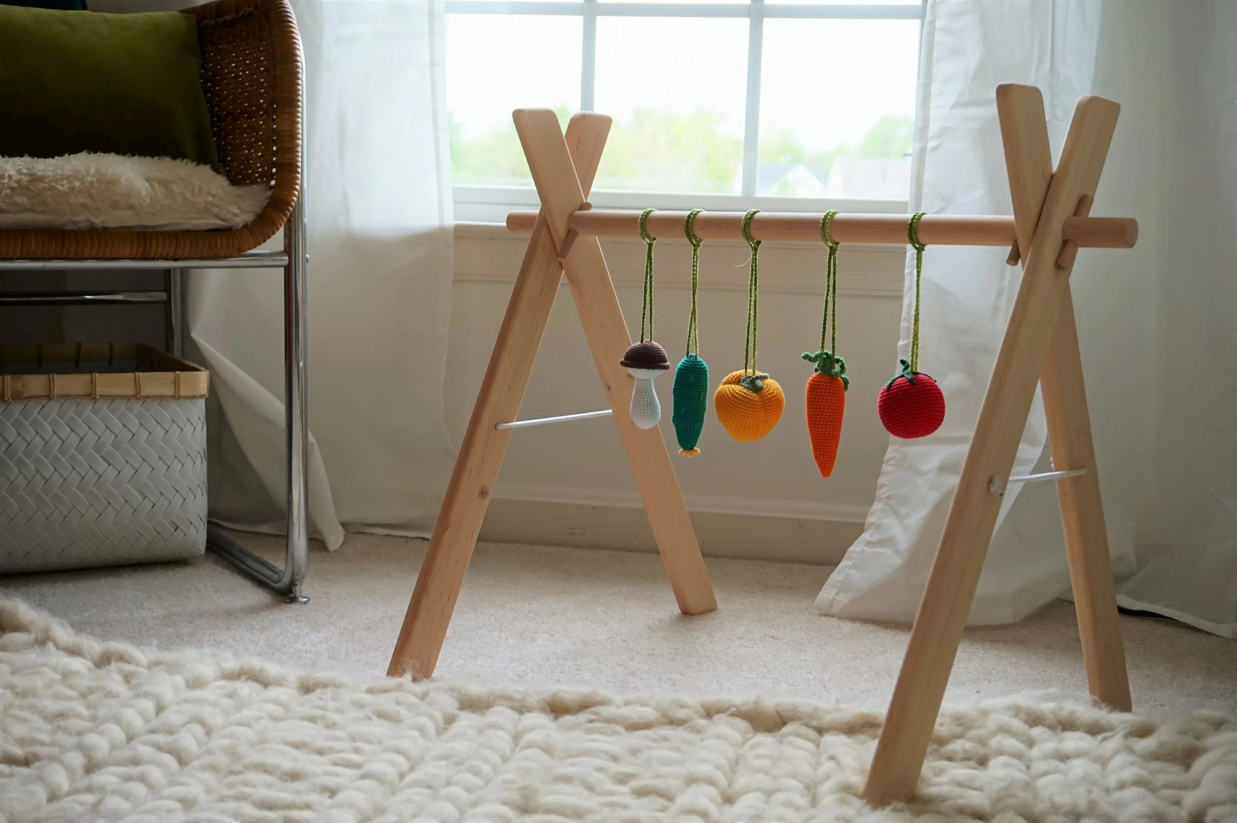
For the most part, we’ve kept toys to a minimum knowing that baby stuff has a way of multiplying like rabbits (no offense Gizmo). I’m sure Huntleigh will have hoards stashed around the house when she’s graduated from the boobs and bowel-movement phase and becomes more interested in bells and whistles.
I’d be remise if I didn’t mention one other special piece of art in the room - framed notes from Huntleigh’s cousins (Chelsea’s kids). It hangs by the window above my nursing chair - displaying personalized messages to their littlest cousin that I will cherish forever.
We kept Huntleigh’s name a secret so they each addressed their notes “dear baby girl.”
Alrighty folks! That pretty much concludes this nursery room tour and it’s time to cross item No.5 off the list.
But for good measure, why don’t I throw in a quick little bonus tour of the dog’s…er… the guest room next door.
Please ignore my postpartum bed-making skills. I promise to do better if you ever come to stay with us - what is with that crooked sheet-to-comforter ratio?!?!
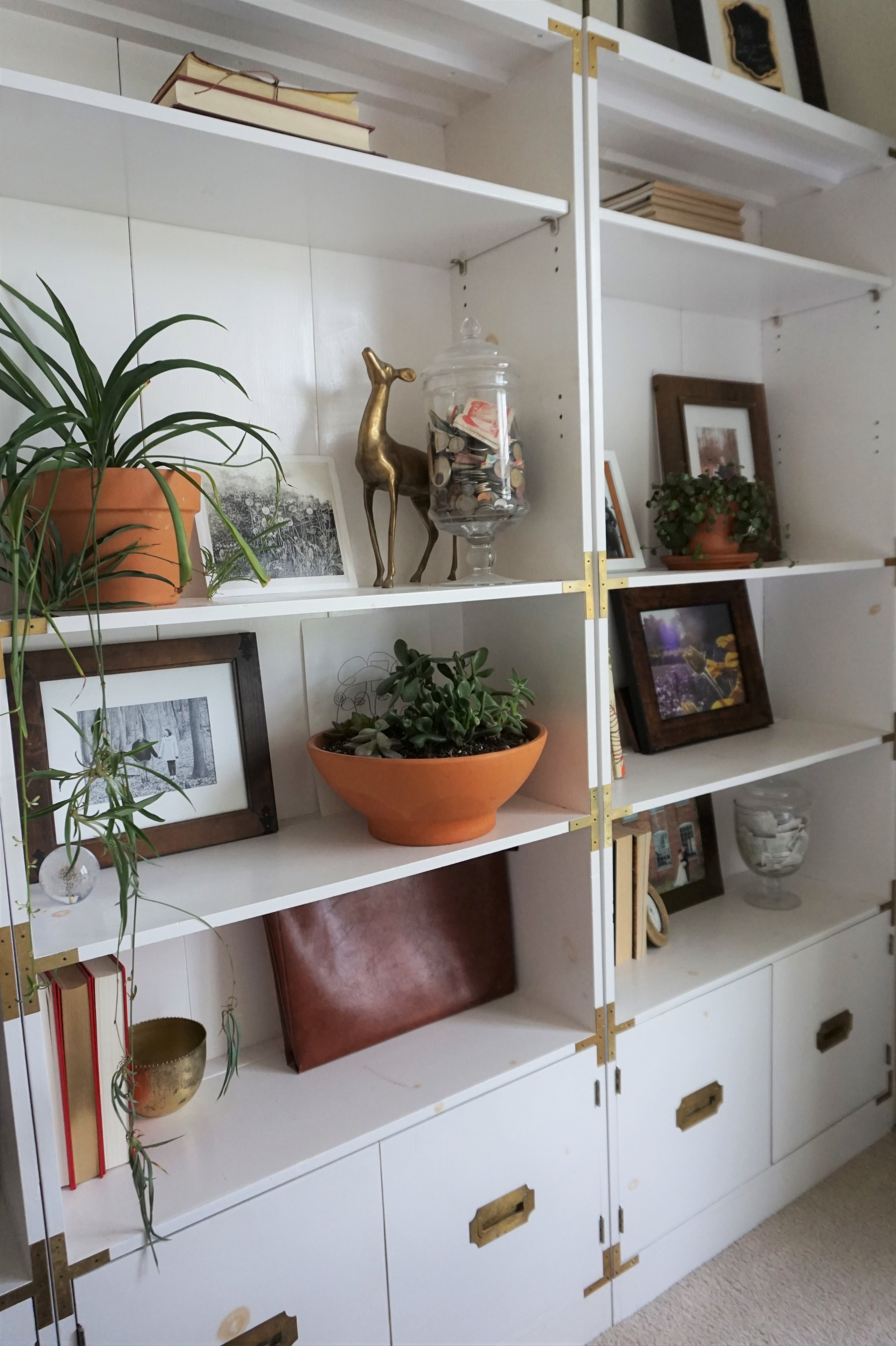
This room design is rather simple - mostly white with winks of warm tones and greenery.
The campaign shelves hold a lot of our mementoes and hide a lot of our paperwork in the lower cabinets.
It’s no shoebox but the bed pretty much takes up the whole space. It has no headboard or nighstands but I did get some simple sconces mounted for some friendlier lighting.
Blackout curtains were a must for my husband if either of us were going to get some quality sleep in my third trimester. These chartreuse velvet ones were a fabulous find on Amazon and ended up being such an easy lux touch in an otherwise simple room.
Ok friends. Thanks for joining me for another peek at our little townhouse! And if you missed it, here’s our dining room, bedroom, and man cave tours.
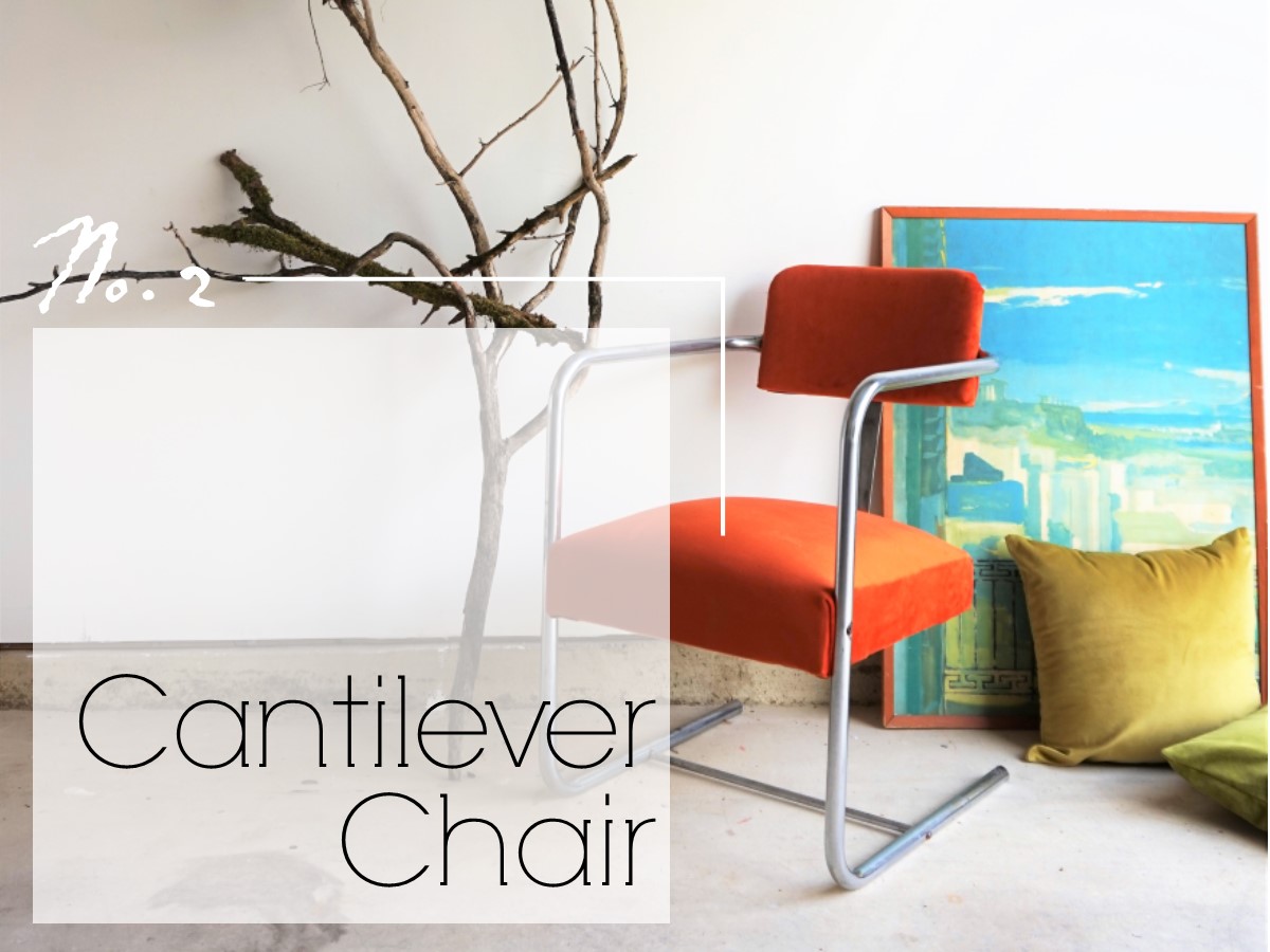
Four down, one to go. Catch up on the 2019 Furniture Flip Bucket List.

