Chrome Cantilever Chair || 2019 Flip List Item No.2

I know. I know.  I said that my last post would be the last flip before baby.  But what can I say?  She was apparently too comfortable to vacate the premises any earlier than she had to so I’ve been left to my own devices while she takes her sweet sweet time.  Is this any indication of what she’ll be like on the outside?  Heaven help us. 

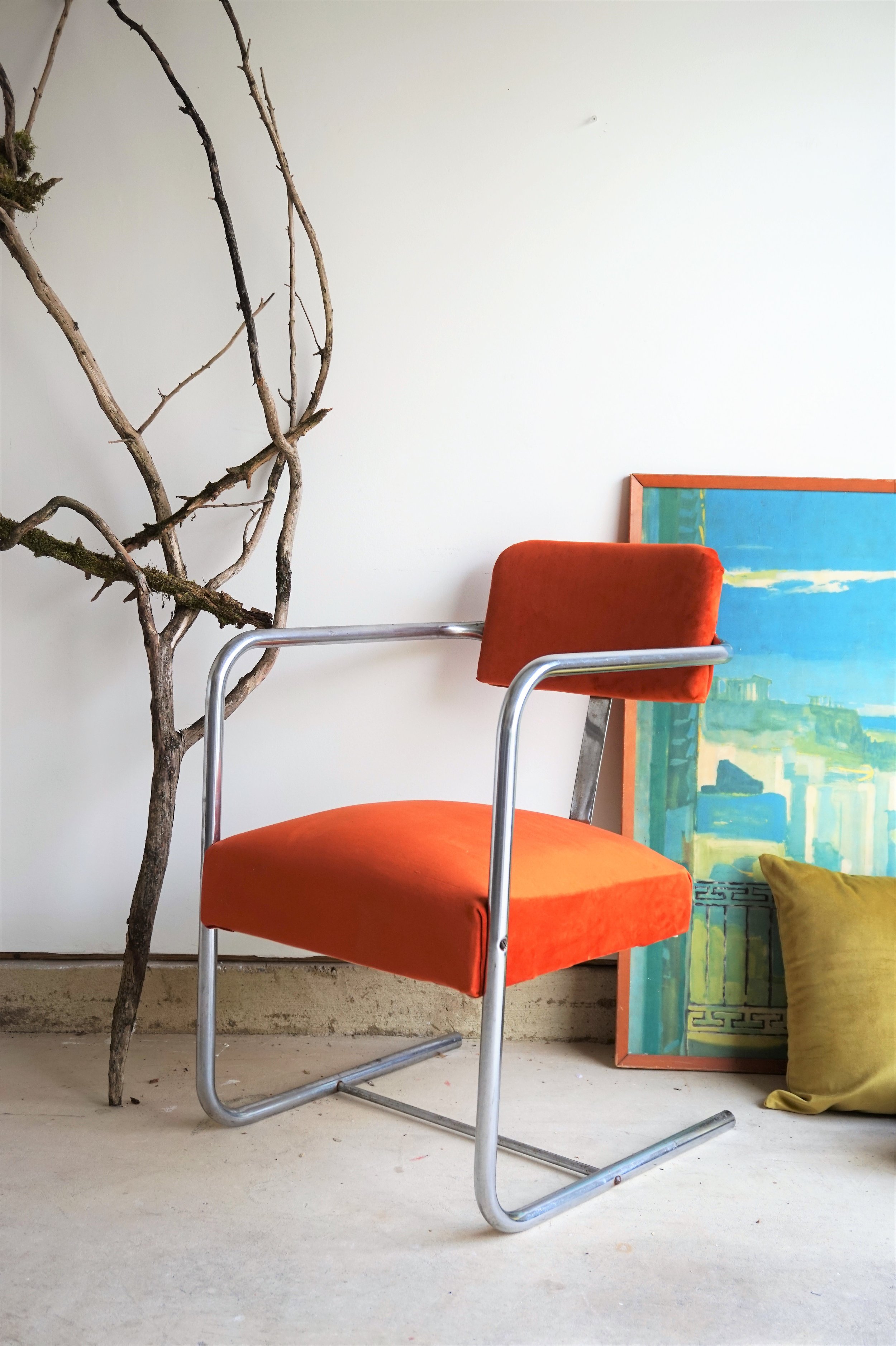
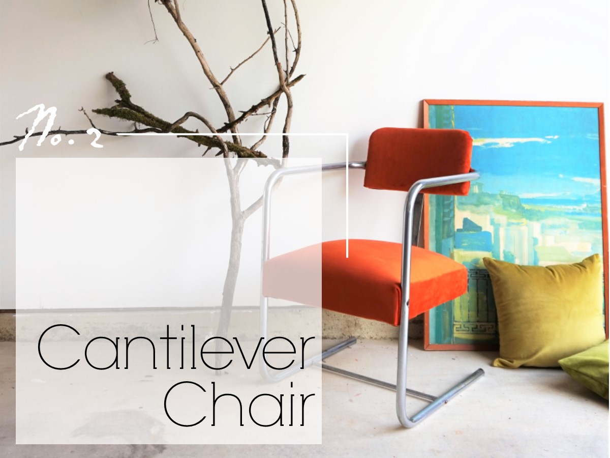
We all know I love me a good cantilever chair (see here and here).  In fact, I’ve been hoarding a chrome cantilever chair in my workshop for a few months now so it was the perfect quick flip to crank out in my impatient 39-weeks state.

FullSizeRender.jpg

It was a gray vinyl with a speckling of rusty patina on the chrome.  What drew me to it was the mod lines and I started to see it becoming something modern and lux.  Plus it was the perfect opportunity to try out a new decor crush of mine:

Burnt Orange Velvet

DSC05217.jpg
DSC05234.jpg

We also know that I love me a good terra-cotta color but guys...if you put it in velvet then I’M JUST SMITTEN.

DSC05242.jpg

As I said before, the chrome wasn’t in the most perfect but it was easy to shine up for the most part using some wadded up aluminum foil and water.

DSC05254.jpg
DSC05256.jpg

That velvet - I mean COME ON!!! 

DSC05259.jpg

On the back of the chair, I added some matching chrome nailhead trim.

DSC05265.jpg

And styled the whole shebang with stark shapes and vivid contrasting colors (also faves of mine): chartreuse and aqua.

DSC05230.jpg

Ok that’s it I promise - I’m officially on maternity leave.  The good news is, with baby’s due date being today and all, this means I’ll at least have one more bucket list item to share in the near future - No.5: the Nursery!  So stay tuned for that reveal and Baby H’s big debut!

DSC05233.jpg

Burnt Orange Velvet Chair
Now available for sale
$295

 If you are interested in this piece or a custom order like it, email me at cate@stylemutthome.com

Cate.jpg

Three down, two to go. Catch up on the 2019 Furniture Flip Bucket List.

Reader Design: Adam's Charming Tudor

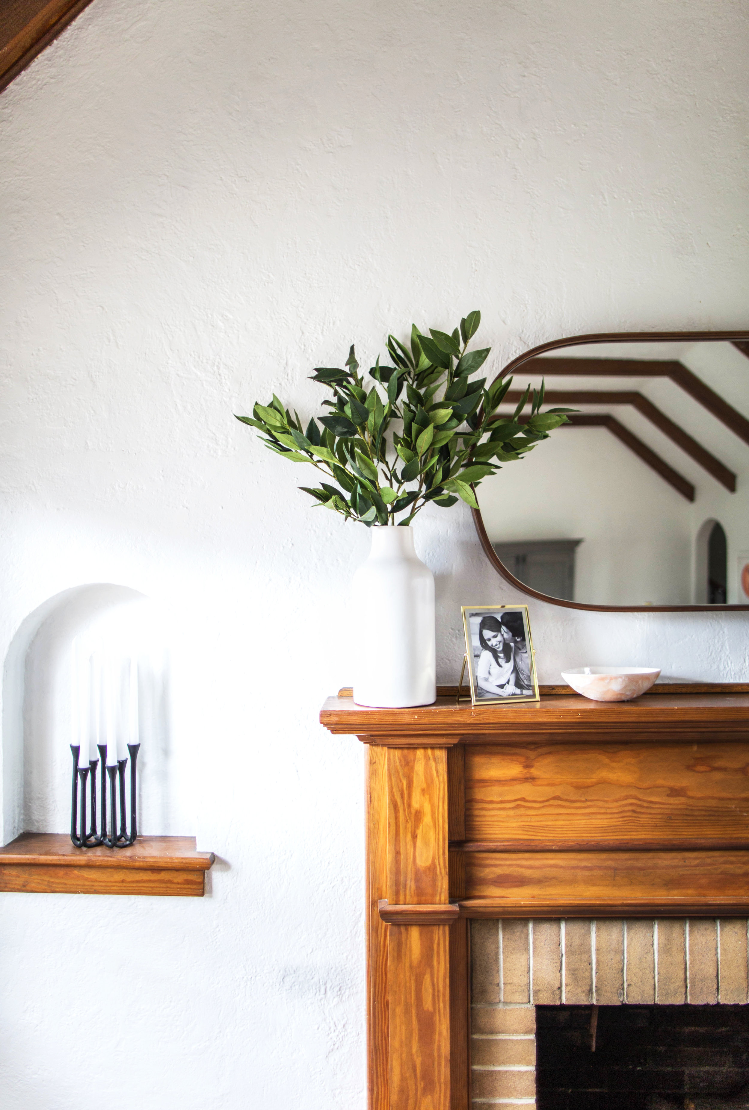
Today, we're off to visit a historic 1940's Tudor home in Knoxville, Tennessee. It's the loving project of Adam, a photographer, and his wife Amber and, as their first home together, is a major labor of love. 

With such a labor of love, Adam & Amber are taking their sweet time with this place, making sure things are done right the first time in a way that feels true to them and is true to the character of the home.

We have tried to spread our design process out over a longer period of time to allow us to wrestle with the overall design of the space, trends, and what the space actually needs. Our philosophy throughout the process has been to try our very best not to cut corners. I am a firm believer that you get what you pay for, and we really attempted to do it right the first time. Obviously, we have been blessed to be able to do this, and it has often meant waiting on certain purchases.


They started the process with a focus on what they were trying to achieve. Is it a specific look? Mastery of a certain trend? Or something more elusive - a feeling, perhaps? For Adam & Amber, that was it. They wanted to their home to feel joyful, calm, and captivating. 

The journey to capture those feelings also guided their style decisions. 

We do not concern ourselves with following one particular style, outside of trying to integrate the design in a seamless way with the architectural bones of the house. In our home, you will see elements of mid-century, Scandinavian, traditional, minimal, etc.


Adams & Amber composed their home piece-by-piece. In the dining room, they started with a custom, handmade table from Vermont Farm Table. 

It is perfectly proportioned, has such clean lines, and feels modern and timeless all at the same time. We wanted a table that would age well over time and become a family staple. The finish Vermont Farm Table uses strives to highlight the natural beauty of the wood and stand the test of time.

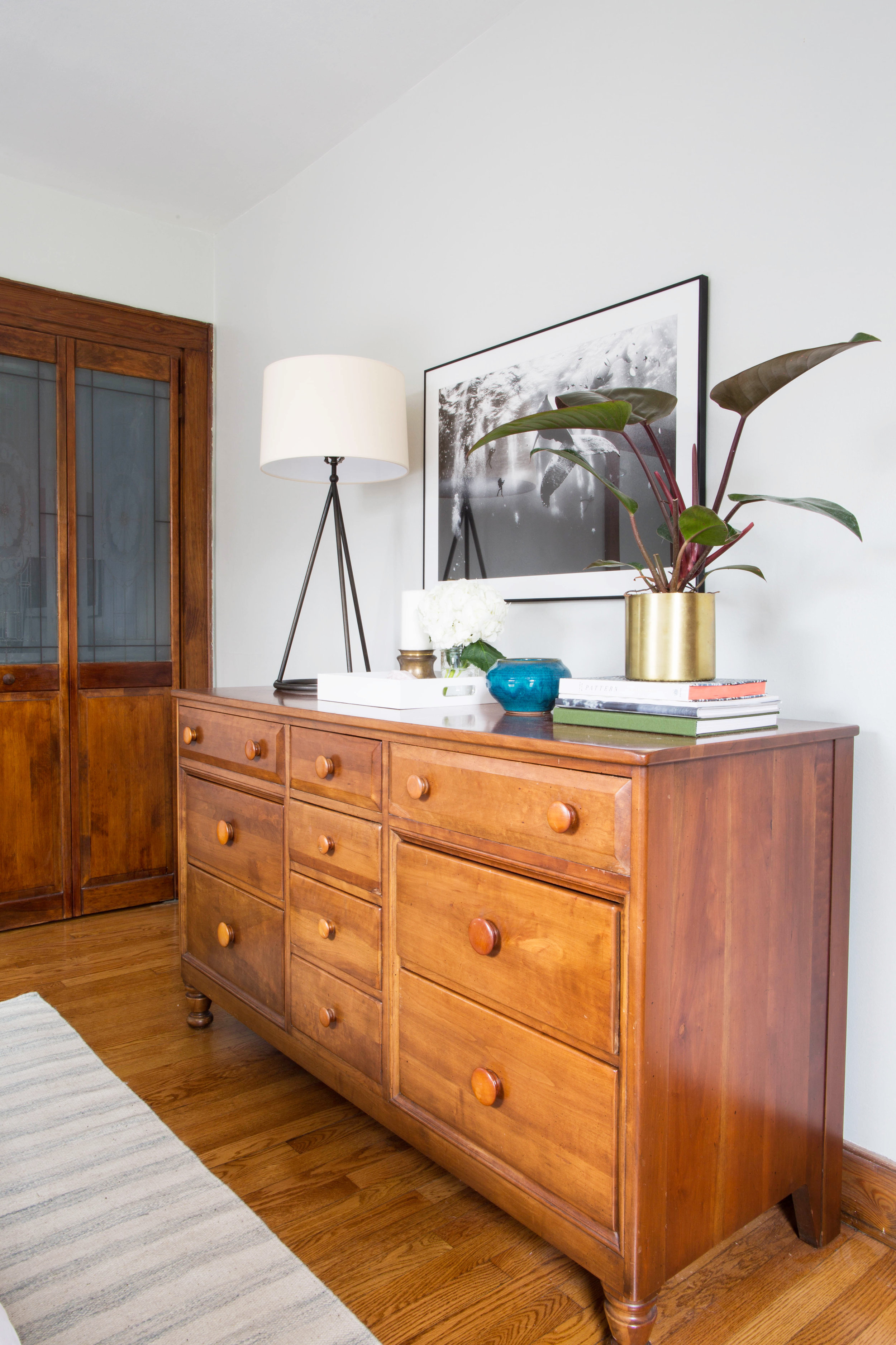
In the bedroom, they proudly display two of their favorite belongings. 

The first is our midcentury dresser, which belonged to my wife’s great-grandparents. It fits so seamlessly with the aesthetic of the rest of the room without being too matchy-matchy while also adding some extra soul. My wife remembers pulling clothes and jewelry from the piece to dress up in when she was young, and we often talk about how fun it is to think of her great-grandparents using the piece each day when they were young so many years ago.

My second favorite piece in our bedroom is our print above the dresser by Anjuar Patjane. The photo actually won the National Geographic Travel Photo Contest a few years back and captivated us so much that we new instantly we would integrate it some day into our home. We often find ourselves staring at it mesmerized.

I simply adore everything about this home and the method by which it was created - lovingly, carefully, and slowly over time, as if it were mirroring the process used almost 80 years ago to build it in the first place. 

I also adore these parting words of wisdom from Adam.

It is so easy in the age of Instagram and Pinterest to be overly critical of your work, which we find ourselves guilty of from time to time. While it is hard to know what the future will hold, we see ourselves staying in our home for a long period of time. Therefore, we try to not worry too much about what others would do, but instead choose what fits us the best as a young family.

Thank you so much for letting us in. And if all you mutts are feeling the same way I do, RUN to follow Adam along on Instagram @azford. 

Next week, I'm off for my jet set across the pond, so we'll see you in two weeks for more reader designs! 

Muted Teal Apothecary Chest

It's been a long time since I've been in touch with my shabby chic side.  In fact, I don't think I've heavily distressed a piece since this dresser .  But once-in-a-while, only for the most spectacular of clients, do you roll up your sleeve and distress the heck out of something to get that chippy-vintage-storied look.

As Chelsea hinted at with some teasers in this post, we've had the joy nay the honor of styling a hip condo for our latest client in DC.  One of the unique challenges we've faced with her space is a quirky triangular entryway with very little space and very little going on to greet you when you first walk in.  After weighing a few options, we decided that a narrow piece in a bright but sophisticated color would do the trick.

And it just so happened that I had a 12" deep faux apothecary chest in my possession ;)

image.jpg

Recognize it in our first apartment?  This skinny little piece has served us well over the years.  But the inevitable shift of my personal style combined with our lack of entryway in our new apartment meant it was time to move on to bigger better things.  I was pondering how to refinish it for resale just when our client brought up her need for some super-skinny entryway storage!  Twas meant to be.

After running some custom refinishing ideas past our client, we decided on a muted teal that played well with the rest of her newly designed home and a "weathered" look for some added character.

In my experience, it is really rare to find a storage piece as narrow as 12" - I mean just look at how thin this lady is! 

All she really needs to be for our client is a happy little place to catch her keys and store her weather-wear (scarves, mittens, and such).

Giving a nod to the piece's vintage vibes, I styled it with the replica botanical prints salvaged from our old master bathroom (which have been sitting in a box since we moved) and a blown-glass vase with foraged thistles.

I am so happy to see her go to a beautiful new home and even happier to offer our client a custom piece that I've had the chance to product-test myself!

You'll have to circle back to us to see how she'll fit into our client's digs!