Living Room Fireplace Reveal

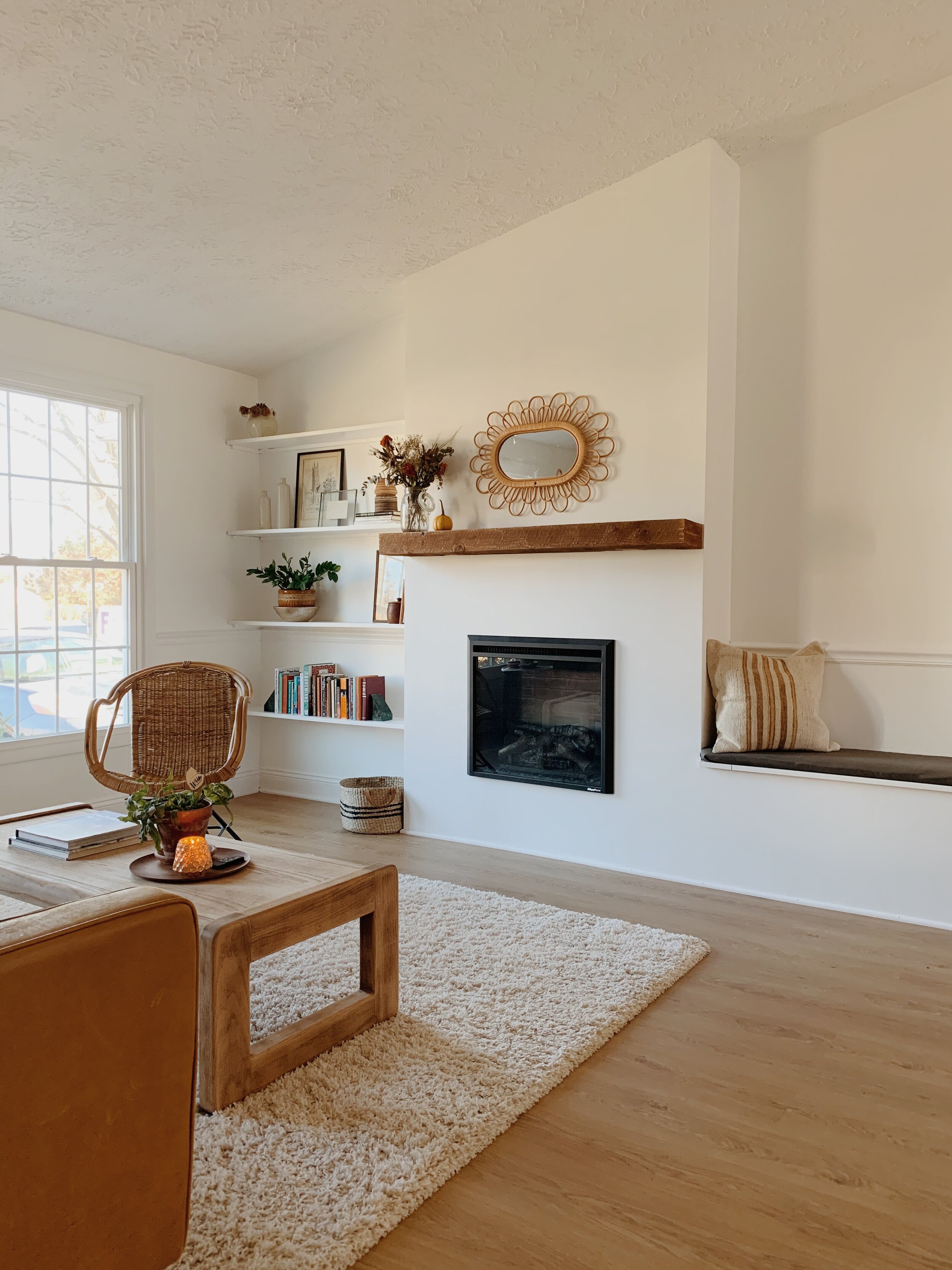
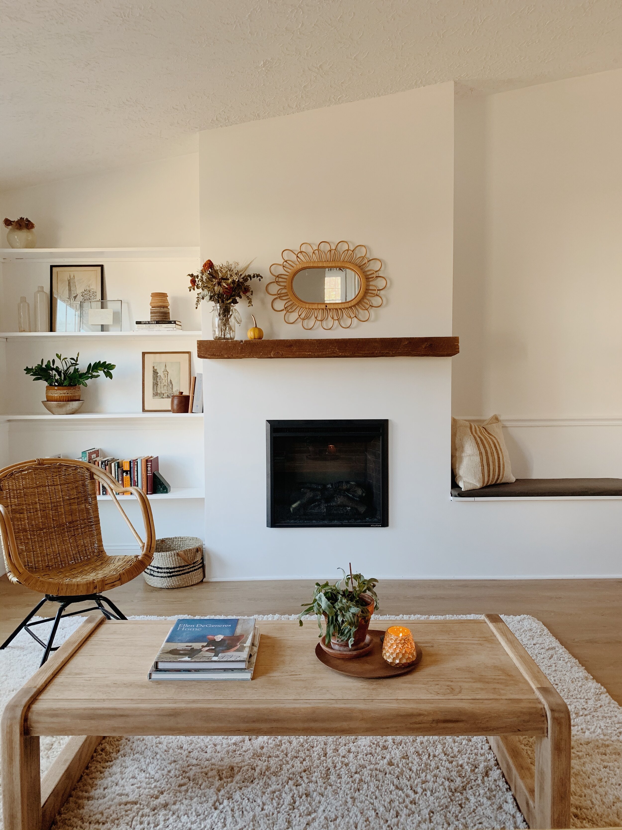
So tickled to finally get to share our finished fireplace with you all today! It is an absolute dream; I can’t believe this is the same house we moved into 9+ years ago! A few weeks ago I shared our plan and inspiration here, and now that it’s finished it’s even better than I had expected. As with most projects, some of the details evolved as the build came together, but I think it’s worth sharing the plan I had laid out last January. So almost a year ago!

20.jpg

And here’s where we ended up:

neww14.JPG

We could not be more grateful to our dear friend, Bill, who spent the better part of 3 weekends coming over to help us with this. To say he is incredibly skilled is a massive understatement, but beyond that even is his generosity. We were so blessed by his knowledge and willingness to help - and all I did was send him home with bacon! Listen, there’s more where that came from for anyone out there who wants to help the Biebers with home projects. Lol!

neww1.JPG

At the last minute we decided to paint the shelves and bench seat white to let the mantle really stand out. The mantle was removed from our dear friends’ 1960-something fireplace when they started their home renovation. They decided to replace it during their own home reno process, so we lucked out big time - it is SUCH a gorgeous, chunky piece of wood. The years of use have banged it up and faded it’s color and that kind of character is just what our new structure needed.

neww3.JPG

Funny, we moved the sofa to this side of the room, (it was previously against the windows), just to get it out of the way during the construction. It didn’t take long for us to love it this way! The kids said they prefer it here, facing the fireplace, so I think we’ll leave it! Plus, we’ve got to make space for the Christmas tree this weekend. No idea where it’ll go. Send any suggestions my way because I am stumped! Hah!

neww13.JPG
neww2.JPG

Adding a bench to the side was one of my favorite ideas that helped the whole thing come together for me, visually. We didn’t know whether to add shelves to this side, cabinets, or what. It was really tricky to figure this side out! When the thought of a bench with storage inside came into play it was just perfect. Bill created a lid that comes up like a piano bench, and it’s the easiest access to our new hidden storage.

neww4.JPG
neww5.JPG
neww12.JPG
neww11.JPG
neww6.JPG

I think I mentioned this in my last post, but link to our actual insert is here, and we are really pleased with the unit. It warms our large open space up very well and is completely safe for little ones, (the glass doesn’t get hot because the warm air is pushed out of a vent only at the top of the unit). The insert itself does not heat up, making it completely safe inside its frame of drywall and 2x4s. The unit is plugged into an outlet accessed inside the storage bench, and we can slide the unit out of the frame anytime we need.

neww9.JPG
neww8.JPG
neww16.JPG
neww15.JPG

That’s it! Hard to measure what a difference this has made to our home. With such an open floor plan I have already been enjoying having the fireplace on while in the kitchen, during homework time, dinner; it’s just been wonderfully cozy.

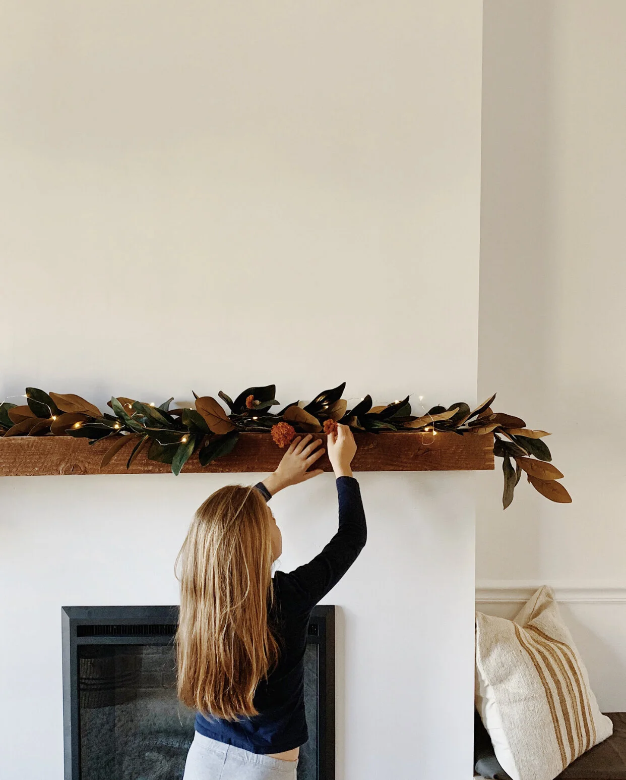
Speaking of, here’s a sneak peek at our Christmas mantle…

17.jpg

More Christmas coming soon!

Thank you so much for stopping by today!

Chelesa.jpg

Easy-Glide Dresser + Art Sugar

There are pros and cons to tackling a refinishing project for a dresser that is not actually vintage:

1) Usually the dressers aren’t made of solid wood.
2) Sometimes that means it’s too difficult to remove the drawers for easier transportation
3) On the plus side, they more often than not have smoother gliding drawers than their older counterparts

Like Mr. Easy-Glide here:

IMG_2071.jpeg

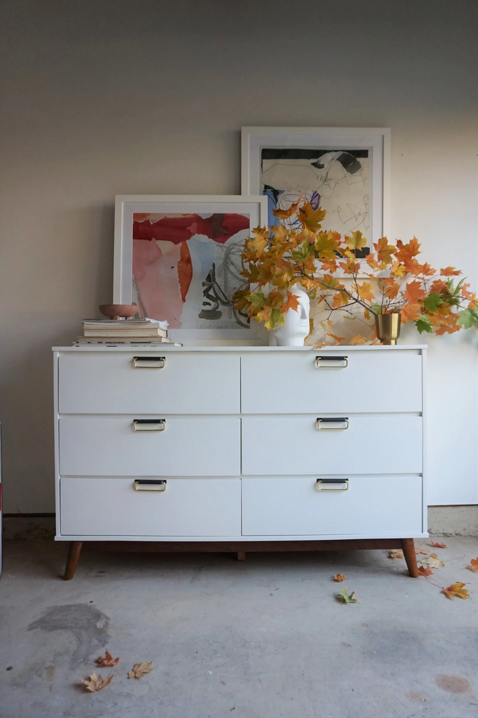
I liked his clean lines and tapered legs but he is definitely an assemble-yourself number. All his guts are labeled with little A-G alphabet stickers. But what you loose with newer construction, you gain with functionality. And these drawers slide like a pad of butter on a hot skillet. So he was worth a second look in my opinion - and a second chance to stand out.

dsc06195.jpeg

My go-to secret for instantly updating a dresser is usually adding legs. But Mr. Easy-Glide already had a decent set of gams.

dsc06213.jpeg

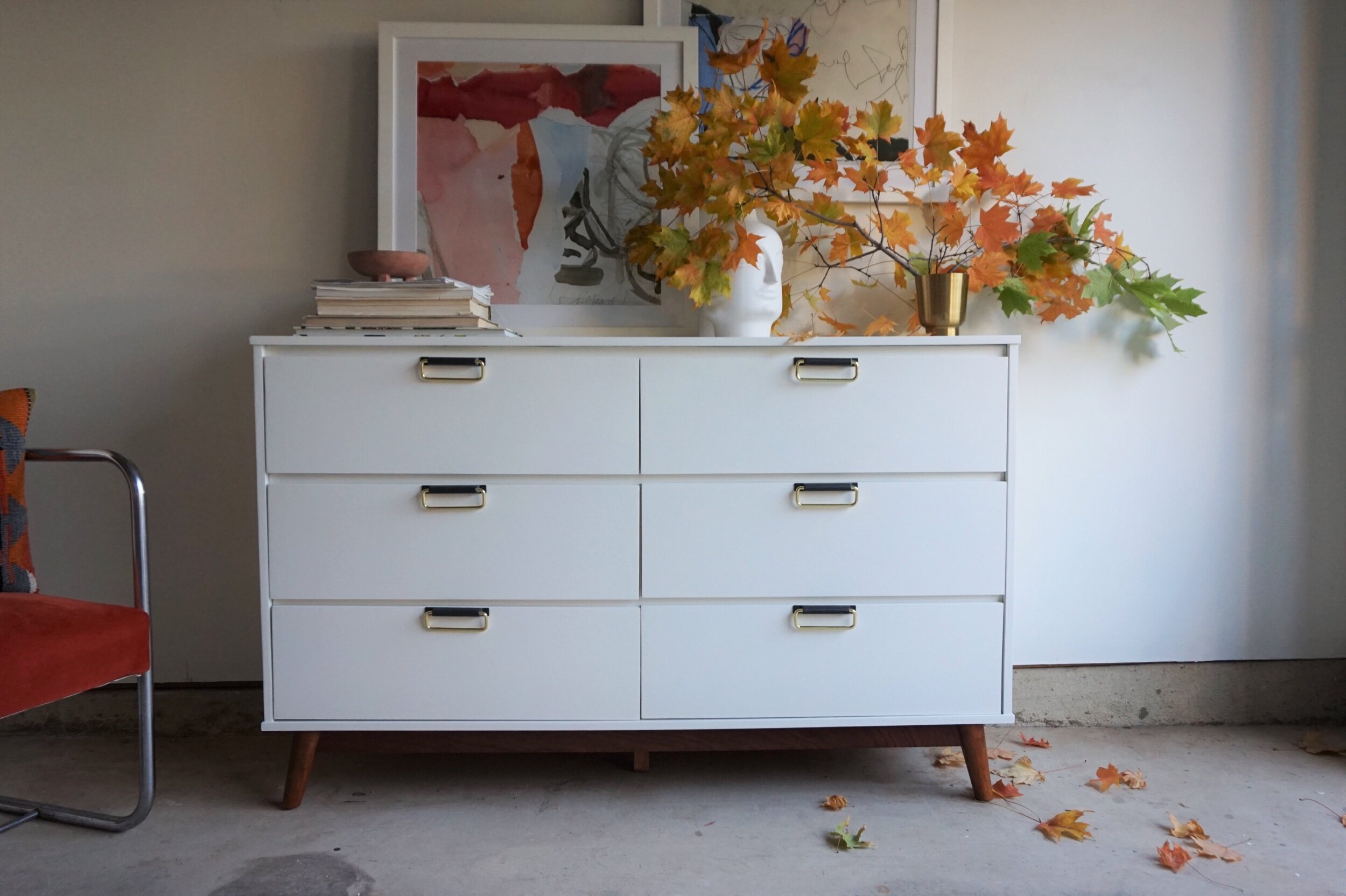
So I deployed my next go-to trade secret: change the pulls placement. Instead of leaving them dead-center, I changed the pulls and moved them to be perched right at the top of each drawer. It’s a very subtle move, and patching in the old holes meant painting the body, but it allows for a fresher take on a standard box store dresser.

dsc06197.jpeg

For the body color I chose “Swiss Coffee” - an StyleMutt staple I might add, but usually for wall color. I decided to try it on this piece because 1) I needed a warm white to play well with the wood tones and 2) I had plenty of it lying around ;)

dsc06200.jpeg

The dresser is actually painted the same color as the wall here - see how beautifully it holds both light and shadow? We love this color because it’s like a living neutral. It’s not devoid of personality just because it’s white.

dsc06217.jpeg

And yes - that’s a cameo from my cantilever chair flip.

dsc06186.jpeg

I asked him to step in as a supporting roll to some fall foliage and my new favorite pieces of art: these two Art Sugar abstracts by Caroline Orr.

dsc06202.jpeg

You know you’re getting happy mail when the box has Sugar in the name. And opening these art pieces when they arrived was like unwrapping some confiscated Halloween candy. I’m talking KING sized bars if you’re picking up what I’m laying down.

Known mostly for their pop art prints, Art Sugar has prints in multiple sizes supporting a myriad of artists - with a portion of each purchase going to charity. Their prices are affordable but if you’re not sure, you can even rent one of their pre-framed pieces for 90 days to make sure you’re in love with the look.

dsc06226.jpeg

When I saw Caroline Orr’s abstract collection, I didn’t need 90 days. Caroline’s watercolor shapes, whispered handwritings, and torn paper mixed media all spoke to me. And most notably her strong moments of color! I believe that when you bring art into your home, it should elicit a guttural response - otherwise it’s just wall filler.

dsc06204.jpeg

Together, they were the inspiration of my whole vignette - Tupelo Honey with his mossy greens and pops of blue…

dsc06205.jpeg

And Etta James with her soft pinks and bold red and orange accents. They demanded a visually striking foliage that could handle their spotlight so what better than some maple branch clippings in peak fall colors?

dsc06198.jpeg

If you’re shopping for ready-to-hang artwork, check out some of their fun and sometimes cheeky prints.

dsc06208.jpeg

And if you’re shopping for a fresh dresser, email me for more about our purchase and shipping options.

dsc06192.jpeg
 

Easy-Glide Dresser
Now Available for Sale
54"L x 16"D x 34"H
$695


If you are interested in this piece or a custom order like it, email me at cate@stylemutthome.com

Cate Sig 2.jpeg