Pop of Color Custom Order

It's a REAL treat to work with a client with similar design sensibilities.  I mean, that’s gotta mean you’re doing something right, right?  Your tribe is finding you.  And you get to work with people that inspire your creativity.

This fall, I had the opportunity to develop a DIY nightstand tutorial for Apartment Therapy.  Shortly after, a couple reached out to me hoping to get a customized a version of the tables that could work around two specific design elements:

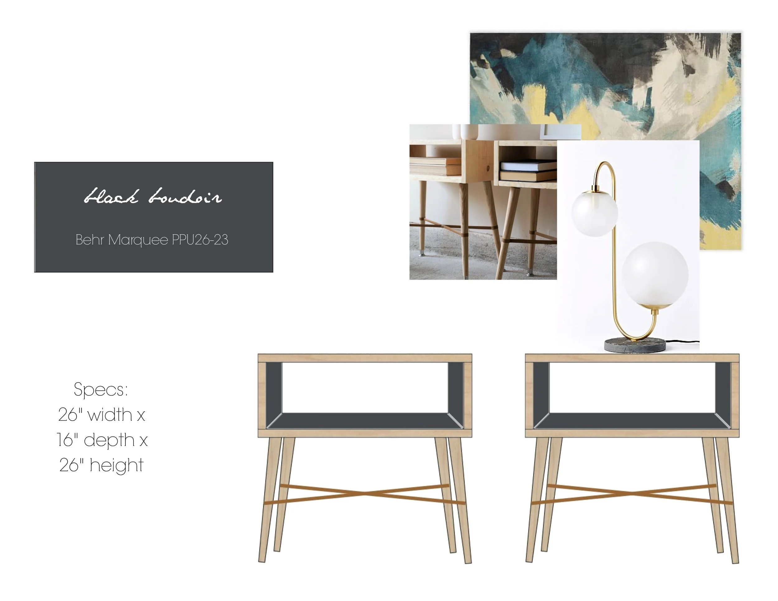
The tables needed to be large enough to showcase a West Elm Pelle Table Lamp:

Source: West Elm

Source: West Elm

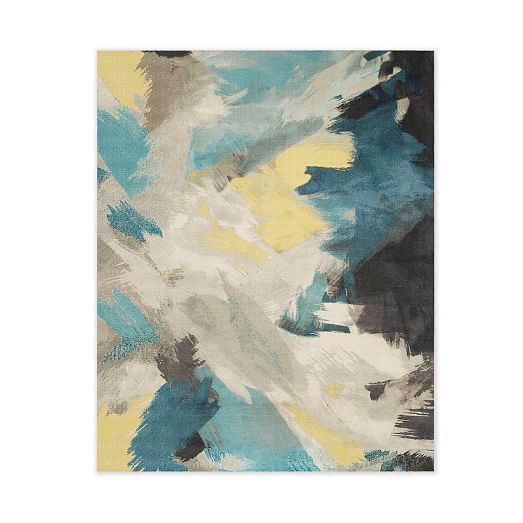
And they wanted a pop of color that played well with the West Elm Expressionist Printed Rug.

Source: West Elm

Source: West Elm

So with these specifications in mind, I rendered two options for them to consider - one with a teal accent color and one with an "inky" black. 

Deep Breath S460-7.jpg
Black Boudoir PPU26-23.jpg

And which color did they choose...?

DSC02649.jpg
DSC02599.jpg

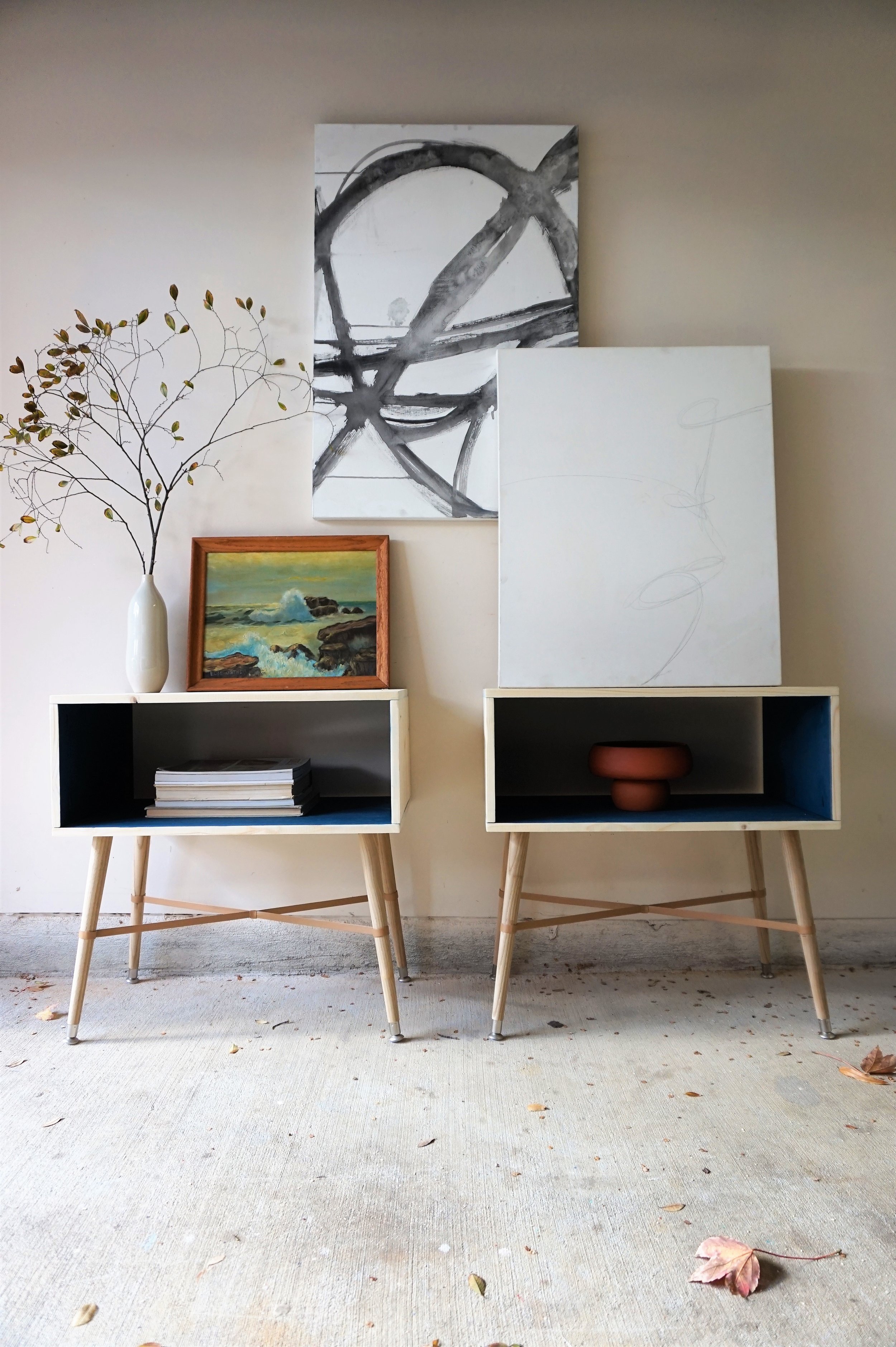
Instead of painting the entire piece to match the rug, I proposed we just paint the inside to preserve their "airy" quality while giving the clients more versatility down the line if they ever got the itch to rearrange things. 

DSC02602.jpg

I used the same materials as my original design for the rest of the build: blonde wood + camel leather straps but I did have to modify the proportions a little to accommodate their ideal dimensions.

DSC02607.jpg
DSC02622.jpg

To highlight the interior pop of color, I chose to style with warm earthy tones comprised of...

DSC02641.jpg

1) Terracotta touches (always)

DSC02621.jpg

2) A grouping of paintings

DSC02599.jpg

3) And a salvaged tree branch (ok, I pulled it off a sapling in the parking lot)

DSC02628.jpg
DSC02618.jpg

The happy clients picked up these custom orders this weekend and I'm happy to say they are already settled in their new home!

If you are interested in your own custom order, please contact me at cate@stylemutthome.com

Cate.jpg

NY-Bound Custom Order

There's a lot about this little business that has blown me and Chelsea away.  We've accrued clients from across the US (and even Canada!), designed for a battery of dream spaces, and even shipped pieces out of state!  That's crazy to think about - I mean, we're just two women working out of our homes!  In our garages, at our dining room table, late at night or the wee small hours of the morning.  And God is still growing us!

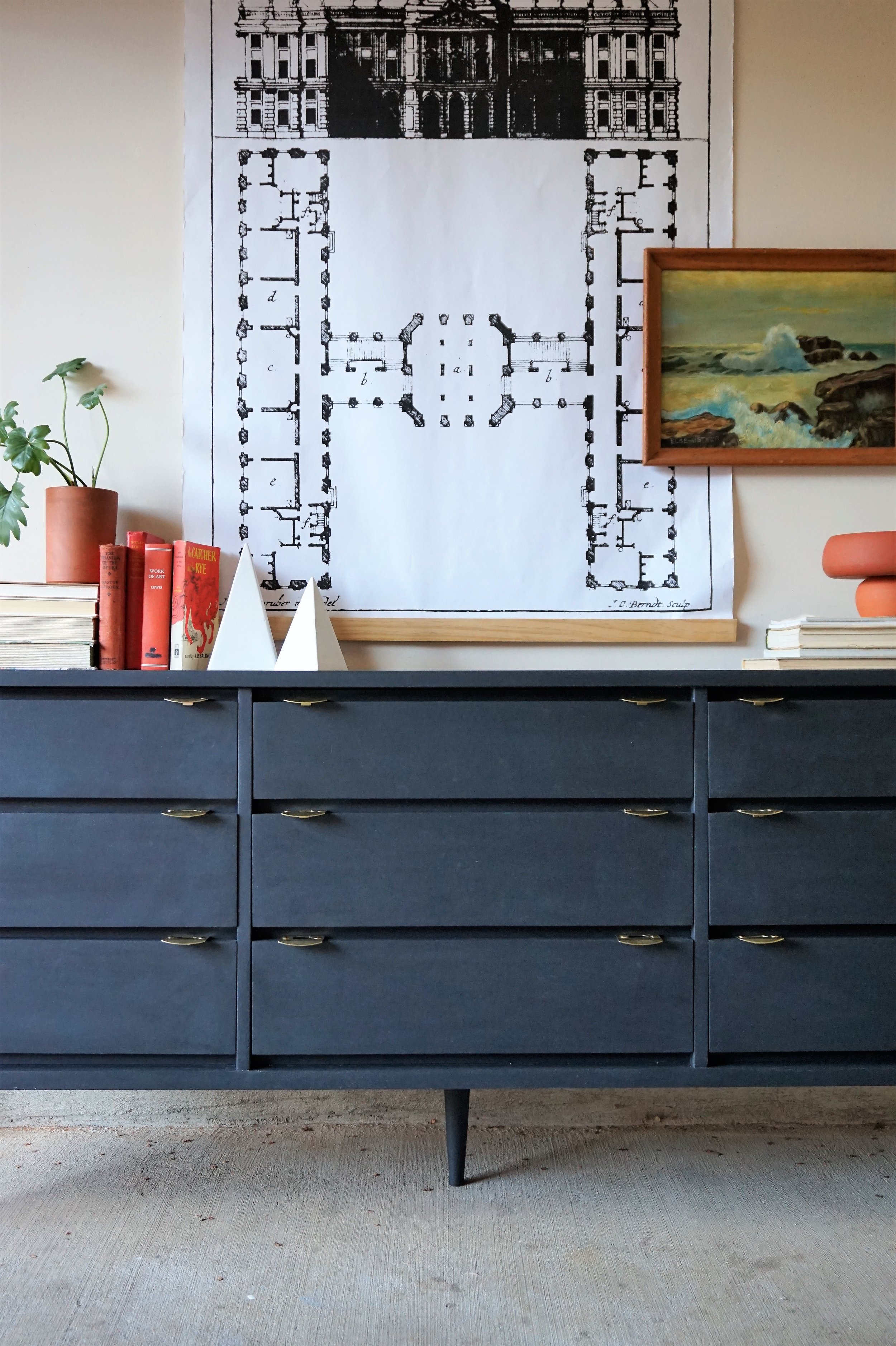
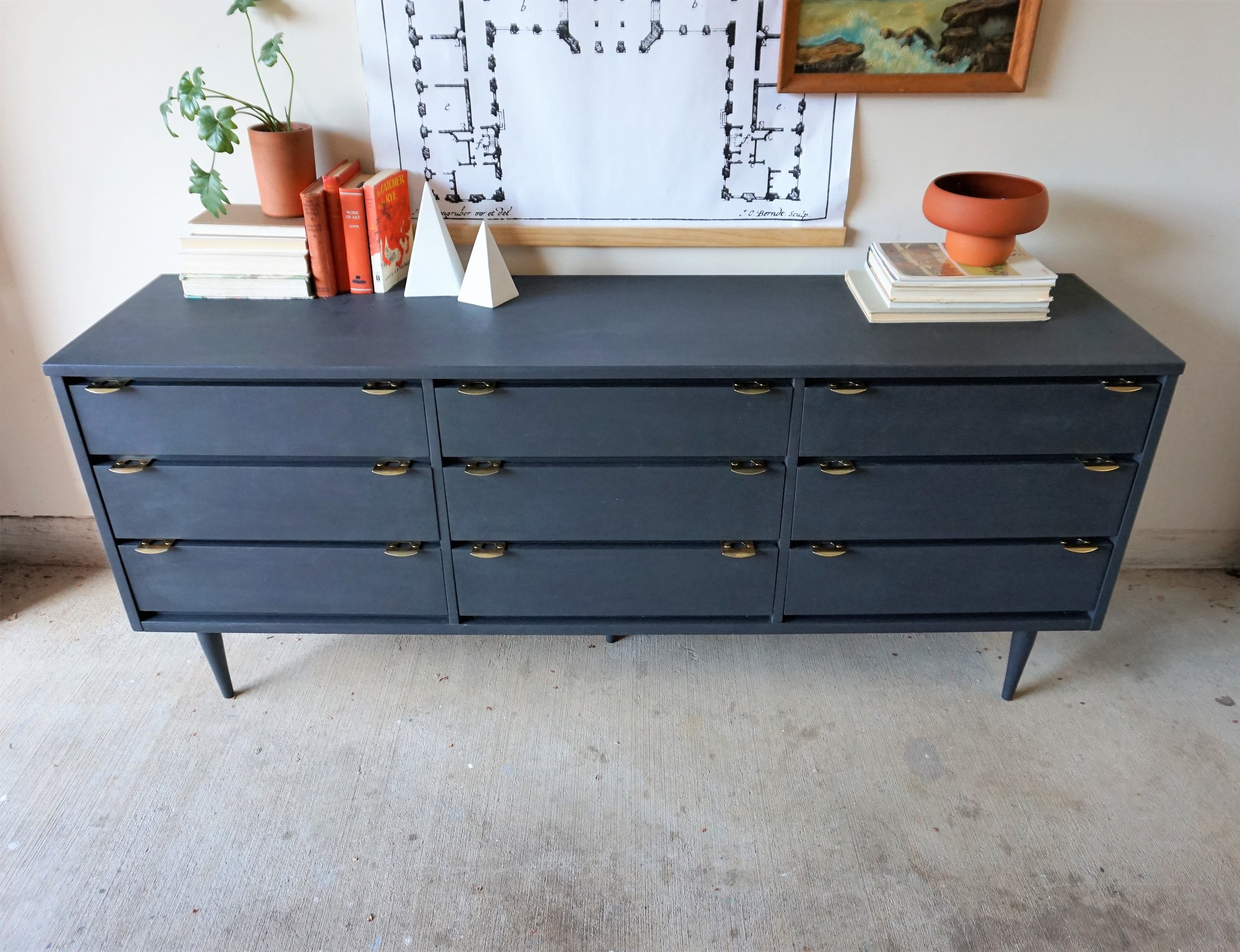
Recently I was commissioned for a custom order for delivery to New York.  And I gotta say - it makes me feel swanky to have a piece in the Big Apple *sheepish grin.*  The client wanted something similar to my brass finger pull tall boy but needed a lot more storage. 

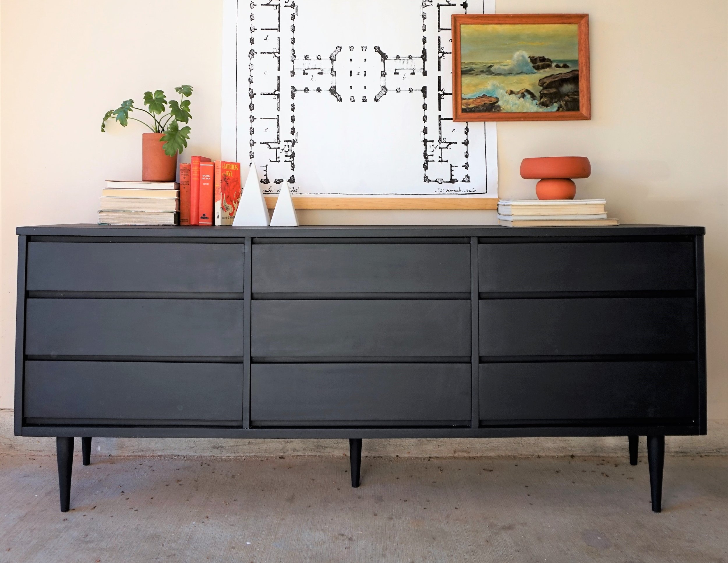
I did some hunting on my local craigslist and found the perfect low boy (from the same furniture line no less - how does that happen?!?).

IMG_8283.JPG

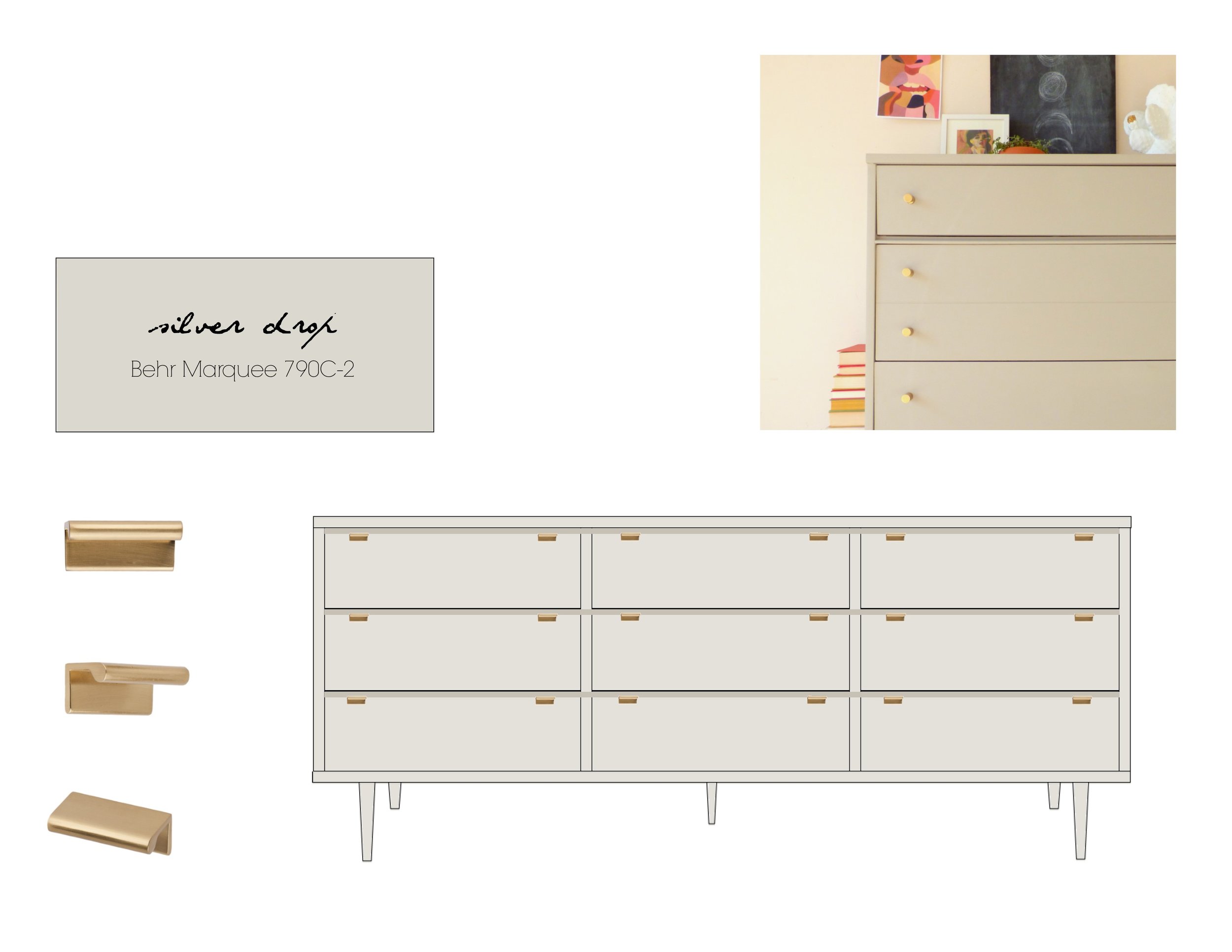
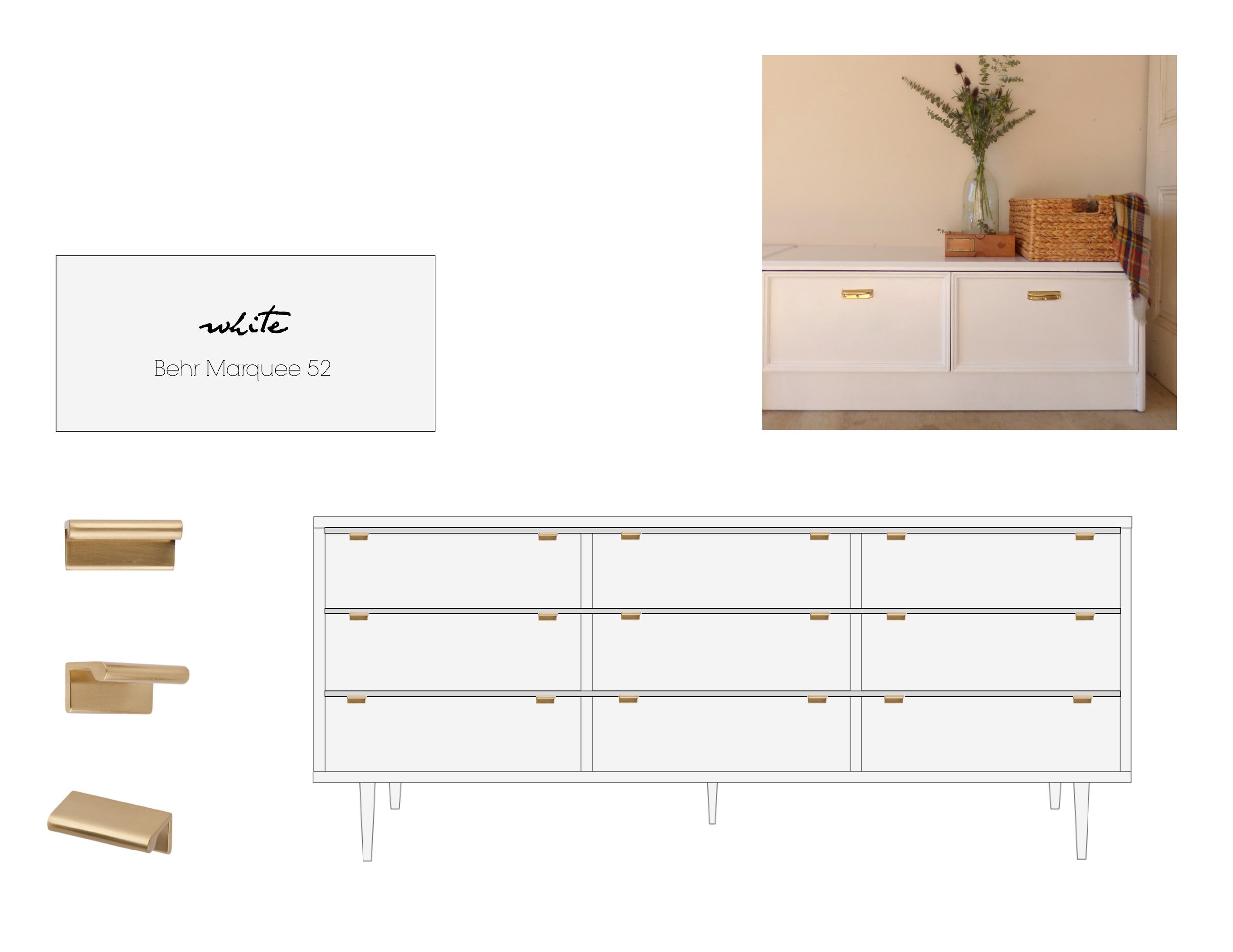
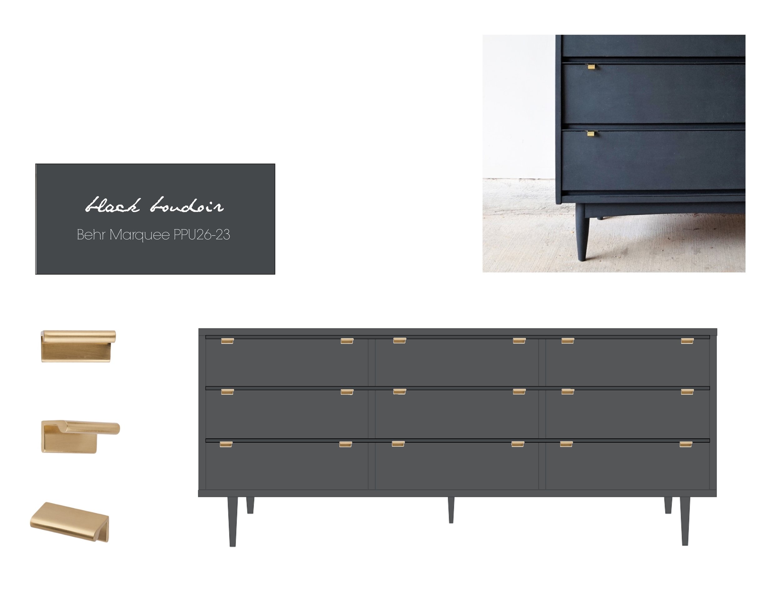
Her design aesthetic was simple: she wanted a matte color that could go with anything and a touch of brass.  After seeing some photos of her space and discussing her vision, I worked up 3 renderings for her to review:

She liked the idea of a warm gray or white in her space, but in the end she kept coming back to her first love: the moody dark finish from my finger pull tall boy.  My client had a tight deadline so I immediately set about painting.  But T-minus a few days until our scheduled for pick up, I ran into a bit of a problem...

IMG_8468.JPG

Where was the brass hardware?

 
IMG_8469.JPG
 

I had ordered these yummy brass finger pulls a week prior and had selected 2-day shipping.  7 days later, my tracking number was reporting that it was bouncing between distribution centers in the vicinity but never “out for delivery.”


What the?!?

IMG_8372.JPG

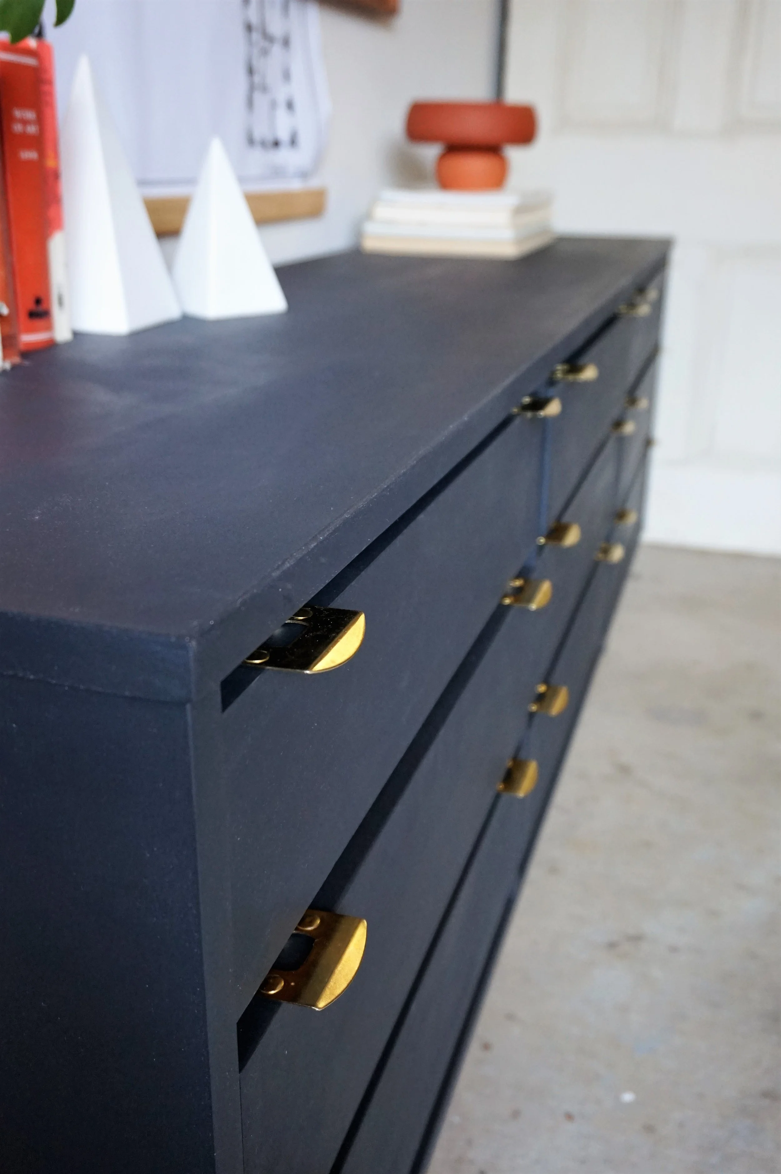
Stupid hardware.  Why you got to play me like that?!?  I looped the client in on the conundrum and she gave me the green light to get creative in order to meet our deadline.  She only wanted a “peek” of brass anyways so I combed through my local hardware store to see if there was something outside-the-box that would work.  And I found... 

IMG_8390.JPG

Strike plates! 

IMG_8391.JPG

ould you tell?

IMG_8389.JPG

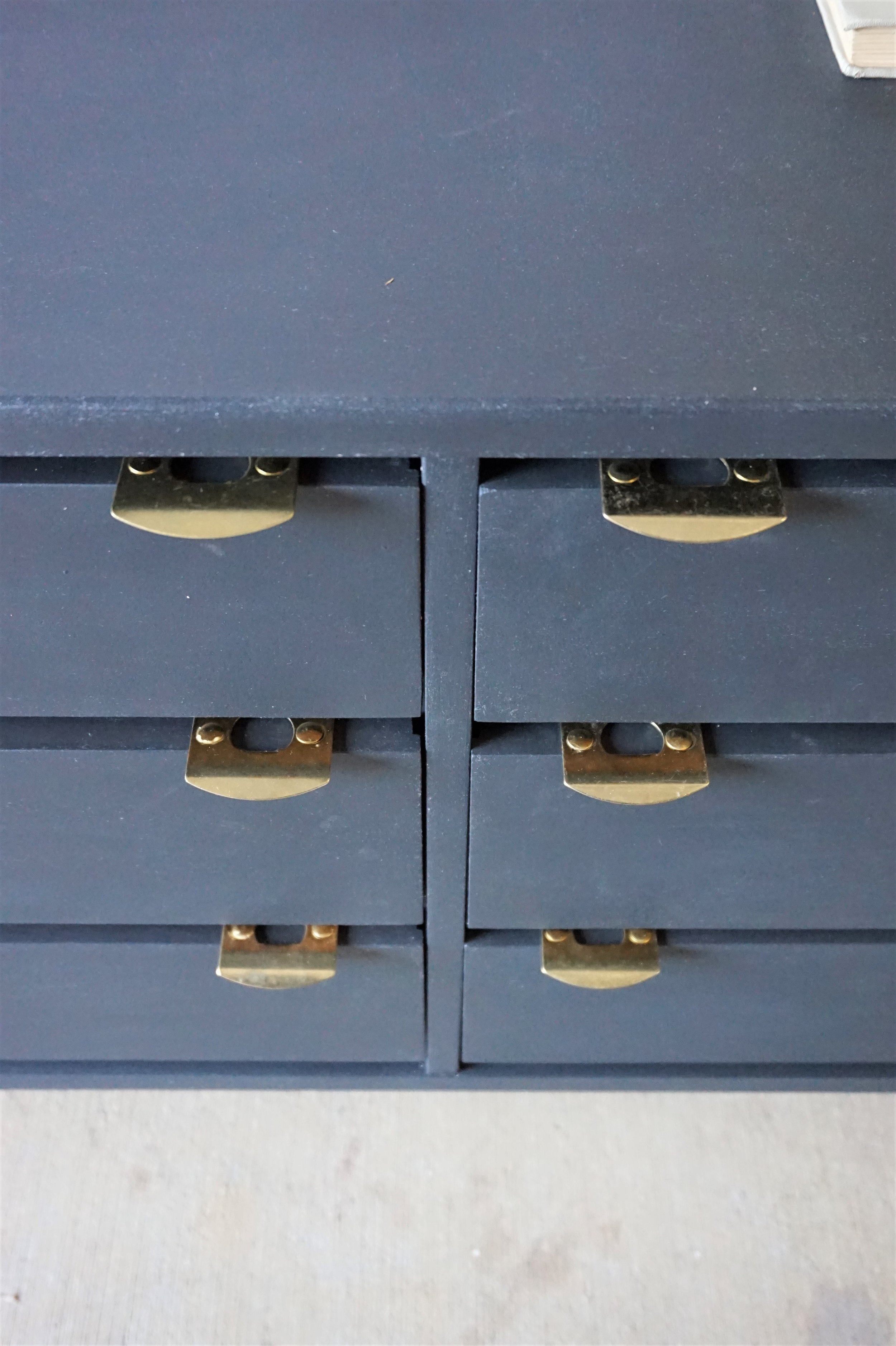
Strike plates are those metal plates that you attached to a threshold to correspond to the bolt of the door.  Much like the library pulls I reconfigured for my original tall boy, the strike plates had a subtle lip that could protrude off the drawer top like a true finger pull.  I used the same brass tacks as my other piece for a low-profile attachment method that wouldn't interfere with the functionality of the drawers.

IMG_8392.JPG

Recognize them now?

IMG_8393.JPG

I showed my alternative idea to the client and she was all for it!  So I attached the hardware right-quick and had the piece ready for pick-up in the NICK of time.

IMG_8394.JPG

The piece arrived at my client’s NYC walk-up the next day and after the delivery guys fenagled it up the stairs (Pivot! Pivot!), it is safely in its new home with minimal wear and tear from the harrowing out-of-state journey.  

And I can officially say I have big city clientele ;)  *Eek!*


If you’re interested in a custom order like this piece or how we can work with you out-of-state, check out our helpful FAQ guide or email me at cate@stylemutthome.com

IMG_4088.JPG

Want to see what we can do?  Check out what's in stock or view more of our past work on Instagram.

Gallery Block
This is an example. To display your Instagram posts, double-click here to add an account or select an existing connected account. Learn more

Chelsea's Bedroom Makeover

Hi, friends! We've had a lot of fun furniture and eDesign reveals to share around here lately, but it's been quite some time since we've shared anything new from our own home fronts! As our plates have been filled up with these various projects, the ones we've desired for our own homes have been set aside for quite some time.

But I can only partially blame the busy schedule.

I've always felt like our bedroom was the black sheep of our home. It's not that I never felt satisfied with it, but it's always stuck out as an entirely different style and feel from the rest of the house. Our home has evolved to this cozy minimal bohemian look that's very laid back, understyled and layered for function. Since before we were married I've had the pleasure of using a family heirloom bedroom set that was anything but laid back! The carved antique wood was completely unique, remarkable and unlike anything I've ever seen.Still, I couldn't figure out how to make the large and ornate pieces work in this house. Here's a shot from last Christmas:

40.jpg

Like I said, this was beautiful to me! I loved our bedroom, truly. But as I really started to embrace a style that felt a lot more 'us' as a whole, I needed a clean break with the fancier bedroom set so our home could be consistent the whole way through. I found inspiration from a very simple shot I took last year of a chair, a plant and a wall hanging:

13.jpg

Don't worry, you're not missing anything here; it's really about as dull an inspiration pic as one could strum up. But here's what I liked and why I thought it worth setting as my guide - it's both simple and interesting. It's monochromatic yet cozy. It's fresh. These are the things I wanted for my bedroom and I did revert back to this photo to keep myself in check when I was tempted by evil things like color and pattern. HAHA! I'm totally kidding. I love color and pattern, just in very particular execution for my own home. So let's take a look around at our brand new bedroom!

6.jpg
17.jpg

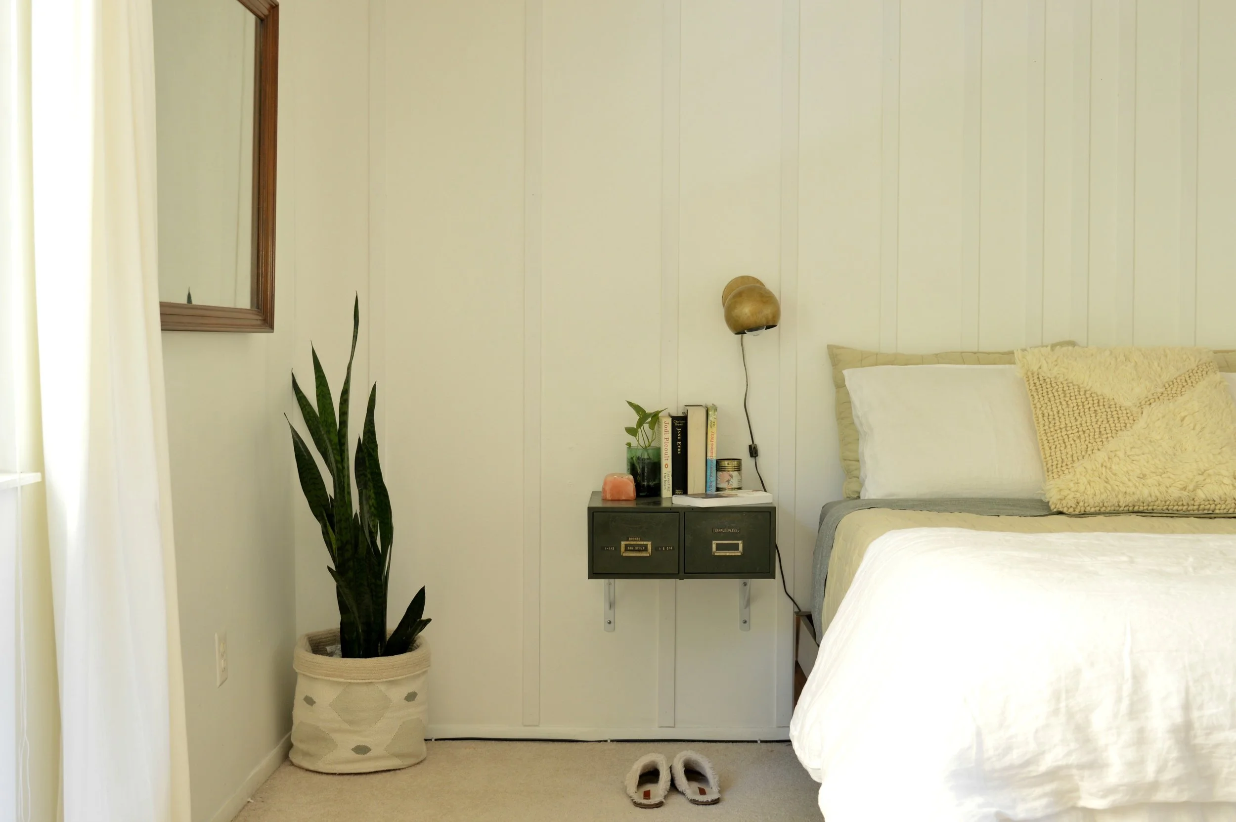
My main objective was a quiet and calm space that still had that interest and unique appeal that I so love. I knew I didnt' want another headboard, but also that I didn't want nothing. After using the idea for horizontal trim in this clients bedroom, I loved that touch of something on the wall that didn't scream for attention. I strummed up this idea to install vertical trim pieces that start close together at the center of the bed, and then fan out, getting wider and wider. The pieces that are close together anchor the bed just as a headboard would! Don't you just love visual tricks?! I think I get those kicks from my Mama. Looking around, I kept my white dresser that I had refinished a couple years ago, but the bed and Matt's dresser were lucky Craigslist finds. After many years of a matching bedroom set, I've welcomed some inconsistencies and mixed pieces.

7.jpg

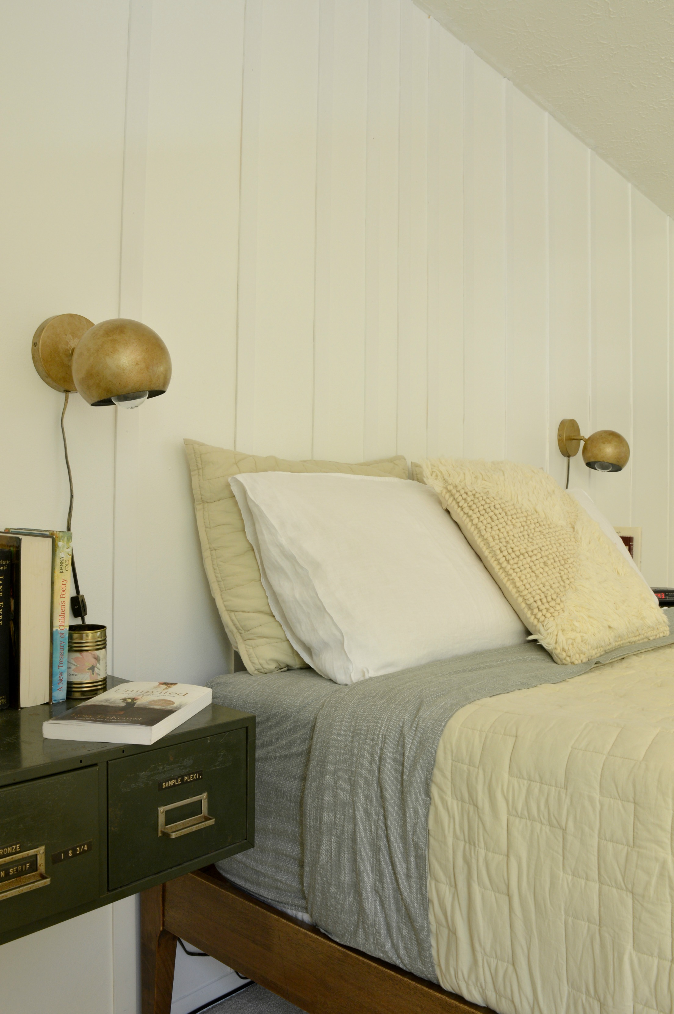
The idea to use floating dark green two-drawer file cabinets as nightstands came a while before I actually found a pair of dark green two drawer file cabinets. These guys were tucked in the corner of a local antique shop for $35/ea. Not a bad deal! (Of course, Matt was the one who handled the installation logistics) Fun fact: My kids have been writing each other a lot of notes lately.. They write apologies when they've been unkind, thank you notes when they've been helped, and don't even get me started on all their correspondence to the tooth fairy. Now I have a 'Small Letters' drawer for these precious small letters.

13.jpg

Another major component to pulling off an interesting beige and white room is choosing the right bedding. When you go monochromatic, texture and pattern can make a huge difference! When Cstudio Home reached out to introduce themselves, I was smitten with their use of texture and tone-on-tone pattern! The way their blankets are stitched, the subtle weave of the sheets - it's all a minimalists dream come true! We've got the Studio Quilt in Sandstone, the Canvas Sheet Set in Moss, and the Woven Shag Pillow Cover. I've made our bed and am more than willing to sleep in it!

12.jpg
3.jpg
4.jpg
8.jpg
5.jpg
9.jpg

I love the subtle pattern on the sheets - I've never had sheets worth looking at so I've never turned them down like this before! But the subtle mossy green is just so lovely with the white and beige pieces. Fresh, just like the plan.

11.jpg

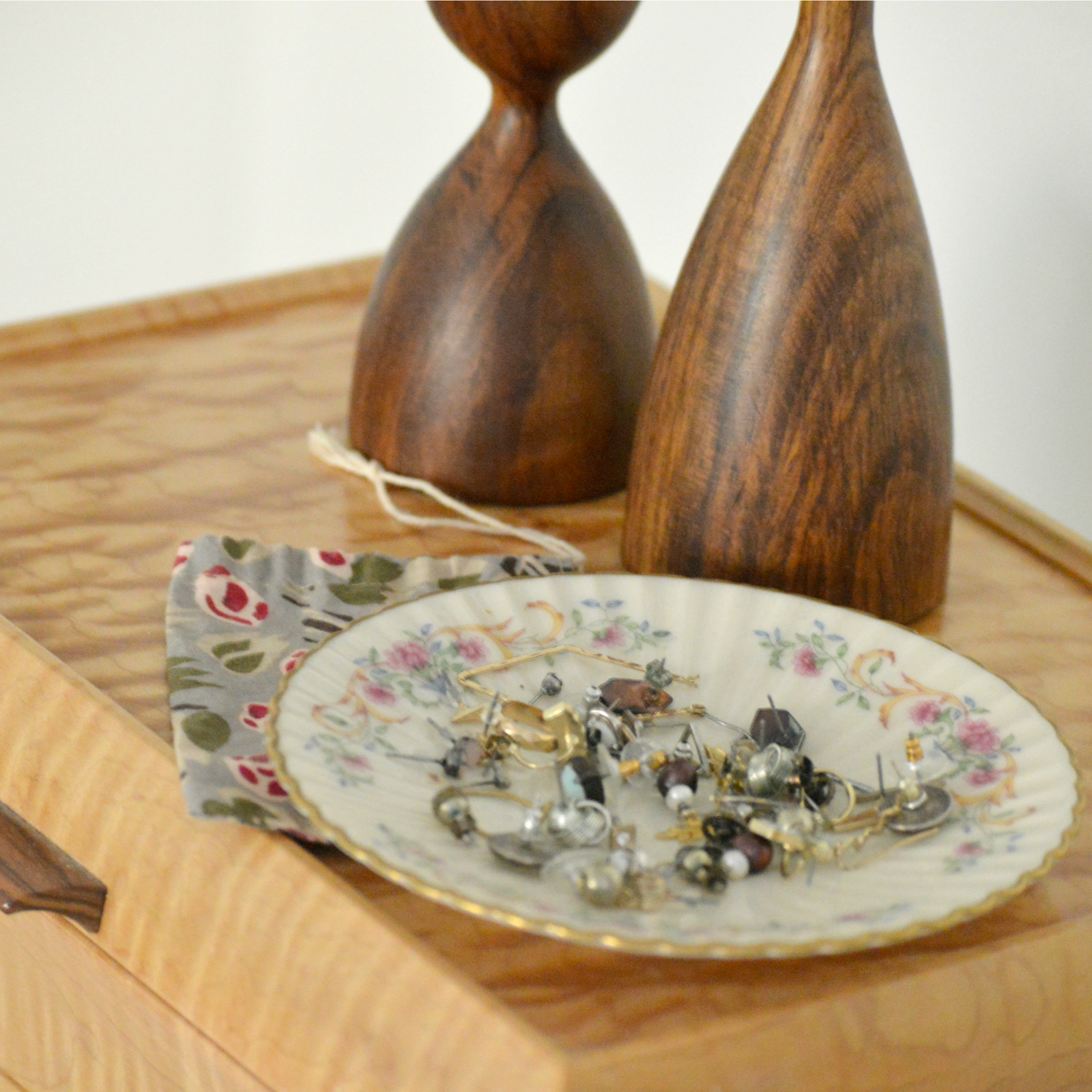
Of course the only true way to make your space truly unique and one hundred percent you, is with your own personal pieces. I may not be able to look at this photo of my grandpa yet without a lump forming in my throat, but I absolutely want to see this every day. I miss him so. The dish to the left is a saucer from my grandma's china collection, and it's where I keep all my studs. I haven't found another way to keep them organized until now! (Well, they're still not so much organized as I can just see them all better)

14.jpg

This vanity mirror hung horizontally was an estate sale find last Spring. I loved the wood pieces of the frame fit together like a puzzle, and it's such a lovely shade of wood; couldn't turn it down.

16.jpg

That's a wrap! Thank you, friends, for coming by. I realize it's a pretty underwhelming room reveal compared to what's out there, but I really believe simple can be interesting, too, and wanted to share my own experience with this room's evolution. Onward and upward, I say! Grateful to finally be at this end of the transformation. :) We would love for you to come back tomorrow to see what Cate has whipped up in her room!  It's so beautiful, completely 'her' and I'm just smitten...oh, I can't wait for you to see!

Chelesa.jpg