Friends. It's Friday!! Can I be honest? This week dragged. It was a serious struggle, and all I'm craving is a night in without my computer or phone. I need to unplug - and yes, I realize the irony of that statement coming from someone who just returned from a week-long California vacation.
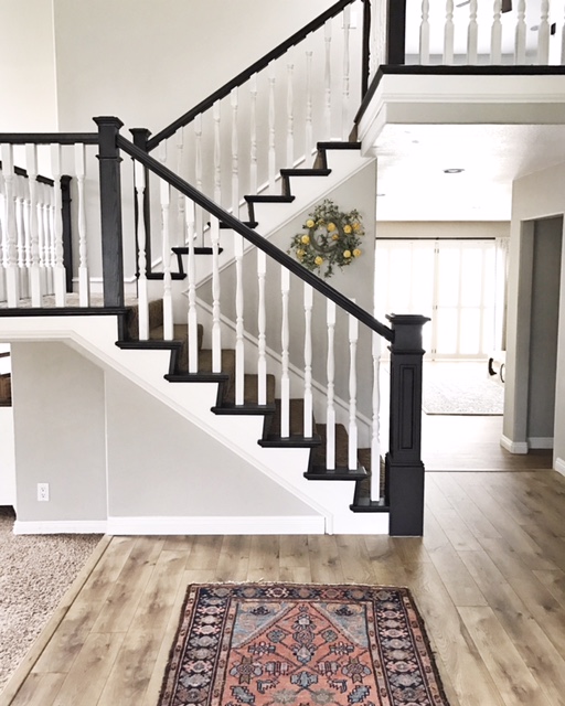
So, we're going back to California and checking out Ashley's gorgeous home - which, given an exciting turn of events, is soon to be on the market after Ashley and her family found a perfect plot of land on which to build!
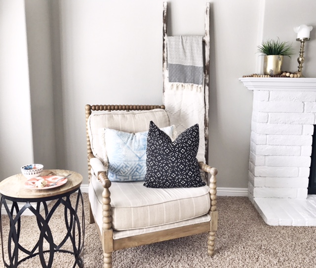
Her home is a gorgeous blend of rustic, modern, traditional, and eclectic.
“I think my style is unique because I am so eclectic. I love mixing blacks and blues together. I throw florals in with about every mix, and while I am very eclectic, I think everything flows well and it doesn’t feel harsh. I am constantly inspired by different aesthetics, places I travel to, and by people I admire. ”
Ashley's design philosophy also harkens back to the humble beginnings of StyleMutt Home, when Chelsea put her all into Craigslist hunting and furniture refinishing (don't worry, that's still a critical component of SMH!).
“I’m a bargain shopper at my core, a lover of garage sales and Craigslist, and am always searching for that hidden treasure. I have a passion for “recreating” pieces. I love hunting for the pieces that people can’t see beyond what is just sitting in from them... but I see the potential. ”
And seeing that potential has allowed Ashley to create a home that is carefully crafted, but so comfortable. Can you all just imagine a quiet Friday night in here, cuddled on the couch? Raise your hands. If you can't see it, mine is touching the sky.
The kitchen was largely renovated, but Ashley strategically decided to leave one thing as-is: the butcher block island. For someone who doesn't tend to follow trends, Ashely saw this as a way to incorporate trends on a whim. The island isn't always green; Ashley treats it as an accent piece and paints it all the time!
There is one thing trends are really good for, though, and that's exposing us (or rather, inundating us, as it may feels sometimes) with new ideas. Trends make it easy to identify what we like and what we don't like. Of course, the flip side of the coin is that once we find something we love that way, it may ultimately fall out of favor.
For Ashley, the trend she fell in love with was the gallery wall concept. We've seen a lot but Ashley's is particularly because of what it centers around: her family.
“I love my gallery walls. Especially the one of the family. It brings me joy seeing the kids faces up in our family room. It was such a pain to hang, since it was the first one I ever did, and I made a lot of mistakes. But those suckers are in and not moving; in fact, I used earthquake glue to keep them in place!”
Best of luck to the new owners on getting those earthquake glue marks off the walls!! I jest. But seriously, Ashley, you will most definitely have to call us in the future to check out your new home. Congratulations!
Follow Ashley along on Instagram @arrowsandbow for more!
And be sure to follow along with Cate, Chelsea, and I through our design busy season - we're just getting started!


