Ok so we already love Friday, but Annie's Reader Design is the cherry on top! Annie from Zevy Joy is a wonderful new Insta-friend (you can follow her @zevyjoy for some insta-inspiration). And I'm so excited she shared her #stylemuttspaces with us so we could share them with you! And the best part about this reader design is it's practically a whole home tour! Let's get gawking shall we?
From Annie:
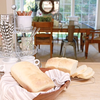
Here is our kitchen with an eat-in Island... I would say my style is mostly farmhouse/country - a bit industrial. We completely renovated this sweet little kitchen by taking down a small wall and putting in an island I found on Craigslist and adding a butcher block counter top. We painted the cabinets and I recently painted our heirloom China hutch. As a finishing touch we added copper chicken wire in place of the glass doors. I spray painted our light fixture so it would look like copper pendants and this space is perfect for us.
Bessie the cow joined our kitchen a couple years ago and so did the open shelves from Ikea.
Who wouldn't want a sweet and laurel-ed Bessie watching over their coffee station?
Annie's open concept floor plan allows sight lines to move seamlessly to the dining and living areas. I love the mix of wood and metal for such a refined farmhouse vibe.
[The dining room/ living room] is an open concept room that you enter from our kitchen. It was originally built as a sun room but we use it for these purposes instead. Some of our of furniture was handed down from my grandparents and parents. We found our dining table on Craigslist. As I have developed my style I am drawn to neutrals and wood tones - a mix of farmhouse and country. Most of the time I am trying to use what we have considering we are on a very tight budget. Our sectional was a rich chocolate brown and very comfy. Instead of replacing it I ended up sewing the slipcover for it with 100% duck cotton. I still have many things I would love to do to this space but have had so much fun making it our home!
You sewed an entire sectional slipcover?!?! Mad props girl.
If you think that couch looks comfy you should see the bedroom! Thankfully the tour doesn't end here and we get to sneak a peek here too:
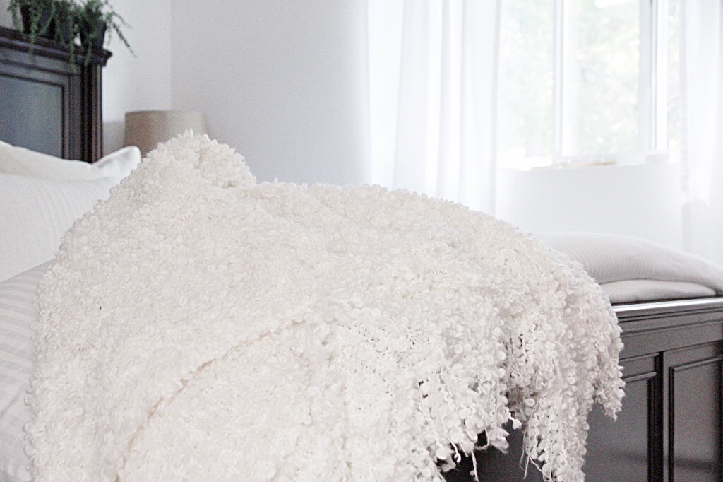
It is small but I have been working on making it a space that is comfortable for us. It has been the last room to really get any attention so I have enjoyed styling it to fit our taste. This room has the most color in my very neutral decor themed home. Again I love white linens and this room has touches of blue. Mirrors to reflect light and lots of texture with blanket layers. Many heirloom pieces in this room from my great grandparents - I love having these and they are very special to me!
Thank you Annie for inviting us into your home! I love the textured pile of cozy white linens and the desk as a nightstand! What was your favorite part of the tour ya'll?
Remember, sharing is caring here at StyleMutt Home and our SPACES page is meant to be a one-stop shop for decor drool. So don't forget to share your spaces with us for your chance to be a featured reader design. Just post pictures to our Facebook page or tag #stylemuttspaces on Instagram and we'll contact you with further details.


