Big time,
So you KNOW what that means, don't you. A pretty dandy Reader Design! Can I just brag about our Reader Designs for a sec?! These special features have absolutely nothing to do with Cate or myself - we don't even personally know most of these inspiring home owners, (or renters)! By the Lord's sweet design we've digitally crossed paths with each of these talented guests in some form or another and they've graciously agreed to share their home on our blog. We feel like we have the luckiest blog in the world to have SO many incredible tours to view!
We are so grateful to those who've come on and are yet to come for what they've given StyleMutt Home - our growing SPACES page's popularity is beyond what we ever could have imagined. We are so excited about beefing it up with more Reader Designs and hope you'll join in the fun! Just tag #stylemuttspaces on Instagram or post a photo or two to our facebook page to express interest. Then we'll contact you with the simple deets!
Speaking of beefing up that SPACES page, this gorgeous tour just hits all the right notes and it's from our oh-so-inspiring Inerweb friend, Kathy, (@thedailynest)! There's something for everyone in this one. Come on in!
From Kathy:
I would say my decor style is traditional with an eclectic twist! I love a traditional piece of furniture with maybe an accessory that would make you say, "What the what?" The most frequent comment I get about my home is, "It's so warm and inviting!" And that's exactly what I want my home to be. Warm, comfy and a place where you feel like you can come in and curl your feet up in a chair or put your feet on the coffee table!
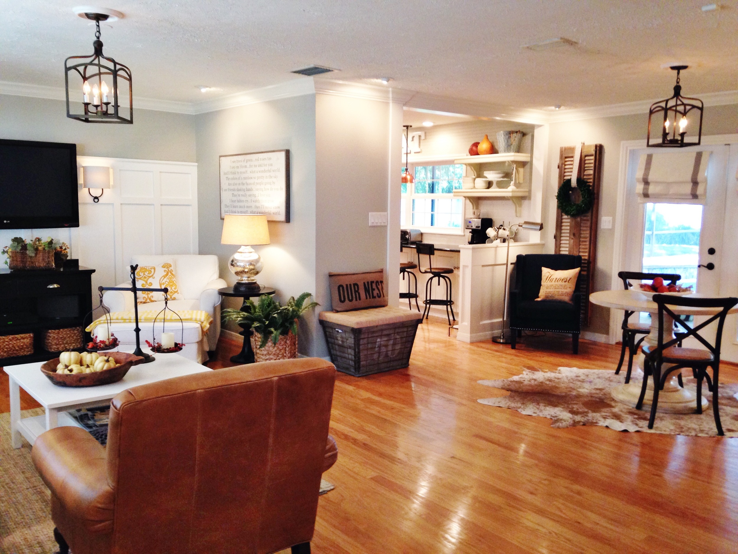
This is an over all look at the living room, breakfast area and kitchen. The walls are painted Benjamin Moore's Revere Pewter and all the trim is White Dove.
Traditional with an eclectic twist? Nailed it!
This is my husband's favorite chair. It's the Buchanan chair from Pottery Barn and I love the little pop of turquoise on the side table!
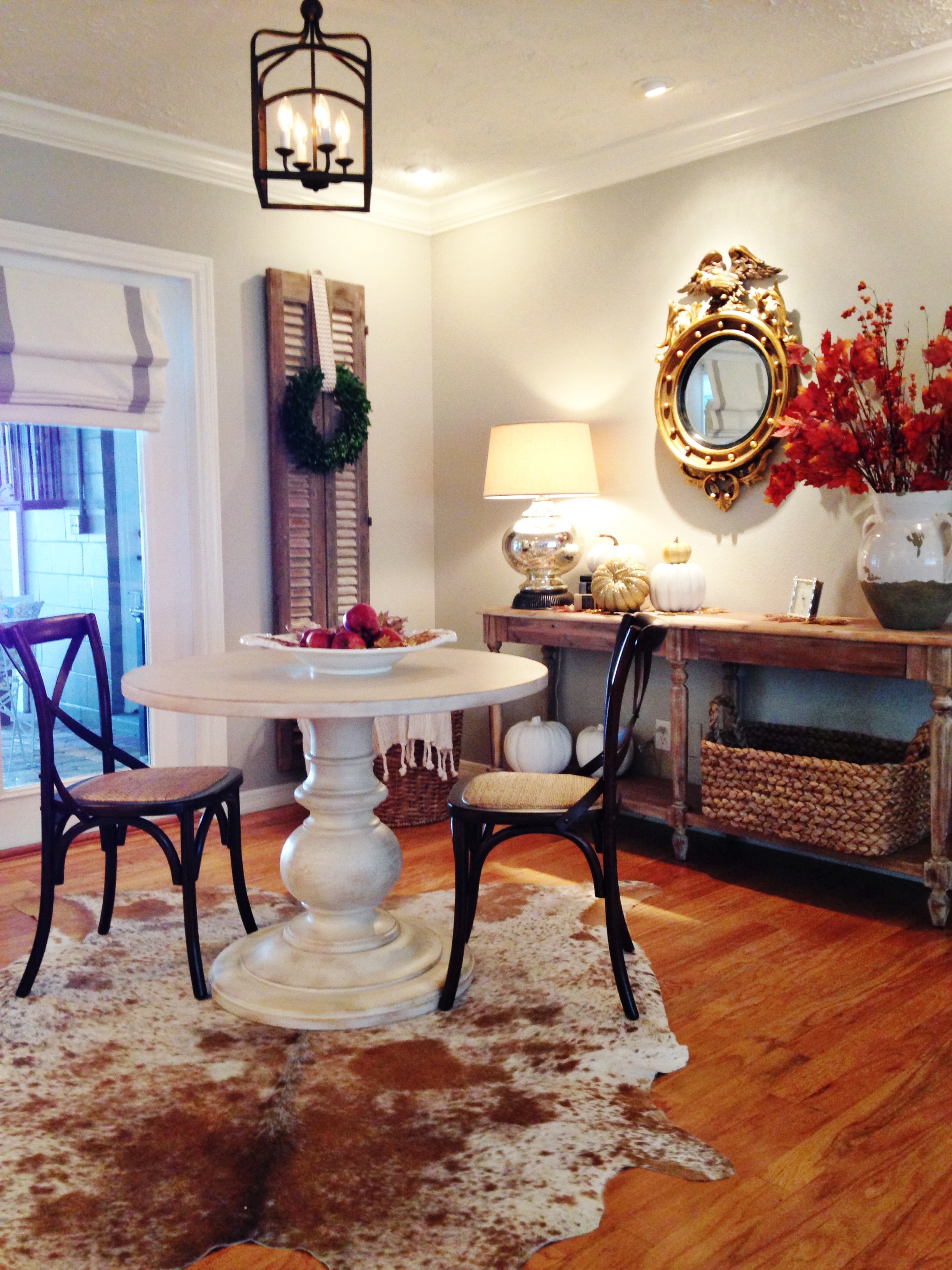
The breakfast area is where we really eat most of our meals, since we are now empty nesters! The round table is perfect for two but could sit four if need be. And one of my favorite all time purchases is this cow hide rug! I just love him or her! My 2 1/2 year old Granddaughter sits on it and says, "This is Mimi's cow!" We just recently found these incredible shutters from a salvage store and they are from Eqypt, can you believe! I think they add some architecture to the room flanking both sides of the french doors.
The kitchen is the heart of the home! And this is so true for this space! It's where everyone gathers when we have our family get together's. Before we remodeled we had a tiny window over the sink and the counters ended there. So we added a large window that overlooks the pool and backyard and extended the counters and under cabinets to the end of the wall. The half wall used to be a solid wall and closed up the room so by opening it up to the breakfast area it makes the kitchen feel so much bigger! Best decision we ever made!
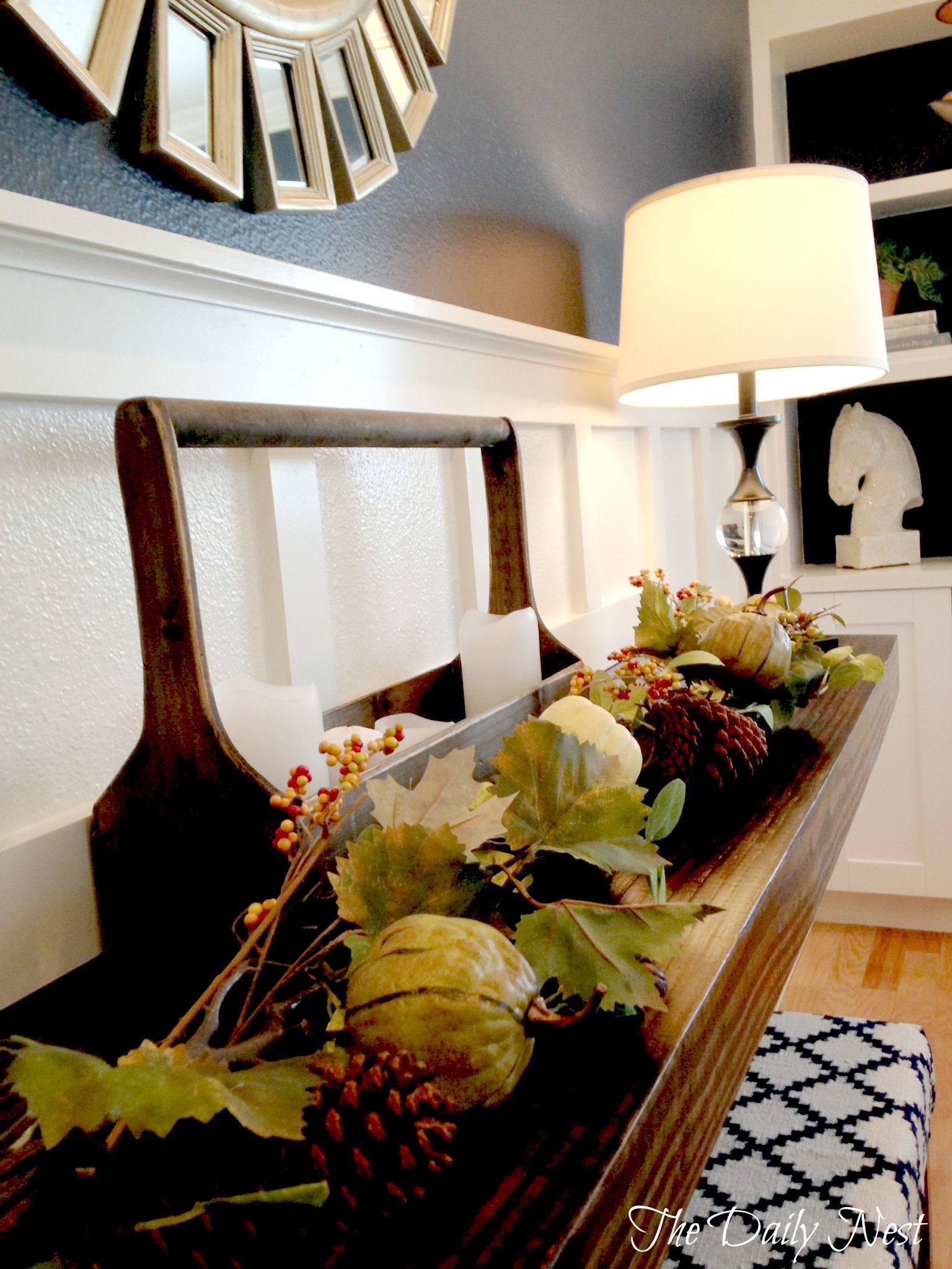
Our dining room, which used to be our master, then our sons room, and then an office, is now my favorite room in the house! Wow! I'm tired just thinking of all the transformations it's undergone! But with every change it's made our home functional for the time! I always say it was cheaper than moving! I found a room on Houzz.com that we used for inspiration for the built ins. The walls are Benjamin Moore's Hale Navy and my talented husband built the large shelf on the left and did all the board and batten which is painted BM White Dove.
Bringing in a little Fall on the large shelf which was inspired by a shelf I saw on HGTV's dream home one year! It's a great piece and serves as a buffet at times.
This room is affectionately known as the empty nest room! Because this was our younger son's room for his entire life! So when he moved out…hold on, talk amongst yourselves! It still gets me every time…okay I've pulled it together! This room is now my little office where I'm writing this now and it also has a daybed and crib for our Grandbabies! Can you say multipurpose?? The room is painted Benjamin Moore's Palladian Blue and the trim is White Dove. It's a happy little room, and I hardly ever think about our son leaving us! I kid!!
This is our master bedroom and right now its going through some changes so this is what it looked like a while back. We added this room when my husband wanted to have another baby and I said, "Can you build my dream bedroom?" And the day I went for my first Doctors appointment to find out if I was pregnant, we went downtown and pulled the permits to build this room! We recently painted the fireplace Benjamin Moore's White Dove. It was a red brick and I think the white really updates it! The walls are Revere Pewter and the pup is Sydney!
This comfy chaise from Ikea is perfect in this spot where the corner window overlooks the pool. It's a pretty view to sit and have a cup of coffee in the mornings!
This is my new and improved and recently remodeled laundry room! And I couldn't be happier with it! It had a very off center and awkward window above the washer and dryer so we eliminated it! I know! Who closes up windows? But it turned out great! We hung bead board horizontally and added these beautiful yet functional shelves from Ballard Designs and a little blingy chandelier makes doing laundry not so much of a chore!
Well that was just heavenly! Kathy is truly an inspiring home decorator and just as sweet as can be. We highly encourage you to hop over to her blog, The Daily Nest, to keep up on her current projects and decorating tips!
Have a wonderful weekend, style mutts! Thank you for stopping by!


