Often, I don't really know what I'm going to do with a piece when I first see it in the thrift store. But one thing's for sure: before I bring it home, I snap a pic and text it to Caleb. Although {some} of his design opinions may be valid, I do not do this to get his aesthetic input {that's when I text Chelsea}. I text Caleb because one of the first rules of marriage I have learned so far is ask my husband if he's willing to carry something up 3 flights of apartment stairs BEFORE I buy it. {She writes with a big guilty/ sheepish grin}.
My lovingly tolerant husband {AKA "The Muscle"} did indeed give me the go-ahead so I brought home this 3-door outdated beast in hopes that I would eventually get an idea for what to do with him.
I thought about doing this one a little shabby-chic with some gray chalk paint and distressed edges. He had the right little pulls for it, but I couldn't help but feel that something was off. He was just too BIG. At 60" long and 24" wide, he just seemed too massive for such characteristically "feminine" touches of a shabby-chic treatment.
He was really deep for a sideboard. Unless you have a giant dinning room, I couldn't see him working as buffet or a credenza. So what on earth am I gonna do with this beast?
Feeling kinda stuck, I took off the doors to get a good look inside and a fresh perspective. This helped me pinpoint what he had going for him:
- 6 drawers for storage {dovetailed - always a good indicator of quality craftsmanship}
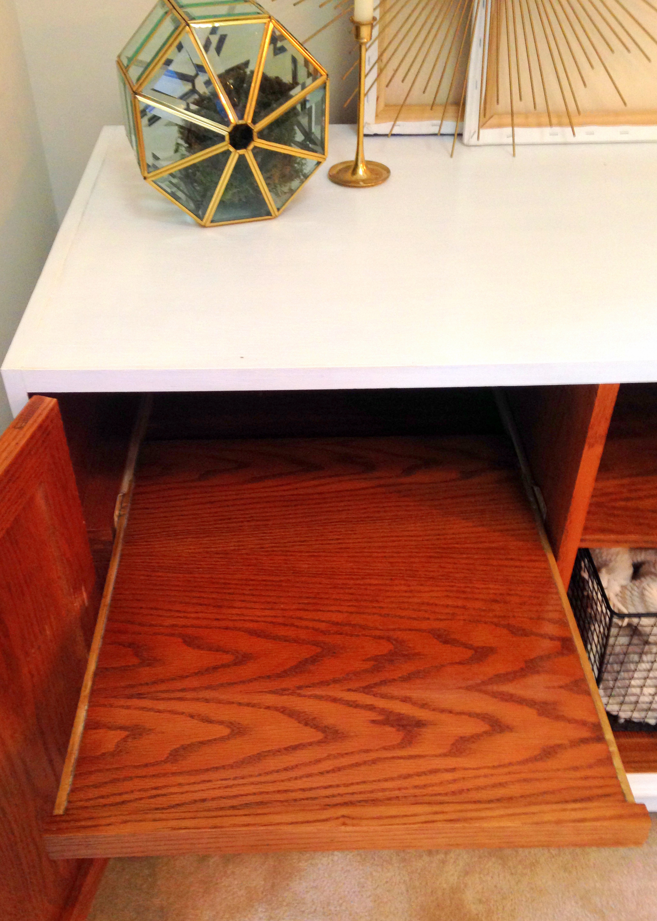
- A pull-out tray on the left side
- 2 strategically placed holes to allow hidden routing for unsightly cables
I was beginning to realize that this piece had all the fixin's to be a solid media stand: the holes for cables would make the centralized shelf perfect for a cable box...
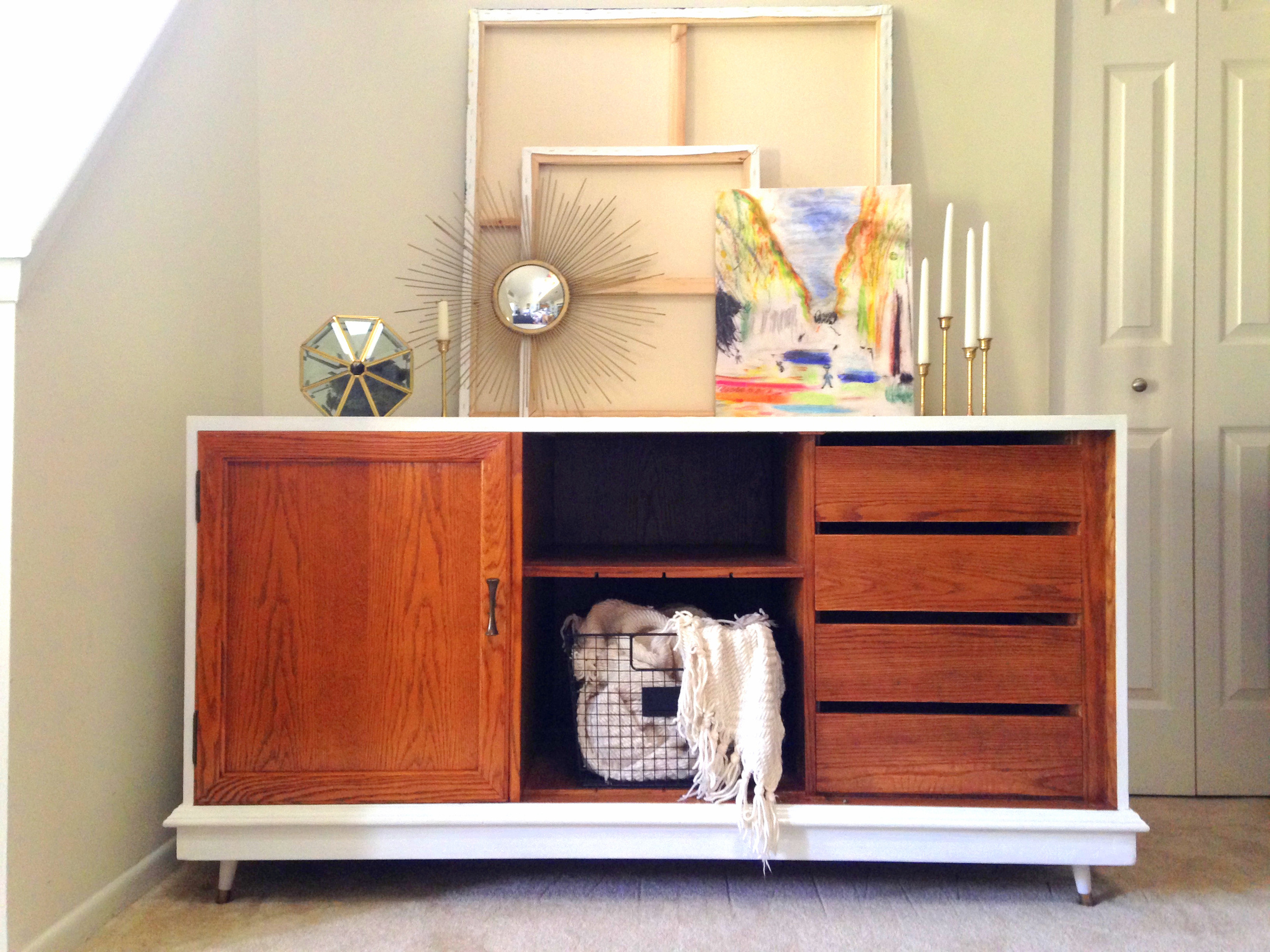
But who would really use a TV stand that required you to open a door for the remote to communicate with the receiver? This is where I had my revelation: this was no ordinary TV stand. This was a Mid-Century Modern TV Stand just waiting to come out of hiding! He had all the right lines {especially with those clean drawers that sat flush into the piece}. So naturally I had to help this poor soul. I removed two of the doors and gave him some painted trim, a warm coat of stain, and some tapered legs from the hardware store...
What. Just. Happened. Did you see that transformation coming? I sure didn't when I first saw it in the store ;)
The veneer needed some extensive repair. After using some wood filler and putting in some sweat equity in manual sanding {I'm saving up for a power sander...} I decided to paint the outside and the tapered legs a crisp white and leave the door and drawers to get that two-tone MCM look.
I left only one of the doors on to hide the biggest cable slit and the pull-out tray.
By leaving other two doors off, now the center shelf can be used for a cable box. Plus I love being able to show off the 4 right-side drawers.
Savvy me saved the old pulls from the Bamboo Dresser flip which were the perfect 70's style to reuse one for this piece {points for Gryffindor!}
Now I can so see this MCM piece as a sharp-looking entertainment console. Throw a drink set and a tray on there and it can even moonlight as bar worthy of Mad Men.
I'm so pleasantly surprised with how retro-licious it turned out!
Now available for sale.
60"L x 24"W x 32"H
SOLD
If you are interested in this piece or a custom order like it, please email cate@stylemutthome.com.
P.S. We invite you to share your proud transformations with us by tagging #stylemuttrefinishes when you post before & after photos to instagram or facebook. Looking forward to seeing your unrecognizable renos!


