Guess what guys... our living room is CLEAN. So you know what that means: it's time for a living room tour!
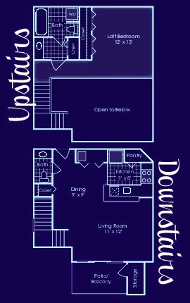
Let me start by explaining that Caleb and I live in a studio/ loft apartment. As you can see in the floorplan, basically this means we live in one big room that's a whopping 863 square feet.
Nevertheless, we are very proud of our newlywed nest. I'm proud that I managed to make my extensive collection of roadside rescue furniture and DIY decor work for a small space. And Caleb is proud that he found us an apartment that, although minuscule, still has more than one bathroom {1.5 to be exact} and a flight of stairs.
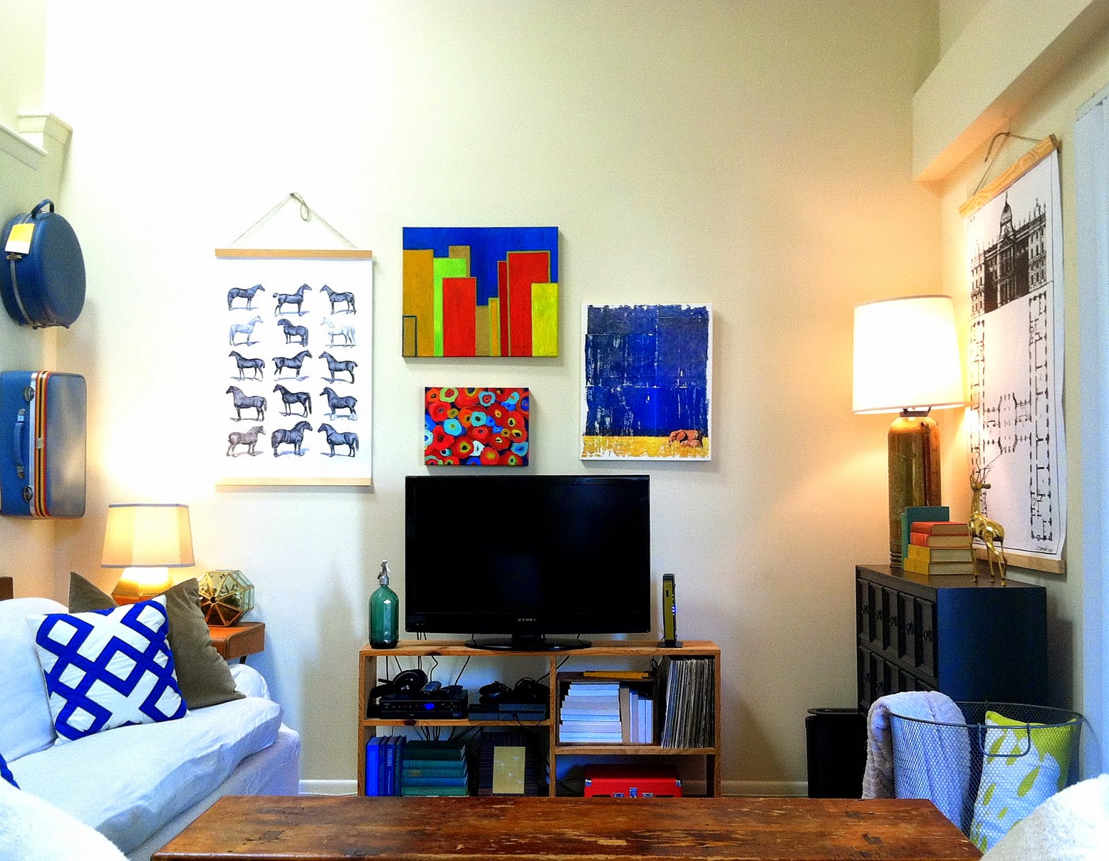
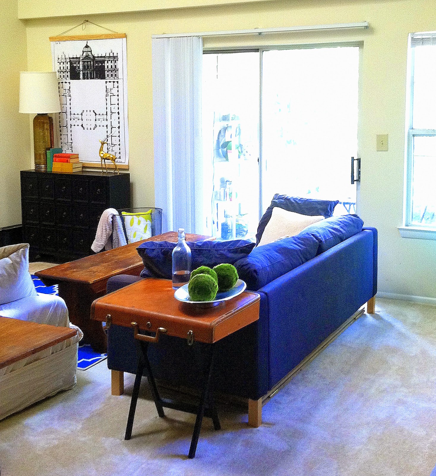
Now with that said, I don't know if this post will actually qualify as a tour since you can pretty much grasp our tiny living situation in one photo:
Yep you're looking at it.
That's the whole living room people and pretty much our whole apartment.
Tour over. Just kidding.
Even though the photo taken from our lofted bedroom space pretty much covers it, I'll still do my best to walk you through the things we have that define our living space.
Alright, let's take a closer look at some of our decorative items.
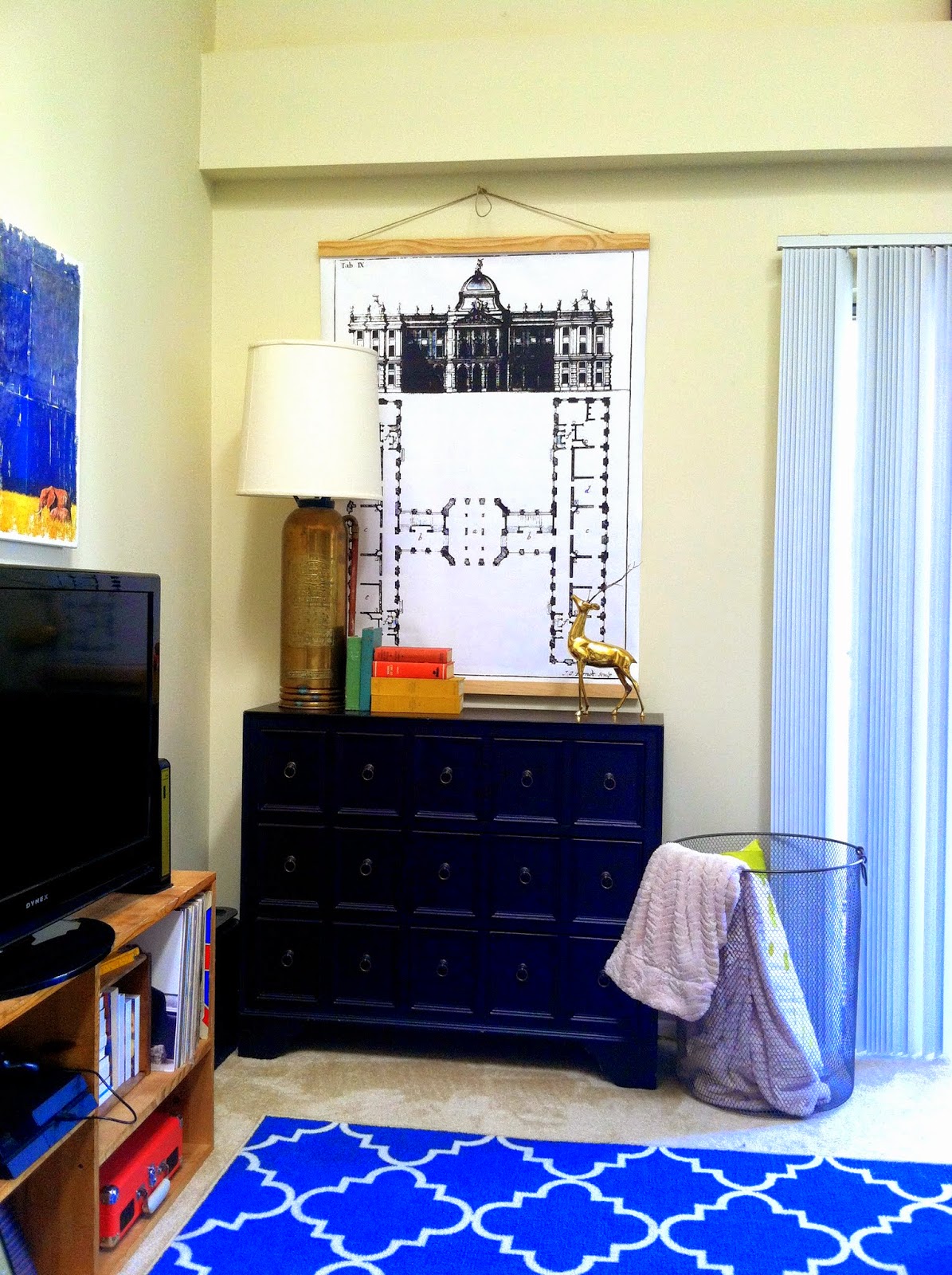
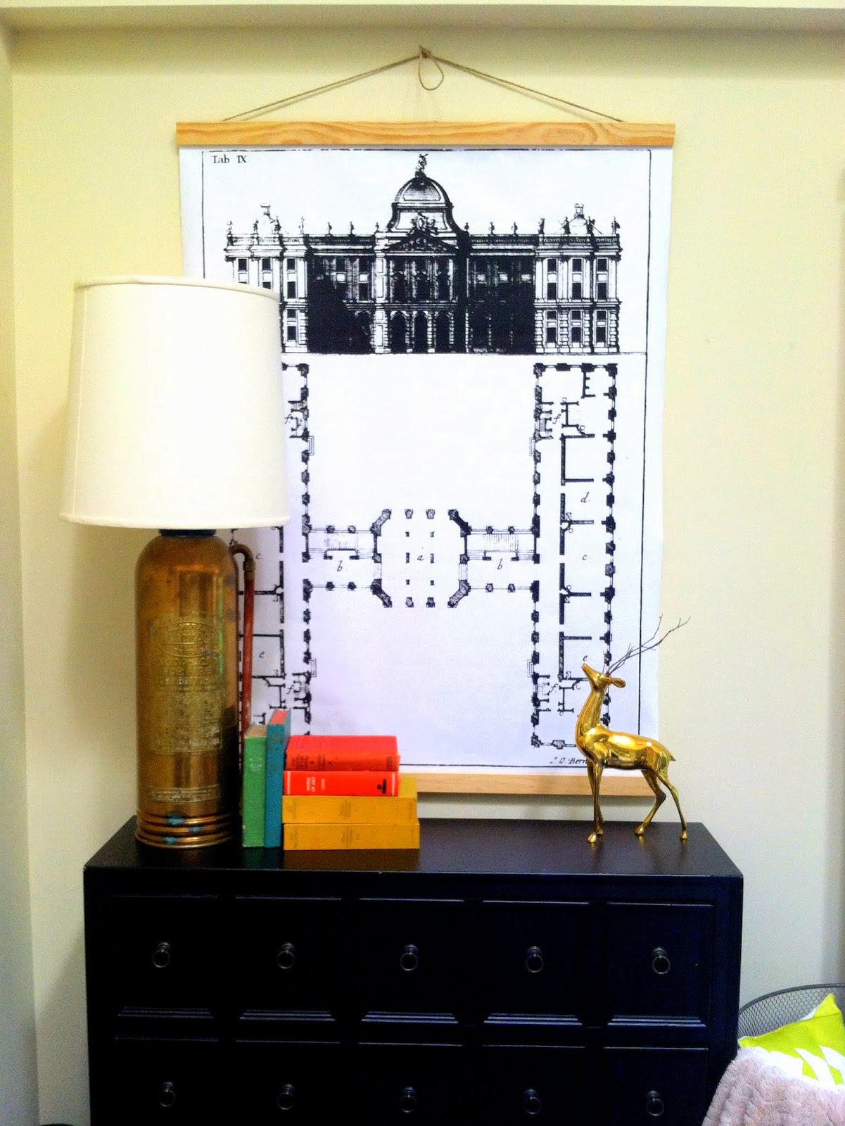
First we have our extra storage in this faux-front apothecary chest from Kirklands. Above it hangs another engineer print that was converted to a faux pull-down chart. Quick tangent: after I made my first pull-down chart in this tutorial, I was inspired to make another by this exquisite architectural alphabet print.
I did a little digging and learned that each letter was taken from a famous architectural publication by Johann Steingruber circa 1773. Talk about vintage. I tried DESPERATELY to get my hands on a reproduction image of the whole set with no luck. But what I did find was a high resolution blueprint of the letter H. H for Henderson - score!
Ok still with me? Let's get back to the rest of the tour. For those of you attention-to-detail CG readers, you might notice a couple of previous posts sprinkled through out the room...
{Geometric Lamp Copycat provides extra task lighting}
{Steve the Stag still stands on the credenza}
{Extra credit if you spotted the roadside rescue from Chelsea's suitcase table post last September}
Confession time: when she first made those tables, I was immediately smitten. At the time however, they were promised to another project. So when that went in a difference direction, I was ready with the rebound plan and Chelsea graciously let me inherit the pair!
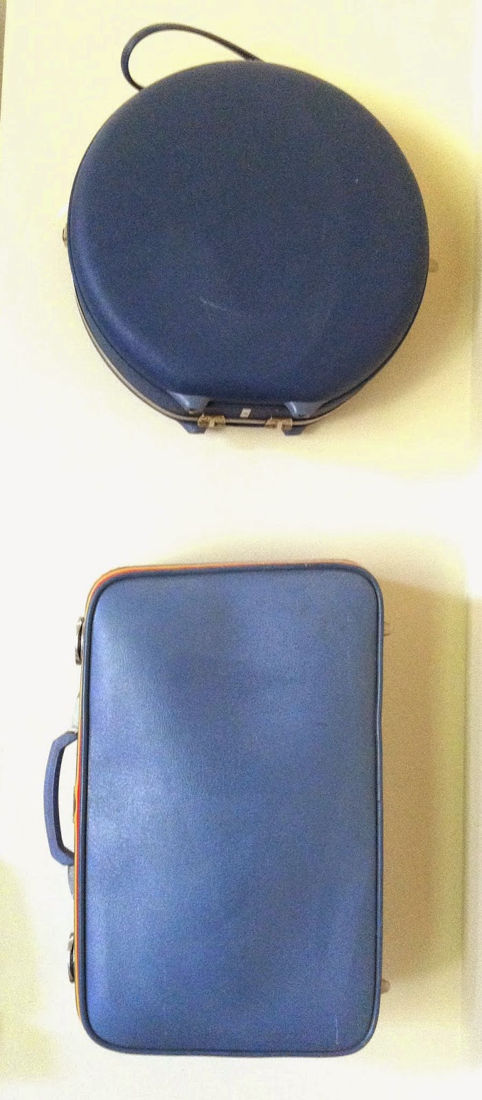
There are also a couple new-to-CG ideas in the room. Continuing my suitcase motif, more suitcases on the wall provide extra hidden storage.
On our walls hang some original artwork - two acrylic paintings and one art piece made using a photo-to-canvas transfer method from A Beautiful Mess.
Behind the floating sofa is an old metal file cabinet that I spray painted aqua. It provides a great place to hold all my tools since we don't have a garage.
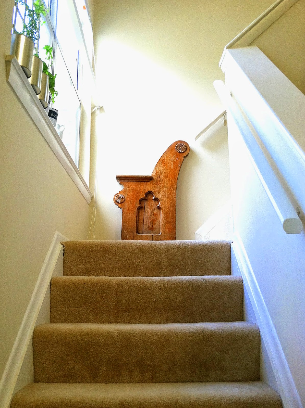
Head up the stairs and you'll find the remnants of an old church pew from my childhood church in DC.
And on the window sill is an antique grate pulling double duty as a trellis.

You can kind of see in this photo that the white slip-covered sofa sits up against the kitchen counter. What can I say... small apartment problems. But it's great if you want to make toast without leaving your comfy spot on the couch.
The lofted ceiling does help the room feel bigger and the pops of red, marigold, and chartreuse mixed in with navy gives it a playful personality.
I know what you're asking yourself... there are no dog toys littering the floor so where's Thor?
Snoozing through the whole tour of course...
And that concludes the tour of what is definitely the focal point of our little apartment. Hope you enjoyed it and have a happy Wednesday!
~ Cate
This post was published under Chelsea's Garage, now affectionately known as StyleMutt.
